강의
1. 애니메이션
1. transform
-
기본적인
html과css작성후 링크 -
<div>태그에class로 속성값을 주고<div class="transform"></div> -
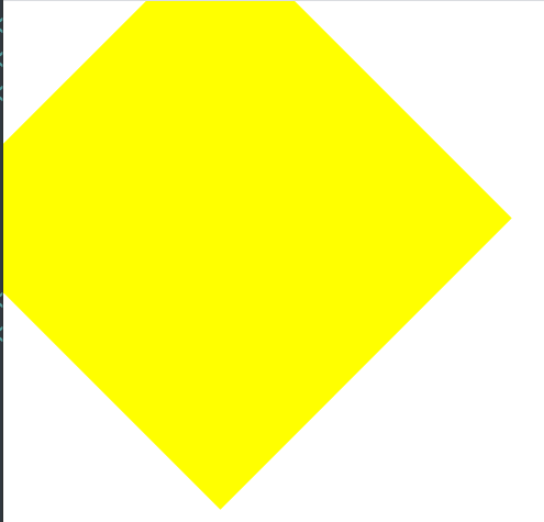
css에서 공간을 잡은뒤transform:을 사용해보자.transform { width: 300px; height: 300px; background-color: yellow; transform: rotate(45deg);}rotate는 2차원적인 회전효과 ,평면적으로 회전
값은 양수or 음수, 양수는 오른쪽으로 회전, 음수는 왼쪽으로 회전
-
다음으론
scaletransform: scale(2,3);scale은 정해준 값만큼 원래길이의 배수로 크기를 키움
위 경우처럼 앞이 2,뒤가 3이면- x축인
width값을 2배 , y축인height값을 3배 - 줄이고 싶을경우엔 소수점 값을 넣으면된다.
-
skewtransform: skew(10deg,20deg);skew는rotate처럼 공간을 돌리긴하지만 돌리기보단 비트는거같은느낌 ,3차원 회전효과- x축을 10만큼, y축을 20만큼 회전시킨것,
rotate랑 동일하게 음수값을 넣으면 왼쪽으로 돌아감
-
translatetransform: translate(100px,300px);- x축을 기준으로 100px만큼 , y축을 기준으로 300px만큼 이동시킴
- 도형자체보단 위치를 옮길때
-
주의점
- 브라우저가 적용되는버전인지 확인
- 링크에서 확인가능
- 만약 이전버전에서 사용하고싶을시
-webkit-transform: rotate(10deg); -moz-transform: rotate(10deg); -ms-transform: rotate(10deg); -o-transform: rotate(10deg); transform: rotate(10deg);- 이런식으로 앞에 프리픽스를 붙여준다
- 그다음 마지막에 작성
2. transition
-
Ex)
.transition:hover{ width: 600px;}-
이렇게 마우스오버시 변화하는값을 줬을때,
transition-property:width ; transition-duration: 2s; transition-timing-function: linear; transition-delay: 1s; -
이런식으로 마우스오버시 보여지는 애니메이션 조정
-
굳이 저렇게 4줄을 쓸필요는없고
transition: width 2s linear 1s; -
이렇게도 표현가능 나머지값의 순서는 상관없지만
2s,1s의 시간표현은 먼저나온게duration나중에 나온게delay에 적용됨, 하나만 적으면duration
-
-
보통 자연스러운 색상변화 등등에 사용
-
만약
height값이 추가되면.transition:hover{ width: 600px; height: 600px;},를 사용해서height을 뒤에 더적어준다.transition: width 2s linear ,height 2s linear;}
3. animation
-
Ex)
<div class="animation"></div> -
Css
.animation{ width: 300px; height: 300px; background-color: yellow; -
animationanimation-name: changeWidth; animation-duration: 3s; animation-timing-function: linear; animation-delay: 1s;name은 내가 원하는대로 지정duration진행시간timing-function은 어케 진행할껀지linear는 그냥 기본 평범하게delay도 시간- 여기까진
transition이랑 같음
- 여기까진
-
animationanimation-iteration-count: 6; animation-direction: normal;interation-count진행횟수 'infinite로 무한반복direction이alternate`일때는 횟수가 절반이라고 생각하면될듯direction진행방향
normal은 그냥 일반(from에서to)반복
alternate는 왕복(from에서to->to에서from)
-
@keyframes- 항상
animation이랑 같이@keyframes changeWidth { from{ width: 300px; height: 300px; background-color: yellow; } to{ width: 600px; height: 600px; background-color: red; border: solid 10px blue; } } from에 최초값,to에 결과값을 넣는느낌border처럼 한쪽에만 값을 넣으면 실행은 하지만 부자연스러움from은0%,to는100%로도 표현가능- 중간중간에 숫자사이사이에 예를들어
50%이런값을 넣어서도 표현가능
- 항상
-
-
머리 까딱이는 사자
<div class="spin-lion"></div> -
Css
.spin-lion{ width: 150px; height: 150px; background-color: blue; animation: spinLion 1.5s linear infinite alternate; @keyframes spinLion{ from{ transform: rotate(-10deg); } to{ transform: rotate(10deg); }} -
animation도transition처럼 한줄로 표현가능 -
여기서도
-webkit-같은 프리픽스 사용가능 -
할때는
@와keyframe사이 -
transform앞에도 붙이고 -
animation앞에도 붙이면됨
-
-
Stylie
- 포물선같은거 만들때 활용
4. 실습
-
추가적인것
animation-play-state: paused; animation-fill-mode: backwards;-
play-state는 접속햇을때 실행하는지 멈춰있는지running이랑paused -
fill-mode는 기본적인background-color가 머든간에
처음0%에 있는 색을 가져와서 보여줌background-color: red;0%{ background-color: green;- 이러면
green이 보임
- 이러면
-
-
img태그를 쓸데 기본값으로 밑에 빈칸이있는데vertical-align: middle;- 를붙여주면 깔끔해짐
-
a태그처럼 커서가 변하는것cursor: pointer;
오늘 진행했던 내용 Git
2. 어려웠던점
- 이전했던부분들을 같이 활용하면서 하니까 점점 더 복잡해진다.
3. 해결
- 전에 배웠던 내용들을 써놓은 개발일지를 참고하거나
- 다시 구글링
4. 소감
- 어려웠던점과 동일하게 점점 복잡하고 길어지니까, 머리가아프다..