이번에는 ShadCN UI의 Dialog(모달) 컴포넌트를 학습하면서, 입력 필드와 버튼을 활용한 모달 창을 구현해 보았습니다
ShadCN Dialog(모달) 설명
ShadCN에서 제공하는 Dialog 컴포넌트는 기본적으로 모달(팝업) 창을 쉽게 구현할 수 있도록 만들어졌습니다.
✅ 사용된 주요 컴포넌트
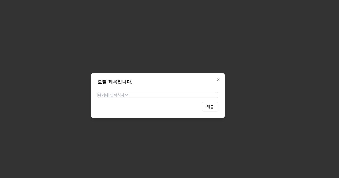
- Dialog 모달 전체 컨테이너
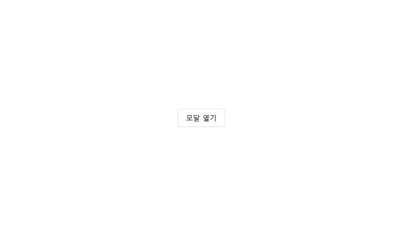
- DialogTrigger 모달을 여는 버튼
- DialogContent 모달의 본문(내용)
- DialogHeader 모달의 헤더 부분
- DialogTitle 모달 제목
- DialogDescription 모달 설명
useState를 활용해 모달의 열림/닫힘 상태를 관리하며, open 속성을 통해 현재 상태를 전달했습니다.
'use client';

import { Button } from '@/components/ui/button';
import {
  Dialog,
  DialogContent,
  DialogDescription,
  DialogHeader,
  DialogTitle,
  DialogTrigger,
} from '@/components/ui/dialog';
import { ChangeEvent, useState } from 'react';

const DialogPage = () => {
  const [isOpen, setIsOpen] = useState(false);
  const [name, setName] = useState('');

  const handleSubmit = () => {
    alert(`${name}을 제출하겠습니다.`);
    setIsOpen(false);
    setName('');
  };

  return (
    <div className="flex h-screen items-center justify-center">
      <Dialog open={isOpen} onOpenChange={setIsOpen}>
        <DialogTrigger asChild>
          <Button variant="outline" onClick={() => setIsOpen(true)}>
            모달 열기
          </Button>
        </DialogTrigger>
        <DialogContent>
          <DialogHeader className="gap-5">
            <DialogTitle>모달 제목입니다.</DialogTitle>
            <DialogDescription className="gap-2">
              <input
                id="inputField"
                type="text"
                placeholder="여기에 입력하세요"
                value={name}
                onChange={(e: ChangeEvent<HTMLInputElement>) =>
                  setName(e.target.value)
                }
                className="mt-1 block w-full rounded-md border border-gray-300 shadow-sm transition duration-200 focus:border-blue-500 focus:outline-none focus:ring focus:ring-blue-500"
              />
            </DialogDescription>
          </DialogHeader>
          <div className="flex justify-end space-x-2">
            <Button variant="outline" onClick={handleSubmit}>
              제출
            </Button>
          </div>
        </DialogContent>
      </Dialog>
    </div>
  );
};

export default DialogPage;

프론트엔드 개발공부를 하고있습니다.