이번에는 쇼핑몰 사이트나 공고 사이트 등 다양한 콘텐츠의 웹 사이트에서 자주 볼 수 있는 컴포넌트, 케러셀 컴포넌트에 대해 실습해보려고 함.
특히 embla-carousel-autoplay 플러그인을 함께 사용해 자동 슬라이드 기능도 구현해봤다.
- https://ui.shadcn.com/docs/components/carousel
- 위의 링크를 클릭해 설치방법 및 사용 방법을 터득한다.
아래 코드에서의
💡 주요 포인트
- Carousel, CarouselItem 등의 컴포넌트는 shadcn/ui의 커스텀 컴포넌트이다.
- Autoplay 기능은 useRef로 생성된 plugin을 통해 주입.
- Carousel에 plugins 배열로 추가하면 자동 슬라이딩 구현 가능.
- opts={{ loop: true }}를 통해 무한 루프 슬라이드도 가능.
https://github.com/shadcn-ui/ui/issues/3393
위 링크를 참고하여 개발을 하였음.
'use client';

import { Card, CardContent } from '@/components/ui/card';
import {
  Carousel,
  CarouselContent,
  CarouselItem,
  CarouselNext,
  CarouselPrevious,
} from '@/components/ui/carousel';
import Autoplay from 'embla-carousel-autoplay';

const CarouselPage = () => {
  const plugin = useRef(
    Autoplay({ delay: 2000, stopOnInteraction: false }),
  );

  return (
    <Carousel
      plugins={[plugin.current]}
      opts={{ loop: true }}
      className="w-full max-w-xs"
    >
      <CarouselContent>
        {Array.from({ length: 5 }).map((_, index) => (
          <CarouselItem key={index}>
            <div className="p-1">
              <Card>
                <CardContent className="flex aspect-square items-center justify-center p-6">
                  <span className="text-4xl font-semibold">{index + 1}</span>
                </CardContent>
              </Card>
            </div>
          </CarouselItem>
        ))}
      </CarouselContent>
      <CarouselPrevious />
      <CarouselNext />
    </Carousel>
  );
};

export default CarouselPage;
추가적으로 외부 이미지나 내부 이미지들도 넣을 수 있을 것 같았음.
예전에 케러셀에 관한 다른 라이브러리를 사용한 적이 있었는데 그것보다 shadcn ui를 사용한 것이 커스터마이징하기에도 훨씬 수월하였고 직접 구현하는 부분도 쉽게 느껴졌음.
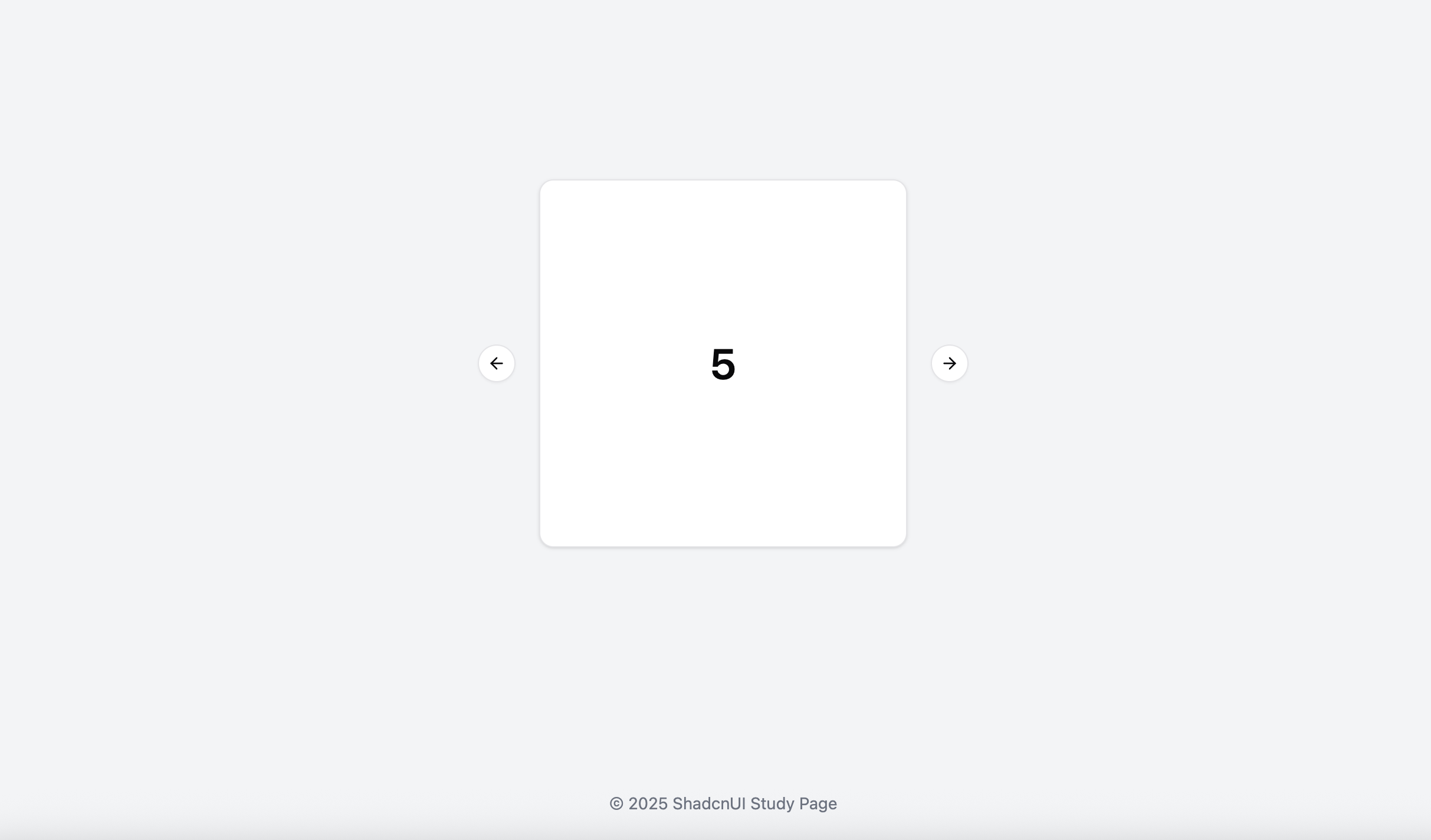
https://shadcn-ui-umber.vercel.app/CarouselPage
케러셀을 적용한 후 직접 배포한 페이지이다. 생각했던 요구사항대로 잘 적용된 것을 볼 수 있음.

프론트엔드 개발공부를 하고있습니다.