BFC / IFC
- div, section / a, span, img
| BFC | IFC |
|---|---|
| 크기조절가능(width,height) | 크기조절 불가(width,height) |
| 부모에 영향을 받음 | text 영역만큼만 처리 |
- 기본적인 body태그 아래의 div는 body 전체에 처리가 적용된다.
display:inline-block
block -> 크기 조절 가능
inline -> 나란히 연결가능한 IFC 형태
BOX MODEL
- margin
- border
- padding
box-sizing
1) box-sizing:content-box (border/padding/witdh 분리)
2) box-sizing:border-box (border까지 width에 포함)
1rem
- rem(root em) : html에서 default로 가지는 font-size
- 약 16px이라고 보면 된다.
태그간 공백의 크기 0으로 처리하기
<html>
<style>
    section{display:inline-block;padding:5%}
    .a{width:30%;background-color:skyblue;}
    .b{width:50%;background-color:green;}
</style>
<body>
    <div class='container'>
        <section class='a'>
            <h1>A</h1>
            <p>Lorem Ipsum is simply dummy text of the printing and typesetting industry. Lorem Ipsum has been the industry's standard dummy text ever since the 1500s, when an unknown printer took a galley of type and scrambled it to make a type specimen book. It has survived not only five centuries, but also the leap into electronic typesetting, remaining essentially unchanged. It was popularised in the 1960s with the release of Letraset sheets containing Lorem Ipsum passages, and more recently with desktop publishing software like Aldus PageMaker including versions of Lorem Ipsum</p>
        </section>
        <section class='b'>
            <h1>B</h1>
            <p>Lorem Ipsum is simply dummy text of the printing and typesetting industry. Lorem Ipsum has been the industry's standard dummy text ever since the 1500s, when an unknown printer took a galley of type and scrambled it to make a type specimen book. It has survived not only five centuries, but also the leap into electronic typesetting, remaining essentially unchanged. It was popularised in the 1960s with the release of Letraset sheets containing Lorem Ipsum passages, and more recently with desktop publishing software like Aldus PageMaker including versions of Lorem Ipsum</p>
        </section>
    </div>
</body>
</html>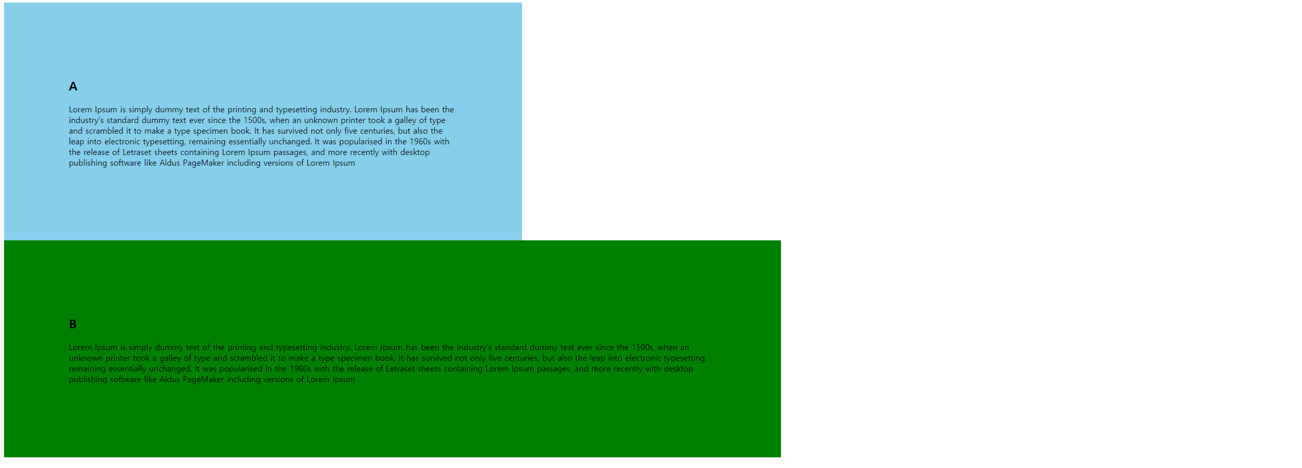
- 원인은 section 태그간의 사이의 공백이 크기를 가지고 있기때문이다.
해결방법
1) section 태그끼리 붙여주기
2) container class에 font-size:0을 부여하고 그 아래 section태그에 font-size:1rem을 부여한다.
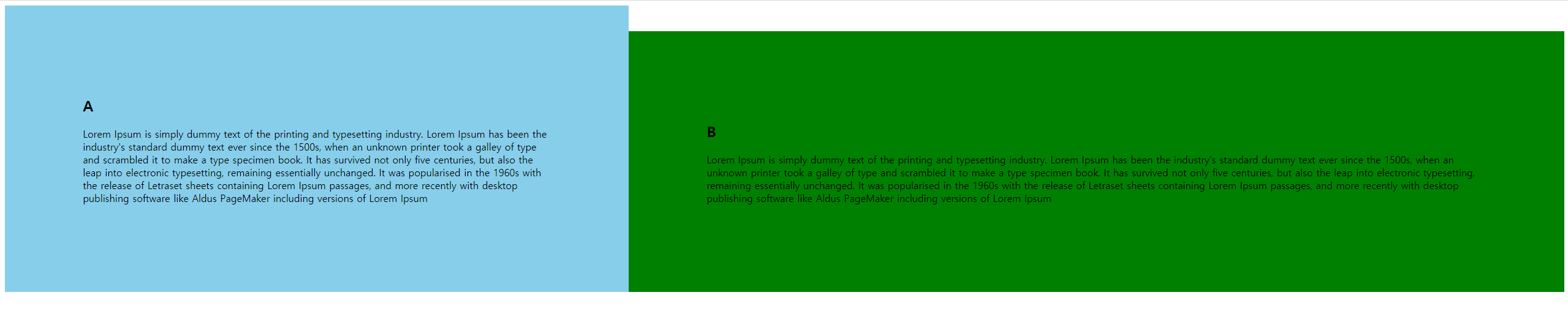
- container class 기준으로 padding 5% * 4 + width 30% + width 50%로 100% 전부이므로 body의 margin이 0 이 아니더라도 옆으로 나열이 가능하다.
vertical-align
- inline 또는 table-cell box에서의 수직 정렬을 지정
max-width
- 브라우저 크기에 따라 유연하게 움직이되 해당 max 크기만큼만 늘어나게 한다.
margin : 0 auto
margin-left : auto
margin-right : auto
- 상하는 0 좌우는 auto
위와 같은 결과다.
고민해보기
1)
<html>
<style>
    /*body{margin:0; font-size:2em;}*/
    h1, p {margin:0;}
    .container{}
    section{padding:5%;display:inline-block;}
    .a{width:30%;background-color:skyblue;}
    .b{width:50%;background-color:green;}
</style>
<body>
    <div class='container'>
        <section class='a'>
            <h1>A</h1>
            <p>Lorem Ipsum is simply dummy text of the printing and typesetting industry. Lorem Ipsum has been the industry's standard dummy text ever since the 1500s, when an unknown printer took a galley of type and scrambled it to make a type specimen book. It has survived not only five centuries, but also the leap into electronic typesetting, remaining essentially unchanged. It was popularised in the 1960s with the release of Letraset sheets containing Lorem Ipsum passages, and more recently with desktop publishing software like Aldus PageMaker including versions of Lorem Ipsum</p>
        </section><section class='b'>
            <h1>B</h1>
            <p>Lorem Ipsum is simply dummy text of the printing and typesetting industry. Lorem Ipsum has been the industry's standard dummy text ever since the 1500s, when an unknown printer took a galley of type and scrambled it to make a type specimen book. It has survived not only five centuries, but also the leap into electronic typesetting, remaining essentially unchanged. It was popularised in the 1960s with the release of Letraset sheets containing Lorem Ipsum passages, and more recently with desktop publishing software like Aldus PageMaker including versions of Lorem Ipsum</p>
        </section>
    </div>
</body>
</html><html>
<style>
/*body{margin:0; font-size:2em;}*/
h1, p {margin:0;}
.container{}
section{padding:5%;float:left;}
.a{width:30%;background-color:skyblue;}
.b{width:50%;background-color:green;}
</style>
<body>
<div class='container'>
<section class='a'>
<h1>A</h1>
<p>Lorem Ipsum is simply dummy text of the printing and typesetting industry. Lorem Ipsum has been the industry's standard dummy text ever since the 1500s, when an unknown printer took a galley of type and scrambled it to make a type specimen book. It has survived not only five centuries, but also the leap into electronic typesetting, remaining essentially unchanged. It was popularised in the 1960s with the release of Letraset sheets containing Lorem Ipsum passages, and more recently with desktop publishing software like Aldus PageMaker including versions of Lorem Ipsum</p>
</section>
<section class='b'>
<h1>B</h1>
<p>Lorem Ipsum is simply dummy text of the printing and typesetting industry. Lorem Ipsum has been the industry's standard dummy text ever since the 1500s, when an unknown printer took a galley of type and scrambled it to make a type specimen book. It has survived not only five centuries, but also the leap into electronic typesetting, remaining essentially unchanged. It was popularised in the 1960s with the release of Letraset sheets containing Lorem Ipsum passages, and more recently with desktop publishing software like Aldus PageMaker including versions of Lorem Ipsum</p>
</section>
</div>
</body>
</html>왜 2번은 section을 같이 붙이지도 않았는데 두 결과 모두 한 라인에 있는 이유는
1번은 section을 붙여 공백을 제거하였고
2번은 공백이 있음에도 float에 의해 공백자체가 사라져 공백이 제거된 효과로 둘다 같은라인에 있다.
추가 float 사항
-
부모태그 안의 자식태그가 float일 경우 부모태그의 width는 0이다. ( 자식태그들이 붕 떠있다.)
-
float를 사용 후 그 후
clear:both를 적용 시켜야한다.
ex)
<html>
<style>
    /*body{margin:0; font-size:2em;}*/
    h1, p {margin:0;}
    .container{background-color:pink;}
    section{padding:5%;float:left;}
    .a{width:30%;background-color:skyblue;}
    .b{width:50%;background-color:green;}
    footer{clear:both;}
</style>
<body>
    <div class='container'>
        <section class='a'>
            <h1>A</h1>
            <p>Lorem ...</p>
        </section>
        <section class='b'>
            <h1>B</h1>
            <p>Lorem ....</p>
        </section>
    </div>
    <footer>footer</footer>
</body>
</html>
해당 내용의 container에 pink를 주지만 결과는 남은 부분이 색칠 되어지지않고 이는 아래와 같다.
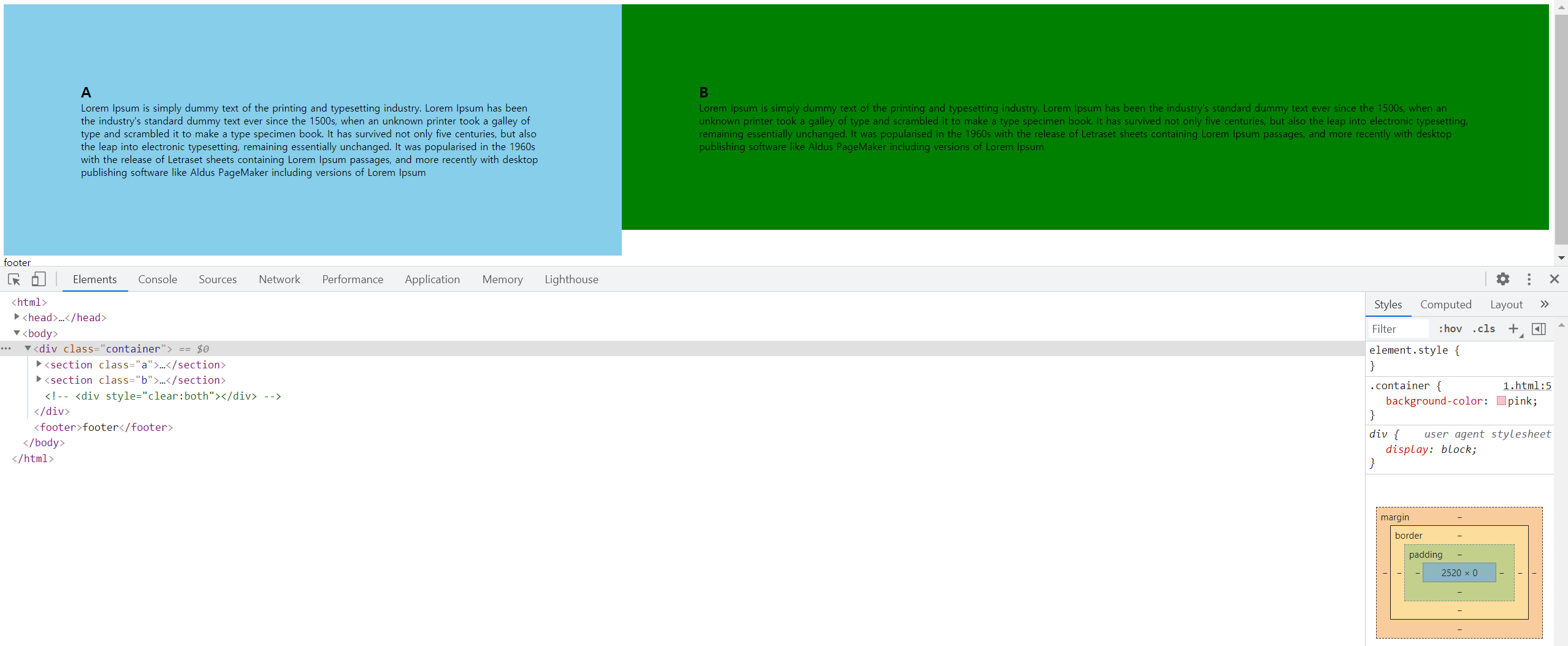
해결 방법으로는 해당 부분이 끝나면 float 영향을 끝내야하므로
종료 태그 아래에clear:both를 추가한다.
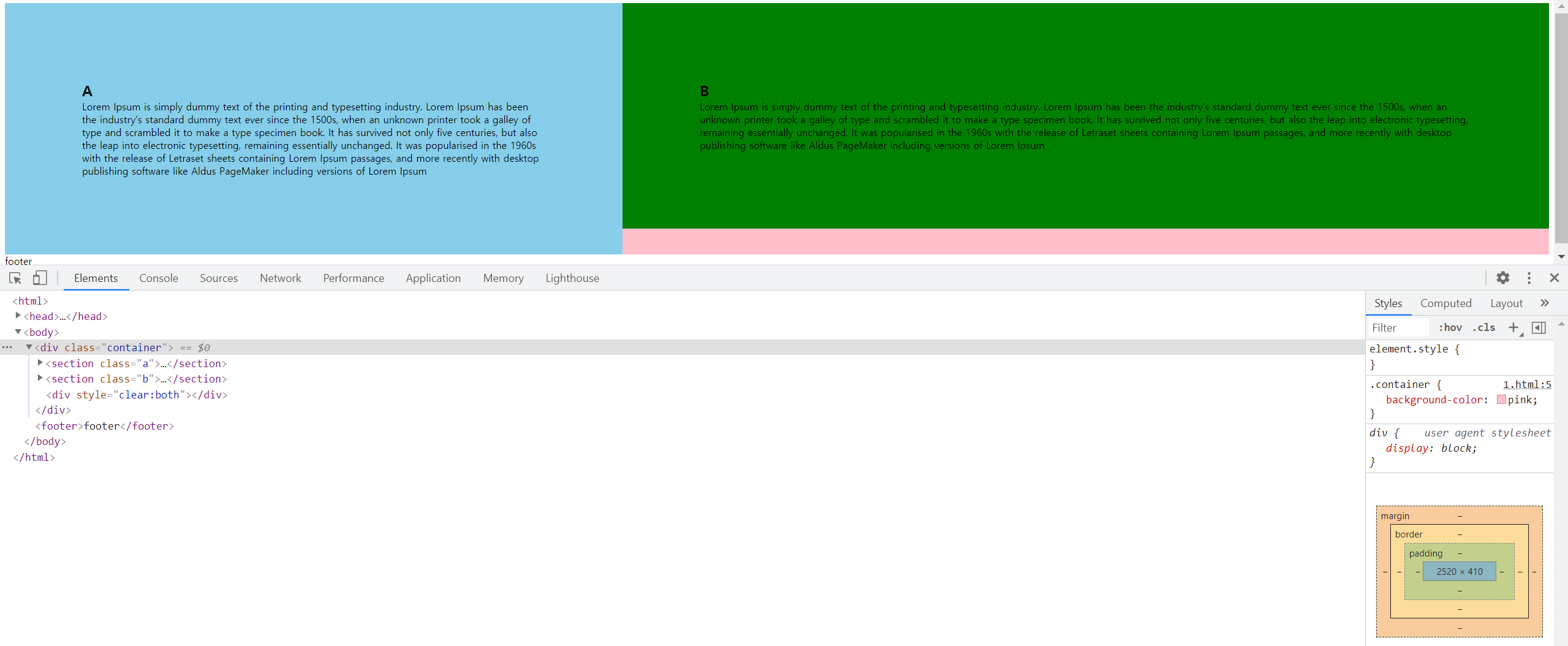
다른 해결방법으로는 after를 이용한다.
.container:after{
        content:'';
        display:block;
        clear:both;
    }
CSS에서, ::after(:after)는 선택한 요소의 맨 마지막 자식으로 의사 요소를 하나 생성합니다. 보통 content 속성과 함께 짝지어, 요소에 장식용 콘텐츠를 추가할 때 사용합니다. 기본값은 인라인입니다
- 즉, 태그를 추가할 필요없이 style에서 clear:both를 적용할 수 있다.
반응형 웹
<html>
    <head>
    </head>
<style>
    body{margin:0;}
    h1, p {margin:0;}
    .container{background:pink;}
    section{padding:5%;}
    .a{background-color:skyblue;}
    .b{background-color:green;}
    @media only screen and  (min-width:1000px) {
        .container{
            font-size:0;
        }
        section{
            vertical-align:top;
            font-size:1rem;
            display:inline-block;
        }
        .a{
            width:30%;
        }
        .b{
            width:50%;
        }
    }
</style>
<body>
    <div class='container'>
        <section class='a'>
            <h1>A</h1>
            <p>Lorem ...m</p>
        </section>
        <section class='b'>
            <h1>B</h1>
            <p>Lorem ...</p>
        </section>
    </div>
    <footer>footer</footer>
</body>
</html>
@media only screen and (min-width:1000px) { ...}에 의해 해당 부분의 screen과 1000px까지가 괄호 안의 내용으로 처리가 된다.
필요에 따라 max-width등 다른 것도 가능하다.