StoryBook
UI 개발을 위한 도구
사용방법
npx create-react-app taskbox
cd taskbox
npx -p @storybook/cli sb init
- npx로 react 관련 환경을 만든 후 storybook을 설치
필요한 파일
- A.js
- stories/A.stories.js
- 2번은 만들어진 stories 폴더 안에 만들어야한다.
예시 코드1
- Counter.js
import {useState} from "react";

const Counter = ({ onIncrease }) => {
  const [count, setCount] = useState(0);

  const handleIncrease = () => {
    setCount(count + 1);
    onIncrease();
  }

  return <div>
    <div>{count}</div>
    <button onClick={handleIncrease}>+</button>
  </div>
}

export default Counter
- Counter.stories.js
import React from "react";
import Counter from "../components/Counter";

export default {
  title : "Example/Counter",
  component : Counter,
  argTypes : { onIncrease : {actions : 'clicked'}}
}

//export const Default = (args) => <Counter {...args}/>
const Template = (args) => <Counter {...args}/>
export const Default = Template.bind({})
title : "Example/Count"로 하면 보기에 Example안의 Count로 나타난다.
이해할 부분
- argTypes를 통해 onIncrease가 actions로 clicked가 뜨도록 처리된다
- 버튼을 누를경우 handleIncrease가 실행되고 이를 통해 setCount로 count 값이 변경되며 onIncrease를 처리한다.
- Title은 Example이라는 곳에서의 Counter라는 컴포넌트의 Default라는 스토리를 가지고 있다. (Example/count라고 하면 count라는 컴포넌트로 보이게된다.)
- component는 기존에 import한 컴포넌트로 이름을 적어야한다.
결과보기

- Controls에서는 onIncrease에 대해서 정의되어있다 (argTypes 등록)
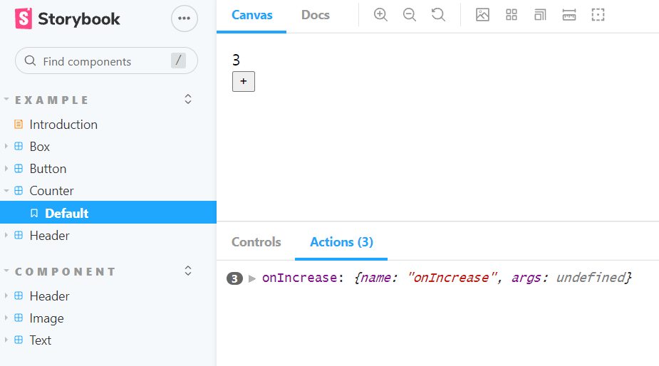
- 버튼 클릭을 통해 Actions에 나타난다.
예시 코드1
- Header/index.js
import PropTypes from 'prop-types'

const Header = ({children , level=1 , strong, underline, color, ...props}) => {
  let Tag = `h${level}`
  if(level <1 || level>6){
    console.warn('Header only accept 1~6 level')
    Tag = 'h1'
  }
  const fontStyle = {
    fontWeight : strong ? 'bold' : "normal",
    textDecoration : underline ? 'underline' : undefined,
    color
  }

  return <Tag style={{...props.style, ...fontStyle }} {...props}>{children}</Tag>
}

Header.propTypes = {
  children : PropTypes.node.isRequired,
  level : PropTypes.number,
  strong : PropTypes.bool,
  underline : PropTypes.bool,
  color : PropTypes.string,
}

export default Header
- Header.stories.js
import Header from  "../components/Header"

export default{
  title : "component/Header",
  component : Header,
  argTypes : {
    level : {control : {type:'range',min:1,max:10}},
    strong : {control : 'boolean'},
    underline : {control : 'boolean'},
    color : {control : 'color'}
  }
}

export const Default = (args) =>{
  return <Header {...args}>Header</Header>
}
이해할 부분
- argTypes로 level , strong , underline ,color를 control을 통해 제어가 가능하다.
- PropTypes를 통해 type 체크를 한다.
(이때 추가한 내용들 또한 결과 controls에 나타난다. )- children은 버튼안의 내용을 담당한데 현재는
<Header {...args}>Header</Header>의 Header가 children이다.
결과보기
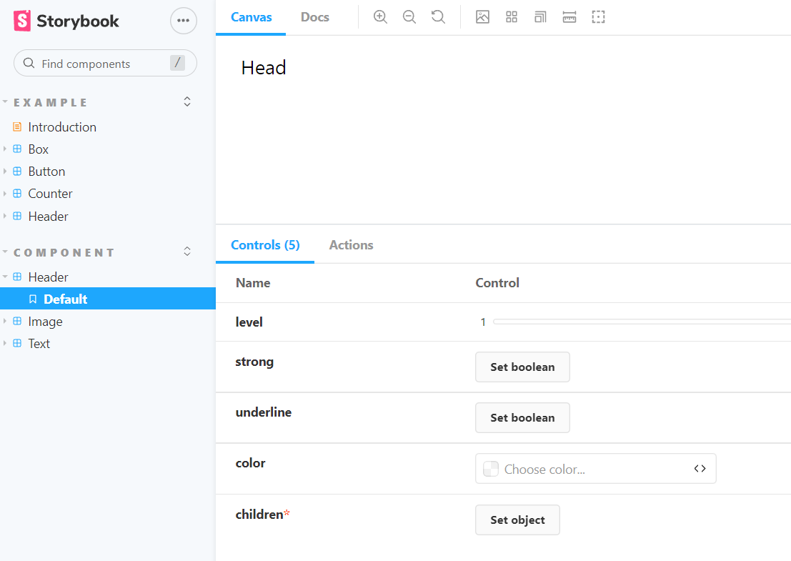
argTypes의 선택적인 range인 level과
strong과 underline은 boolean으로 적용 여부를 할 수 있고 color는 원하는 색상을 선택 가능하다

나의 하루를 가능한 기억하고 즐기고 후회하지말자