그림그리기
- Geometry - reflow
- Fragment - repaint
- Post process - 픽셀, 색깔 blur 등의 수많은 변형 가능
buffer
계산을 해서 바로 bitmap에 쓰는 것이 아닌 메모리에서 조작한 이후에 그림 그린다.
모던 브라우저
- CPU -> geometry, fragment
- GPU -> post process
Perspective : 원근의 거리
px이 클수록 작아보인다.
가까이 갈수록 왜곡이 심하고 멀수록 FLAT하게 보임(2D처럼)
예시
<html>
    <style id='s'>
    </style>
<body>
    <div class="test"></div>
</body>
<style>
@keyframes spin{
    100%{transform:rotateX(360deg)}
}
html, body{height:100%;}
body{perspective:600px;background:#404040;animation:origin 10s linear infinite}
.test{
    width:500px;height:500px;background:#aaa;;
    position:absolute;left:50%;top:50%;margin-left:-250px;margin-top:-250px;
    animation:spin 30s linear infinite;
}

</style>
</html>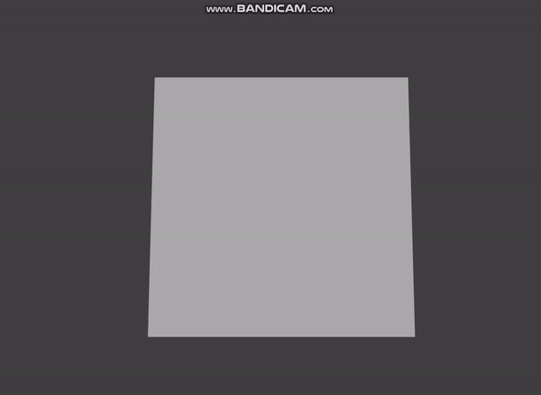
Perspective-origin : 눈이 보는 기준을 바꿀 수 있다.
예시
<html>
    <style id='s'>
    </style>
<body>
    <div class="test"></div>
</body>
<style>
@keyframes origin{
    0%{perspective-origin:0% 50%}
    50%{perspective-origin:100% 50%}
    100%{perspective-origin:0% 50%}
}

@keyframes spin{
    100%{transform:rotateX(360deg)}
}
html, body{height:100%;}
body{perspective:600px;background:#404040;animation:origin 10s linear infinite}
.test{
    width:500px;height:500px;background:#aaa;;
    position:absolute;left:50%;top:50%;margin-left:-250px;margin-top:-250px;
    animation:spin 30s linear infinite;
}

</style>
</html>.gif)
transform-style : 자식도 부모의 perspective를 이어받으면 좋겠을때
tranform - style : preserve-3d ( 자식도 이어받음 )
tranform - style : flat ( 자식도 이어받지않음 )
ex)
<html>
<style>
    @keyframes bingle{
        to{
            transform:rotateY(360deg);
        }
    }
    html{
        height:100%;font-size:3rem;
    }
    .stage{
                display:flex;
        justify-content:center;
        align-items:center;
        width:100vw;
        height:100vh;
        background:powderblue;
        perspective:600px;
    }
    .carousel{
        position:relative;
        width:200px;
        height:200px;
        transform-style:preserve-3d;
        animation:bingle 5s infinite linear;
    }
    .panel{
        position:absolute;
        left:0;
        top:0;
        display:flex;
        justify-content:center;
        align-items:center;
        width:200px;
        height:200px;
        background:rgba(255,255,255,0.5);
    }
    .panel:nth-child(1){
        transform:rotateY(0deg) translateZ(173px);
    }
    .panel:nth-child(2){
        transform:rotateY(60deg)
        translateZ(173px)
    }
    .panel:nth-child(3){
        transform:rotateY(120deg)
        translateZ(173px)
    }
    .panel:nth-child(4){
        transform:rotateY(180deg)
        translateZ(173px)
    }
    .panel:nth-child(5){
        transform:rotateY(240deg)
        translateZ(173px)
    }
    .panel:nth-child(6){
        transform:rotateY(300deg)
        translateZ(173px)
    }


</style>
<body>
<div class="stage">
    <div class="carousel">
        <div class="panel">1</div>
        <div class="panel">2</div>
        <div class="panel">3</div>
        <div class="panel">4</div>
        <div class="panel">5</div>
        <div class="panel">6</div>
    </div>
</div>
</body>


</html>- .carousel이 flat과 preserved-3d에 따라 결과가 달라진다.
transform-origin : 실제 변형이 일어날 때 어디를 주는지
backface-visibility
- 사용하는 이유 : 컴퓨터는 보이지 않는 면도 그리기 때문에 보이지않는 내부를 그리지 않으면 부하를 줄일 수 있다.
ex)
- 위의 코드에서
.panel에backface-visibility: hidden;속성을 부여하면 안에가 안보이는 다른 결과를 보여준다.
정리
- perspective => 대상과 눈의 원근의 거리
- perspective-origin => 자신이 보는 눈의 위치
- transform-style => 자식에 영향을 주는 transform을 적용 or NOT
- transform-origin => 실제 변형이 일어났을 때의 위치
- backface-visibility => 3D 의 앞면/뒷면을 보이게 할지 말지 선택
출처
나의 하루를 가능한 기억하고 즐기고 후회하지말자
설명이 명료하고 코드 실행 결과도 볼 수 있어서 좋네요 잘 읽었습니다!