그리드 시스템이란 화면을 몇 개의 컬럼으로 나누어 요소들을 배치하는 것으로 필요할 때마다 컬럼들을 묶어 배치할 수 있다.
그리드 시스템에서는 화면 너비를 몇 픽셀로 하는가에 따라 960픽셀로 고정하는 '960' 그리스 시스템이나 '1200' 그리드 시스템으로 나누기도 하고 몇 개의 컬럼으로 나누는가에 따라 12칼럼, 16칼럼 그리드... 이런식이 있다.
가변 그리드 레이아웃 만들기
- 고정 그리드 레이아웃으로 만들고 퍼센트로 다시 계산한다.
고정 그리드 레이아웃
<html>
<title>

</title>
<style>
    #wrapper {
        width: 960px;
        margin: 0 auto;
        background: blue;
    }
    header {
        width: 960px;
        height: 120px;
        background: green;
    }

    .content {
        float: left;
        width: 600px;
        height: 400px;
        background: greenyellow;
    }
    .right-side {
        float:right;
        width: 300px;
        height: 400px;
        background: blueviolet;
    }
    footer {
        clear: both;
        width: 960px;
        height: 100px;
        background: pink;
    }
</style>

<body>
    <div id="wrapper">
        <header>
            Header
        </header>

        <div class="content">content</div>
        <div class="right-side">Side</div>

        <footer>footer</footer>
    </div>
</body>

</html>
가변 그리드 레이아웃
<html>
<title>

</title>
<style>
    #wrapper {
        width: 96%;
        margin: 0 auto;
        background: blue;
    }
    header {
        width: 100%;
        height: 120px;
        background: green;
    }

    .content {
        float: left;
        width: 62.5%;
        height: 400px;
        background: greenyellow;
    }
    .right-side {
        float:right;
        width: 31.25%;
        height: 400px;
        background: blueviolet;
    }
    footer {
        clear: both;
        width: 100%;
        height: 100px;
        background: pink;
    }
</style>

<body>
    <div id="wrapper">
        <header>
            Header
        </header>

        <div class="content">content</div>
        <div class="right-side">Side</div>

        <footer>footer</footer>
    </div>
</body>

</html>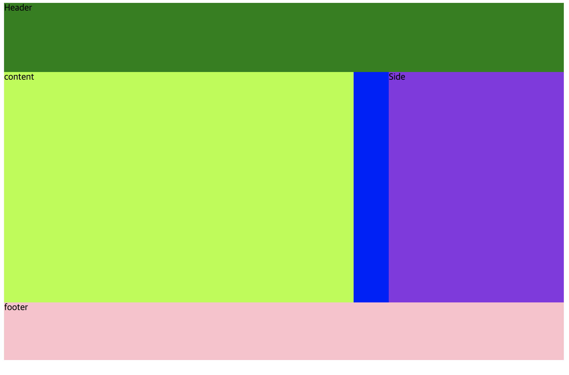

unit test, tdd, bdd, laravel, django, android native, vuejs, react, embedded linux, typescript