React Styled Components 에서 Fade in/out Modal 컴포넌트 만들기

개요
Styled Components 를 사용하여 모달을 직접 구현해볼 상황이 생겨서
직접 구현해보고 정리해보았습니다.
환경
- react - v17.0.2
- styled-components - v5.3.0
- typescript
구현하고자 하는 것
- 일반적인 모달처럼 배경 투명화 처리
- 열었을 때, 닫았을 때 Fade in, Fade out 애니메이션 효과
- 투명화된 백그라운드 부분 클릭 시 모달 닫기
구현하고자 하는 내용은 위와 같은데요, 생각보다 고려해야 할 점이 있습니다.
우선 modal 컴포넌트를 보여주는 부분을 display: none 옵션으로 처리해도 되고
컴포넌트 자체에서 열어주는 props 값이 false이면 null 혹은 fragment 를 리턴해도 상관없을 것 같죠
하지만 display none 방식으로 처리하면 fade out 애니메이션 처리가 까다로워져서
개인적으로는 null 혹은 fragment 를 리턴하는 방식을 이용하는게 더 낫다고 생각합니다.
컴포넌트 만들기
모달 창 안에 들어갈 내용은 컴포넌트 자체를 props로 받아오고
모달 기능만 제공하는 ModalBase 컴포넌트를 생성헀습니다.
받아 올 컴포넌트와 모달 창 생성 여부를 컨트롤할 변수와 닫을때 실행할 함수를 props 로 지정합니다.
export type ModalBaseProps = {
  /** 모달에 들어갈 컴포넌트 */
  children?: ReactNode;
  /** 모달 창 생성 여부를 컨트롤할 변수 */
  visible: boolean;
  /** 닫기 버튼 혹은 백그라운드 클릭 시 실행할 함수 */
  onClose: () => void;
};

const ModalBase = ({ children, visible, onClose }: ModalBaseProps) => {
	return <div></div>
}

export default ModalBase;
그리고 모달 구현을 위해서 styled components 로 컴포넌트 및 fade 애니메이션을 적용했습니다.
// animations
const fadeIn = keyframes`
  0% {
    opacity: 0;
  }
  100% {
    opacity: 1;
  }
`;

const fadeOut = keyframes`
  0% {
    opacity: 1;
  }
  100% {
    opacity: 0;
  }
`;

// components
const modalSettings = (visible: boolean) => css`
  visibility: ${visible ? 'visible' : 'hidden'};
  z-index: 15;
  animation: ${visible ? fadeIn : fadeOut} 0.15s ease-out;
  transition: visibility 0.15s ease-out;
`;

const Background = styled.div<{ visible: boolean }>`
  top: 0;
  right: 0;
  bottom: 0;
  left: 0;
  position: fixed;
  background-color: rgba(0, 0, 0, 0.6);
  ${(props) => modalSettings(props.visible)}
`;

const ModalSection = styled.div<{ visible: boolean }>`
  width: 400px;
  position: absolute;
  top: 50%;
  left: 50%;
  transform: translate(-50%, -50%);
  background-color: rgba(255, 255, 255, 1);
  padding: 16px;
  ${(props) => modalSettings(props.visible)}
`;

const Title = styled.div`
  display: flex;
  justify-content: flex-end;
  padding: 0 16px;
`;

const Content = styled.div`
  padding: 16px 0;
`;

const CloseButton = styled.button`
  border: none;
  background: none;
  cursor: pointer;
`;
그리고 스타일을 적용한 컴포넌트를 리턴해줍니다.
const ModalBase = ({ children, visible, onClose }: ModalBaseProps) => {
  if (!visible) {
    return null;
  }

  return (
    <>
      <Background visible={visible} onClick={onClose} />
      <ModalSection visible={visible}>
        <Title>
          <CloseButton type="button" onClick={onClose}>
            X
          </CloseButton>
        </Title>
        <Content>{children}</Content>
      </ModalSection>
    </>
  );
};
props의 visible 값이 false 인 경우 null 값을 리턴하여 랜더링 되지 않고
그렇지 않으면 해당 모달을 띄워주게끔 되겠죠?
잘 작동하는지 보기 위해서 다른 컴포넌트에서 사용해봅시다.
저는 ModalPage 라는 컴포넌트를 생성해서 해당 모달을 사용해보겠습니다.
모달을 열지 말지를 결정하는 boolean 값의 변수를 state로 사용하고
버튼 클릭 시 해당 state 값을 true로 변경하게끔 지정했습니다.
// MainPage.tsx

const ModalPage = () => {
  const [isOpen, setIsOpen] = useState(false);

  const handleModalOpen = () => {
    setIsOpen(true);
  };

  const handleModalClose = () => {
    setIsOpen(false);
  };

  return (
    <Block>
      <ModalButton type="button" onClick={handleModalOpen}>
        열기
      </ModalButton>
      <ModalBase visible={isOpen} onClose={handleModalClose}>
        <div>모달에 들어갈 콘텐츠입니다.</div>
      </ModalBase>
    </Block>
  );
};
아래와 같이 페이지에 열기 버튼이 생성되어 있습니다.
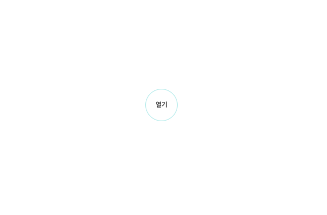
해당 버튼을 클릭하여 제대로 작동하는지 확인해보면 되겠죠
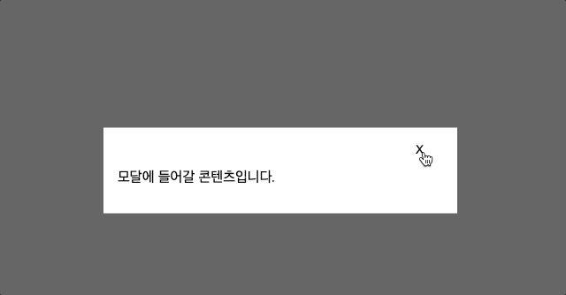
아래처럼 스크린샷처럼 모달이 제대로 열립니다.

닫기 버튼 혹은 백그라운드 클릭 시 닫히는 기능도 제대로 작동하는데요
Fade out 애니메이션이 제대로 작동하지 않습니다.
Fade out 애니메이션 오류 수정
분명히 Fade out 애니메이션을 제대로 설정했는데도 제대로 작동하지 않는데요
이 문제는 다른 부분이 아니라 이전에 컴포넌트에 조건문에서 props 의 visible 값이 false인 경우
null 값을 리턴하게끔 했기 때문에 애니메이션이 보여질 시간이 없이
해당 컴포넌트 자체가 랜더링 되지 않게끔 변경되기 때문인데요
useState 와 useEffect hook 을 사용하여 해당 부분을 해결할 수 있습니다.
props 에서 받아온 visible 값과 별개로 컴포넌트 내부에서 boolean 형태의 state를 따로 사용하여
해당 값이 애니메이션이 끝난 시간 이후 변경되게끔 하고 이전에 props 의 visible 값에 따라
null을 리턴하는 것이 아니라 컴포넌트 내부의 state에 따라서 return하게끔 변경하면 됩니다.
코드로 구현하자면 아래와 같이 구현할 수 있습니다.
const ModalBase = ({ children, visible, onClose }: ModalBaseProps) => {
  const [open, setOpen] = useState(false);

  useEffect(() => {
    if (visible) {
      setOpen(true);
    } else {
      setTimeout(() => setOpen(false), 150);
    }
  }, [visible]);

  if (!open) {
    return null;
  }

  return (
    <>
      <Background visible={visible} onClick={onClose} />
      <ModalSection visible={visible}>
        <Title>
          <CloseButton type="button" onClick={onClose}>
            X
          </CloseButton>
        </Title>
        <Content>{children}</Content>
      </ModalSection>
    </>
  );
};
open 이라는 state를 생성한 후 useEffect를 이용해서 props의 visible 값을 그대로 할당해 줍니다.
그리고 visible 값이 false로 변경될 때는 아까 지정한 애니메이션의 duration 과 같은 값으로
setTimeout 함수를 이용해서 해당 시간 이후에 open state가 변경되게끔 하면 됩니다.
한번 제대로 작동하는지 확인해볼까요?

이전과 다르게 Fade out 애니메이션도 제대로 작동하는 것을 확인할 수 있습니다.
현재 코드에 작동에 문제는 없지만 한가지 문제가 있습니다.
close 버튼을 누른 뒤 지정해둔 timeout 이전에 해당 컴포넌트가 언마운트 됐을 때 에러가 발생하는데요
useEffect 의 cleanup function에서 clearTimout 코드를 작성해두면 됩니다.
useEffect(() => {
    let timeoutId: NodeJS.Timeout;
    if (visible) {
      setIsOpen(true);
    } else {
      timeoutId = setTimeout(() => setIsOpen(false), 150);
    }

    return () => {
      if (timeoutId !== undefined) {
        clearTimeout(timeoutId);
      }
    };
  }, [visible]);
전체 코드
import { ReactNode, useEffect, useState } from 'react';
import styled, { css, keyframes } from 'styled-components';

export type ModalBaseProps = {
  /** 모달에 들어갈 컴포넌트 */
  children?: ReactNode;
  /** 모달 창 생성 여부를 컨트롤할 변수 */
  visible: boolean;
  /** 닫기 버튼 혹은 백그라운드 클릭 시 실행할 함수 */
  onClose: () => void;
};

const ModalBase = ({ children, visible, onClose }: ModalBaseProps) => {
  const [isOpen, setIsOpen] = useState(false);

  useEffect(() => {
    let timeoutId: NodeJS.Timeout;
    if (visible) {
      setIsOpen(true);
    } else {
      timeoutId = setTimeout(() => setIsOpen(false), 150);
    }

    return () => {
      if (timeoutId !== undefined) {
        clearTimeout(timeoutId);
      }
    };
  }, [visible]);

  if (!isOpen) {
    return null;
  }

  return (
    <>
      <Background visible={visible} onClick={onClose} />
      <ModalSection visible={visible}>
        <Title>
          <CloseButton type="button" onClick={onClose}>
            X
          </CloseButton>
        </Title>
        <Content>{children}</Content>
      </ModalSection>
    </>
  );
};

// animations
const fadeIn = keyframes`
  0% {
    opacity: 0;
  }
  100% {
    opacity: 1;
  }
`;

const fadeOut = keyframes`
  0% {
    opacity: 1;
  }
  100% {
    opacity: 0;
  }
`;

// components
const modalSettings = (visible: boolean) => css`
  visibility: ${visible ? 'visible' : 'hidden'};
  z-index: 15;
  animation: ${visible ? fadeIn : fadeOut} 0.15s ease-out;
  transition: visibility 0.15s ease-out;
`;

const Background = styled.div<{ visible: boolean }>`
  top: 0;
  right: 0;
  bottom: 0;
  left: 0;
  position: fixed;
  background-color: rgba(0, 0, 0, 0.6);
  ${(props) => modalSettings(props.visible)}
`;

const ModalSection = styled.div<{ visible: boolean }>`
  width: 400px;
  position: absolute;
  top: 50%;
  left: 50%;
  transform: translate(-50%, -50%);
  background-color: rgba(255, 255, 255, 1);
  padding: 16px;
  ${(props) => modalSettings(props.visible)}
`;

const Title = styled.div`
  display: flex;
  justify-content: flex-end;
  padding: 0 16px;
`;

const Content = styled.div`
  padding: 16px 0;
`;

const CloseButton = styled.button`
  border: none;
  background: none;
  cursor: pointer;
`;

export default ModalBase;