front 수업을 듣고, 간단한 플젝을 해보며 느낀점 중 하나가 display랑 position에 대한 확실한 이해가 필요하다는 것.
display
해당 요소를 block이나 inline요소 중 어떤 방식으로 처리할지 그리고 자식 요소의 배치를 flow, grid, flex와 같은 방식 중 어떤 레이아웃으로 배치할 지 정하는 CSS 속성이다.
요소의 내부와 외부 display 유형으로 나뉜다.
1. 외부 : 플로우 레이아웃에 요소가 참여하는 방법 -> 자신 자체의 유형을 나타낸다. (block, inline 과 같은)
2. 내부 : 자식의 레이아웃 방식을 설정
키워드
1. block
2. inline
3. inline-block
4. none
5. flex
6. grid
7. table
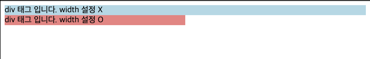
block
- 항상 새로운 라인에서 시작
- 화면 크기 전체의 가로폭을 차지 (width: 100%)
- width, height, margin, padding 프로퍼티 지정 가능
- block 레벨 요소 내에 inline 레벨 요소를 포함 가능
block 레벨 요소의 예)
div, h1~h6, p, ol, ul, li, hr, table, form
inline
- 새로운 라인에서 시작하지 X
- 문장의 중간에 들어갈 수 있다.(줄을 바꾸지 않고 다른 요소와 함께 한 행에 위치)
- content의 너비만큼 가로폭을 차지
- width, height, margin-top, margin-bottom 프로퍼티 지정 불가
- 상, 하 여백은 line-height로 지정
- inline 레벨 요소 뒤에 공백(엔터, 스페이스 등)이 있는 경우, 정의하지 않은 space(4px)가 자동 지정된다.
- inline 레벨 요소 내에 block 레벨 요소를 포함할 수 없음
inline 레벨 요소의 예)
span, a, strong, img, br, input, select, textarea, button

inline-block
- block과 inline 레벨 요소의 특징을 모두 가짐
- inline 레벨 요소와 같이 한 줄에 표현되면서 width, height, margin 프로퍼티를 모두 지정 가능
- content의 너비만큼 가로폭을 차지
- inline 특징과 같이 레벨 요소 뒤 공백이 있는 경우, 정의하지 않은 space(4px) 자동 지정

none
- 해당 요소를 보이지 않게 한다.
- 사용하는 공간 또한 없앤다.
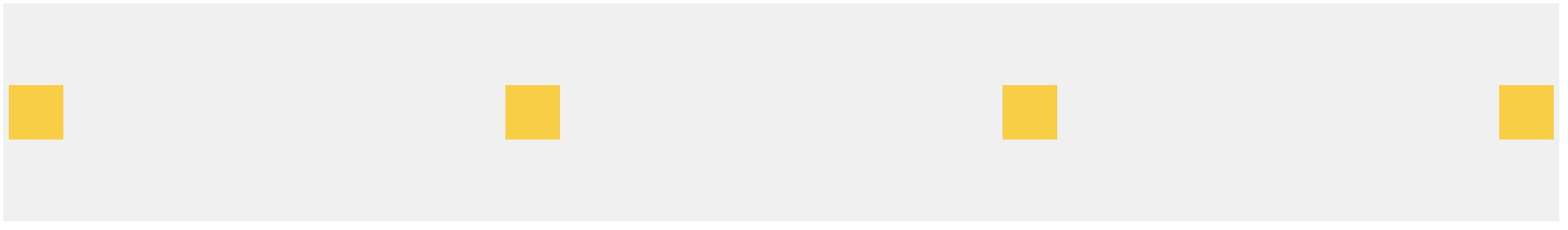
flex
- 요소가 플렉스 컨테이너가 된다.
- 유연한 레이아웃 구현 가능
- 내부 아이템들을 행 or 열로 배치 가능
- 각 아이템들의 크기, 순서 조정 가능
<!DOCTYPE html>
<html>
<head>
<title>Flex Example</title>
<style>
.container {
display: flex;
justify-content: space-between; /* 아이템들을 컨테이너 양 끝에 정렬 */
align-items: center; /* 아이템들을 수직 가운데로 정렬 */
height: 200px; /* 컨테이너의 높이 설정 */
background-color: #f0f0f0;
}
.item {
width: 50px;
height: 50px;
background-color: #ffcc00;
margin: 5px;
}
</style>
</head>
<body>
<div class="container">
<div class="item"></div>
<div class="item"></div>
<div class="item"></div>
<div class="item"></div>
</div>
</body>
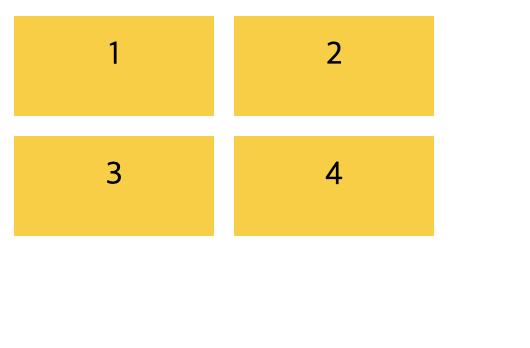
</html>grid
- 요소가 그리드 컨테이너가 되며, 격자 레이아웃을 구현할 수 있다.
- 행과 열을 정의하고 아이템들을 격자 셀에 배치하여 레이아웃을 제어할 수 있다.
<!DOCTYPE html>
<html>
<head>
  <title>Grid Example</title>
  <style>
    .container {
      display: grid;
      grid-template-columns: 100px 100px; /* 두 개의 열로 정의 */
      grid-template-rows: 50px 50px; /* 두 개의 행으로 정의 */
      grid-gap: 10px; /* 열과 행 사이의 간격을 10px로 설정 */
    }

    .item {
      background-color: #ffcc00;
      padding: 10px;
      text-align: center;
    }
  </style>
</head>
<body>
  <div class="container">
    <div class="item">1</div>
    <div class="item">2</div>
    <div class="item">3</div>
    <div class="item">4</div>
  </div>
</body>
</html>
table
- 요소가 테이블 레이아웃을 구현할 수 있게 한다.
- 테이블 요소를 모방하여 행, 셀 등으로 구성되는 레이아웃을 만들 수 있다.
- HTML 테이블 태그와는 다르게 시맨틱 요소가 아니기 때문에 구조적으로 테이블 역할을 하는 것은 아니다.

<!DOCTYPE html>
<html>
<head>
  <title>Table Layout Example</title>
  <style>
    .table {
      display: table;
      width: 100%;
      border: 1px solid #ddd;
    }

    .row {
      display: table-row;
    }

    .cell {
      display: table-cell;
      padding: 8px;
      border: 1px solid #ddd;
    }
  </style>
</head>
<body>
  <div class="table">
    <div class="row">
      <div class="cell">Header 1</div>
      <div class="cell">Header 2</div>
      <div class="cell">Header 3</div>
    </div>
    <div class="row">
      <div class="cell">Data 1</div>
      <div class="cell">Data 2</div>
      <div class="cell">Data 3</div>
    </div>
    <div class="row">
      <div class="cell">Data 4</div>
      <div class="cell">Data 5</div>
      <div class="cell">Data 6</div>
    </div>
  </div>
</body>
</html>
position
문서 상에 요소를 배치하는 방법을 지정한다.
키워드
1. static
2. relative
3. absolute
4. fixed
5. sticky
static
- 요소를 일반적인 문서 흐름에 따라 배치
- top, right, bottom, left, z-index 속성이 아무런 영향도 주지 않음
- 기본적인 요소의 배치 순서에 따라 위에서 아래로, 왼쪽에서 오른쪽으로 순서에 따라 배치되며 부모 요소 내에 자식 요소로서 존재할 때는 부모 요소의 위치를 기준으로 배치
relative
- 요소를 일반적인 문서 흐름에 따라 배치
- 자기 자신을 기준으로 top, right, bottom, left의 값에 따라 오프셋을 적용
absolute
- 부모 요소 또는 가장 가까이 있는 조상 요소(static 제외)를 기준
- 좌표 프로퍼티(top, bottom, left, right)만큼 이동
- relative, absolute, fixed 프로퍼티가 선언되어 있는 부모 또는 조상 요소를 기준으로 위치가 결정
- 부모에 static 이외의 position 프로퍼티가 지정되어 있을 경우에만 부모를 기준으로 위치하게 된다. 만일 부모, 조상이 모두 static 프로퍼티인 경우, document body를 기준으로 위치하게 된다.
fixed
- 부모 요소와 관계없이 브라우저의 viewport를 기준
- 좌표프로퍼티(top, bottom, left, right)을 사용하여 위치를 이동
- 스크롤이 되더라도 화면에서 사라지지 않고 항상 같은 곳에 위치
sticky
- 요소를 일반적인 문서 흐름에 따라 배치
- 테이블 관련 요소를 포함해 가장 가까운, 스크롤 되는 조상과, 표 관련 요소를 포함한 컨테이닝 블록(가장 가까운 블록 레벨 조상) 을 기준으로 top, right, bottom, left의 값에 따라 오프셋을 적용
- fixed와 같이 스크롤이 되더라도 지정한 위치에 고정
fixed, sticky 차이
position: fixed
- 스크롤에 영향을 받지 않고 항상 뷰포트의 특정 위치에 고정
- 부모 요소에 상대적이지 않으며, 가장 가까운 위치 기준은 뷰포트입니다.
- 주로 페이지 상단의 네비게이션 바나 광고 배너 등을 고정하여 사용자가 항상 볼 수 있도록 할 때 사용
position: sticky
- 요소를 스크롤 영역의 상대적인 위치에 고정
- 지정한 위치를 지나기 전까지는 일반적인 흐름대로 배치되며, 지정한 위치에 도달하면 고정
- 부모 요소의 크기에 따라 동작하며, 가장 가까운 위치 기준은 가장 가까운 position: relative, position: absolute, position: fixed, 또는 루트 요소(HTML)
- 주로 테이블의 헤더나 사이드바 등을 스크롤 시에 고정하여 테이블 내용이나 페이지 내용을 더 쉽게 확인할 수 있도록 할 때 사용
참고
position
mdn

공부중인 것들 기록
좋은 글 감사합니다. 자주 올게요 :)