
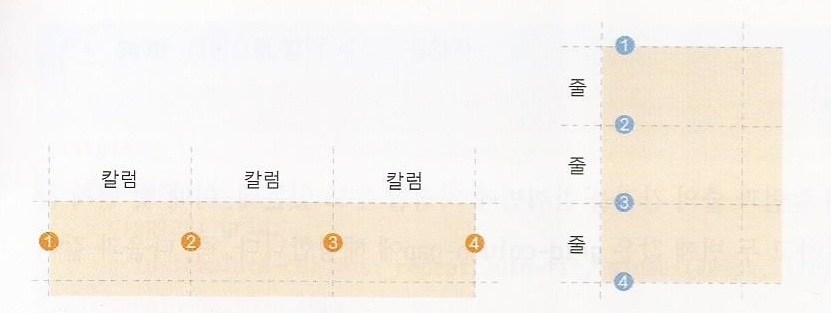
CSS 그리드 레이아웃에서 사용하는 용어
플렉스 박스 레이아웃에서는 플렉스 항목을 배치할 때 가로나 세로 중에서 하나를 주축으로 정해 놓고 배치함. 반면, CSS 그리드 레이아웃에서는 그리드 항목을 배치할 때 가로와 세로를 모두 사용함. 그래서 플렉스 항목은 1차원이고 CSS 그리드 레이아웃은 2차원이라고 함.

CSS 그리드 레이아웃 항목을 배치하는 속성
① 그리드 컨테이너를 지정하는 display 속성

② 칼럼과 줄을 지정하는 grid-template-columns, grid-template-rows 속성
그리드 컨테이너 안에 항목을 배치할 때 칼럼과 줄의 크기와 개수를 지정할 때 사용
<style>
    #wrapper {
        display: grid;    /* 그리드 컨테이너 지정*/
        grid-template-columns: 200px 200px 200px;  /* 너비가 200px인 컬럼 3개*/
        grid-template-rows: 100px;  /* 줄 높이 100px */
    }
    .items {
        padding: 10px;
        background-color: #eee;
    }
    .items:nth-child(odd){
        background-color:#bbb;
    }
</style>
...생략...
	<div id="wrapper">
        <div class="items">Lorem ipsum dolor sit amet consectetur adipisicing elit. Amet, reprehenderit.Lorem ipsum dolor, sit amet consectetur adipisicing elit. </div>
        <div class="items">Lorem ipsum dolor, sit amet consectetur adipisicing elit.Lorem ipsum dolor, sit amet consectetur adipisicing elit</div>
        <div class="items">Lorem ipsum dolor sit amet.Lorem ipsum dolor, sit amet consectetur adipisicing elit</div>
        <div class="items">Lorem ipsum dolor sit.Lorem ipsum dolor, sit amet consectetur adipisicing elit</div>
        <div class="items">Lorem, ipsum dolor.</div>
    </div>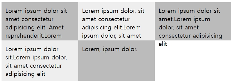
③ 상대적인 크기를 지정하는 fr 단위
fr : fraction의 줄임말. '부분', '분수'를 의미.
예를 들어, 너비가 같은 컬럼을 3개 배치한다면 fr 단위를 사용해 다음과 같이 지정
grid-template-columns: 1fr 1fr 1fr;또는 컬럼을 2:1:2로 배치하고 싶다면 다음과 같이 지정함.
grid-template-columns: 2fr 1fr 2fr; ④ 값이 반복될 때 줄여서 표현할 수 있는 repeat() 함수
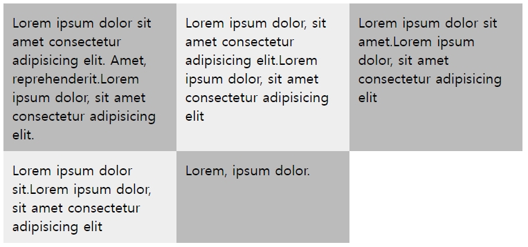
grid-template-columns: repeat(3, 1fr);⑤ 최소값과 최대값을 지정하는 minmax() 함수
  #wrapper {
      width: 600px;
      display: grid;                            /* 그리드 컨테이너 지정 */
      grid-template-columns: repeat(3, 1fr);    /* 너비가 같은 컬럼 3개 */
      grid-template-rows: minmax(100px, auto);  /* 줄 높이는 최소 100px */
  }
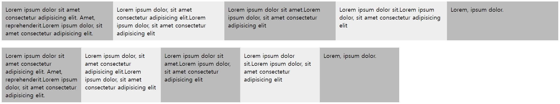
⑥ 자동으로 컬럼 개수를 조절하는 auto-fill, auto-fit 함수
auto-fit을 사용하면 화면이 넓을 때에는 남는 공간 없이 꽉 채워서 컬럼을 표시하고,
auto-fill을 사용하면 컬럼의 최소 너비(아래 예제 소스에서는 200px)만 표시하고 남는 공간은 그대로 둠.
  #wrapper1 {
      display: grid;            /* 그리드 컨테이너 지정 */
      grid-template-columns: repeat(auto-fit, minmax(200px, 1fr));
      margin-bottom: 20px;
  }
  #wrapper2 {
      display: grid;
      grid-template-columns: repeat(auto-fill, minmax(200px, 1fr));
  }
⑦ 그리드 항목의 간격을 지정하는 grid-column-gap, grid-row-gap, grid-gap 속성
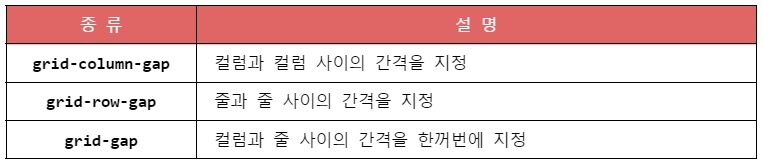
#wrapper1 {
display: grid; /* 그리드 컨테이너 지정 */
grid-template-columns: repeat(3, 200px);
grid-gap: 20px 30px; /* 컬럼 간격 30px, 줄 간격 20px */
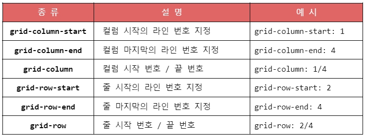
}⑧ 그리드 라인을 이용해 배치하기
<style>
    #wrapper {
        width: 700px;
        display: grid;
        grid-template-columns: repeat(3, 1fr);  /*컬럼은 1ft씩 3개*/
        grid-template-rows: repeat(3, 100px);   /*줄은 100px씩 3개*/
    }
    .box{
        padding:15px;
        color:#fff;
        font-weight:bold;
        text-align:center;
    }
    .box1 {
        background-color:#3689ff;
        grid-column:1/4;
    }
    .box2 {
        background-color:#00cf12;
        grid-row:2/4;
        /* grid-column:1/2; */
        grid-column-start:1;
    }
    .box3 {
        background-color:#ff9019;
        grid-column:2/4;
        /* grid-row:2/3; */
        grid-row-start:2;
    }
    .box4 {
        background-color:#ffd000;
        grid-column-start:3;
        grid-row-start:3;
    }
  </style>
  ... 생략 ...
  <div id="wrapper">
      <div class="box box1">box1</div>
      <div class="box box2">box2</div>
      <div class="box box3">box3</div>
      <div class="box box4">box4</div>
  </div>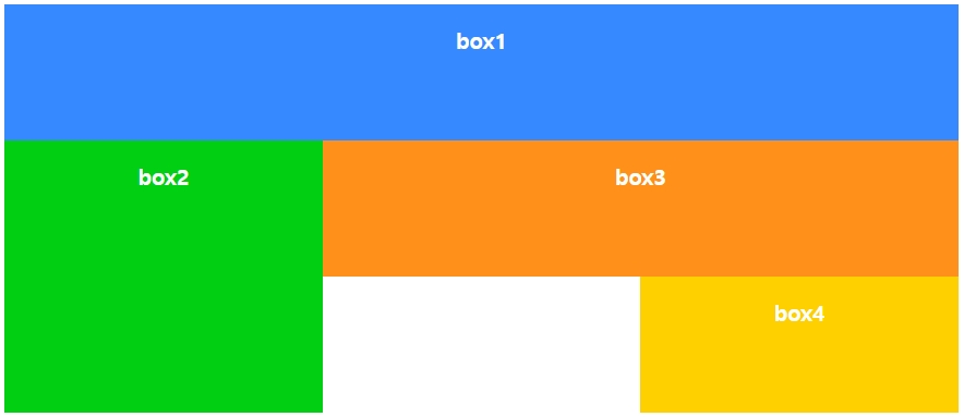
⑨ 템플릿 영역을 만들어 배치하기
grid-area 속성을 사용해 각 영역에 템플릿 이름을 지정해주고, 그리드 컨테이너로 사용하는 요소에서 grid-template-areas 속성을 사용해 템플릿 영역을 어떻게 배치할지 지정함.
  <style>
    #wrapper {
        width: 700px;
        display: grid;
        grid-template-columns: repeat(3, 1fr);  /*컬럼은 1ft씩 3개*/
        grid-template-rows: repeat(3, 100px);   /*줄은 100px씩 3개*/
        grid-template-areas:
            "box1 box1 box1"   /* 한 줄에 들어갈 템플릿 영역은 큰따옴표("")로 표시 */
            "box2 box3 box3"
            "box2 . box4" ;    /* 빈 영역은 마침표(.)로 표시함*/
    }
    .box{
        padding:15px;
        color:#fff;
        font-weight:bold;
        text-align:center;
    }
    .box1 {
        background-color:#3689ff;
        grid-area: box1;
    }
	.box2 {
        background-color:#00cf12;
        grid-area: box2;
    }
    .box3 {
        background-color:#ff9019;
        grid-area: box3;
    }
    .box4 {
        background-color:#ffd000;
        grid-area: box4;
    }
  </style>