
사진 데이터
우선 사진 데이터를 준비하자
import numpy as np
import matplotlib.pyplot as plt

!wget https://bit.ly/fruits_300_data -O fruits_300.npy
fruits = np.load('fruits_300.npy')
!를 통해 쉘명령어를 사용하여 파일을 가져오자
wget이 안 돼요!
!를 통해 명령을 수행시, 기본적으로 수행되는 OS에서 명령어를 수행하게된다
이때, window에서 해당 명령어를 수행시, 기본적으로 wget이 없으므로 작동하지 않는다
https://eternallybored.org/misc/wget/
해당 주소에서 wget을 받은 후 PATH에 wget을 넣어주자
보통C:\Windows에 넣으면 정상적으로 동작된다
해당 파일의 일부를 출력해보자
print(fruits.shape) # (300, 100, 100)우선 300개의 100100 배열이 들어있음을 알 수 있다
각 각의 100100 배열은 하나의 이미지를 나타낸다
print(fruits[0,0,:])
# [  1   1   1   1   1   1   1   1   1   1   1   1   1   1   1   1   2   1
#	2   2   2   2   2   2   1   1   1   1   1   1   1   1   2   3   2   1
#	2   1   1   1   1   2   1   3   2   1   3   1   4   1   2   5   5   5
#	19 148 192 117  28   1   1   2   1   4   1   1   3   1   1   1   1   1
#	2   2   1   1   1   1   1   1   1   1   1   1   1   1   1   1   1   1
#	1   1   1   1   1   1   1   1   1   1]
위처럼 0~255의 정수값을 가지는 배열이 출력된다
지금 해당 이미지에 담긴 과일은 다음과 같다
- 0~99 : 사과
- 100~199 : 파인애플
- 200~299 : 바나나
그럼 0,100,200번째 과일을 출력해보자
fig, axs = plt.subplots(1,3)
axs[0].imshow(fruits[0],cmap='gray_r')
axs[1].imshow(fruits[100], cmap='gray_r')
axs[2].imshow(fruits[200], cmap='gray_r')
plt.show()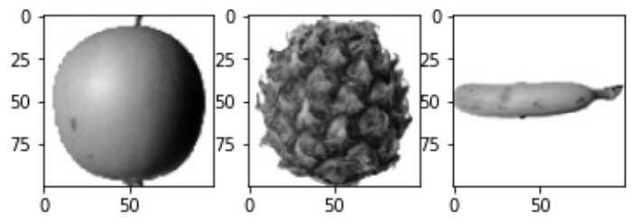
위처럼 이미지가 출력됨을 알 수 있다
데이터의 평균값
이제 각 값의 평균값을 통해 과일의 정보를 정리해보자
apple = fruits[0:100].reshape(-1,100*100)
pineapple = fruits[100:200].reshape(-1,100*100)
banana = fruits[200:300].reshape(-1,100*100)
먼저 100*100의 2차원 배열을 10000의 1차원 배열로 변경한다
이제 각각 100개의 값에대한 평균값들을 확인 가능하다
print(apple.mean(axis=1))
print(pineapple.mean(axis=1))
print(banana.mean(axis=1))
'''
[ 88.3346  97.9249  87.3709  98.3703  92.8705  82.6439  94.4244  95.5999
  90.681   81.6226  87.0578  95.0745  93.8416  87.017   97.5078  87.2019
  88.9827 100.9158  92.7823 100.9184 104.9854  88.674   99.5643  97.2495
  94.1179  92.1935  95.1671  93.3322 102.8967  94.6695  90.5285  89.0744
  97.7641  97.2938 100.7564  90.5236 100.2542  85.8452  96.4615  97.1492
  90.711  102.3193  87.1629  89.8751  86.7327  86.3991  95.2865  89.1709
  96.8163  91.6604  96.1065  99.6829  94.9718  87.4812  89.2596  89.5268
  93.799   97.3983  87.151   97.825  103.22    94.4239  83.6657  83.5159
 102.8453  87.0379  91.2742 100.4848  93.8388  90.8568  97.4616  97.5022
  82.446   87.1789  96.9206  90.3135  90.565   97.6538  98.0919  93.6252
  87.3867  84.7073  89.1135  86.7646  88.7301  86.643   96.7323  97.2604
  81.9424  87.1687  97.2066  83.4712  95.9781  91.8096  98.4086 100.7823
 101.556  100.7027  91.6098  88.8976] # apple.mean(axis=1)
...
'''
그리고 히스토그램을 그려 해당 데이터를 시각적으로 표현하였다
plt.hist(np.mean(apple,axis=1),alpha=0.8)
plt.hist(np.mean(pineapple,axis=1),alpha=0.8)
plt.hist(np.mean(banana,axis=1),alpha=0.8)
plt.legend(['apple','pineapple','banana'])
plt.show()
이번에는 각 과일마다의 평균을 구하여 데이터를 시각적으로 나타내보았다
해당 그래프와 비슷한 값이 사과/파인애플/바나나임을 알 수 있을것이다
fig, axs = plt.subplots(1,3,figsize=(20,5))
axs[0].bar(range(10000),np.mean(apple, axis=0))
axs[1].bar(range(10000),np.mean(pineapple, axis=0))
axs[2].bar(range(10000),np.mean(banana, axis=0))
plt.show()
apple_mean = np.mean(apple, axis=0).reshape(100,100)
pineapple_mean = np.mean(pineapple, axis=0).reshape(100,100)
banana_mean = np.mean(banana, axis=0).reshape(100,100)

fig, axs = plt.subplots(1,3,figsize=(20,5))
axs[0].imshow(apple_mean, cmap='gray_r')
axs[1].imshow(pineapple_mean, cmap='gray_r')
axs[2].imshow(banana_mean, cmap='gray_r')
plt.show()
위 데이터를 통해 각 사진의 값들의 평균을 그림으로 나타내었다
apple_mean = np.mean(apple, axis=0).reshape(100,100)
pineapple_mean = np.mean(pineapple, axis=0).reshape(100,100)
banana_mean = np.mean(banana, axis=0).reshape(100,100)

fig, axs = plt.subplots(1,3,figsize=(20,5))
axs[0].imshow(apple_mean, cmap='gray_r')
axs[1].imshow(pineapple_mean, cmap='gray_r')
axs[2].imshow(banana_mean, cmap='gray_r')
plt.show()
이제 해당 사진과 가장 가까운 사진을 찾으면 사진을 분류 할 수 있을것이다
평균값과 가까운 사진
abs_diff = np.abs(fruits - apple_mean) # 차이
abs_mean = np.mean(abs_diff, axis=(1,2)) # 평균
print(abs_mean.shape) # (300, 100, 100)
apple_index = np.argsort(abs_mean)[:100]
이제 apple_index에는 가장 사과사진의 평균과 비슷한 100개의 샘플이 담겨있을것이다
fig, axs = plt.subplots(10,10,figsize=(10,10))
for i in range(10):
    for j in range(10):
        axs[i,j].imshow(fruits[apple_index[i*10 + j]], cmap='gray_r')
        axs[i,j].axis('off')
plt.show()
그리고 100개의 샘플을 출력해보면 위와 같은 모습을 확인 할 수 있다