FCC : Responsive Web Design > (3) Applied Visual Design
<div class="fullCard" id="thumbnail">
  <div class="cardContent">
    <div class="cardText">
      <h4>Alphabet</h4>
      <hr>
      <p><em>Google was founded by Larry Page and Sergey Brin while they were <u>Ph.D. students</u> at <strong>Stanford University</strong>.</em></p>
    </div>
    <div class="cardLinks">
      <a href="https://en.wikipedia.org/wiki/Larry_Page" target="_blank" class="links">Larry Page</a><br><br>
      <a href="https://en.wikipedia.org/wiki/Sergey_Brin" target="_blank" class="links">Sergey Brin</a>
    </div>
  </div>
</div>
<style>
h4 {
text-align: center;
background-color: rgba(45, 45, 45, 0.1);
padding: 10px;
font-size: 27px;
text-transform: uppercase;
}
p {
text-align: justify;
}
.links {
text-align: left;
color: black;
opacity: 0.7;
}
#thumbnail {
box-shadow: 0 10px 20px rgba(0,0,0,0.19), 0 6px 6px rgba(0,0,0,0.23);
}
.fullCard {
width: 245px;
border: 1px solid #ccc;
border-radius: 5px;
margin: 10px 5px;
padding: 4px;
}
.cardContent {
padding: 10px;
}
.cardText {
margin-bottom: 30px;
}
</style>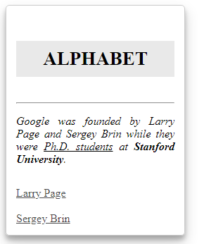
Create Visual Balance Using CSS Property
text-align: 글의 정렬
text-align: justify: 양쪽 정렬 /text-align: center: 가운데 정렬 /text-align: right: 오른쪽 정렬 /text-align: left: 왼쪽 정렬 (Default)
font-weight: 폰트의 두께
font-weight: bold: 볼드체
html element 에서 원하는 단락을<strong>태그로 둘러싸면 동일한 효과를 얻는다.
text-decoration: 텍스트 장식
text-decoration: underline: 밑줄
html element 에서 원하는 단락을<u>태그로 둘러싸면 동일한 효과를 얻는다.
text-decoration: line-through: 취소선
html element 에서 원하는 단락을<s>태그로 둘러싸면 동일한 효과를 얻는다.
font-style: 폰트 스타일
font-style: italic: 이탤릭체
html element 에서 원하는 단락을<em>태그로 둘러싸면 동일한 효과를 얻는다.
font-size: 폰트 크기
heading taglike<h1 ~ 6>은 일반적으로<p>태그 보다 글자 크기가 커야 함.
이때font-size를 사용.
box-shadow: 박스 그림자 효과
box-shadow는 property 로 다음의 값을 받음.
offset-x(how far to push the shadow horizontally from the element)
offset-y(how far to push the shadow vertically from the element)
blur-radius
spread-radius
color
링크에서 박스 그림자 견본들을 가져다 쓸 수 있다.
opacity: 투명도
opacity: 1.0: 전혀 투명하지 않음
opacity: 0.5: 반 정도 투명함
opacity: 0.0: 완전 투명함, 안 보임
text-transform: 텍스트 변환, HTML에서 미처 설정하지 못한 부분을 CSS로 설정 가능
lowercase: 전부 소문자 like "transform me"
uppercase: 전부 대문자 like "TRANSFORM ME"
capitalize: 앞 글자만 대문자 like "Transform Me"
initial: 상속을 무시
inherit: 부모 element 에서text-transform의 설정값을 상속
none: 원래 HTML 에 쓴 그대로
Create Visual Balance HTML 도 써요
<hr>: 둘러싸는 element의 너비 만큼의 길이를 가진 Horizontal Line 을 해당 element 위에 그린다.
<hr>는 별도의 closing tag 가 필요하지 않다.
rgb 대신에 rgba 쓰기
rgba()의 a 는alpha값, 투명도를 의미.
rgb 애들이 0부터 255 사이의 값을 가지는 반면, a 는 0부터 1 사이의 값을 가짐.
ex)background-color: rgba(45, 45, 45, 0.25)
<h1>This is h1 text</h1>
<h2>This is h2 text</h2>
<h3>This is h3 text</h3>
<h4>This is h4 text</h4>
<h5>This is h5 text</h5>
<h6>This is h6 text</h6>
<style>
h1 {
font-size: 68px;
font-weight: 800;
}
h2 {
font-size: 52px;
font-weight: 600;
}
h3 {
font-size: 40px;
font-weight: 500;
}
h4 {
font-size: 32px;
font-weight: 400;
}
h5 {
font-size: 21px;
font-weight: 300;
}
h6 {
font-size: 14px;
font-weight: 200;
}
</style>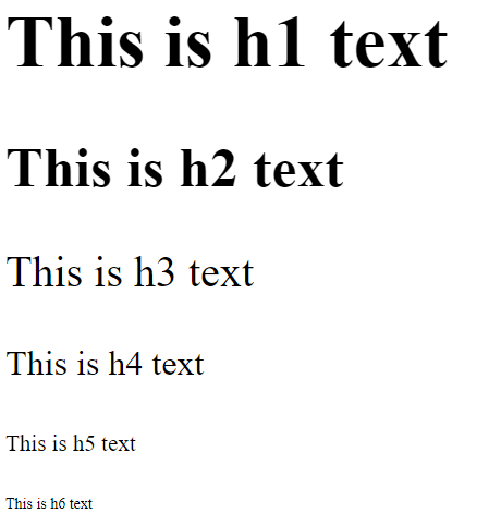
heading element 에서 font size 와 weight 설정
font-size,font-weight를 통해, 폰트의 크기와 너비를 설정할 수 있다.
헤딩 element 는 단락의 중요도 및 구분을 위해 사용되기 때문에,<h1>은<h6>에 비해 더 큰 폰트 크기와 폰트 너비를 가져야 한다.
paragraph element 에서 font size 와 line-height 설정
line-height: 줄간격아마
line-height: 18px을 default로 가지는 듯, 가시성을 위해 다르게 설정 가능.
a tag 의 hover 상태 조작하기
a:hover {
  color: red;
}
위 처럼
:hover라는 가짜 클래스를 달아줌으로써, 해당 지정자가 특정 조건을 성립할 때 나타난 효과를 표기할 수 있다.
Element 의 Position 바꾸기
<body>
  <h1>On Being Well-Positioned</h1>
  <h2>Move me!</h2>
  <p>I still think the h2 is where it normally sits.</p>
</body>
<style> h2 { position: relative; top: 15px; } </style>
positionproperty 의 값으로relative로 줘서, 다른 element에 상대적으로 위치하게 한 뒤에,top right left bottom등의 property 에 값을 넣어줌으로써 element 의 위치를 변경할 수 있다.
<body>
  <h1>Welcome!</h1>
  <section>
    <form id="searchbar">
      <label for="search">Search:</label>
      <input type="search" id="search" name="search">
      <input type="submit" name="submit" value="Go!">
    </form>
  </section>
</body>
<style> #searchbar { position: absolute; top: 50px; right: 50px; } </style>
positionproperty 의 값으로absolute로 줘서, 부모 container 로부터 절대적인 자리에 위치시킨다. 즉 주변 element 들은 얘를 무시하고 배치된다.
<body>
  <header>
    <h1>Welcome!</h1>
    <nav id="navbar">
      <ul>
        <li><a href="">Home</a></li>
        <li><a href="">Contact</a></li>
      </ul>
    </nav>
  </header>
  <p>I shift up when the #navbar is fixed to the browser window.</p>
</body>
<style> #navbar { position: fixed; top: 0px; left: 0px; width: 100%; } </style>
positionproperty 의 값으로fixed로 줘서, 절대적인 자리에 위치시킨다. absolute 와 다른 점은 absolute 는 부모 container 가 기준점이 되지만, fixed 는 브라우저 창을 기준으로 위치가 결정된다. 스크롤을 넘겨도, fixed 된 element 는 계속해서 같은 위치에서 따라온다.
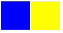
<body>
  <header>
    <h1>Welcome!</h1>
  </header>
  <section id="left">
    <h2>Content</h2>
    <p>Good stuff</p>
  </section>
  <aside id="right">
    <h2>Sidebar</h2>
    <p>Links</p>
  </aside>
</body>
<style> #left { float: left; width: 50%; } #right { float: right; width: 40%; } </style>
positionproperty 을 쓰지 않고, 위치를 설정할 수 있다.floatproperty 를 사용하는 방법이다.
float는 기존 문서의 흐름에서 벗어나, 부모 container 안에서 왼쪽에 위치시킬지, 오른쪽에 위치시킬지 정할 수 있다.
<div class="first"></div>
<div class="second"></div>
<style> div { width: 60%; height: 200px; margin-top: 20px; } .first { background-color: red; position: absolute; z-index: 2; } .second { background-color: blue; position: absolute; left: 40px; top: 50px; z-index: 1; } </style>element 들의 위치가 겹치는 경우가 있다. 이때, 보통 나중에 생기는 HTML 요소가 맨 앞으로 나오게 될 것이다.
이는z-index값을 변경함을 통해 바꿀 수 있다. 각 요소의z-index는 디폴트로 0 이 주어지고, 이 값을 높게 줄 수록 해당 element 가 앞으로 오게 된다.
<style>
  div {
    background-color: blue;
    height: 100px;
    width: 100px;
    margin: auto;
  }
</style>
block element 를 수평선상에서 중앙에 위치시키기 위해서,
marginproperty 값에auto를 주는 방법이 있다.
imgelement 는 기본적으로inlineelement 이지만,display: block을 통해, block 으로 바꾼다면 위의 방법으로 가운데 정렬할 수 있다.
CSS 색체 원리
CSS 에서 색을 이용해서, 집중시키고 싶은 내용을 부각되게 나타나게 할 수 있다.
보색 (Complementary Colors) : 서로 대비를 이루는 색쌍을 의미한다.
색상 대비를 통해, 서로가 서로를 돋보이게 해준다.
ex)red (#FF0000) and cyan (#00FFFF)/green (#00FF00) and magenta (#FF00FF)/blue (#0000FF) and yellow (#FFFF00)
3차색 (Tertiary Colors) : 원색과 2차색을 혼합한 색상
완전한 보색을 사용하는 것보다, 보색에 근접한 색을 사용하면 더 은은한 느낌을 주면서 강한 대비를 보일 수 있다.
ex)orange #FF7F00/cyan #00FFFF/raspberry #FF007F

가장 중심이 되는 색상 하나는 고른 뒤, 그것과 그것의 보색을 사용하여 웹을 꾸밀 수 있다.
보색은 사람들의 시각적 주의가 요구되는 내용을 꾸미는데 사용한다.
hsl(): 색상, 채도, 명도 (hue, saturation, and lightness), 3 가지 값을 주는데
색상에는 0 부터 360 사이의 정수 / 채도는 기본으로 100%, 회색이 더 많을수록 0%에 가까워짐 / 명도는 50% 이 기본, 100% 아예 흰색, 0% 는 아예 검은색
ex)
redhsl(0, 100%, 50%)/ yellowhsl(60, 100%, 50%)/ greenhsl(120, 100%, 50%)/ cyanhsl(180, 100%, 50%)/ bluehsl(240, 100%, 50%)/ magentahsl(300, 100%, 50%)
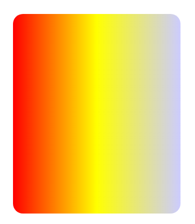
background: linear-gradient(90deg, red, yellow, rgb(204, 204, 255));선형 그라데이션을 주기 위해서
linear-gradient을backgroundproperty 에 값으로 줌.linear-gradient는 args 로 각도, 색상 등을 받음. 색상의 개수는 제한 없음.
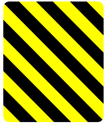
    background: repeating-linear-gradient(
      45deg,
      yellow 0px,
      yellow 40px,
      black 40px,
      black 80px
    );
반복 선형 그라데이션은
repeating-linear-gradient을 통해 표현 가능.
위 코드의 경우 아래의 순서로 나타남.
0px [yellow -- blend -- yellow] 40px [black -- blend -- black] 80px
Background image 사용하기
<style>
  body {
    background: url(https://cdn-media-1.freecodecamp.org/imgr/MJAkxbh.png);
  }
</style>
backgroundprop 에 값으로url을 주고, 여기에 링크를 달면, 배경화면도 이미지로 꾸밀 수 있다.
transform 으로 element 내 속성 바꾸기
#ball2 {
  transform: scale(1.5);
}
transformprop 의 값으로scale을 주면, 해당 요소의 크기를 기존과 비교하여 어떤 비율로 바꿀지 정할 수 있다.
ex)transform: scale(0.5): 기존의 반 /transform: scale(2): 기존의 두 배
#ball2:hover로 지정함을 통해, 커서를 올릴 때만 변화가 일어나도록 설정 가능
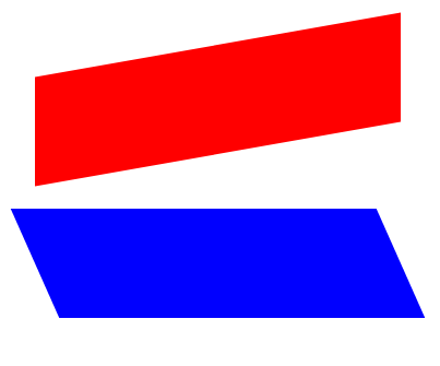
  #bottom {
    transform: skewX(24deg);
  }
  #top {
  transform: skewY(-10deg);
  }
transform: skewX(deg): 수평축으로 비스듬하게 주어진 각도만큼 기울임. 너비나 높이는 변화가 없음.
ex)transform: skewX(-32deg): 32도 만큼 시계방향으로 비스듬히 /transform: skewX(24deg): 24도 만큼 반시계방향으로 비스듬히
#ball2:hover로 지정함을 통해, 커서를 올릴 때만 변화가 일어나도록 설정 가능
transform: skewY(deg): 수직축으로 비스듬하게 주어진 각도만큼 기울임.
CSS 로 그래픽 만들기
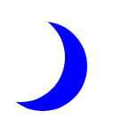
<style>
  .center {
    width: 100px;
    height: 100px;
    background-color: transparent;
    border-radius: 50%;
    box-shadow: 25px 10px 0 0 blue;
  }
</style>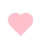
<style>
  .heart {
    position: absolute;
    margin: auto;
    top: 0;
    right: 0;
    bottom: 0;
    left: 0;
    background-color: pink;
    height: 50px;
    width: 50px;
    transform: rotate(-45deg);
  }
  .heart::after {
    background-color: pink;
    content: "";
    border-radius: 50%;
    position: absolute;
    width: 50px;
    height: 50px;
    top: 0px;
    left: 25px;
  }
  .heart::before {
    content: "";
    background-color: pink;
    border-radius: 50%;
    position: absolute;
    width: 50px;
    height: 50px;
    top: -25px;
    left: 0px;
  }
</style>
::before::after: pseudo-element 를 생성함, before 는 부모의 가장 첫 자식 element 을 / after 는 부모의 가장 마지막 자식 element 를.이들이 멀쩡히 작동하기 위해서는
contentprop 을 가진다. 보통 이 prop 은 선택된 element 에 사진이나 텍스트를 더하기 위해서 사용되나, 어떤 형태를 만들기 위해 사용되었다면 빈 문자열을 값으로 준다.
CSS 로 애니메이션 만들기
#anim {
  animation-name: colorful;
  animation-duration: 3s;
}

@keyframes colorful {
  0% {
    background-color: blue;
  }
  100% {
    background-color: yellow;
  }
}
지정자에서
animation-name과animation-duration의 값을 지정해주고,
해당 이름을@keyframes을 통해 지목하고, 어떤 애니메이션 효과를 줄 지 설정한다.
@keyframes에서는 효과가 전환되는 시점을 (0%~100%) 지정해준다.
animation-fill-mode: forwards: 지정한 element 가 애니메이션 효과가 종료한 뒤에 어떤 모습으로 남을지 지정. (forwards 이면, 100% 시점의 변경상태가 지속 / backwards 이면, 0% 시점의 상태로 롤백)
position:top right bottom left등에 값을 넣어, 이동시킬 수도 있고opacity: 투명도를 바꾸는 효과도 넣고animation-iteration-count: 이거는 지정자에서 설정해서, 애니메이션 몇 번 반복할지 정해주고, 계속 루프로 만들고 싶다면 값으로infinite를 넣는다.animation-timing-function: 전환이 이루어질 때 시작은 빠르고 끝에는 느리게 하고 싶으면ease-out값을 / 시작은 느리고 끝에는 빠르게 하고 싶으면ease-in/ 일정한 속도로 애니메이션을 진행하고 싶으면linearanimation-timing-function: cubic-bezier(x1, y1, x2, y2): args 로 4개의 값을 받는데, 좌표에 잡힌 점의 추이대로 전환이 이루어지는 속도가 결정된다.