1. Emotion 초기설정
아래에서 다룰 예제를 테스트 하는 과정에서 문제가 생겼다...
${ChildDiv}{ background-color: red; }
이와 같은 jsx문법을 @emotion/styled 패키지가 인식하지 못하는 것 같았다.
하지만 한 시간을 삽질한 결과.. 해결완료..
먼저 루트 폴더에서 아래와 같이 바벨 플러그인을 설치 한다.
- yarn add --dev @emotion/babel-plugin
- 루트 폴더에 .babelrc 파일을 만든 후 다음과 같이 작성해준다.
{
    "presets": [
        [
            "next/babel",
            {
                "preset-react": {
                    "runtime": "automatic",
                    "importSource": "@emotion/react"
                }
            }
        ]
    ],
    "plugins": ["@emotion/babel-plugin"]
}- 그다음 연습할 js파일에서 다음과 같이 설정해주면
/** @jsxImportSource @emotion/react */
import { jsx } from "@emotion/react";
import styled from "@emotion/styled";
오류가 해결된다..
구글링으로 한참 헤매다 결국 emotion 공식문서에서 해결책을 얻었다.
앞으로는 문제가 생기면 공식문서를 먼저 확인해야겠다.
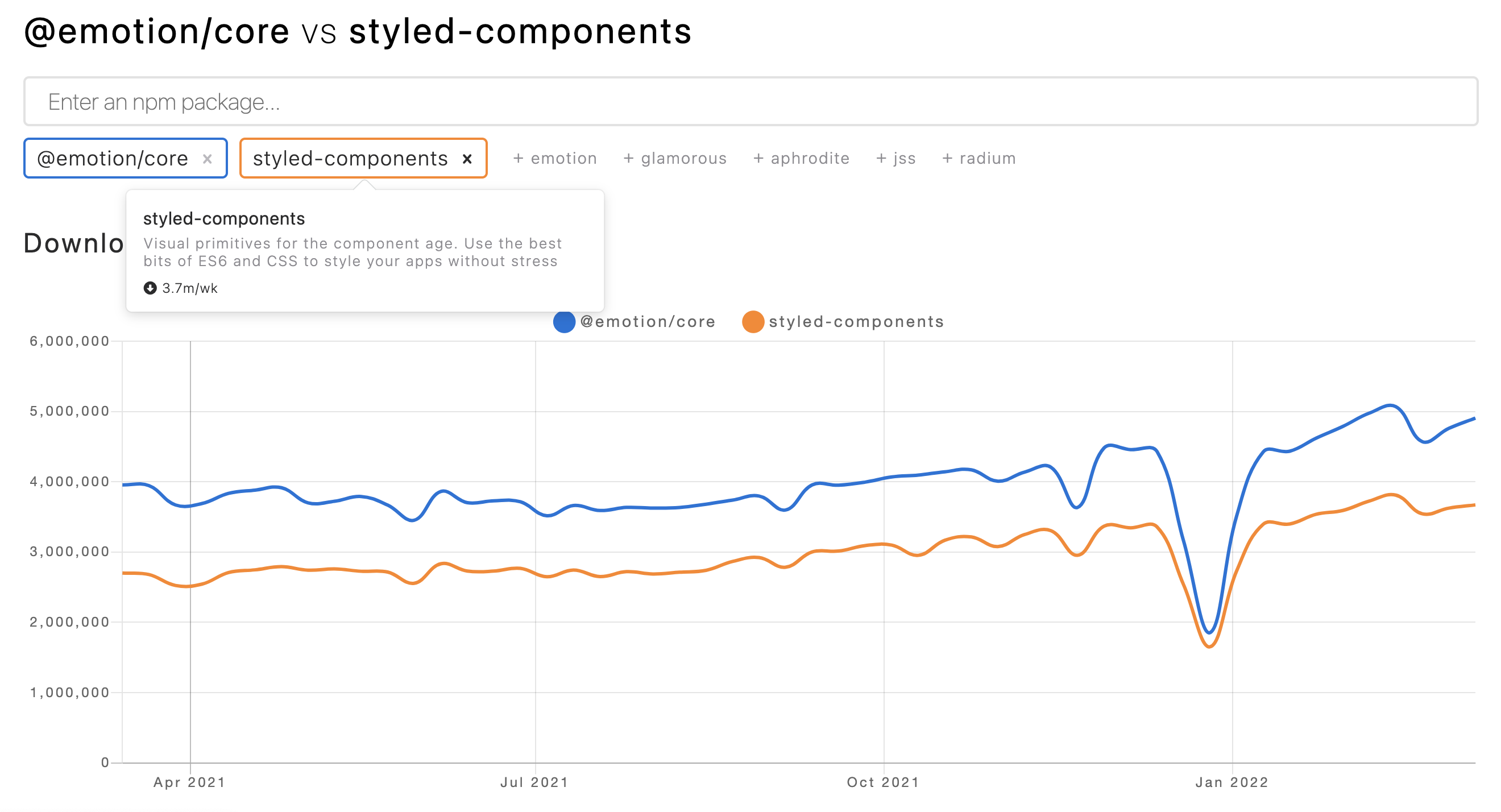
2. Emotion vs Styled-components
- npm-trends를 보면 styled-components 보다 emotion이 더 인기있다.

- size 비교


용량은 emotion이 더 가볍다.하지만 구글링 해본 결과. 둘의 성능에 유의미한 차이는 없다고 한다.
-
코드 비교
- styled-components
// CSS syntax in tagged template literal const Title = styled.h1` font-size: 1.5em; text-align: center; color: palevioletred; ` render(<Title>Hiya!</Title>) // Object syntax const button = styled.button({ fontSize: '1.5em', textAlign: 'center', color: 'palevioletred' });- emotion
// CSS syntax in tagged template literal

const Button = styled.button`
  padding: 32px;
  background-color: hotpink;
  font-size: 24px;
  border-radius: 4px;
  color: black;
  font-weight: bold;
  &:hover {
    color: white;
  }
`

render(<Button>Hey! It works.</Button>)

---

render(
  <h1
    className={css`
      font-size: 1.5em;
      text-align: center;
      color: palevioletred;
    `}
  >
    Hiya!
  </h1>
)

// Object syntax
const titleStyles = css({
  fontSize: '1.5em',
  textAlign: 'center',
  color: 'palevioletred'
})

render(<h1 className={titleStyles}>Hiya!</h1>)
emotion은 "const titleStyles = css({})"와 같이 class속성을 추가할 수 있다.
3. CSS-IN-JS 익히기
- 가장 Basic한 사용 예.
import styled from '@emotion/styled"'

const MyDiv = styled.div`
	width: 200px;
	height: 200px;
	background-color: red;
	&:hover{
		background-color: blue;
	}
`
& 는 자기 자신(this)의 역할을 한다.
위에서는 MyDiv:hover 을 의미.
- 하위 컴포넌트 스타일
/** @jsxImportSource @emotion/react */
import { jsx } from "@emotion/react";
import styled from "@emotion/styled";

const ChildDiv = styled.div`
	width: 100px;
	height: 100px;
	background-color: blue;
`;
const ParentDiv = styled.div`
	width: 500px;
	height: 400px;

	${ChildDiv}{
		background-color: red;
	}
`;

const MyApp = () => {
	return(
		<>
			<ParentDiv>
				<ChildDiv></ChildDiv>
			</ParentDiv>
		</>
	)
}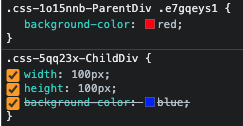
이와 같이 부모태그에서 jsx문법을 사용해 하위태그의 속성을 지정해줄 수 있다.
- Global Styles
루트 경로/styles/reset.js
import { css, Global } from "@emotion/react";
export const globalStyles = (
    <Global
        styles={css`
            * {
                box-sizing: border-box;
                padding: 0;
                margin: 0;
            }

            html,
            body {
                width: 100vw;
                height: 100vh;
                font-size: 16px;
            }
        `}
    />
);
루트 경로/pages/_app.js
/** @jsxImportSource @emotion/react */
// ... 생략 ... //
import { globalStyles } from "../styles/reset";
function MyApp({ Component, pageProps }) {
	// ... 생략 ... //
    return (
        <ApolloProvider client={client}>
            {globalStyles}
            <Component {...pageProps} />
        </ApolloProvider>
    );
}
export default MyApp;
{globalStyles}아래의 모든 하위 컴포넌트에 글로벌하게 스타일이 적용된다.
- Extend -1
/** @jsxImportSource @emotion/react */
import { jsx } from "@emotion/react";
import styled from "@emotion/styled";

const MyButton = styled.button`
    font-size: 23px;
    border: none;
`;
const BlackButton = styled(MyButton)`
    background-color: black;
    color: white;
`;
const RedButton = styled(MyButton)`
    background-color: red;
    color: blue;
`;

const MyApp = () => {
    return (
        <>
            <BlackButton>클릭</BlackButton>
            <RedButton>클릭</RedButton>
        </>
    );
};
export default MyApp;
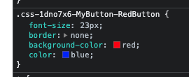
RedButton에 MyButton 스타일이 적용된 것을 확인할 수 있다.
- Extend -2
/** @jsxImportSource @emotion/react */
import { jsx } from "@emotion/react";
import styled from "@emotion/styled";

const MyFont = styled.p`
    font-size: 24px;
    font-weight: bold;
`;

const MyItalicFont = styled(MyFont.withComponent("span"))`
    font-style: italic;
    font-weight: normal;
`;

const MyApp = () => {
    return (
        <>
            <MyFont>p</MyFont>
            <MyItalicFont>span</MyItalicFont>
        </>
    );
};
export default MyApp;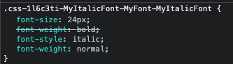
MyFont의 스타일을 상속 받으면서 동시에 p -> span 태그로 변환하여 깔~끔하게 코드를 작성할 수 있다.
- Extend -3
/** @jsxImportSource @emotion/react */
import { jsx } from "@emotion/react";
import styled from "@emotion/styled";

const MyFont = styled.p`
    font-size: 24px;
    font-weight: bold;
`;

const MyApp = () => {
    return (
        <>
            <MyFont as={"span"}>p</MyFont>
        </>
    );
};
export default MyApp;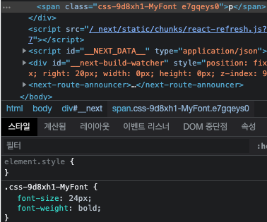
코드의 가독성이 좋아지고 변수 선언을 줄일 수 있어 좋은 것 같다.
- Extend -4
믹스인은 여러 컴포넌트 간, 공통으로 사용하는 로직이나 기능을 재사용하는 방법을 정의한다.
/** @jsxImportSource @emotion/react */
import { jsx, css } from "@emotion/react";
import styled from "@emotion/styled";

const MyButton = styled.button`
    border: none;
    padding: 10px;
    font-weight: bold;
`;

const hover = css`
    &:hover {
        background-color: red;
    }
`;

const BlueButton = styled(MyButton)`
    background-color: blue;
    ${hover}
`;

const MyApp = () => {
    return (
        <>
            <MyButton>클릭</MyButton>
            <BlueButton>클릭</BlueButton>
        </>
    );
};
export default MyApp;
자신의 태그를 선택한 후 hover 스타일을 주게끔 하는 함수를
${hover}를 통해 원하는 태그에 적용할 수 있다.
- Theme
styled-components의 ThemeProvider를 사용하여 외부에서 정의한 color를 import 시킬 수 있다.
// color.js
const MyColor = {
    default: "black",
    myAppColor: "red",
};

export default MyColor;
/** @jsxImportSource @emotion/react */
import { jsx, css, ThemeProvider } from "@emotion/react";
import styled from "@emotion/styled";
import MyColor from "./color";

const MyButton = styled.button`
    border: none;
    padding: 10px;
    background-color: ${(props) => {
        return props.myAppColor ? MyColor.myAppColor : MyColor.default;
    }};
`;

const MyApp = () => {
    return (
        <ThemeProvider theme={MyColor}>
            <MyButton default>기본버튼</MyButton>
            <MyButton myAppColor>테마버튼</MyButton>
        </ThemeProvider>
    );
};
export default MyApp;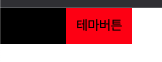
color.js에서 export한 MyColor함수에 default, myAppcolor 속성이 담겨져 있고
이 것을 다른 파일에서 import 하면 MyColor.default , MyColor.myAppcolor와 같이 호출할 수 있다.
그래서 background-color에 myAppColor 값이 속성이 있으면 myAppColor를 적용하고,
없으면 default를 적용하게 하여 효율적이고, 확장성있는 코드작성이 가능하다.
- Animation
/** @jsxImportSource @emotion/react */
import { jsx, css, keyframes } from "@emotion/react";
import styled from "@emotion/styled";

const Rotation = keyframes`
	from{
		transform: rotate(0deg);
	}
	to{
		transform: rotate(360deg);
	}
`;

const MyButton = styled.button`
    border: none;
    padding: 10px;
    ${(props) => {
        if (props.warning) {
            return css`
                animation: ${Rotation} 1s linear infinite;
                background-color: ${props.warning ? "red" : "gray"};
            `;
        }
    }};
`;

const MyApp = () => {
    return <MyButton warning>버튼</MyButton>;
};
export default MyApp;

keyframes를 활용해 애니메이션 효과를 줄 수 있다.
- Material-UI
아래와 같은 방법으로 사용가능
import styled from 'styled-components'
import {Button} from '@material-ui/core'

const MyButton = styled.button(Button)`
	&&{
		color: red;
		border: 1px solid red;
	}
`
styled-component와 emotion은 문법상으로는 유사하나, 일부 사용방법이 다르기 때문에 속성과 스타일을 동시에 주는 데에 실패했다.
emotion 공홈에서 제공하는 가이드를 꼼꼼히 읽고 잘 찾아서 해결해야겠다.
HINT : 태그의 속성은 별도로 render의 jsx 태그에 직접 작성하여야 한다.