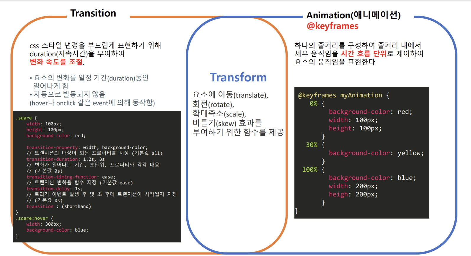
@keyframes
👉 애니매이션이 만들어지는 부분
👉 from(0%)모양에서 to(100%)모양으로 변할지 정한다 (IE는 버전 10이상에서 사용 가능)
@keyframes name {
    0% { ... }
    n% { ... }
    100% { ... }
}
name: 애니메이션의 변수명.
0%: 시작할 때의 모양을 정한다. 0% 대신 from을 사용가능.
n%: n%일 때의 모양을 정한다.
100%: 끝날 때의 모양을 한다. 100% 대신 to를 사용가능.
/* 예시(1) */
@keyframes big {
    from {
      width: 0px;
      height: 0px;
    }
    to {
      width: 150px;
      height: 150px;
    }
}


/* 예시(2) */
@keyframes big {
    0% {
        width: 0px;
        height: 0px;
    }
    25% {
        width: 150px;
        height: 150px;
    }
    50% {
        width: 100px;
        height: 100px;
    }
    75% {
        width: 200px;
        height: 200px;
    }
    100% {
        width: 150px;
        height: 150px;
    }
}
🎃 animation 속성
.sqare {
    animation-name: myAnimation; // = @keyframes 이름
    animation-duration: 3s // 변화가 일어나는 기간. 초단위. (기본값 0s)
    animation-iteration-count: 3; (기본값 1. number or infinite.)
    animation-timing-function: ease; // 애니메이션 함수 지정 (기본값 ease)
    }
✅ animation-name : (애니매이션 이름)
= @keyframes(애니매이션 이름) { }
❗ animation을 주고자 하는 태그에 같은 이름을 지정 후, @keyframes 뒤에 같은 이름을 명시해준다
/* div에 active class가 부여되면 hide라는 animation이 적용된다(transform 지정값 변화)
   (0.2초에 걸쳐 ease-out속도로 적용) */

div.active {
  transform: translate(-50%, -50%) scale(0);
  animation: hide 0.2s ease-out;
}

/* hide라는 이름의 애니매이션 */
@keyframes hide {
  0% {
    transform: translate(-50%, -50%) scale(1);
  }

  100% {
    transform: translate(-50%, -50%) scale(0);
  }
}
✅ animation-duration
- 타임프레임 길이. 애니메이션 시작부터 마지막까지 총 지속시간
- animation-name과 꼭 함께 필수로 작성해야 한다❗❗❗
- 재생 시간의 기본값은 0초이므로, 재생할 시간을 명시하지 않으면 아무런 효과도 나타나지 않는다.
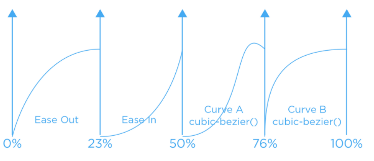
✅ animation-timing-function
- 애니메이션 속도 조절
linear=cubic-bezier(0, 0, 1, 1), 같은속도
ease=cubic-bezier(0.25, 0.1, 0.25, 1), 처음과 끝을 부드럽게
ease-in=cubic-bezier(0.42, 0, 1, 1), 처음을 느리게
ase-out=cubic-bezier(0, 0, 0.58, 1), 마지막을 느리게
ease-in-out=cubic-bezier(0.42, 0, 0.58, 1), 처음과 마지막을 느리게
cubic-bezier
✅ animation-delay
- 애니메이션이 시작하기 전 지연시간(양수,음수 모두 사용 가능)
- 첫 번째 반복에서만 지연된다
✅ animation-iteration-count
반복 횟수
👉 infinite 또는 양의 정수만 입력 가능
✅ animation-direction
- 애니매이션이 재생되는 방향
- 루프 (loop) 방향. 정방향으로 반복, 역방향으로 반복, 번갈아가며 반복 등을 설정 -> 시작점과 끝점이 정해져야 그 사이의 방향을 정한다
normal
reverse역방향
lternate정 -> 역방향
alternate-reverse역 -> 정방향
initial기본값 설정
✅ animation-fill-mode
- 애니메이션 시작/끝 상태 제어
none아무것도 지정되어 있지 않은 상태
forwards애니매이션이 키프레임의 100%에 도달했을 때 마지막 키프레임을 유지
backwards애니매이션의 스타일(style)을 애니매이션이 실제로 시작되기 전에 미리 적용
bothforwards, backwards 둘 다 적용
/* 예시(1) */
.element {
    animation-name: circle;   /* 변수명 */
    animation-duration: 4s;
    animation-delay: 1s;
    animation-iteration-count: infinite;
    animation-timing-function: linear;
    animation-direction: alternate;

    animation: circle 4s 1s infinite linear alternate, /* 변수1 (circle) */
               circle2 4s 1s infinite linear alternate; /* 변수2 (circle2) */
             /* 2개의 변수에 효과를 주고 싶으면 콤마(,)로 이어준다 */
}

/* 예시(2) */
.element {
  animation: circle 4s 1s infinite linear alternate;
}

/* 예시(3) */
.element {
  width: 45%;
  height: 45%;
  position: absolute;
  animation: spin 2s ease infinite

 @keyframes spin{   /* spin 변수 가져오기 */
        0%,100%{transform:translate(0)}    /* 단계에 따라 transform 효과주기 */
        25%{transform:translate(160%)}
        50%{transform:translate(160%, 160%)}
        75%{transform:translate(0, 160%)}
}
Thanks a lot for sharing!JOKER123