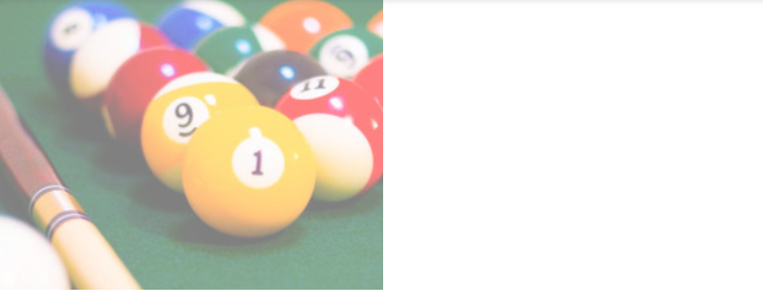
css filter
이미지(img)에 효과를 주는 것
선택자 {
	filter : 효과이름 (값)
    }
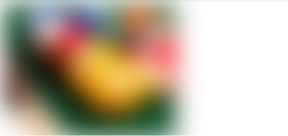
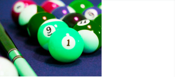
✅ blur
<img src="1.jpg" alt="" />
<style>
  img{
    filter:blur(20px);
    -webkit-filter:blur(20px);
  }
</style>
✅ grayscale
<img src="1.jpg" alt="" />
<style>
  img{
    filter:grayscale(100px);
    -webkit-filter:grayscale(100px);
  }
</style>
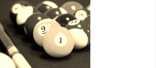
✅ sepia (어두운 갈색 효과)
<img src="1.jpg" alt="" />
<style>
  img{
    filter:sepia(100px);
    -webkit-filter:sepia(100px);
  }
</style>
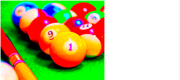
✅ saturate (채도조절 효과)
0%는 무채색, 100%는 이미지 그대로 유지, 100%보다 큰 값도 허용
<img src="1.jpg" alt="" />
<style>
  img{
    filter:saturate(10);
    -webkit-filter:saturate(10);
  }
</style>
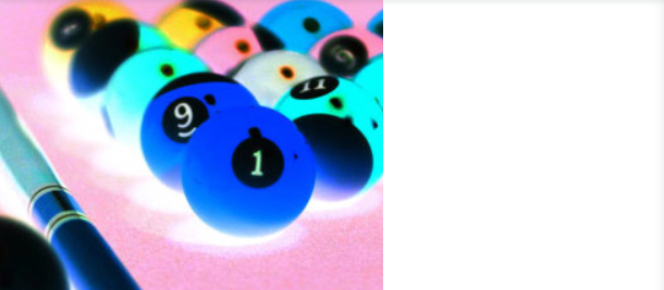
✅ hue-rotate (색조 회전 적용)
0deg는 이미지 그대로 유지, 최대값은 360deg
<img src="1.jpg" alt="" />
<style>
  img{
    filter:hue-rotate(100deg);
    -webkit-filter:hue-rotate(100deg);
  }
</style>
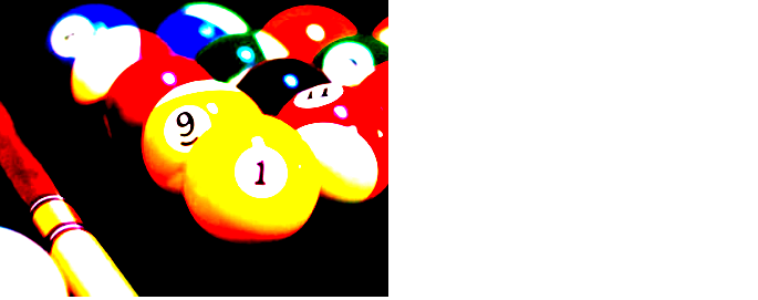
✅ invert (이미지 색 반전)
0%는 이미지 그대로 유지, 100%일 경우 정반대
<img src="1.jpg" alt="" />
<style>
  img{
    filter:invert(10);
    -webkit-filter:invert(10);
  }
</style>
✅ opacity (투명도)
0%는 완전 투명, 100%는 이미지 그대로 유지
<img src="1.jpg" alt="" />
<style>
  img{
    filter:opacity(0.5);
    -webkit-filter:opacity(0.5);
  }
</style>
✅ contrast (이미지 대비)
0%는 완전 회색, 100%는 이미지 그대로 유지
<img src="1.jpg" alt="" />
<style>
  img{
    filter:contrast(5);
    -webkit-filter:contrast(5);
  }
</style>
✅ drop-shadow (그림자 효과)
0%는 완전 회색, 100%는 이미지 그대로 유지
<img src="1.jpg" alt="" />
<style>
  img{
    filter:drop-shadow(10px 10px 5px rgba(0,0,0,0.5));
    -webkit-filter:drop-shadow(10px 10px 5px rgba(0,0,0,0.5));
  }
</style>
boma91@gmail.com
호옹..스터디에서 필터 기능 궁금했는데 정리해주셔서 감사해요오❣