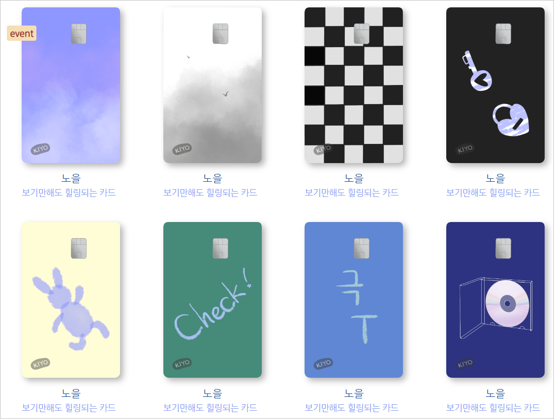
이미지 하나하나 그렸당..
소스코드는 여기 서 참고해서
아래처럼 내 입맛대로 바꿔봤다. chat gpt의 도움 받으면서!
테스트용 html:
<div class="card">
      	<img class="pngimg" src="img/noeul.PNG">
        <p class="cardName"><br>노을</p>
        <p class="cardDisc">보기만해도 힐링되는 카드</p>
        <p class="event">event</p>
      </div>
java 적용 html:
<div align="center" class="container">
<h2>cardList</h2>

<section>
<%
    if (li != null) {
        for (CardVo m : li) {
%>
    <input type="hidden" id="idx" name="idx" value="<%= m.getIdx() %>">

    <div class="card">
        <a href="CardCtrl?sw=view&idx=<%=m.getIdx() %>">
            <img class="pngimg" src="img/<%= m.getCardImg() %>">
        </a>
        <p class="cardName"><br>
            <a href="CardCtrl?sw=view&idx=<%=m.getIdx() %>">
                <%= m.getCardName() %>
            </a>
        </p>
        <p class="cardDisc"><%= m.getCardDisc() %></p>
        <% if (m.isEventYN()) { %>
            <p class="event">event</p>
        <% } %>
    </div>
<%
        }
    } else {
%>
    <p>카드 리스트가 비어있음</p>
<%
    }
%>
</section>
</div>
css:
@charset "UTF-8";
@import url('https://fonts.googleapis.com/css2?family=Nanum+Gothic&display=swap');

* {
   		font-family: "Nanum Gothic", sans-serif;
			margin: 0 auto;
			margin-top: 10px;
    }

    .container {
      width: 90%;
      max-width: 1200px;
      min-width: 360px;
/*       background-color: gainsboro; */
    }

    header {
      height: 200px;
      text-align: center;
    }

/*     h1 { */
/*       margin-top: 40px; */
/*       text-decoration: coral underline;  */
/*       text-underline-position: under; */
/*       line-height: 100px; */
/*     } */

    section {
      display: flex;
      flex-flow: row wrap;
      justify-content: center;
      align-items: center;
    }

    .card {
      height: 320px;
      width: 200px;
      background-color: white;
      margin: 5px;
      float: left;
      padding: 10px;
      }

      .card img {
       	width: 160px;
       	height: auto;
       	margin-bottom: 10px;
      }

      .pngimg {
      filter: drop-shadow(5px 5px 5px #b3b3b3);
      cursor: pointer;
      }

      .pngimg:hover{
      filter: drop-shadow(7px 7px 7px #838383);
      transition: 0.3s;
      }

      p {
        line-height: 14px;
        margin: 10px;
        margin-top: -10px;
      }

			.card p:first-of-type {
            margin-bottom: 20px; /* 간격 조정 */
        }

			.cardName {
				color: #054491;
				font-size: 17px;
			}

			.cardDisc {
			font-size: 14px;
			text-align: left;
			width: 160px;
			color: #7D98F5;
			}

      .event {
        text-align: center;
        width: 30px;
        background-color: wheat;
        color: brown;
        position: relative; /* 화면 확대, 축소해도 위치 고정 */
        bottom: 280px; left: -80px; /* div 내 위치 */
        border-radius: 3px;
        border: none;
        min-height: 17px; min-width: 40px; /* bg 크기 */
        font-size: 15px;
        padding: 4px;
        font-weight: bold;
				display: flex; justify-content: center;	align-items: center; /* 중앙정렬 */
      }

    footer {
      clear: both;
      text-align: center;
      line-height: 50px;
    }

      @media (min-width:1280px) {
        section { width: 1040px; height: 580px; }
      }

      @media (max-width:1279px) {
        section { width: 780px; height: 870px; }
      }

      @media (max-width:900px) {
        section { width: 520px; height: 1160px; }
      }

      @media (max-width:600px) {
        section { width: 260px; height: 2320px; }
      }
기기 좋아하는 여자