
🚀 react-modal
팀 프로젝트 과정 중 Modal이 필요하다는 의견에 react-modal 라이브러리를 사용하게 되었습니다. 평소 학습하는 입장에서 최대한 라이브러리를 지양하고 원하는 기능을 구현하는 방식으로 코드를 짰었지만, 프로젝트는 한정된 기간이 있고 필요한 라이브러리를 적절히 사용하는 것 또한 프로그래머의 능력이라 생각하고 해당 라이브러리를 사용해 보았습니다.
react-modal 설치하기
npm install --save react-modalreact-modal 시작하기
import React from 'react';
import ReactDOM from 'react-dom';
import Modal from 'react-modal';

const customStyles = {
  content: {
    top: '50%',
    left: '50%',
    right: 'auto',
    bottom: 'auto',
    marginRight: '-50%',
    transform: 'translate(-50%, -50%)',
  },
};

// Make sure to bind modal to your appElement (https://reactcommunity.org/react-modal/accessibility/)
Modal.setAppElement('#yourAppElement');

function App() {
  let subtitle;
  const [modalIsOpen, setIsOpen] = React.useState(false);

  function openModal() {
    setIsOpen(true);
  }

  function afterOpenModal() {
    // references are now sync'd and can be accessed.
    subtitle.style.color = '#f00';
  }

  function closeModal() {
    setIsOpen(false);
  }

  return (
    <div>
      <button onClick={openModal}>Open Modal</button>
      <Modal
        isOpen={modalIsOpen}
        onAfterOpen={afterOpenModal}
        onRequestClose={closeModal}
        style={customStyles}
        contentLabel="Example Modal"
      >
        <h2 ref={(_subtitle) => (subtitle = _subtitle)}>Hello</h2>
        <button onClick={closeModal}>close</button>
        <div>I am a modal</div>
        <form>
          <input />
          <button>tab navigation</button>
          <button>stays</button>
          <button>inside</button>
          <button>the modal</button>
        </form>
      </Modal>
    </div>
  );
}

ReactDOM.render(<App />, appElement);
react-modal로 부터 Modal 컴포넌트를 import해서 사용이 가능합니다. Modal 컴포넌트는 모달의 표시 상태를 나타내는 isOpen이라는 필수 Prop이 존재합니다.
그 외에도 onAfterOpen, onRequestClos등 많은 Prop으로 Modal를 다룰 수 있습니다. 자세히보기
react-modal 적용하기
const ReservationPopup = ({
  isOpen,
  onClose,
  reportId,
  starPoint,
  review,
}: ReservationPopupProp) => {

  // ...

  return (
    <Modal
      isOpen={isOpen}
      onRequestClose={onClose}
      style={{
        overlay: { background: "rgba(0, 0, 0, 0.80)" },
        content: {
          position: "fixed",
          top: "50%",
          left: "50%",
          transform: "translate(-50%, -50%)",
          background: "rgba(0, 0, 0, 0)",
          WebkitOverflowScrolling: "touch",
          border: "none",
          outline: "none",
          width: "360px",
          height: "390px",
          padding: "0",
          display: "flex",
          alignItems: "center",
          justifyContent: "center",
        },
      }}
    >
      // ...
    </Modal>
  );
};
Modal을 return하는 컴포넌트를 만들어서 구현을 하였습니다. 해당 컴포넌트는 Modal의 필수 Prop인 isOpen과 그 밖의 컴포넌트에 필요한 Prop을 받고있습니다. 그리도 위의 Modal 컴포넌트의 isOpen과 onRequestClose는 Modal에 필요한 Prop입니다. isOpen은 모달의 표시 상태를 나타내는 Prop이고 onRequestClose는 Modal창이 Open시 뒷 배경인 Overlay부분을 클릭시 발생하는 Prop입니다.
해당 컴포넌트를 사용하는 페이지에서 컴포넌트의 isOpen Prop에는 boolean으로 이루어진 State값을 부여하고 onClose Prop은 앞의 isOpen에 들어가는 State값을 변경하는 함수를 주어 Modal 컴포넌트의 onRequestClose에 넣어주었습니다.
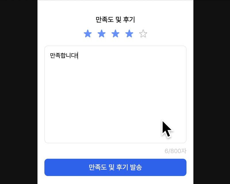
결과
📝 후기
라이브러리를 통한 작업으로 효율적으로 프로젝트를 진행할 수 있었습니다. 효율적인 구조로 이루어진 라이브러리들을 보고 코드 구조의 중요성을 배웠고, 다음에 기회가 된다면 저 또한 다른 프로그래머들에게 도움이 되는 라이브러리를 배포하고 싶다는 생각이 들었습니다.
🧾 Reference
본 후기는 유데미-스나이퍼팩토리 10주 완성 프로젝트캠프 학습 일지 후기로 작성 되었습니다.
#프로젝트캠프 #프로젝트캠프후기 #유데미 #스나이퍼팩토리 #웅진씽크빅 #인사이드아웃 #IT개발캠프 #개발자부트캠프 #리액트 #react #부트캠프 #리액트캠프
