TIL DAY 200
오늘 배운 일
✔️ CSS Layout
🎢 Grid [part II]
저번에 grid 를 입문하고 오늘은 grid-template-areas 에 대해 알아보겠다.
우선 새롭게 코드를 작성해봤는데...
index.html
<body>
  <div class="grid">
    <div class="header"></div>
    <div class="content"></div>
    <div class="nav"></div>
    <div class="footer"></div>
  </div>
</body>
style.css
.grid {
display: grid;
grid-template-columns: 200px 200px 200px 200px;
grid-template-rows: 300px 300px 300px 300px;
}
.header {
background-color: #2ecc71;
}
.content {
background-color: #3498db;
}
.nav {
background-color: #8e44ad;
}
.footer {
background-color: #f39c12;
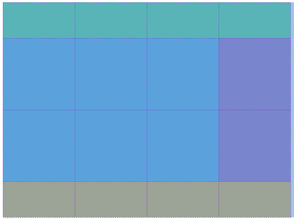
} 결과는...

이렇게 가로 길이 200px 과 세로 길이 300px 를 가지고 있는 색 다른 박스들을 볼 수 있다.

column 과 row 의 길이를 4번 지정해두니, 4x4 박스를 확인할 수 있다.
근데 위의 코드를 보면...
.grid {
  display: grid;
  grid-template-columns: 200px 200px 200px 200px;
  grid-template-rows: 300px 300px 300px 300px;
}
grid-template-columns 과 grid-template-rows 를 보면, 똑같은 수치를 계속 반복해서 쓰는데 매우 효율성이 떨어진다.
이 때 쓸 수 있는게 repeat 이다.
- repeat 은 CSS grid 가 가진 함수이다.
style.css
.grid {
  display: grid;
  grid-template-columns: repeat(4, 200px);
  grid-template-rows: repeat(4, 300px);
}
repeat( ) 함수를 작성하고 안의 첫 번째 아규먼트로 몇 번 반복할지 써주고, 두 번째로는 길이를 작성해준다.
결과물을 확인해보면...

똑같이 됐다!
위의 코드에서, grid 라는 클래스 안에 4개의 div 는 header, content, nav, footer 라는 클래스 이름을 가지고 있다.
생각하고 있는 구조는 맨 위에 header, 그리고 중간에 content 와 nav 가 있고 마지막으로 맨 밑으로는 footer 가 있는 것이다.
이 때, 우리가 배울 grid-template-areas 의 도움으로 해결이 가능하다.
grid-template-areas 는 눈에 잘 보이게 layout 을 디자인 해준다.
위에서 우리는 row 가 4개고 column 이 4개이다.
먼저, row 을 300px 에서 200px 로 바꿔주고 밑에처럼 코드를 바꿔보자!
style.css
.grid {
  display: grid;
  grid-template-columns: repeat(4, 200px);
  grid-template-rows: repeat(4, 200px);
  grid-template-areas:
  "header header header header"
  "content content content nav"
  "content content content nav"
  "footer footer footer footer";
}

.header {
  background-color: #2ecc71;
}

.content {
  background-color: #3498db;
}

.nav {
  background-color: #8e44ad;
}

.footer {
  background-color: #f39c12;
}
grid-template-areas 프로퍼티를 보면,
- 첫 번째 row 는 "header header header header"
- 두 번째는 "content content content nav"
- 세 번째는 "content content content nav"
- 마지막 네 번째는 "footer footer footer footer"
이 이름들은 4개의 div 들의 클래스 이름이다.
결과물을 확인해보면...

*** 아무런 변화가 없는데 그 이유는 각 자식 요소들한테 area 이름을 지정해주어야 한다!
style.css
.grid {
  display: grid;
  grid-template-columns: repeat(4, 200px);
  grid-template-rows: repeat(4, 200px);
  grid-template-areas:
  "header header header header"
  "content content content nav"
  "content content content nav"
  "footer footer footer footer";
}

.header {
  background-color: #2ecc71;
  grid-area: header;
}

.content {
  background-color: #3498db;
  grid-area: content;
}

.nav {
  background-color: #8e44ad;
  grid-area: nav;
}

.footer {
  background-color: #f39c12;
  grid-area: footer;
}
위의 코드를 확인해보면, 각 자식 요소들은 'grid-area: 이름'이 주어져 있다.
이름들은 각 요소의 class 이름들이랑 아무런 연관이 없다.
부모 요소한테 작성해준 grid-template-areas 의 이름들은 자식 요소들의 grid-area 와 매치해야 작동한다.
자식 요소들의 class 이름과 동일하게 한 이유는 이해하기 쉽게할려고 한 것이다.
실행하면...

아 그리고 약간 조정해보자면...
grid-template-rows: 100px repeat(2, 200px) 100px;
첫 번째 row 는 100px 그리고 두 번째 세 번째는 200px 그리고 마지막은 100px 이렇게 만들어주면...

훨씬 깔끔한 layout 이 만들어졌다!!!
grid 를 확인해보면...
4x4 행렬로 만들어져있다.
그럼 만약 중관에 공간을 비운다면?
style.css
.grid {
  display: grid;
  grid-template-columns: repeat(4, 200px);
  grid-template-rows: 100px repeat(2, 200px) 100px;
  grid-template-areas:
  "header header header header"
  "content content . nav"
  "content content . nav"
  "footer footer footer footer";
}

중간에 빈 공간이 생겼다!
위의 코드를 보면, 기존에 있던 content 대신 . (점) 이 있는데 이것은 빈 칸을 의미한다.
아! 그리고 colums 를 약간 수정해주면...
grid-template-columns: auto 200px;결과를 확인하면...

화면의 모든 공간을 차지하면서 더 늘어난 것을 볼 수 있다.
auto 는 가능한 만큼 크게 만들고 그리고 200px 이다.
끝으로 :
- 오늘은 드디어 grid 의 진면목을 볼 수 있는 시간을 가져보았다.
- px, em, % 가 필요없지만 areas 를 쓸려면 자식 요소들한테 이름을 지정해주어야 한다는게 솔직히 번거롭다.
