TIL DAY 210

오늘 배운 일
✔️ CSS Layout
🧾 SCSS [part IV]
Mixin 에서 아직 언급하지 않은 feature 가 있다.
그건 바로 @content 이다.
그럼 전에 진행했던 프로젝트로 돌아가서...
index.html
<body>
  <a href="#">Log In</a>
  <button>Log Out</button>
</body>
_mixins.scss
@mixin responsive {
  @content;
}
@mixin 을 쓰고 responsive 라고 작성해서 안에 @content 를 넣어주고 styles.scss 로 가서...
styles.scss
@import "_mixins";

a {
  @include responsive {
    text-decoration: none;
  }
}
작동원리는 mixins 파일에서 @content 가 바로 styles 에서 작성한 text-decoratioin: none; 이 되는 것이다.
컴파일 된 styles.css 를 확인해보면...
a{text-decoration:none}잘 동작하는걸 알 수 있다.
더 확실하게 확인하고 싶으면...
_mixins.scss
@mixin responsive {
  color: blue;
  @content;
}
색을 파란색으로 지정해두고 styles.css 로 가서...
styles.css
a{color:#00f;text-decoration:none}우리의 anchor 가 파란색이고 text-decoration 이 none 이다.
그러니까 아까 말했듯이, styles.scss 에 있는 스타일 text-decoration 이 mixin 의 content 인 셈이다.
더 심화 과정으로 넘어가서...
밑에 있는 코드처럼 작성해보자!
_mixins_scss
@mixin responsive($device) {
  @if $device == "iphone" {
    @media screen and (max-width: ) {
      @content;
    }
  } @else if $device == "tablet" {
    @media screen and (max-width: ) {
      @content;
    }
  } @else if $device == "iphone-l" {
    @media screen and (max-width: ) {
      @content;
    }
  } @else if $device == "ipad-l" {
    @media screen and (max-width: ) {
      @content;
    }
  }
}
if 와 else if 를 사용해서 $device 가 특정 물건이면, media query 를 만들고 그 자리에 @content 를 넣는다.
아 그리고 iphone-l 과 ipad-l 은 방향이 landscape 이여서 코드를 추가해주자
_mixins.scss
@mixin responsive($device) {
  @if $device == "iphone" {
    @media screen and (max-width: ) {
      @content;
    }
  } @else if $device == "tablet" {
    @media screen and (max-width: ) {
      @content;
    }
  } @else if $device == "iphone-l" {
    @media screen and (max-width: ) and (orientation: landscape) {
      @content;
    }
  } @else if $device == "ipad-l" {
    @media screen and (max-width: ) and (orientation: landscape) {
      @content;
    }
  }
}
다음에 추가되는 코드들은 미디어 쿼리의 길이들과 variables 를 확인할 수 있다.
_mixins.scss
$minIphone: 500px;
$maxIphone: 690px;
$minTablet: $maxIphone + 1;
$maxTablet: 1120px;

@mixin responsive($device) {
  @if $device == "iphone" {
    @media screen and (min-width: $minIphone) and (max-width: $maxIphone) {
      @content;
    }
  } @else if $device == "tablet" {
    @media screen and (min-width: $minTablet) and (max-width: $maxTablet) {
      @content;
    }
  } @else if $device == "iphone-l" {
    @media screen and (min-width: $minIphone) and (max-width: $maxIphone) and (orientation: landscape) {
      @content;
    }
  } @else if $device == "ipad-l" {
    @media screen and (min-width: $minTablet) and (max-width: $maxTablet) and (orientation: landscape) {
      @content;
    }
  }
}
그리고 우리의 index.html 로 가서 수정해준다.
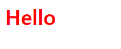
index.html
<body>
  <h1>Hello</h1>
</body>
styles.scss
@import "_mixins";

h1 {
  color: red;
}
타이틀을 빨간색으로 해주고...
그리고 @include 를 해주자!
styles.scss
@import "_mixins";
h1 {
color: red;
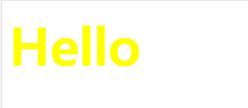
@include responsive("iphone") {
color: yellow;
}
}$device 가 iphone 일 때, 폰트 색깔을 노란색으로 해준다.
화면을 690px 가지 줄어보면...
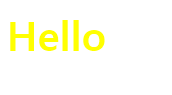
색이 바뀌었다!
그럼 iphone-l 를 만들어주면...
@import "_mixins";

h1 {
  color: red;
  @include responsive("iphone") {
    color: yellow;
  }
  @include responsive("iphone-l") {
    font-size: 60px;
  }
}
가로 방향으로 해줘야 폰트가 커진다.
한 번 확인해보면...
Toggle device toolbar 를 누르고 회전하는 모양을 클릭하고 화면을 줄어보면 잘 작동한다.
다음으로 태블릿을 설정해주자!
@import "_mixins";

h1 {
  color: red;
  @include responsive("iphone") {
    color: yellow;
  }
  @include responsive("iphone-l") {
    font-size: 60px;
  }
  @include responsive("tablet") {
    color: green;
  }
}
태블릿 사이즈는 폰트를 초록색으로 지정해줬다.
Dimensions 를 Responsive 로 지정하고 하얀색 화면을 늘리고 줄여서 색이 바뀌는 걸 확인해보자!
끝으로 :
- 오늘은 @content 와 반응형 웹을 한 번 만들어보았다.
- 이번이 진짜로 SCSS 의 마지막 파트여서 다른걸로 넘어간다.
