Understanding Data Characteristics
데이터 분석을 시작하기전, 다루고 있는 데이터를 철저히 이해해야 한다.
다루는 데이터에 대한 철저한 이해는 분석 방법을 선택하고 적용하는 것의 기반이 된다.
고려해야할 특성들은 아래와 같다.
- 데이터 타입 : 데이터의 타입이 이산적인지, 비율인지, 명목형 등등 중에서 어떤 것인지 아는것은 올바른 분석법을 선택하는 데에 핵심이다.
- 데이터의 분산 : 분산의 범위와 모양은 어떤 분석이 적절한지 선택하는 데에 큰 영향을 미친다.
- 변수들간의 관계 : 변수들간의 상관관계 역시 올바른 분석법을 선택하는데 가이드의 역할을 한다.
Data Types
데이터의 타입은 크게 Univariate Data(단변량 데이터)와 Multivariate Data(다변량 데이터)로 나뉜다.
이 두가지 분석 모두에서 올바르게 데이터의 특성을 이해하는 것은 분석법과 분석기술 선택에 있어서 중요하다.
아래에 두가지 방법론에 대해 설명한다.
Univariate Data(단변량 데이터)
단일 변수 분석, 데이터를 설명하고 그 안에서 발생하는 패턴을 찾는 것이 주 목적이다.
주요 유형은 다음과 같다.
Nominal (Categorical) Data : 명목(범주형) 데이터
- 자연적인 순서가 없는 카테고리나 그룹
- eg. 성별, 음식 종류, 혈액형 등등
- 데이터 예시 : 선호하는 애완동물의 종류에 대한 Survey 답변
- 데이터 포인트 : {개, 고양이, 앵무새, 이구아나}
- 분석 : 각 데이터의 갯수/퍼센트 파악
Ordinal Data : 서열 데이터
- 명목 데이터와 유사하지만 데이터간 논리적이거나 자연적인 순서가 있는 데이터
- 카테고리 간의 간격이 반드시 동일하지는 않는다.
- eg. 교육수준(고등학교, 학사, 석사, 박사), 만족도(매우불만족-불만족-보통-만족-매우만족)
- 데이터 예시 : 상품에 대한 평점(1점~5점)
- 데이터 포인트 : {1 (Very Unsatisfied), 2 (Unsatisfied), 3 (Neutral), 4 (Satisfied), 5 (Very Satisfied)}
- 분석 : Median rating or distribution of satisfaction levels.
Interval Data : 간격 데이터
- 두 값 사이의 거리가 의미 있는숫자 데이터
- 진정한 영점은 없다.(0이 없음을 의미하지 않는다)
- eg. 화씨, 섭씨온도. 0도가 온도가 없다는걸 의미하진 X
- 데이터 예시 : 각 도시별 현재 온도
- 데이터 포인트 : {New York: 20°C, Los Angeles: 25°C, Chicago: 15°C, Miami: 30°C}
- 분석 : 평균 온도, 온도 분포, 각 도시별 온도 비교
Ratio Data : 비율 데이터
- 숫자 데이터이며 간격데이터와 유사하지만, 의미있는 0의 값을 가진다.
- 비율의 계산이 가능하다.
- eg. 키, 무게, 나이, 소득(소득이 0 = 소득이 없음)
- 데이터 예시 : 학생들의 키 조사
- 데이터 포인트 : {170 cm, 160 cm, 165 cm, 175 cm, 180 cm}
- 분석 : 평균 키, 키 분포, 가장 큰 키와 작은 키 식별
Multivariate Data(다변량 데이터)
- 다변량 데이터는 한번에 둘 이상의 변수를 분석하여 변수 간의 관계와 패턴을 검토할 수 있는 데이터이다.
- 각각의 단변량데이터(Nominal, Ordinal, Interval, Ratio)데이터간의 조합으로 이루어져 있다.
Survey Data : 설문조사 데이터
- 다양한 데이터타입의 응답이 모여있는 survey 데이터. 예를 들어 나이(ratio), 성별(nominal), 소득 수준 (ratio), 만족도 조사(ordinal), 그리고 서비스 사용빈도(ratio)이다.
- 다양한 변수를 함께 고려하여 고객들의 선호와 행동에 대한 insight를 얻을 수 있다.
- 데이터 예시 : 성별, 선호하는 애완동물 유형, 만족도 평가를 포함한 설문조사 응답
- 데이터 포인트 : 각 응답자의 데이터는 {Gender: Female, Pet Preference: Cat, Satisfaction: 4 (Satisfied)} 와 같을 수 있다.
- 분석 : 성별과 애완동물 선호 사이의 관계 또는 다양한 애완동물 선호도 간의 만족도 수준 확인.
Health Data : 건강 데이터
- 의학 연구에서는 환자의 나이(ratio), 성별(nominal), 혈압(ratio), 콜레스테롤 수치(ratio), 그리고 질병분류(nominal)와 같은 다변량 데이터를 자주 수집한다.
- 연구자들은 생활 습관 요인과 건강 결과 사이의 관계를 탐구할 수 있다.
- 데이터 예시 : 환자의 나이, 성별, 혈압, 질병 분류
- 데이터 포인트 : 환자 기록은 {나이: 45, 성별: 남성, 혈압: 120/80 mmHg, 질병: 고혈압}일 수 있다.
- 분석 : 나이, 혈압, 고혈압의 유병률 사이의 상관관계 조사; 성별에 따른 차이 분석
Financial Data : 재무 데이터
- 재무 분석가들은 회사의 수익(ratio), 이익률(ratio), 시장 점유율(ratio), 그리고 산업분류(nominal) to identify 와 같은 다양한 변수를 검토하여 재무 성과를 이끄는 요인들을 식별할 수 있다.
- 데이터 예시 : 회사의 연간 수익, 이익률, 산업 분류
- 데이터 포인트 : 회사 데이터는 {수익: $10M, 이익률: 15%, 산업종류: 기술산업}과 같을 수 있다.
- 분석 : 산업별 재무 건전성 분석; 기술 및 비기술 분야 간의 수익과 이익률 비교
Environmental Data : 환경 데이터
- 환경 변화에 대한 연구는 온도(interval), 강수량(ratio), 오염 수준(ratio), 그리고 다양한 지역 및 시간에 따른 식생 유형(nominal)과 같은 변수를 포함할 수 있다.
- 데이터 예시 : 다양한 지역의 월 평균 온도, 강수량, 식생 유형
- 데이터 포인트 : 지역 데이터는 {온도: 22°C, 강수량: 120 mm, 식생: 숲}일 수 있다.
- 분석 : 기후 패턴 및 그것이 식생 유형에 미치는 영향 연구; 지역 간 환경 요인 비교
Data Visualization - Seaborn
- 데이터의 특성을 이해하고 시각화 기술을 사용하는 것은 데이터 분석에서 필수적인 프로세스이다.
- 파이썬에서는 matplotlib, seaborn, plotly 등 다양한 시각화 라이브러리를 지원하는데, 그 중에서도 자주 활용되는 seaborn library에 대해 코드화 함께 아래에 정리한다.
- Seaborn라이브러리는 통계 그래픽을 좀 더 직관적이고 간결하게 생성해주는 파이썬 라이브러리이다.
- Seaborn라이브러리 페이지에서 자세한 plot 종류와 설명을 확인할 수 있다.
import & data 확인
libary import
import numpy as np
import pandas as pd
import matplotlib.pyplot as plt
from matplotlib import rcParams
import seaborn as sns
import warnings
load titanic dataset
# Data load(titanic)
df_titanic=sns.load_dataset('titanic')
Use .head(), .info(), .describe() for understanding dataset
# Understanding data
print(df_titanic.head())
print(df_titanic.info())
print(df_titanic.describe())- Pandas 라이브러리에서 DataFrame 객체를 다룰 때 사용되는 메서드들이다.
- 각각의 목적과 결과는 아래에 설명했다.
df_titanic.head()
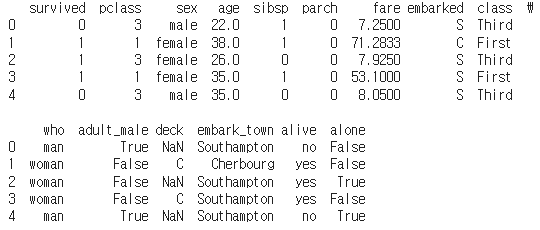
- DataFrame의 상위 n개의 행을 반환한다. 기본값으로는 상위 5개의 행을 보여준다.
- 데이터셋의 처음 몇 개의 행을 빠르게 살펴보고 싶을 때 사용한다.
- 이를 통해 데이터의 구조, 변수의 데이터 타입, 결측치나 이상치의 존재 여부 등을 초기에 파악할 수 있다.
df_titanic.info()
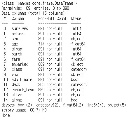
- DataFrame에 대한 요약 정보를 출력한다.
- 이 메서드는 인덱스의 범위, 컬럼 이름, 컬럼별 데이터 타입, 비결측치(non-null) 값의 개수, 메모리 사용량 등을 보여준다.
- 데이터셋의 구조적인 정보를 파악하고 싶을 때 사용한다.
- 각 컬럼의 데이터 타입과 결측치의 유무를 빠르게 확인할 수 있어 데이터 전처리 과정에서 유용하게 사용한다.
df_titanic.describe()
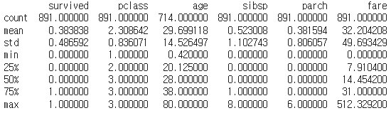
- DataFrame의 각 수치형(numerical) 컬럼에 대한 기술 통계를 요약하여 보여준다.
- 기본적으로 count(개수), mean(평균), std(표준편차), min(최소값), 25%, 50%(중앙값), 75%, max(최대값) 등의 통계량을 포함한다.
- 추가로 include와 exclude 매개변수를 사용해 분석하고자 하는 데이터 타입을 지정할 수 있다.
- 데이터셋의 수치형 변수들에 대한 기본적인 통계적 분석을 하고 싶을 때 사용한다.
- 이 메서드를 통해 데이터의 분포, 중심 경향성, 변동성 등을 빠르게 파악할 수 있으며, 이상치의 존재 여부를 짐작해볼 수도 있다.
df_titanic[column_name].value_counts()
각 컬럼별 분포를 간단히 확인할때 사용한다.
# DataFrame[column name].value_counts()
print(df_titanic['survived'].value_counts()) # 0:Dead, 1:survived
print(df_titanic['sex'].value_counts()) # male/female
print(df_titanic['age'].value_counts())
print(df_titanic['fare'].value_counts())
print(df_titanic['class'].value_counts()) # First, second, third
print(df_titanic['who'].value_counts()) # man, woman, child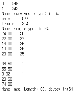
titanic dataset
실제 데이터셋 각 컬럼의 설명은 아래와 같다.
- Survived: 생존 여부 (0 = 사망, 1 = 생존)
- Pclass: 객실 등급 (1 = 1등석, 2 = 2등석, 3 = 3등석)
- Sex: 성별 (male = 남성, female = 여성)
- Age: 나이
- SibSp: 동반한 형제자매/배우자 수
- Parch: 동반한 부모/자녀 수
- Fare: 요금
- Embarked: 탑승 항구 (C = 셰르부르, Q = 퀸스타운, S = 사우샘프턴)
- Class: 객실 등급 (First = 1등석, Second = 2등석, Third = 3등석)
- Who: 인물 구분 (man, woman, child)
- Adult_Male: 성인 남성 여부 (True = 성인 남성, False = 그 외)
- Deck: 객실 번호 첫 글자 (A, B, C, D, E, F, G)
- Embark_Town: 탑승지 명칭 (Cherbourg, Queenstown, Southampton)
- Alive: 생존 여부 (no = 사망, yes = 생존)
- Alone: 혼자 탑승 여부 (True = 혼자 탑승, False = 가족 동반)
Relational Plots
- Relational Plots(관계형 플롯)은 두 개 이상의 변수간의 관계를 이해하기 위해 사용된다.
scatterplot()
- 두 변수 사이의 관계를 보여주기 위해 산점도를 그린다.
- 두 수치변수 사이의 분포와 관계를 관찰하는데 유용하다.
# (8) Fares by age
sns.scatterplot(x='age', y='fare', data=df_titanic)
plt.show()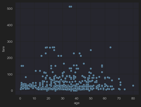
- x축을 나이, y축을 요금으로 scatter를 그려본 결과이다. 나이와 요금의 상관관계를 알 수 있다.
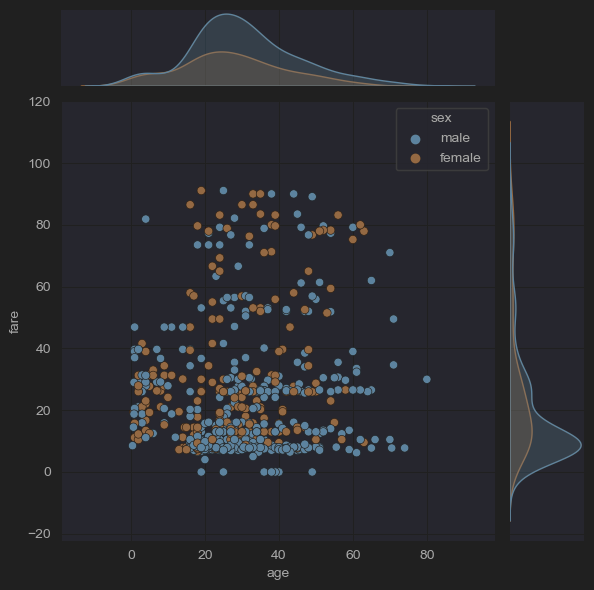
hue
- x, y축을 그릴 때 사용한 변수말고 추가적인 Categorical 데이터가 있는경우, hue 인수에 카테고리 변수 이름을 지정하여 추가적인 서브 분류(subdivides)를 진행할 수 있다.
- 이는 Relational Plots을 말고도 아래 추가적으로 설명할 Categorical Plots과 같은 다른 플롯에도 적용할 수 있다.
# (8) Fares by age (men and women)
sns.scatterplot(x='age', y='fare', hue='sex', data=df_titanic)
plt.show()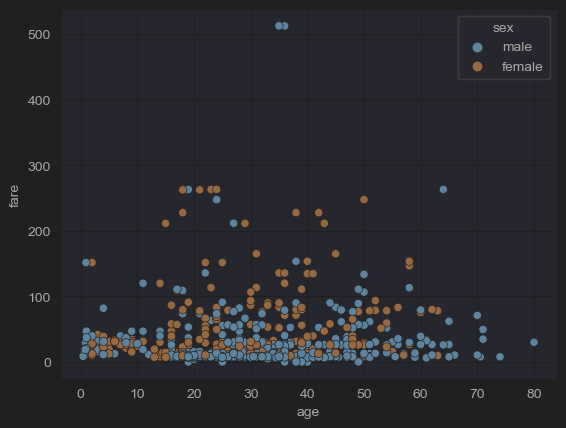
- 위 코드는 기존 코드에 Categorical 데이터인 성별을 서브 분류로 사용하였다.
quantile
- quantile은 데이터를 동등한 부분으로 나누는 값을 의미한다.
- 데이터 세트의 분포에서 특정 위치에 해당하는 값이며, 이 위치는 전체 데이터의 백분위수로 표현한다.
25% quantile (Q1, 1사분위수) : 하위 25%의 데이터가 이 값 이하이고, 상위 75%가 이 값 이상이다.
50% quantile (Q2, 2사분위수) : 짝수 개의 데이터가 있는 경우 중앙에 위치한 두 값의 평균이다. 중앙 값이라고도 불린다.
75% quantile (Q3, 3사분위수) : 하위 75%의 데이터가 이 값 이하이고, 상위 25%가 이 값 이상이다.
# 'fare' 컬럼의 3사분위수(Q3, 하위 75% 지점의 값)를 계산
fare_q3 = df_titanic['fare'].quantile(q=0.75)
# 'fare' 컬럼의 1사분위수(Q1, 하위 25% 지점의 값)를 계산
fare_q1 = df_titanic['fare'].quantile(q=0.25)

# 'fare'의 IQR(Interquartile Range, 사분위수 범위)을 계산
# Q3에서 Q1을 뺀 값으로, 데이터의 중간 50% 범위를 나타낸다.
fare_iqr = fare_q3 - fare_q1

# df_titanic['fare']의 값들이 fare_iqr의 4배한 값안에 들어가는지 검사
condition = df_titanic['fare'] <= 4*fare_iqr
# 검사 범위 안에 들어가는 값으로 새로운 dataframe 선언
new_df_titanic = df_titanic[condition]

sns.scatterplot(x='age', hue='sex', y='fare', data=new_df_titanic)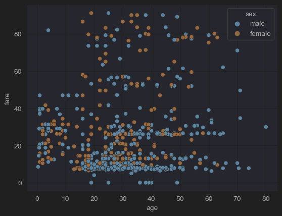
- 위 코드를 통해 기존 plot에 있던 fare가 500이 넘어가는 outlier(이상치)값을 제거했다.
lineplot()
- 시간이나 정렬된 순서가 있는 categorical 데이터를 시각하는데 유용한 라인플롯을 그린다.
- 시간의 연속성이나 categorical 데이터를 직관적으로 보여준다.
data_path = "4.csv"
data = pd.read_csv(data_path)
time_column = data["Time"]
sns.lineplot(data=data, x = "Time", y = "1")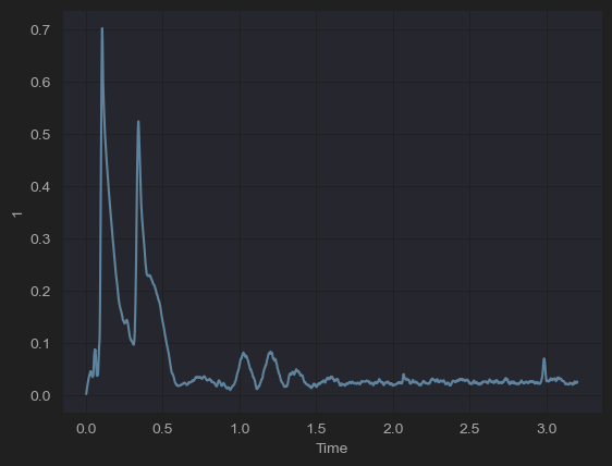
- titanic 데이터는 별도의 시간의 연속성을 나타내는 그래프가 없어서 다른 데이터를 불러와 시각화 했다.
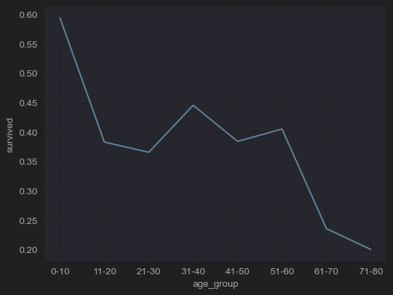
- 나이대에 따른 생존률 추이를 확인할 수 있다.
- titanic 데이터를 다듬어서 위 그림처럼 나이를 clustering 하여 순서가 있는 categorical 데이터를 만들었다.
- lineplot을 이용하여 순서가 있는 categorical 데이터의 추이를 직관적으로 확인할 수 있다.
Categorical Plots
최소한 하나의 데이터가 categorical 데이터일때 시각화에 사용된다.
catplot()
범주형 데이터를 그리는 여러 함수에 접근할 수 있는 figure-level 함수이다.
- countplot, barplot, boxplot, violinplot등 범주형 데이터를 그리기 위한 여러 함수에 접근할 수 있다.
- 다양한 유형의 플롯을 통합된 인터페이스로 생성할 수 있다.
countplot()
막대를 사용하여 각 범주형 구간에서 관측치의 수를 보여준다.
# (2-1) Number of people in each room class
sns.catplot(x='class' ,kind='count', data=df_titanic)
plt.show()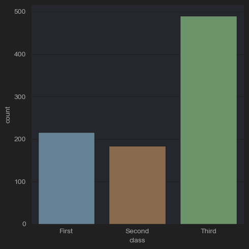
- 클래스별 생존자를 확인할 수 있다.
# (2-2) Number of men, women, and children by room class
sns.catplot(x='class',hue='who', kind='count',data=df_titanic)
plt.show()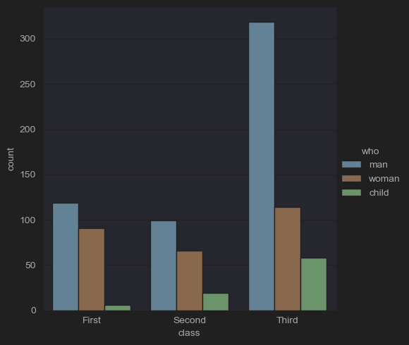
- 클래스별 생존자를 확인하면서 subdivide로 남/녀/아이를 추가로 분석한다.
# (2-3) Number of people in each room class by survival status
sns.catplot(x='class', hue='survived', kind='count', data=df_titanic)
plt.show()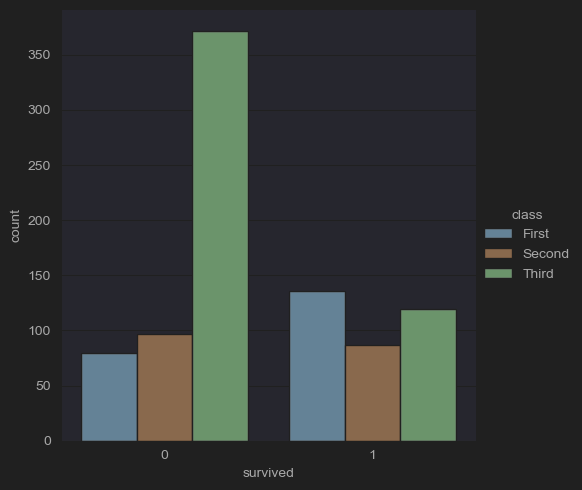
- 클래스별 생존 유무를 파악할 수 있다.
# (2-myself) Number of people in each room class by survival status
sns.catplot(x='survived', hue='class', kind='count', data=df_titanic)
plt.show()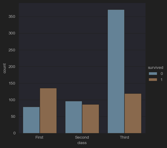
-
생존 유무별 클래스를 파악할 수 있다. 하지만 직접적인 비율을 보기는 힘든데, 그럴경우에 histplot을 이용하면 직접적인 비율 파악이 쉬워진다.(게시글에서 '2-4' 검색)
-
barplot()
범주형 변수의 각 카테고리에 대해 수치형 변수의 평균(또는 다른 추정치)을 오차 막대와 함께 표시한다.
# (3) Average age and deviation by room class
sns.catplot(x='class', y='age', kind='bar', data=df_titanic)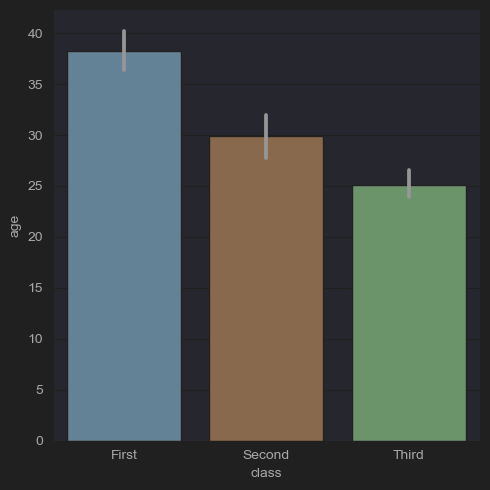
# (4) Proportion of Survivors and Dead (bar vs. pie)
fig, axes = plt.subplots(ncols=2)
df_titanic["survived"].value_counts().plot(kind = "bar", ax=axes[0])
df_titanic["survived"].value_counts().plot(kind = "pie", autopct='%1.1f%%', ax=axes[1])
plt.show()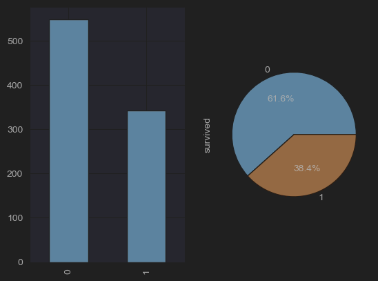
boxplot()
- (picture)
데이터 세트의 사분위수를 사용하여 다른 카테고리에 걸쳐 정량적 데이터의 분포를 보여주며, 이상치(outliers)를 강조 표시한다.
# (5) boxplot
# (5-1) Age distribution of survivors and dead
fig, axes = plt.subplots(ncols=2)
sns.boxplot(x='survived',y='age',data=df_titanic, ax=axes[0])
# (5-2) Age distribution of men, women and children
sns.boxplot(x='who',y='age',data=df_titanic,ax=axes[1])
plt.show()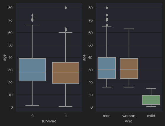
# (5-3) Lab: Fare distribution according to room class
sns.catplot(x='class',y='fare',kind='box',data=df_titanic)
plt.show()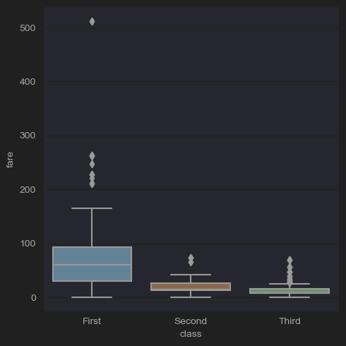
# (5-4) Remove the outliers
fare_q3 = df_titanic['fare'].quantile(q=0.75)
fare_q1 = df_titanic['fare'].quantile(q=0.25)
fare_iqr= fare_q3 -fare_q1
condition = df_titanic['age'] <= 4*fare_iqr
new_df_titanic= df_titanic[condition]
sns.boxplot(data=new_df_titanic, x='survived', y='age')
plt.show()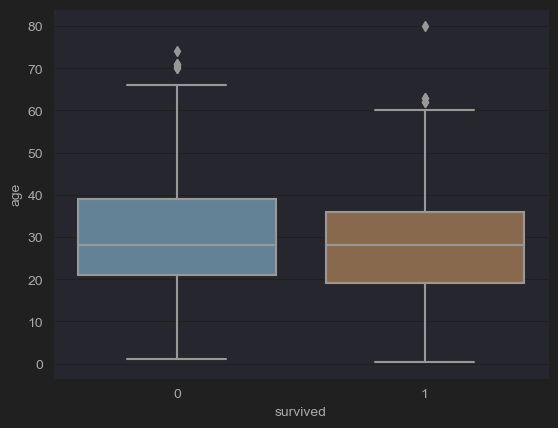
- scatter plot을 찍었을 때와 마찬가지로 outliers를 날린 그림이다.
violinplot()
- (picture)
boxplots과 kernel density plots의 측면을 결합하여 다른 카테고리에 걸쳐 데이터의 분포와 그 확률 밀도를 보여준다.
# (6-1) Age distribution of men, women and children
sns.catplot(x='who',y='age',kind='violin',data=df_titanic)
plt.show()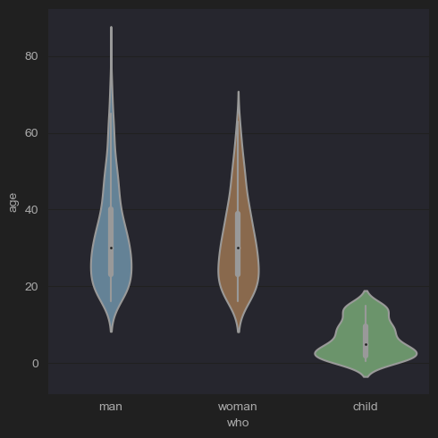
# (6-2) lab: Fare distribution of survivors and dead
sns.catplot(x='survived',y='fare',kind='violin',data=new_df_titanic)
plt.show()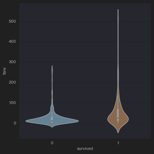
# (6-3) lab: Fare distribution of survivors and dead after removing outliers
fare_q3 = df_titanic['fare'].quantile(q=0.75)
fare_q1 = df_titanic['fare'].quantile(q=0.25)
fare_iqr= fare_q3 -fare_q1
condition = df_titanic['fare'] <= 4*fare_iqr
new_df_titanic= df_titanic[condition]
sns.catplot(x='survived',y='fare',kind='violin',data=new_df_titanic)
plt.show()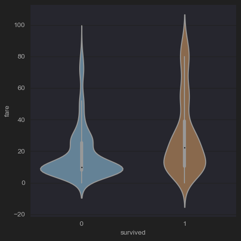
Barplot vs countplot
- barplot()은 범주형 변수와 연속형 변수 사이의 관계를 관찰하고자 할 때 사용된다. - barplot 함수는 각 카테고리에 대한 연속 변수의 평균을 표시(기본설정)하며, 평균 추정치 주변의 불확실성을 보여주는 오차 막대를 포함한다.
- eg. 다양한 학습 그룹(범주형 변수)의 평균 시험 점수(연속형 변수)를 이해하고 싶다면, barplot이 적합하다.
- countplot()은 데이터셋이 범주형이고 각 카테고리에서 발생한 횟수를 단순히 계산하는 barplot의 특별한 경우이다.
- eg. 각 학습 그룹(범주형 변수)의 학생 수를 단순히 계산하고 싶다면, countplot을 사용하면 된다.
Distribution Plots
Distribution plot은 데이터셋의 분포를 시각화하기 위해 설계된 plot이다.
distplot()/histplot()
단변량 데이터셋의 분포를 히스토그램으로 시각화하고, 데이터에 커널 밀도 추정(KDE)을 적용할 수도 있다.
# Distribution of Age
sns.histplot(data=df_titanic, x='age')
plt.show()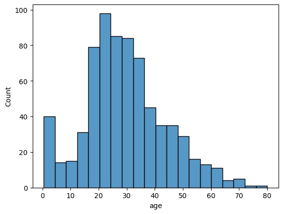
# (2-4) Number of survivors and dead by room class
sns.histplot(x='class', hue='survived', multiple='stack', shrink=.5, data=df_titanic)
plt.show()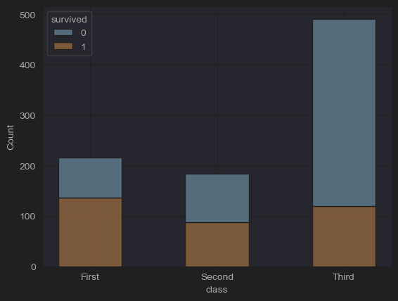
kdeplot()
커널 밀도 추정을 플로팅하는 방법으로, 연속적인 확률 변수의 확률 밀도 함수를 추정한다.
jointplot()
두 변수 간의 이변량(또는 결합된) 관계와 각각의 단변량(또는 한계적) 분포를 별도의 축에서 보여주는 멀티 패널 그림을 생성한다.
# (10) jointplots(fares by ages, -outliers)
sns.jointplot(x='age', y='fare', data=new_df_titanic)
sns.jointplot(x='age', y='fare', hue='sex', data=new_df_titanic)
plt.show()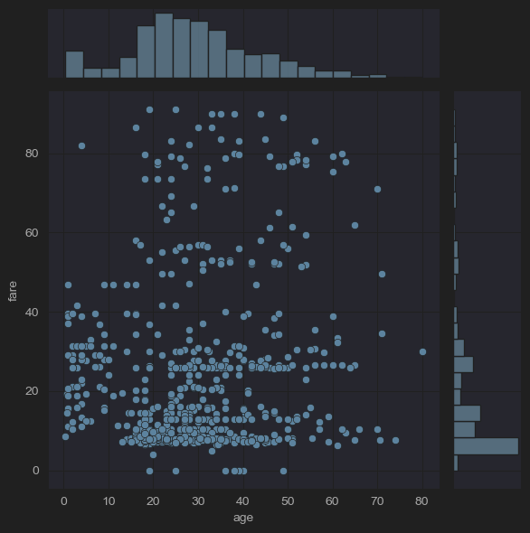
# (10) jointplots(fares by ages, -outliers)
sns.jointplot(x='age', y='fare', kind='hex',data=new_df_titanic)
sns.jointplot(x='age', y='fare', kind='reg',data=new_df_titanic)
plt.show()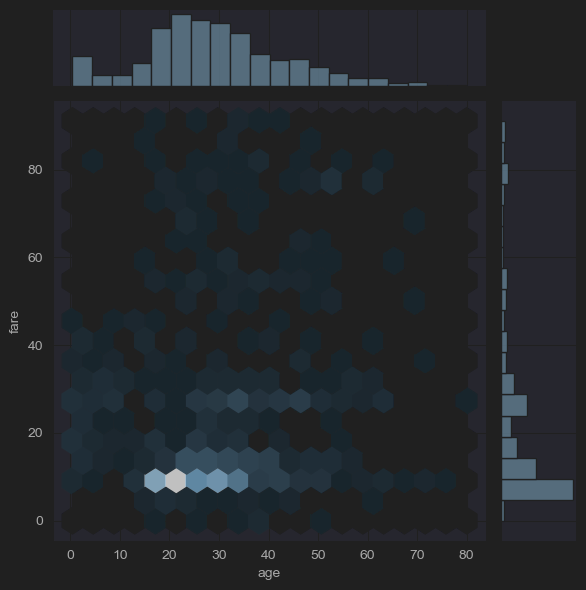
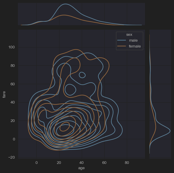
# (10) jointplots(fares by ages, -outliers)
sns.jointplot(x='age', y='fare', hue='sex', kind='hist',data=new_df_titanic)
sns.jointplot(x='age', y='fare', hue='sex', kind='kde',data=new_df_titanic)
plt.show()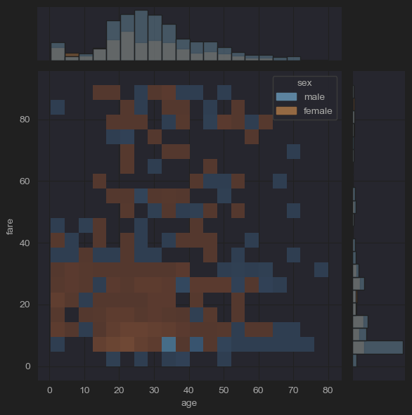
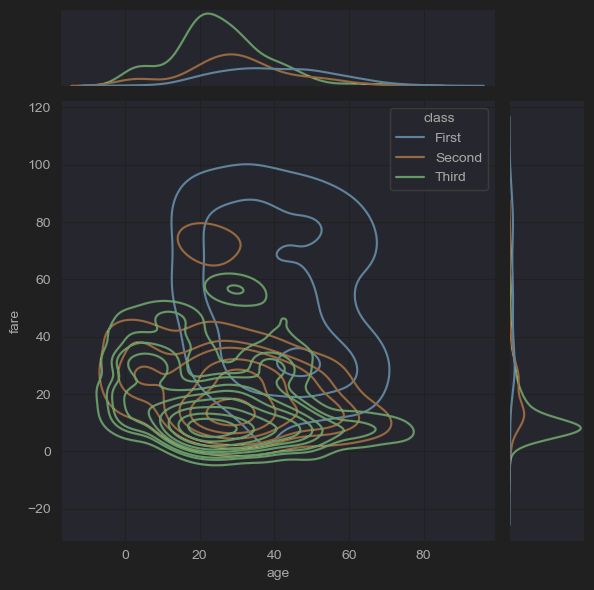
# (10) jointplots(fares by ages, -outliers)
sns.jointplot(x='age', y='fare', hue='who', kind='kde',data=new_df_titanic)
sns.jointplot(x='age', y='fare', hue='class', kind='kde',data=new_df_titanic)
plt.show()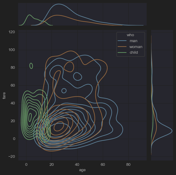
Matrix Plots
매트릭스 플롯은 데이터를 색상 인코딩된 행렬로 플로팅하고, 여러 변수 간의 관계를 시각화하는데 유용하다.
heatmap()
데이터를 색상 인코딩된 행렬로 시각화하여, 변수 간의 상관관계를 보여주거나 혼동 행렬을 표시하는 데 도움이 된다.
clustermap()
hierarchical clustering(계층적 클러스터링)을 수행하고 클러스터링된 데이터의 히트맵을 표시하여, 데이터 구조에 대한 인사이트를 제공한다
Regression Plots
변수들 사이의 선형 관계를 시각화하는 데 사용된다.
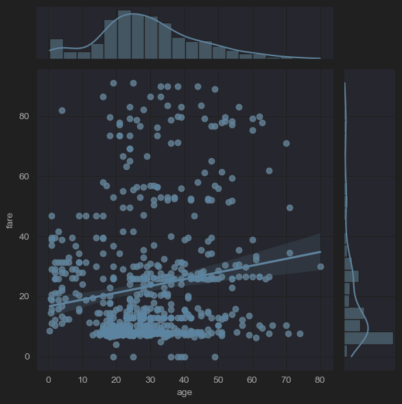
regplot()
산점도를 그리고 그 위에 선형 회귀 모델을 그린다.
# (9) reglot& lmplot
sns.regplot(x='age', y='fare', data=new_df_titanic)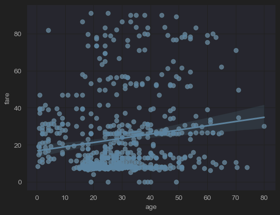
lmplot()
regplot()과 FacetGrid를 결합한 figure-level 함수로, 데이터셋의 다양한 하위 집합에 걸쳐 선형 회귀 모델을 플로팅할 수 있게 해준다.
sns.lmplot(x='age', y='fare', hue='sex',data=new_df_titanic)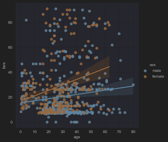
Multi-Plot Grids
Seaborn은 데이터의 다양한 하위 집합을 비교하는 데 유용한 여러 개의 서브플롯을 포함한 그림을 생성하는 함수를 제공한다.
pairplot()
데이터셋 내의 쌍대 관계를 플로팅한다. 기본적으로 이 함수는 데이터 내의 각 변수가 단일 행에 걸쳐 y축에, 단일 열에 걸쳐 x축에 공유되도록 축 그리드를 생성한다.
# (11) pairplots
sns.pairplot(new_df_titanic,
x_vars=['survived','age','fare','class','who','sex'],
y_vars=['survived','age','fare','class','who','sex'],
kind='scatter',
height=1.5)
plt.show()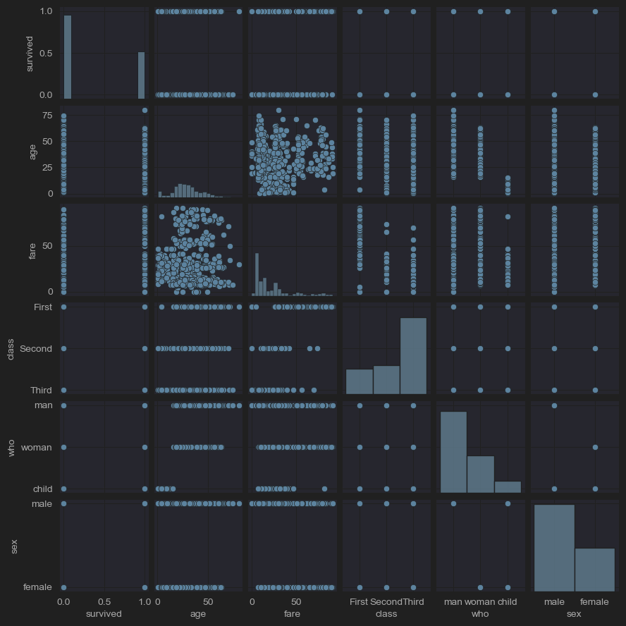
# (11) pairplots
sns.pairplot(new_df_titanic,
x_vars=['survived','age','fare'],
y_vars=['survived','age','fare'],
kind='scatter',
hue='sex',
height=1.5)
plt.show()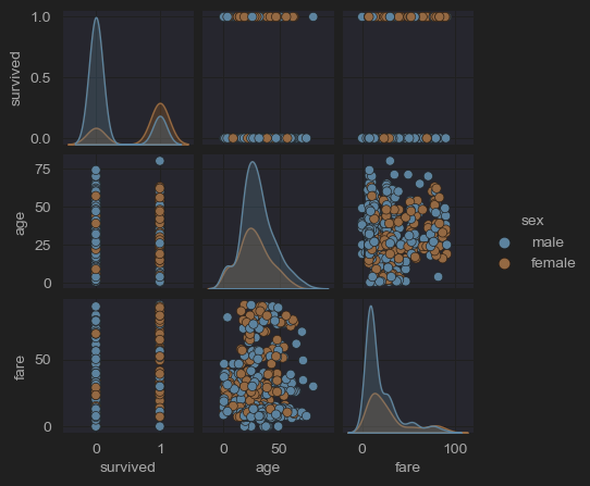
# (11) pairplots
sns.pairplot(new_df_titanic,
x_vars=['survived','age','fare'],
y_vars=['survived','age','fare'],
kind='hist',
hue='sex',
height=1.5)
plt.show()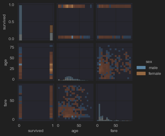
# (11) pairplots
sns.pairplot(new_df_titanic,
x_vars=['survived','age','fare'],
y_vars=['survived','age','fare'],
kind='kde',
hue='class',
height=1.5)
plt.show()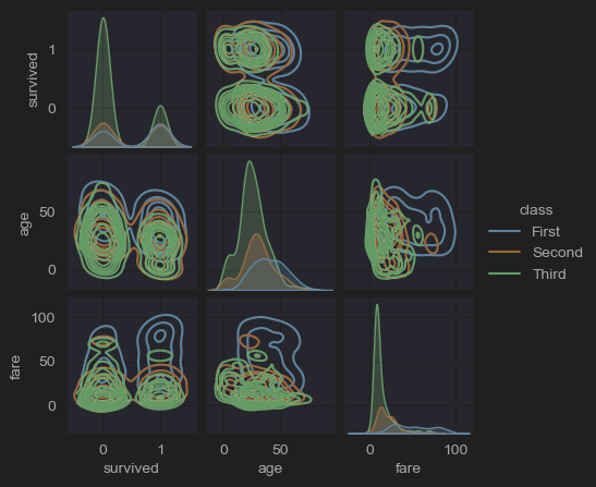
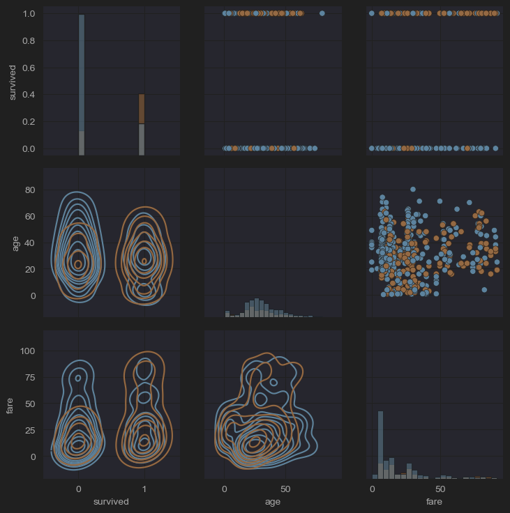
FacetGrid, PairGrid, JointGrid
이들은 다른 변수들에 대한 조건을 기반으로 다중 플롯 그리드를 생성할 수 있는 클래스이다. PairGrid는 PairPlot의 불편함을 해소하기 위해 만들어졌으며, 가장 큰 차이점은 각 시각화 도구를 대각선의 상단과 하단에 적용할 수 있다는 것이다.
- (pairplot, pairgrid 비교 사진)
# (12) pairgrid()
grid = sns.PairGrid(new_df_titanic[['survived','age','fare']])
grid.map_diag(sns.histplot)
grid.map_lower(sns.kdeplot)
grid.map_upper(sns.scatterplot)
plt.show()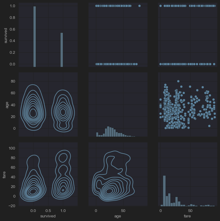
# (12) pairgrid()
grid = sns.PairGrid(new_df_titanic[['survived','age','fare','sex']],hue='sex')
grid.map_diag(sns.histplot)
grid.map_lower(sns.kdeplot)
grid.map_upper(sns.scatterplot)
plt.show()