웹 브라우저 창에 문서가 표시되는 순간 사용자는 눈치 채지 못하지만 브라우저는 HTML소스를 한 줄씩 읽으면서 화면에 내용을 표시하고 관련된 객체를 만들어 낸다.
- 주로 사용하는 객체
| 종류 | 설명 |
|---|---|
| window | 브라우저 창이 열릴 때마다 하나씩 만들어짐, 창의 요소중 최상위 요소 |
| document | body 태그를 만나면 만들어짐 html 문서 정보가 들어있다 |
| navigator | 현재 사용하는 브라우저 정보 |
| history | 현재 창에서 사용자의 방문 기록 저장 |
| location | 현재 페이지의 URL정보 |
| screen | 현재사용하는 화면 정보 |
window 객체
- open()
window.open("notice.html","", "width=500, height=400");// 객체 위치 지정,, 팝업 차단된 브라우저 알림 창 표시
var blocked = false;
function openPopup() {
var newWin = window.open("notice.html", "pop", "width=500, height=400");
if (newWin == null) {
alert("팝업이 차단되어 있습니다. 팝업 차단을 해제해 주세요.")
}
newWin.moveBy(100,100);
}// 창 닫기
<button onclick="javascript:window.close();">닫기</button>navigator 객체
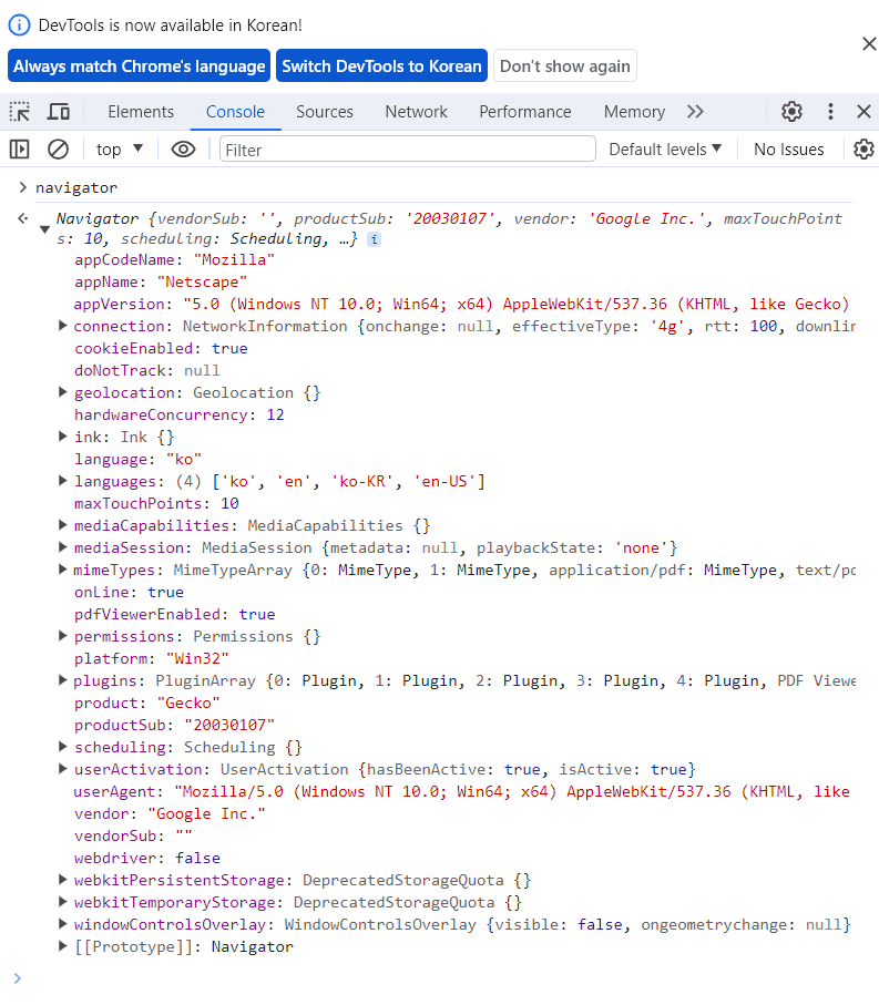
웹 브라우저가 다양해짐에 따라 모든 사용자의 웹 브라우저에서 똑같이 동작하는 웹 문서를 개발할 필요성이 생겼다. navigator 객체는 웹 브라우저에 대한 다양한 정보를 가지고 있어 그 정보를 기반으로 개발하는데 사용할 수 있다.
- navigator는 개발자 모드에서 console 창에 navigator라고 입력하면 확인할 수 있다.
history 객체
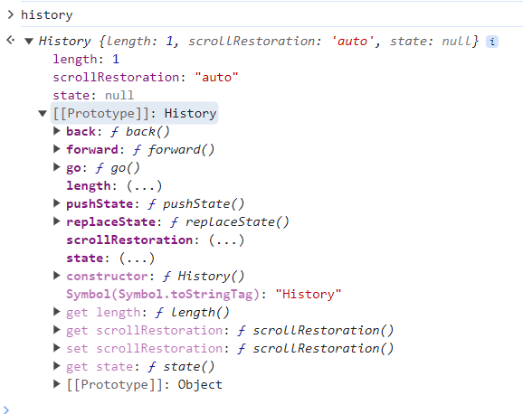
브라우저에서 '뒤로'나 '앞으로' 또는 주소 표시줄에 입력해서 방문한 사이트 주소가 배열 형태로 history 객체에 저장된다. history 객체는 읽기 전용이다
- navigator와 마찬가지로 콘솔창에서 확인할 수 있다.
location 객체
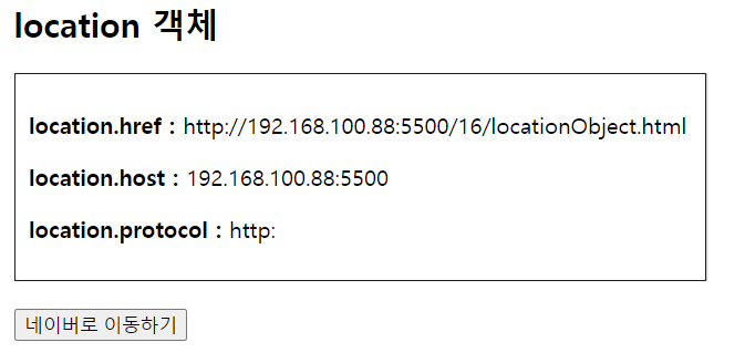
브라우저의 주소 표시줄과 관련, location 객체에는 현재 문서의 URL 주소 정보가 들어 있는데 이 정보를 편집하면 현재 브라우저 창에서 열어야 할 사이트나 문서를 지정할 수 있다.
새로 고침과 같은 역할을 하는 reload()나 현재 창에 다른 사이트나 문서를 보여 주는 replace() 메서드를 많이 사용함
사이트 위치 고정하기
<!DOCTYPE html>
<html lang="ko">
<head>
	<meta charset="UTF-8">
	<meta name="viewport" content="width=device-width, initial-scale=1.0">
	<title>location Object</title>
	<style>
		#container {
			width:500px;
			margin:10px auto;
		}
		#display {
			margin-top:10px;
			padding:10px;
			border:1px solid #222;
			box-shadow: 1px 0 1px #ccc;
		}
		p {
			font-size:1em;
		}
		button {
			margin-top:20px;
			text-align:center;
		}
	</style>
</head>
<body>
	<div id="container">
		<h2>location 객체 </h2>
		<div id="display">
			<script>
				document.write("<p><b>location.href : </b>" + location.href + "</p>");
				document.write("<p><b>location.host : </b>" + location.host + "</p>");
				document.write("<p><b>location.protocol : </b>" + location.protocol + "</p>");
			</script>
		</div>
		<button onclick="location.replace('http://www.naver.com')">네이버로 이동하기</button>
</div>
</body>
</html>
screen 객체
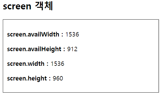
사용자의 화면 크기나 정보를 알아낼 때 screen 객체를 사용
screen객체로 화면의 너비와 높이 알아내기 예제
<!DOCTYPE html>
<html lang="ko">
<head>
	<meta charset="UTF-8">
	<meta name="viewport" content="width=device-width, initial-scale=1.0">
	<meta http-equiv="X-UA-Compatible" content="ie=edge">
	<title>location Object</title>
	<style>
		#container {
			width:400px;
			margin:10px auto;
		}
		.display {
			margin-top:10px;
			padding:10px;
			border:1px solid #222;
			box-shadow: 1px 0 1px #ccc;
		}
		p {
			font-size:1em;
		}
	</style>
</head>
<body>
	<div id="container">
		<h2>screen 객체 </h2>
		<div class="display">
			<script>
				document.write("<p><b>screen.availWidth : </b>" + screen.availWidth + "</p>");
				document.write("<p><b>screen.availHeight : </b>" + screen.availHeight + "</p>");
				document.write("<p><b>screen.width : </b>" + screen.width + "</p>");
				document.write("<p><b>screen.height : </b>" + screen.height + "</p>");
			</script>
		</div>
</div>
</body>
</html>

Sang9riG9ru