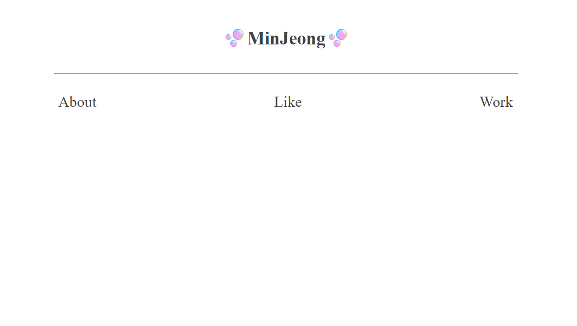
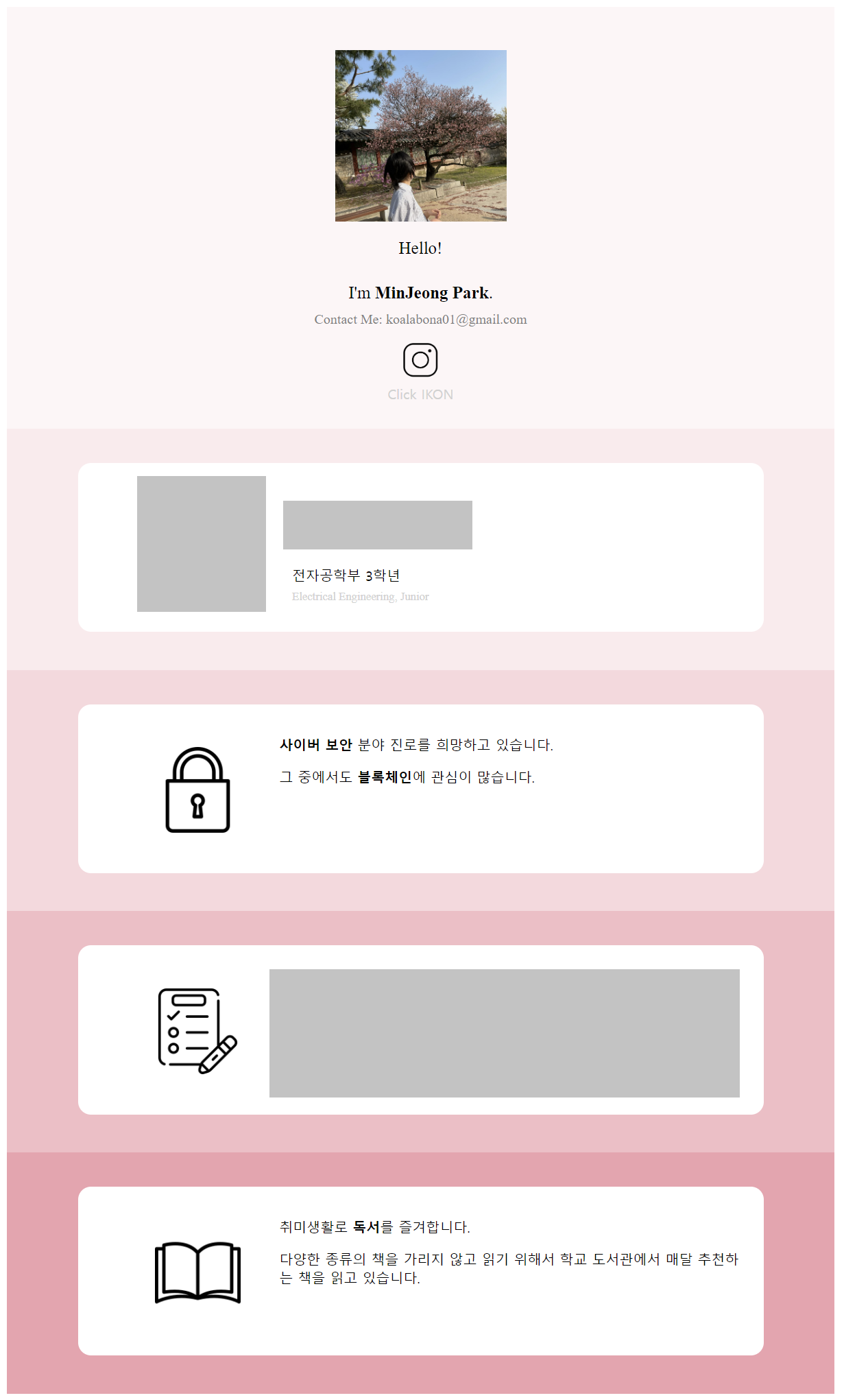
페이지를 공개하고 싶은데 학교 이름이랑 너무 개인적인 정보들이 포함되어 있어서 이미지로라도 올려봅니다.
그때는 거의 독학으로 html을 했던 거라서 정말 주먹구구식으로 만들었던 기억이 납니다. 아쉬웠던 점은 다음 2개를 꼽을 수 있었습니다.
- 모바일로 보면 화면 비율이 맞지 않은 것
- 한 페이지 안에 모든 내용을 다 넣은 것
이번 주 TIL 챌린지의 목표는 2번 문제를 해결하여 페이지가 여러 개가 있는 자기소개 페이지 제작이 목표입니다..! (1번 문제는 추후에 차차 해결하는 걸로..)
이번 교육과정에서 3주 전에 html을 사용해서 영화관 예매 페이지를 만들었던 기억이 나시나요?! 그때는 MySQL이 주요내용이었지만, 이번에는 아쉽게도 데이터베이스를 쓸 일이 없어 HTML 내용만 참고하도록 하겠습니다. 그때 배웠던 문법들을 사용해서 자기소개 페이지를 ver.2024년 으로 다시 만들어 봅시다. 🤘 (저걸 만들었던 게 벌써 2년 전이 됐으니 내용도 꽤 많이 바꿔야겠네요.)
페이지 구상
우선 페이지 구성을 어떻게 할 지 생각해야 합니다.
사실 이게 제일 문제입니다. 저는 디자인에 재능이 정~~~~~~말 없기 때문이죠.. 😳
괜히 번쩍번쩍한 디자인과 기능을 시도했다가 중간에 포기할까봐 되도록 심플하게 만들기로 했습니다. 이번 글은 정식으로 사용할 포트폴리오를 만들기보다는 CSS와 HTML을 복습하는 것에 더 큰 의미가 있기 때문입니다.
Home 화면
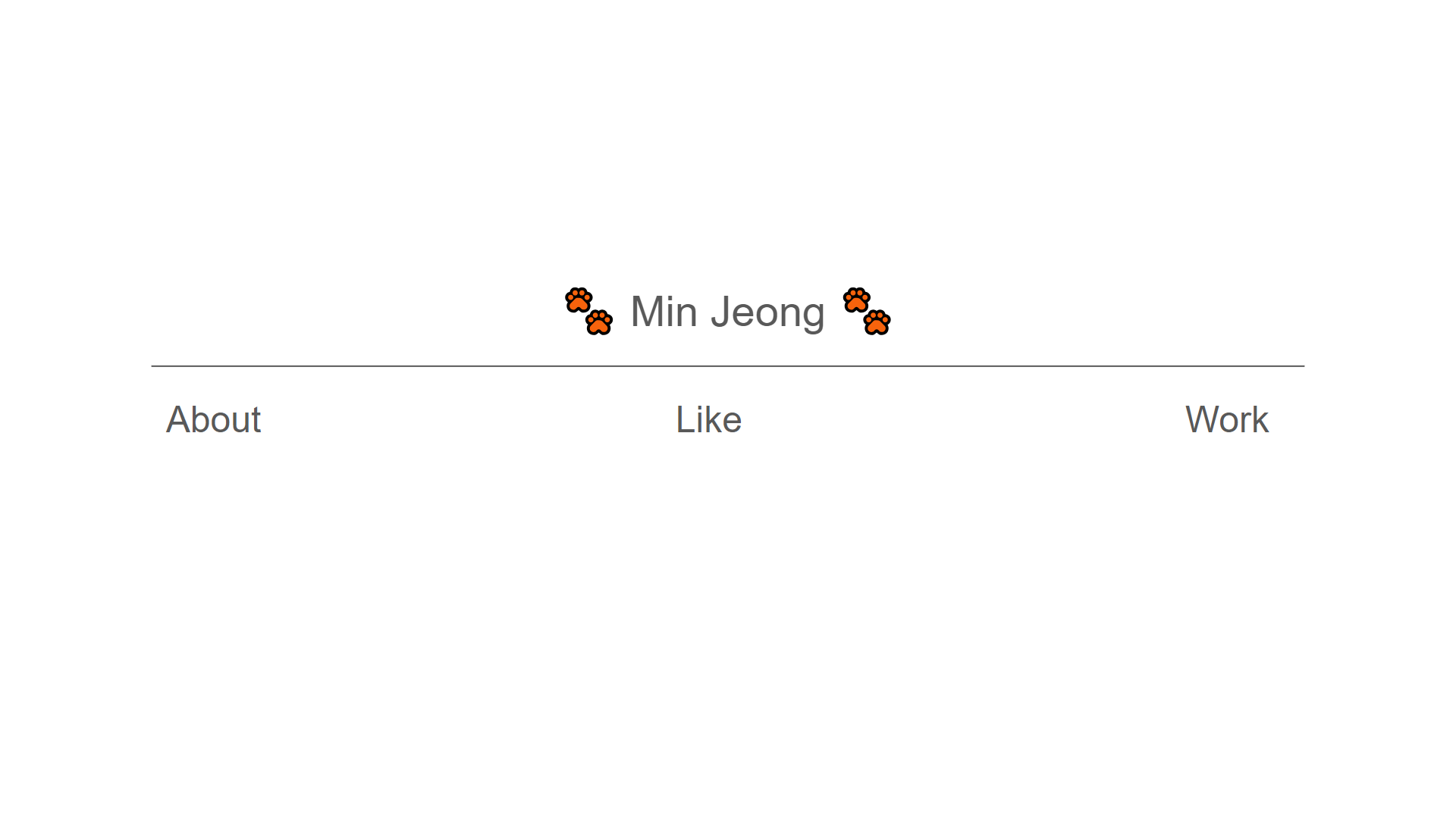
Home 화면은 페이지에 들어가자마자 보이는 화면으로, About / Like / Work 페이지로 이동할 수 있게 합니다. 각 글자를 누르면 해당 페이지로 이동합니다.
About 화면
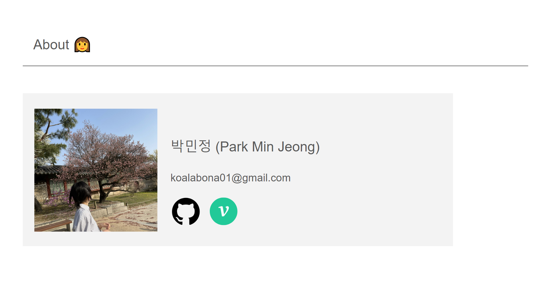
About 화면은 간단한 자기소개를 적어놓은 곳입니다.
Gihub와 Velog 로고를 누르면 해당 사이트로 바로 이동하게 됩니다.
Like 화면
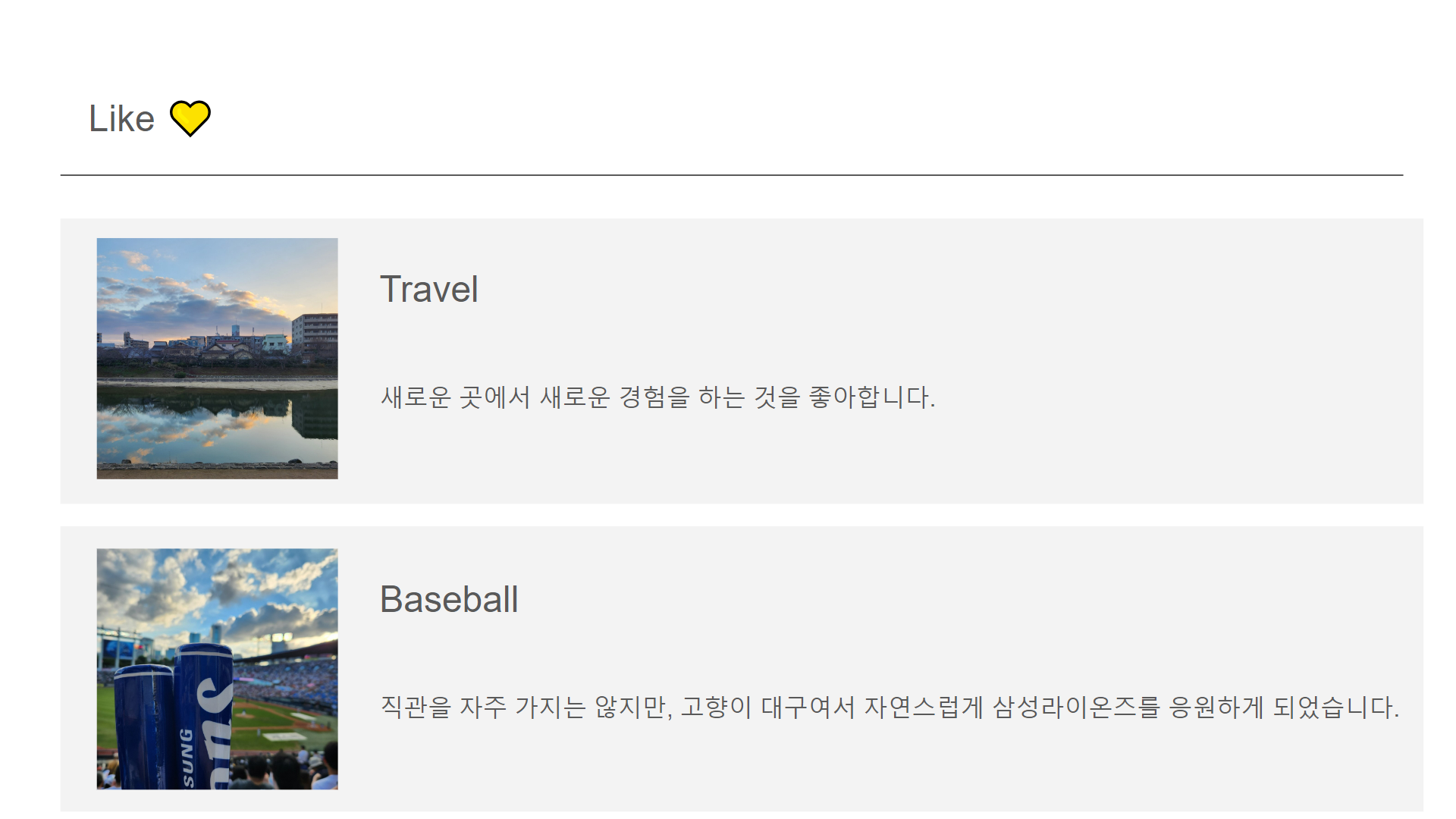
Like 화면은 제가 좋아하는 것들을 모아놓은 곳입니다.
Work 화면
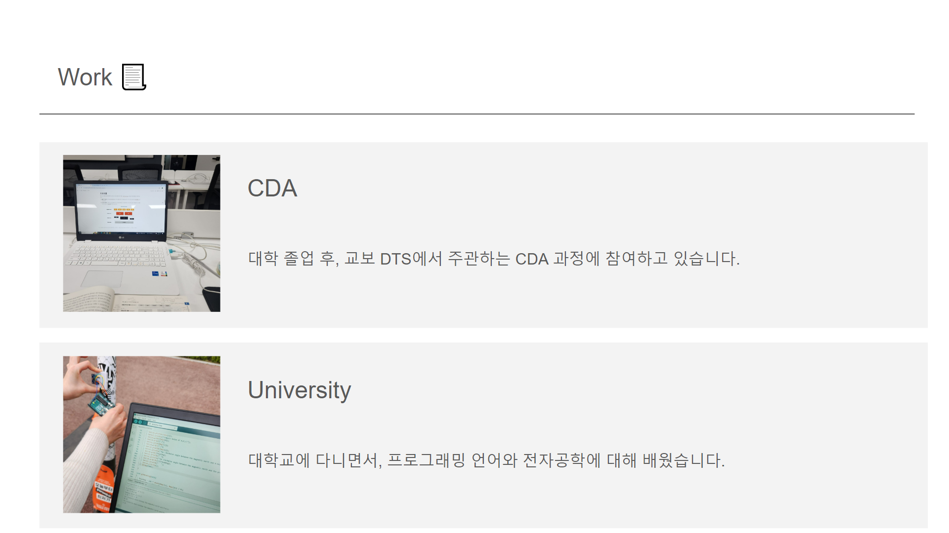
Work 화면은 최근 제가 한 활동들에 대한 정보를 적어놓은 곳입니다.
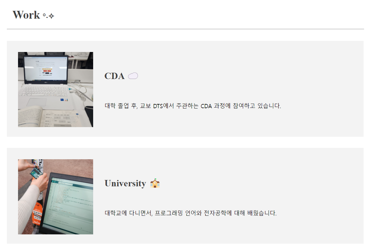
세부적인 내용을 적기에는 너무 많아서 CDA와 대학 두 가지만 간단하게 적어놓았습니다.
페이지 구상이 대략 끝났으니 이제 정말 코드를 써보도록 하겠습니다!!
CSS 코드 작성
웹페이지 디자인을 위해서는 CSS 파일 코드를 작성해야 합니다.
아래는 전체 CSS 코드입니다.
.title0{
    position: relative;
    top: 40px;
    color: #414141;
    font-family:'Times New Roman', Times, serif;
    font-size: 30;
    text-align: center;
}

.title{
    position: relative;
    top: 40px;
    left: 45px;
    font-family:'Times New Roman', Times, serif;
    color: #414141;
    font-size: 30;
}

hr{
    position: relative;
    margin-left : 30;
    top: 30px;
    width: 950px;
}

.profile{
    position: relative;
    top:-5px;
}

.graybox{
    position: relative;
    top: 30px;
    background-color: #F3F3F3;
    height: 35vh;
    padding: 30;
    margin: 30;
    width: 950px;
    box-sizing: border-box;
}

/* 박민정 제목*/
.smalltitle1{
    position: relative;
    top: -200px;
    left: 220px;
    font-size: 25;
}

/* 소제목 */
.smalltitle2{
    position: relative;
    top: -180px;
    left: 230px;
    font-size: 25;
    font-family:'Times New Roman', Times, serif;
    color: #414141;
}

.text2{
    position: relative;
    top: -220px;
    left: 223px;
    font-size: 15;
    font-family:'Times New Roman', Times, serif;
}

.text3{
    position: relative;
    top: -150px;
    left: 230px;
    font-size: 15;
}

.sticker1{
    position: relative;
    top: -225px;
    left: 150px;
}

.sticker2{
    position: absolute;
    top: -130px;
    left: 720px;
    z-index: 1;
}

.sticker3{
    position: absolute;
    top: 180px;
    left: 800px;
}

.speech{
    position: absolute;
    transform: rotate(20deg);
    top: 117px;
    left: 295px;
}

.logo1{
    position: absolute;
    top: 175px;
    left: 350px;
}

.logo2{
    position: absolute;
    top: 175px;
    left: 395px;
}

.receipt{
    position: absolute;
    top: -100px;
    left: 630px;
    z-index: 0;
}

.hr2{
    margin: 0 auto;
    top:50px;
    color: #414141;
    width: 50%;
}

.bu_about{
    position: relative;
    border: 0;
    cursor: pointer;
    background-color: transparent;
    top: 80px;
    left: 25%;
    color: #414141;
    font-family:'Times New Roman', Times, serif;
    font-size: 25;
}

.bu_like{
    position: relative;
    border: 0;
    cursor: pointer;
    background-color: transparent;
    top: 80px;
    left: 43%;
    color: #414141;
    font-family:'Times New Roman', Times, serif;
    font-size: 25;
}

.bu_work{
    position: relative;
    border: 0;
    cursor: pointer;
    background-color: transparent;
    top: 80px;
    left: 61%;
    color: #414141;
    font-family:'Times New Roman', Times, serif;
    font-size: 25;
}
HTML 코드 작성
HTML에서는 버튼과 페이지를 연결해야 합니다.
인터넷에 있는 다른 분들이 써놓은 코드를 참고하려고 해도 구상 레이아웃이 너무 달라서 오히려 제가 처음부터 쓰는 게 빠를 거라고 생각해서 간단한 문법만 검색하며 작성해보기로 했습니다.
Home 화면
위의 초안을 기반으로 Home 화면을 만들어 보겠습니다.
- 제목
- 클릭하면 다른 페이지로 이동하는 About / Like / Work 버튼 3개
Home 화면에서는 이렇게가 필요합니다.
다음은 Home 화면의 HTML 코드입니다.
<html>

    <head>
    <link rel="stylesheet" href="design.css">
        <title>Introduce Me</title>
        <meta charset="UTF-8">
    </head>

    <body>
        <h2><p class = "title0" style="font-size: 30px">🫧MinJeong🫧</p></h2>

        <hr class = "hr2">
            <button type="button" class="bu_about" onclick="location.href='about.html'">About</button>
            <button type="button" class="bu_like" onclick="location.href='like.html'">Like</button>
            <button type="button" class="bu_work" onclick="location.href='work.html'">Work</button>

    </body>

</html>
다음은 최종 완성된 페이지의 화면입니다.
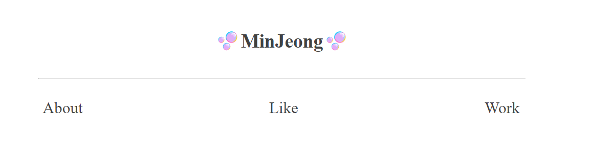
About, Like, Work 버튼을 누르면 각각의 페이지로 이동합니다.
About 화면
위의 초안을 기반으로 About 화면을 만들어 보겠습니다.
About 화면에 포함시켜야 할 것들은 다음과 같습니다.
- About 제목
- 회색 박스
- 프로필 사진
- 자기소개 내용
- 깃허브, 벨로그 아이콘 (사이트로 연결)
다음은 About 화면의 HTML 코드입니다.
<html>
    <head>
        <link rel="stylesheet" href="design.css">
        <h2><p class = "title" style="font-size: 30px">About Me <span style="font-size: 20px">°˖✧</span></p></h2>

        <hr/>
    </head>
    <body>
        <div class="graybox">
            <div class = "profile"><img src = "./profile.jpg"  width="200px"></div>
            <p class="smalltitle1"><strong>박민정 (Park MinJeong)</strong></p>
            <p class="text2">koalabona01@gmail.com</p>


            <div class = "speech"><img src="./speech.png"  width="170px"></div>
            <div class = "sticker1"><img src="./sticker1.png"  width="150px"></div>

            <div class = "sticker3"><img src="./sticker3.png"  width="200px"></div>
            <div class = "sticker2"><img src="./sticker2.png"  width="100px"></div>
            <div class = "receipt"><img src="./receipt.png"  width="300px"></div>
            <a class = logo1 href = "https://github.com/MMinjeong"><img src="./github.png"  width="30px"></a>
            <a class = logo2 href = "https://velog.io/@koalabona01/posts"><img src="./velog.png"  width="30px"></a>
        </div>
    </body>
</html>
다음은 최종 완성된 페이지의 화면입니다.
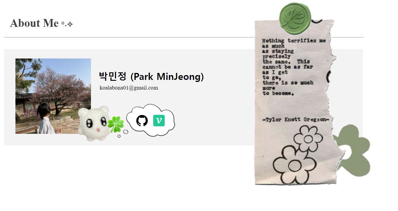
하다보니까 뭐가 많이 변했습니다..
친구랑 같이 하다 보니 욕심이 생겨서 그렇게 됐네요..🤔
웹페이지로 다꾸하는 기분으로 한 번 만들어 봤습니다.
다꾸처럼 하다 보니 어느 이미지가 앞으로 오고, 어느 이미지가 뒤로 가는지가 중요해서 CSS에서 z-index라는 속성을 새롭게 사용해봤습니다. z-index 수치가 큰 것부터 앞에 배치됩니다.
Like 화면
위의 초안을 기반으로 Like 화면을 만들어 보겠습니다.
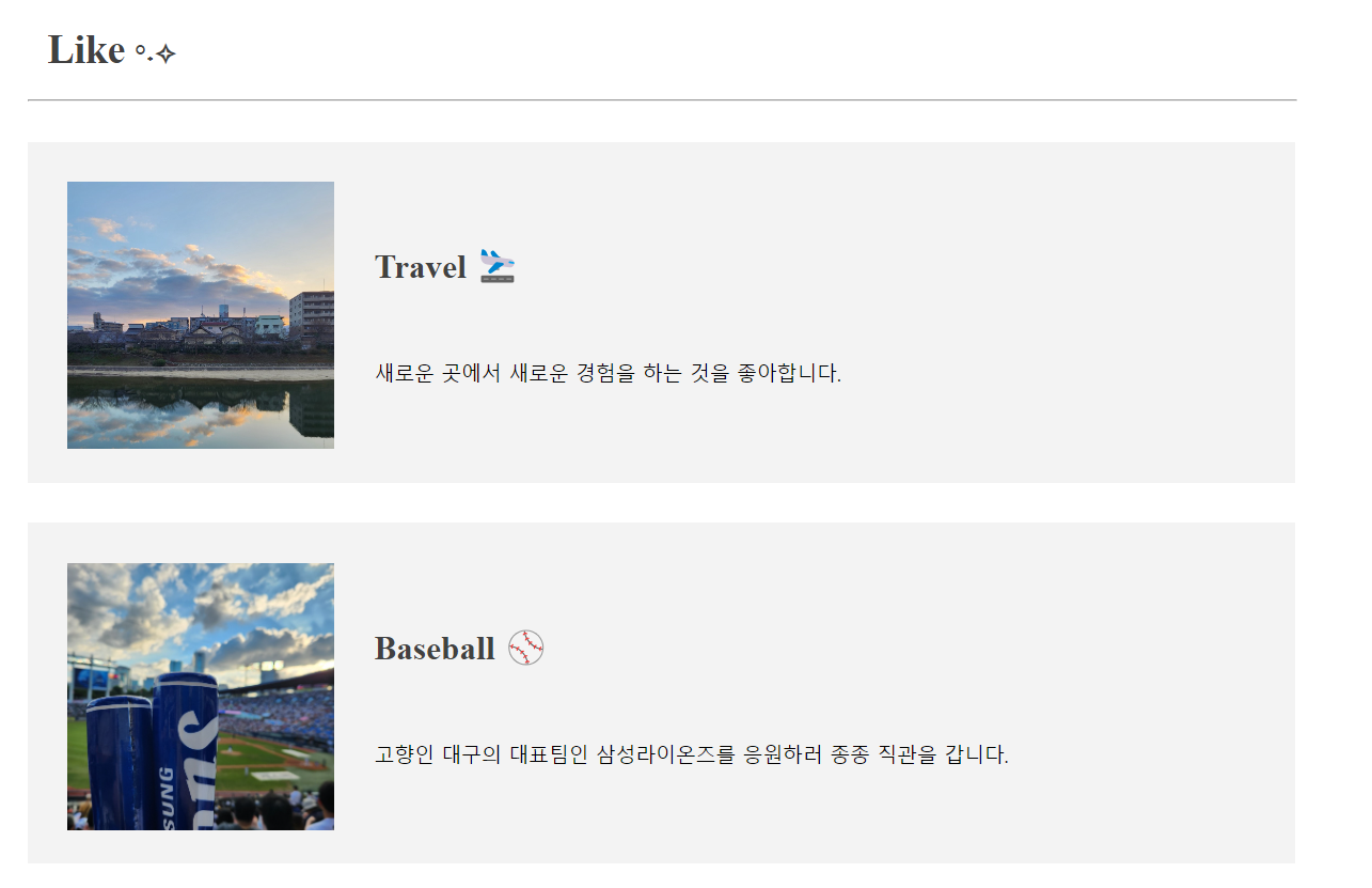
Like와 Work 페이지는 둘 다 같은 위치에 사진, 소제목, 내용을 넣기 때문에 특별히 더 필요한 것은 없습니다.
다음은 Like 화면의 HTML 코드입니다.
<html>
    <head>
        <link rel="stylesheet" href="design.css">
        <h2><p class = "title" style="font-size: 30px">Like <span style="font-size: 20px">°˖✧</span></p></h2>

        <hr/>
    </head>
    <body>

        <div class="graybox">
            <div><img src = "./travel.jpg"  width="200px"></div>
            <p class="smalltitle2"><strong>Travel 🛬</strong></p>
            <p class="text3">새로운 곳에서 새로운 경험을 하는 것을 좋아합니다.</p>
        </div>

        <div class="graybox">
            <div><img src = "./baseball.jpg"  width="200px"></div>
            <p class="smalltitle2"><strong>Baseball ⚾</strong></p>
            <p class="text3">고향인 대구의 대표팀인 삼성라이온즈를 응원하러 종종 직관을 갑니다.</p>
        </div>

    </body>
</html>
다음은 최종 완성된 페이지의 화면입니다.
Work 화면
위의 초안을 기반으로 Work 화면을 만들어 보겠습니다.
다음은 Work 화면의 HTML 코드입니다.
<html>
    <head>
        <link rel="stylesheet" href="design.css">
        <h2><p class = "title" style="font-size: 30px">Work <span style="font-size: 20px">°˖✧</span></p></h2>

        <hr/>
    </head>
    <body>

        <div class="graybox">
            <div><img src = "./cloud.jpg"  width="200px"></div>
            <p class="smalltitle2"><strong>CDA ☁️</strong></p>
            <p class="text3">대학 졸업 후, 교보 DTS에서 주관하는 CDA 과정에 참여하고 있습니다.</p>
        </div>

        <div class="graybox">
            <div><img src = "./university.jpg"  width="200px"></div>
            <p class="smalltitle2"><strong>University 🏫</strong></p>
            <p class="text3">대학교에 다니면서, 프로그래밍 언어와 전자공학에 대해 배웠습니다.</p>
        </div>

    </body>
</html>
다음은 최종 완성된 페이지의 화면입니다.
완성

https://mminjeong.github.io/cda_profile/main.html
최종 완성 링크 입니다!
PC 환경에서의 접속을 권장드립니다. (제작자의 능력 부족으로 모바일에서는 깨집니다..)
😭
하면서 느꼈던 점
-
CSS 코드에서의
position:relative/position:absolute차이점을 잘 몰라서 위치 잡는 데 시간을 많이 소모함 -
좀 더 쉽고 빠르게 코드를 쓸 수 있는 방법이 있었을텐데 노가다로 하느라고 코드가 더러워지고 시간이 많이 걸렸음
-
그래도 2년 전에 했던 것보다는 웹페이지 같은 느낌이 들긴 함 😏
➕
추후 개선 사항
-
모바일에서 접속할 때 깨지지 않게 만들고 싶음
-
버튼을 클릭하거나 마우스 커서를 갖다댔을 때 움직이는 애니메이션을 넣고 싶음
글로벌소프트웨어캠퍼스와 교보DTS가 함께 진행하는 챌린지입니다.