border-style
 border-style : none / dotted / dashed / solid /
 double / groove / ridge / inset / outset;
border-width
border[-위치]-width : 테두리 두께;
border-color
border[-위치]-color : 테두리 색상;
border :
 border[-위치] : 두께 스타일 색상;
 => 색상 생략가능(생략시 글자색으로 통일)
border -radius
 border[-위아래][-좌우]-radius : 숫자값;
 => 위치 생략 시, 사방이 둥글게됨.
box-shadow
box-shadow : 가로거리(x) 세로거리(y) 흐림정도 번짐정도 색상;
<style>
div{
width : 100px;
height : 100px;
border-width : 3px;
margin : 15px;
}
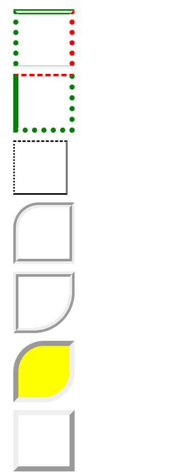
#test1{
border-style: dotted;
border-width: 10px;
border-color: green;
border-top-style: double;
border-right-color : red;
border-bottom-width: 1px;
}
#test2{
border : 10px dotted green;
border-left-style: solid;
border-top : 5px dashed red;
}
#test3{
border-style : dashed double solid dotted;
}
#test4{
border-width : 10px;
border-style : groove;
border-top-left-radius : 50px;
}
#test5{
border-width : 10px;
border-style : ridge;
border-bottom-right-radius : 80px;
}
#test6{
border-width: 10px;
border-style : inset;
border-top-left-radius : 60px;
border-bottom-right-radius : 60px;
background-color: yellow;
}
#test7{
border-width : 10px;
border-style : outset;
}
#test8{
border-style : solid;
border-radius : 50px;
}
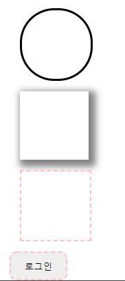
#test9{
box-shadow : 5px 5px 10px 5px gray;
}
#test10{
border : 2px dashed pink;
}
#btn{
border : 2px dashed pink;
padding : 10px 20px;
border-radius : 10px
}
#btn:hover{
background-color: gray;
cursor: pointer;
}
</style>
