Python 공부 기록-28
Plotly tick(눈금)/ tick 레이블 표시 설정하기
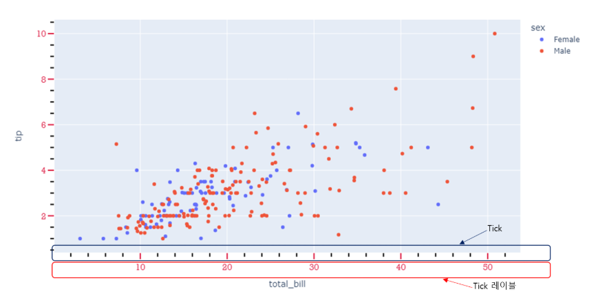
Plotly의 tick 표시방법, tick 스타일 지정 방법, tick레이블 스타일 지정 방법, tick레이블 삭제 방법에 대해 알아봅니다.
tick 기본 생성 및 위치 지정
plotly 에서는 눈금을 표시 하지 않는 것이 디폴트 값으로 지정되어 있습니다. 눈금을 추가하기 위해선 아래의 코드를 추가해야 합니다.
fig.update_xaxes(ticks="위치 입력")
fig.update_yaxes(ticks="위치 입력")
[사용 함수]
- fig.update_xaxes() : x축 tick을 업데이트 할떄 사용
- fig.update_yaxes() : y축 tick을 업데이트 할때 사용
[함수 input 내용]
- ticks="inside" or "outside"
- "inside" : 눈금을 그래프 안쪽으로 생성합니다.
- "outside" : 눈금을 그래프 바깥쪽으로 생성합니다.
예시)
import plotly.express as px
#데이터 불러오기
df = px.data.iris()

# Figure 생성
fig = px.scatter(df, x="sepal_width", y="sepal_length", facet_col="species")

# 눈금 생성
fig.update_xaxes(ticks="outside")
fig.update_yaxes(ticks="inside")

fig.show()
실행 결과
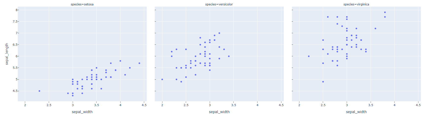
헌데 y 축 눈금이 3개의 Trace에 모두 생성되었습니다. 이럴경우 가시성을 높이기 위해 한가지 그래프만 선택해서 눈금 추가가 가능합니다.
import plotly.express as px
#데이터 불러오기
df = px.data.iris()
# Figure 생성
fig = px.scatter(df, x="sepal_width", y="sepal_length", facet_col="species")

# 눈금 생성
fig.update_xaxes(ticks="outside")
fig.update_yaxes(ticks="inside", col=1)

fig.show()
실행 결과
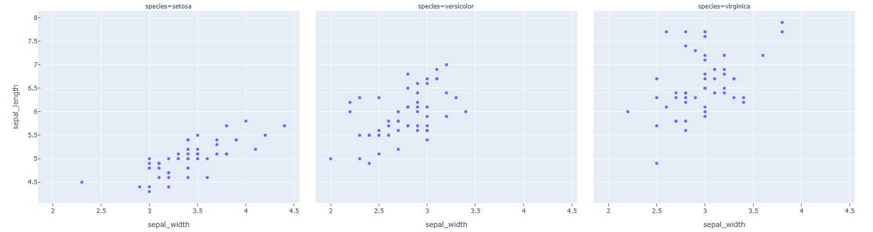
눈금을 추가하고자 하는 Trace의 index를 col = 을 통해 지정하면 해당 Trace 만 눈금이 생성됩니다. 왼쪽부터 차례로 1,2,3 의 index를 갖게 됩니다.
tick 간격 지정
fig.update_xaxes(dtick=간격 입력)
fig.update_yaxes(dtick=간격 입력)
[사용 함수]
- fig.update_xaxes() : x축 tick을 업데이트 할떄 사용
- fig.update_yaxes() : y축 tick을 업데이트 할때 사용
[함수 input 내용]
- dtick = 눈금 간격
예제)
import plotly.express as px
#데이터 불러오기
df = px.data.iris()
# Figure 생성
fig = px.scatter(df, x="sepal_width", y="sepal_length", facet_col="species")

# 눈금 생성 + 눈금 간격 지정
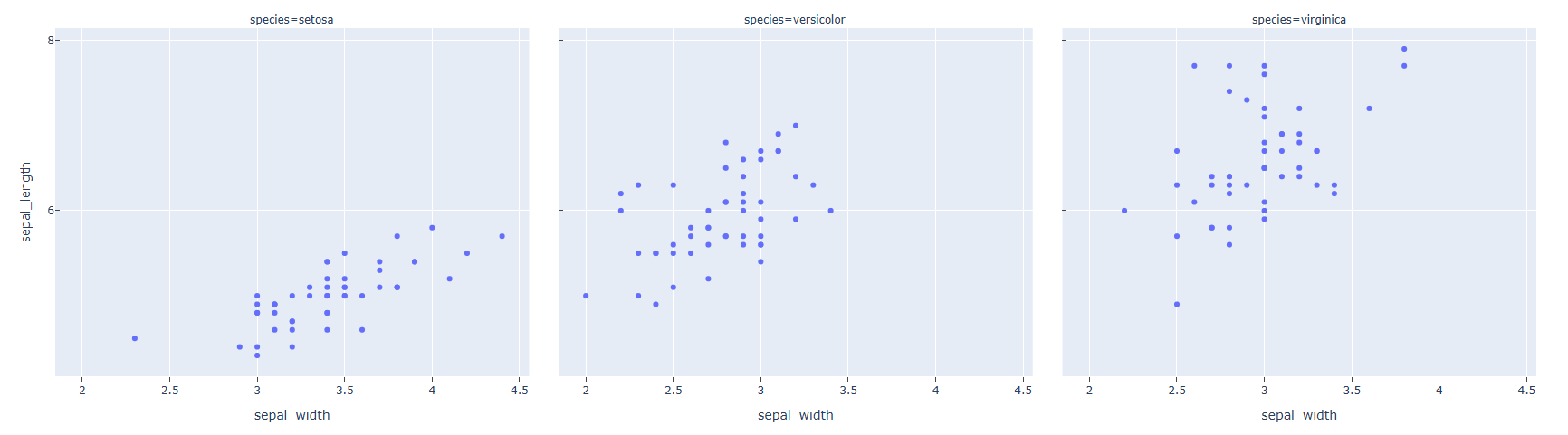
fig.update_xaxes(ticks="outside", dtick=0.5)
fig.update_yaxes(ticks="inside", dtick=2)

fig.show()
실행 결과
tick 위치 수동 입력
tick 위치를 자동 생성이 아닌 원하는 위치에만 지정해서 넣을 수 있습니다.
fig.update_xaxes(tickvals=[tick 좌료 리스트])
fig.update_yaxes(tickvals=[tick 좌료 리스트])
[사용 함수]
- fig.update_xaxes() : x축 tick을 업데이트 할떄 사용
- fig.update_yaxes() : y축 tick을 업데이트 할때 사용
[함수 input 내용]
- tickvals = [...], tick 을 원하는 위치를 리스트 형태로 입력을 합니다.
예제)
import plotly.express as px
#데이터 불러오기
df = px.data.iris()
# Figure 생성
fig = px.scatter(df, x="sepal_width", y="sepal_length", facet_col="species")

# 눈금 생성 + 눈금 위치 수동 입력
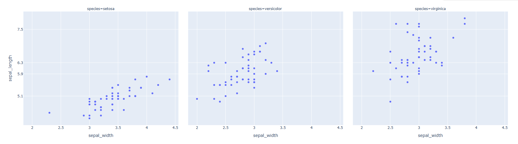
fig.update_yaxes(tickvals=[5.1, 5.9, 6.3, 7.5])

fig.show()
실행 결과
tick 스타일 설정
fig.update_xaxes(tickwidth=두꺠, tickcolor=색, ticklen=길이)
fig.update_yaxes(tickwidth=두꺠, tickcolor=색, ticklen=길이)
[사용 함수]
- fig.update_xaxes() : x축 tick을 업데이트 할떄 사용
- fig.update_yaxes() : y축 tick을 업데이트 할때 사용
[함수 input 내용]
tick 스타일 은 아래의 3가지 항목에 의해 디자인 변경이 가능합니다. - tickwidth = 눈금의 두깨 - ticklen = 눈금의 길이 - tickcolor = 눈금 색
예제)
import plotly.express as px
#데이터 불러오기
df = px.data.iris()
# Figure 생성
fig = px.scatter(df, x="sepal_width", y="sepal_length", facet_col="species")

# 눈금 생성 + 눈금 스타일 설정
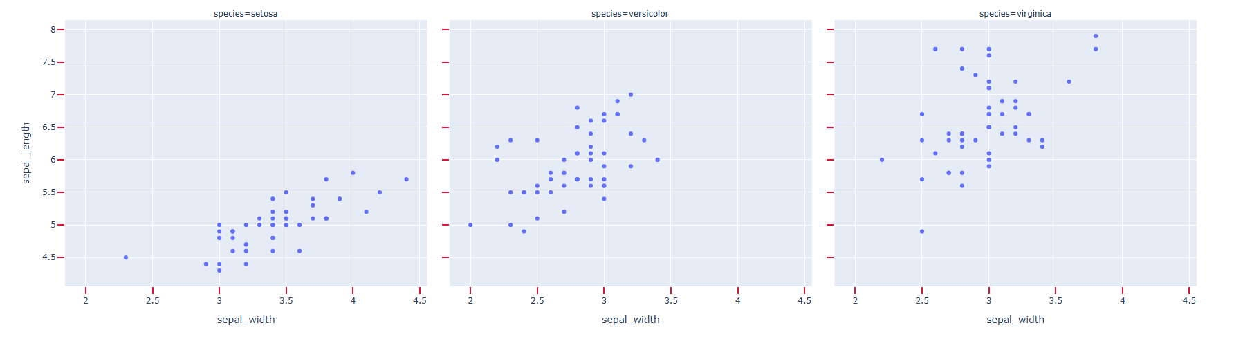
fig.update_xaxes(ticks="outside", tickwidth=2, tickcolor='crimson', ticklen=10)
fig.update_yaxes(ticks="outside", tickwidth=2, tickcolor='crimson', ticklen=10)

fig.show()
실행 결과
minor tick 추가
minor 눈금이란 기본 눈금 범위안의 범위의 더 작은 눈금을 뜻합니다. 자를 생각하시면 되는데요 cm 단위 사이에 mm 단위의 작은 눈금이 있습니다. 이것을 minor tick 또는 minor 눈금이라 합니다.
fig.update_xaxes(minor_ticks =위치,minor_tickwidth = 두깨, minor_ticklen = 길이, minor_tickcolor = 색)
fig.update_yaxes(minor_ticks =위치,minor_tickwidth = 두깨, minor_ticklen = 길이, minor_tickcolor = 색)
[사용 함수]
- fig.update_xaxes() : x축 tick을 업데이트 할떄 사용
- fig.update_yaxes() : y축 tick을 업데이트 할때 사용
[함수 input 내용]
- minor_ticks = 눈금의 위치
- minor_tickwidth = 눈금의 두깨
- minor_ticklen = 눈금의 길이
- minor_tickcolor = 눈금 색
예제)
import plotly.express as px
#데이터 불러오기
df = px.data.tips()
# Figure 생성
fig = px.scatter(df, x="total_bill", y="tip", color="sex")

# 눈금 생성 + 눈금 스타일 설정
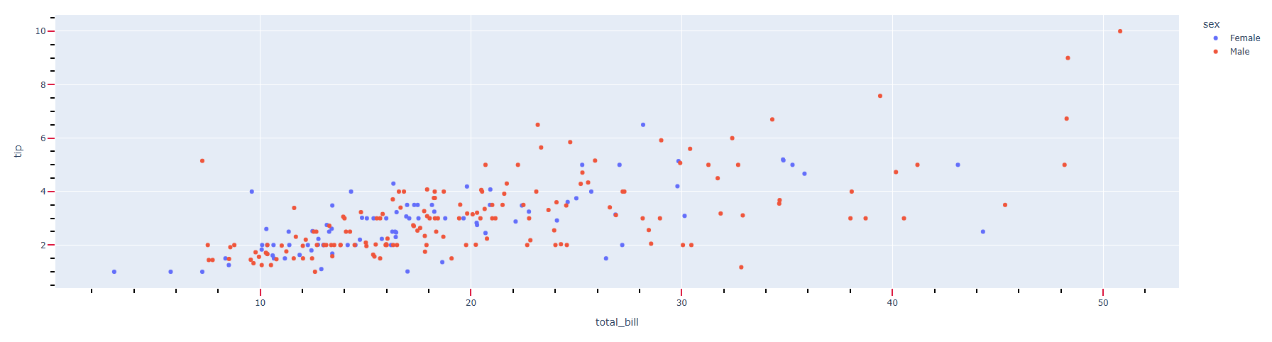
fig.update_xaxes(ticks="outside", tickwidth=2, tickcolor='crimson', ticklen=10)
fig.update_yaxes(ticks="outside", tickwidth=2, tickcolor='crimson', ticklen=10)

# minor 눈금 생성 + minor  눈금 스타일 설정
fig.update_xaxes(minor_ticks="outside",minor_tickcolor = "black")
fig.update_yaxes(minor_ticks="outside",minor_tickcolor = "black")
fig.show()
실행 결과
tick 레이블 위치 설정
plotly에서는 tick 레이블은 자동 생성이 됩니다. tick 레이블 위치를 설정하려면 아래와 같이 작성합니다.
fig.update_yaxes(ticklabelposition="위치")
fig.update_xaxes(ticklabelposition="위치")
[사용 함수]
- fig.update_xaxes() : x축 tick을 업데이트 할떄 사용
- fig.update_yaxes() : y축 tick을 업데이트 할때 사용
[함수 input 내용]
- ticklabelposition= tick 레이블위치
{"outside" | "inside" | "outside top" | "inside top" | "outside left" | "inside left" | "outside right" | "inside right" | "outside bottom" | "inside bottom"}
예제)
import plotly.express as px
#데이터 불러오기
df = px.data.iris()
# Figure 생성
fig = px.scatter(df, x="sepal_width", y="sepal_length", facet_col="species")

# tick 레이블 위치 설정
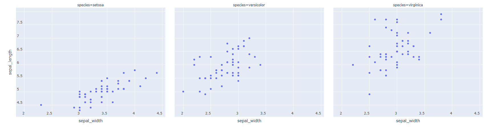
fig.update_yaxes(ticklabelposition="inside top")
fig.update_xaxes(ticklabelposition="inside left")

fig.show()
실행 결과
tick 레이블 스타일 설정
fig.update_xaxes(tickangle=각도, tickfont_family=서체, tickfont_color=색, tickfont_size=사이즈)
fig.update_yaxes(tickangle=각도, tickfont_family=서체, tickfont_color=색, tickfont_size=사이즈)

fig.show()
[사용 함수]
- fig.update_xaxes() : x축 tick을 업데이트 할떄 사용
- fig.update_yaxes() : y축 tick을 업데이트 할때 사용
[함수 input 내용]
총 4가지 항목에 대해 스타일 지정이 가능합니다.
- tickangle = tick 레이블의 각도를조절합니다.
- tickfont_family =HTML font family로 plotly를 구동하는 web browser에서 지원하는 폰트를 지원합니다.
- tickfont_color = 원하는 색을 지정합니다.
- tickfont_size = 폰트 사이즈를 숫자로 입력합니다
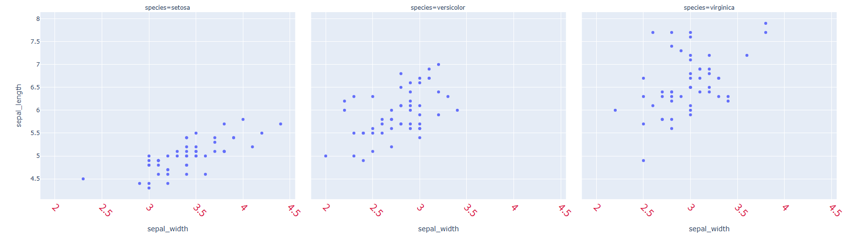
예제)
import plotly.express as px
#데이터 불러오기
df = px.data.iris()
# Figure 생성
fig = px.scatter(df, x="sepal_width", y="sepal_length", facet_col="species")

# tick 레이블 스타일 설정
fig.update_xaxes(tickangle=45, tickfont_family='Rockwell', tickfont_color='crimson', tickfont_size=20)

fig.show()
실행 결과
tick 레이블 삭제
자동 생성된 tick 레이블 또한 아래 코드로 삭제 가능합니다.
fig.update_xaxes(showticklabels=False)
fig.update_yaxes(showticklabels=False)
[사용 함수]
fig.update_xaxes() : x축 tick을 업데이트 할떄 사용
fig.update_yaxes() : y축 tick을 업데이트 할때 사용
[함수 input 내용] - showticklabels = False
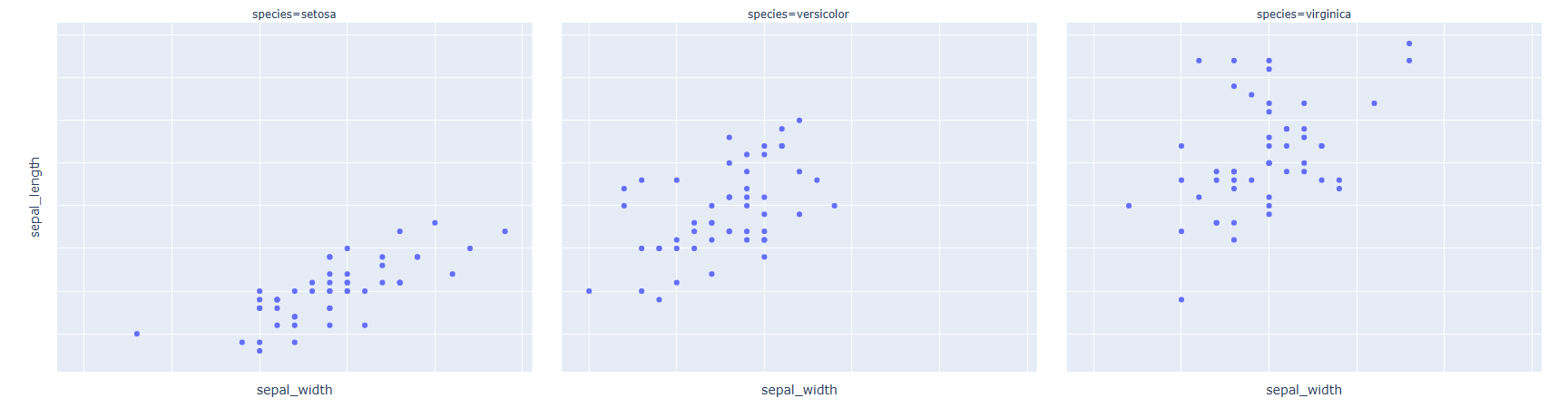
예제)
import plotly.express as px
#데이터 불러오기
df = px.data.iris()
# Figure 생성
fig = px.scatter(df, x="sepal_width", y="sepal_length", facet_col="species")

# tick 레이블 삭제
fig.update_xaxes(showticklabels=False)
fig.update_yaxes(showticklabels=False)

fig.show()
실행 결과
04-06 Plotly 축 스타일 편집하기
축 스타일 편집
fig.update_xaxes(showline=True, linewidth=두깨, linecolor=색)
fig.update_yaxes(showline=True, linewidth=두깨, linecolor=색)
[사용 함수]
- fig.update_xaxes() : x축을 업데이트 할떄 사용
- fig.update_yaxes() : y축을 업데이트 할때 사용
[함수 input 내용]
- showline = True
- linewidth= 라인 두깨
- linecolor= 라인 색
예시)
import plotly.express as px
#데이터 불러오기
df = px.data.tips()

# Figure 생성
fig = px.histogram(df, x="sex", y="tip", histfunc='sum', facet_col='smoker')

# 축 스타일 편집
fig.update_xaxes(showline=True, linewidth=3, linecolor='black')
fig.update_yaxes(showline=True, linewidth=3, linecolor='red')

fig.show()
실행 결과
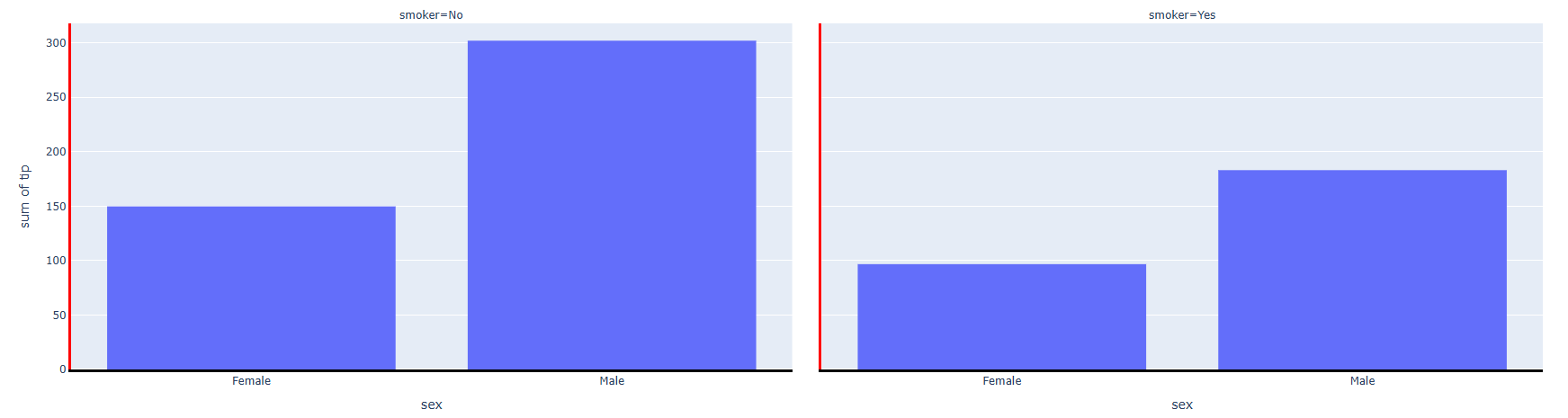
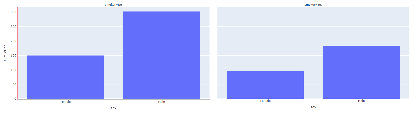
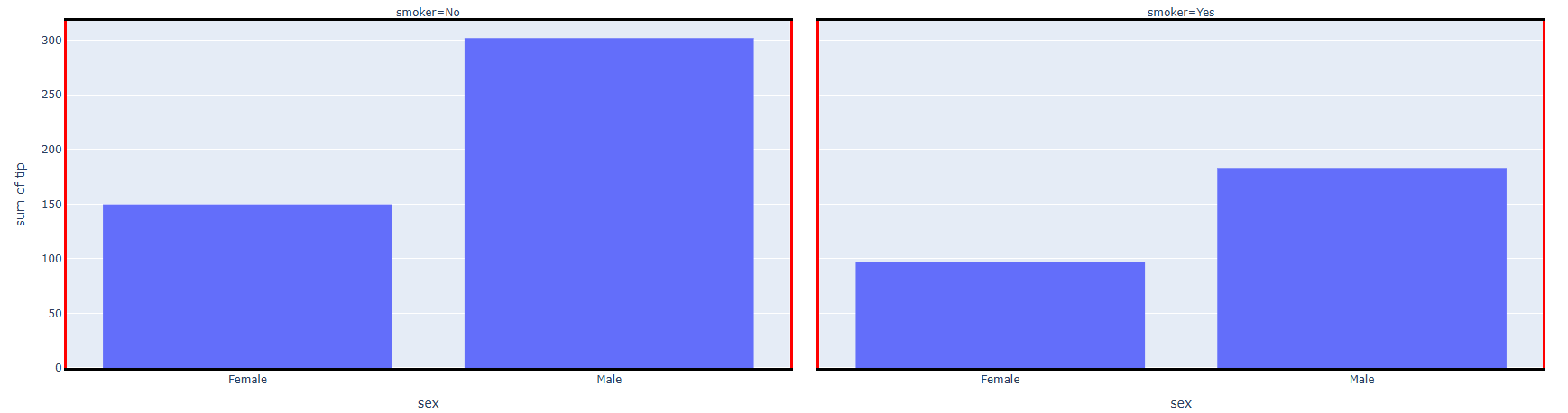
예시와 같이 축 스타일은 모든 Trace에 적용이 됩니다. 만약 특정 축 스타일만 편집하고자 한다면 해당 Trace의 인덱스를 "col= " 으로 입력해주면 해당 Trace 만 적용 가능합니다.
예시)
import plotly.express as px
#데이터 불러오기
df = px.data.tips()

# Figure 생성
fig = px.histogram(df, x="sex", y="tip", histfunc='sum', facet_col='smoker')

# 축 스타일 편집
fig.update_xaxes(showline=True, linewidth=3, linecolor='black', col=1)
fig.update_yaxes(showline=True, linewidth=3, linecolor='red', col=1)

fig.show()
실행 결과
축 반대편 라인 편집
축 반대편 라인의 스타일은 축과 동일하게 맞출수 있습니다.
fig.update_xaxes(mirror=True)
fig.update_yaxes(mirror=True)
[사용 함수]
fig.update_xaxes() : x축을 업데이트 할떄 사용
fig.update_yaxes() : y축을 업데이트 할때 사용
[함수 input 내용]
mirror= True
예시)
import plotly.express as px
#데이터 불러오기
df = px.data.tips()

# Figure 생성
fig = px.histogram(df, x="sex", y="tip", histfunc='sum', facet_col='smoker')

# 축 스타일 편집
fig.update_xaxes(showline=True, linewidth=3, linecolor='black',mirror=  True)
fig.update_yaxes(showline=True, linewidth=3, linecolor='red',mirror=  True)

fig.show()
실행 결과
04-07 Plotly 그리드 설정하기
그리드 설정
그리드는 총 2종류가 있습니다. 큰 단위로 나뉘주는 그리드와 더 작은 단위로 촘촘하게 나뉘주는 minor gird가 있습니다. 기본 그리드는 설정을 따로 하지 않아도 시각화 시 자동으로 보여집니다. minor grid는 따로 코드를 추가해야만 추가가 됩니다.
fig.update_xaxes(showgrid=True, minor_showgrid=True)
fig.update_yaxes(showgrid=True, minor_showgrid=True)
[사용 함수]
- fig.update_xaxes() : x축을 업데이트 할떄 사용
- fig.update_yaxes() : y축을 업데이트 할때 사용
[함수 input 내용]
- showgrid= True or False, 그리드 시각화 여부 결정
- minor_showgrid= True or False, minor 그리드 시각화 여부 결정
예시)
import plotly.express as px
#데이터 불러오기
df = px.data.iris()

# Figure 생성
fig = px.scatter(df, x="sepal_width", y="sepal_length", facet_col="species")

# 그리드/ minor 그리드 시각화
fig.update_xaxes(showgrid=True, minor_showgrid=True)
fig.update_yaxes(showgrid=True, minor_showgrid=True)
fig.show()
실행 결과
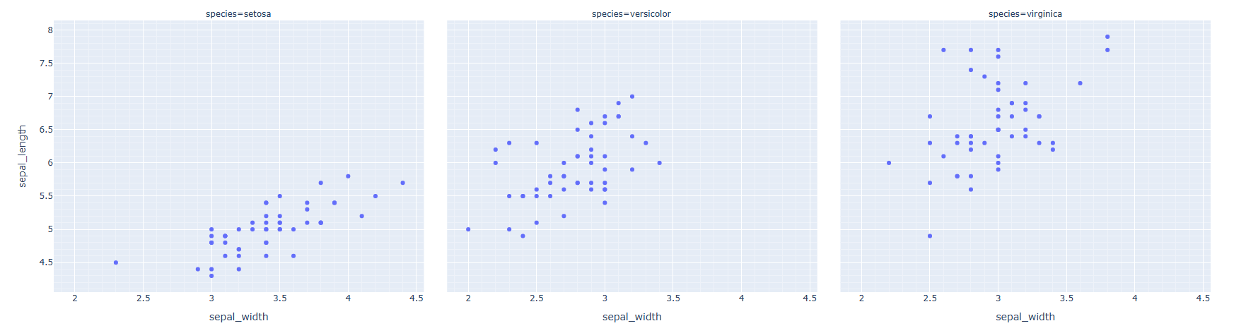
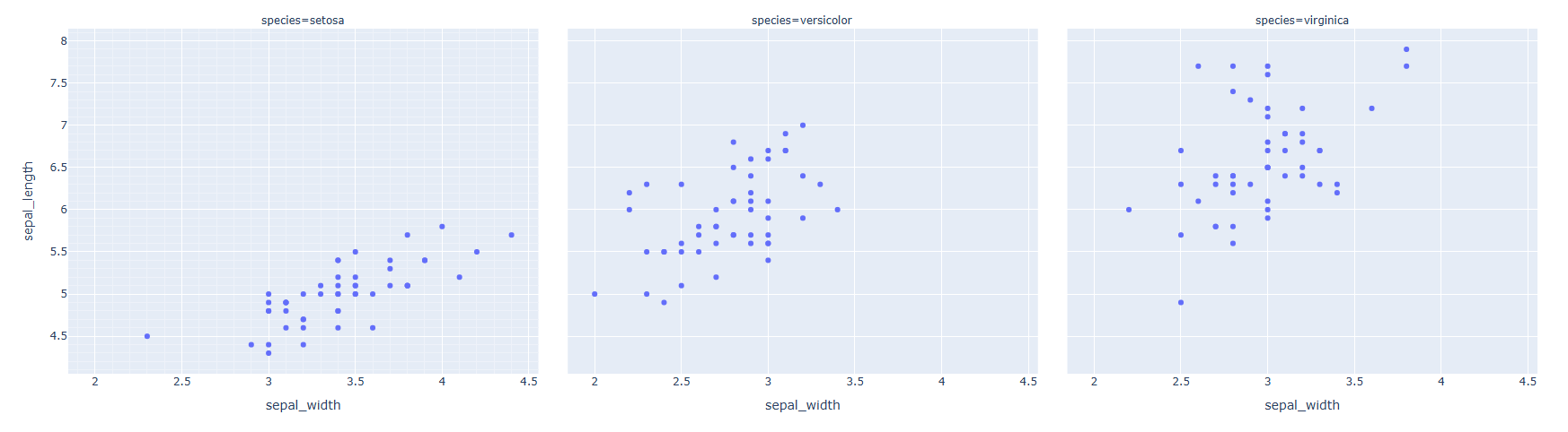
예시와 같이 그리드 스타일은 모든 Trace에 적용이 됩니다. 만약 특정 Trace의 grid만 편집하고자 한다면 해당 Trace의 인덱스를 "col= " 으로 입력해주면 해당 Trace 만 적용 가능합니다.
예시)
import plotly.express as px
#데이터 불러오기
df = px.data.iris()

# Figure 생성
fig = px.scatter(df, x="sepal_width", y="sepal_length", facet_col="species")

# 그리드/ minor 그리드 시각화
fig.update_xaxes(showgrid=True, minor_showgrid=True, col =1 )
fig.update_yaxes(showgrid=True, minor_showgrid=True, col =1)
fig.show()
실행 결과
그리드 스타일 편집
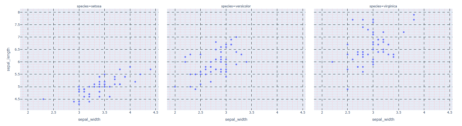
축 반대편 라인의 스타일은 축과 동일하게 맞출수 있습니다.
# 그리드 스타일 편집
fig.update_xaxes(gridwidth= 두깨, gridcolor= 색,griddash = 그리드 모양)
fig.update_yaxes(gridwidth= 두깨, gridcolor= 색,griddash = 그리드 모양)

# minor 그리드 스타일 편집
fig.update_xaxes(minor_gridwidth= 두깨, minor_gridcolor= 색,minor_griddash = 그리드 모양)
fig.update_yaxes(minor_gridwidth= 두깨, minor_gridcolor= 색,minor_griddash = 그리드 모양)
[사용 함수]
- fig.update_xaxes() : x축을 업데이트 할떄 사용
- fig.update_yaxes() : y축을 업데이트 할때 사용
[함수 input 내용]
- gridwidth = 그리드 두깨
- gridcolor = 그리드 색
- griddash = {"solid", "dot", "dash", "longdash", "dashdot","longdashdot"}, 그리드 스타일 선택
- minor_gridwidth = minor 그리드 두깨
- minor_gridcolor = minor 그리드 색
- minor_griddash = {"solid", "dot", "dash", "longdash", "dashdot", "longdashdot"}, minor 그리드 스타일 선택
예시)
import plotly.express as px
#데이터 불러오기
df = px.data.iris()

# Figure 생성
fig = px.scatter(df, x="sepal_width", y="sepal_length", facet_col="species")

# 그리드/ minor 그리드 시각화
fig.update_xaxes(minor_showgrid=True, griddash='dash',gridcolor='black',minor_griddash="dot",minor_gridcolor='LightPink')
fig.update_yaxes(minor_showgrid=True,griddash='dash',gridcolor='black', minor_griddash="dot",minor_gridcolor='LightPink')
fig.show()
실행 결과
04-08 Plotly 여러개의 그래프 겹쳐 그리기
기본 사용 방법
그래프를 겹쳐 그리는 방법은 2단계를 거칩니다.
-
Base 그래프 그리기 - 기초 그래프를 생성하는 단계입니다. - express 또는 graph_objects 를 활용해서 생성합니다.
-
추가할 그래프 그리기
fig.add_trace(추가할 Trace 입력)add_trace() 함수는 이미 생성된 Figure 위에 덧붙여서 새로은 그래프를 그릴때 사용하는 함수 입니다.
예시 1
먼저 express 를 통해 생성한 figure 를 겹쳐 그리는 예시를 설명드리겠습니다.
1.Base 그래프 그리기
import plotly.express as px

# Base 그래프 그리기
fig = px.scatter(x=[0, 1, 2, 3, 4], y=[0, 1, 4, 9, 16],size = [20]*5)

fig.show()
실행 결과
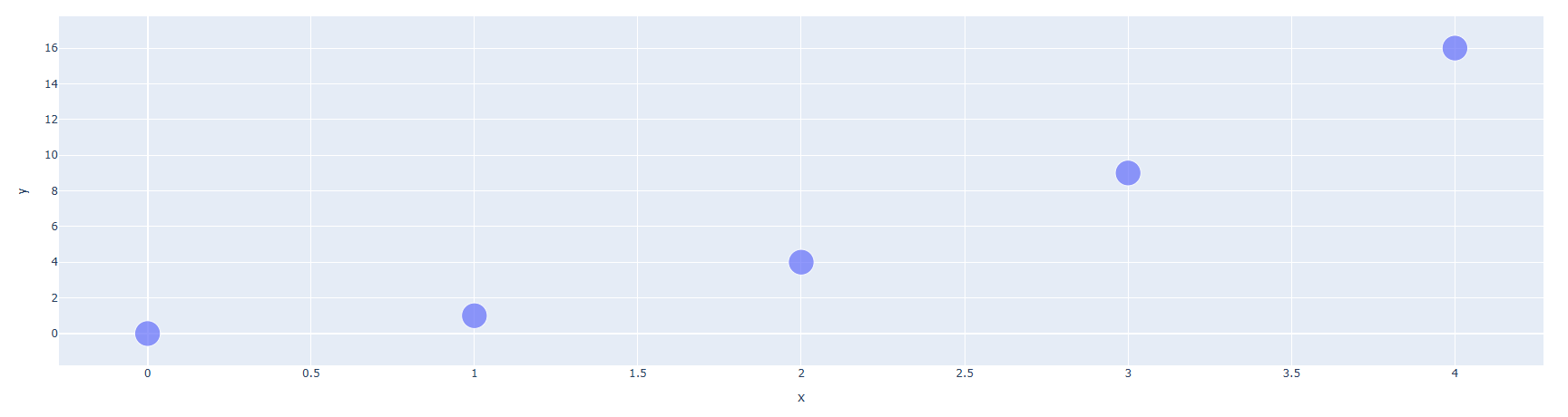
먼저 px.scatter() 함수를 통해 산점도 그래프를 그렸습니다.
2.추가 할 그래프 그리기
import plotly.express as px
import plotly.graph_objects as go

# Base 그래프 그리기
fig = px.scatter(x=[0, 1, 2, 3, 4], y=[0, 1, 4, 9, 16],size = [20]*5)

# 추가 할 그래프 그리기
fig.add_trace(go.Scatter(x=[0, 1, 2, 3, 4], y=[0, 1, 4, 9, 16]))

fig.show()
실행 결과
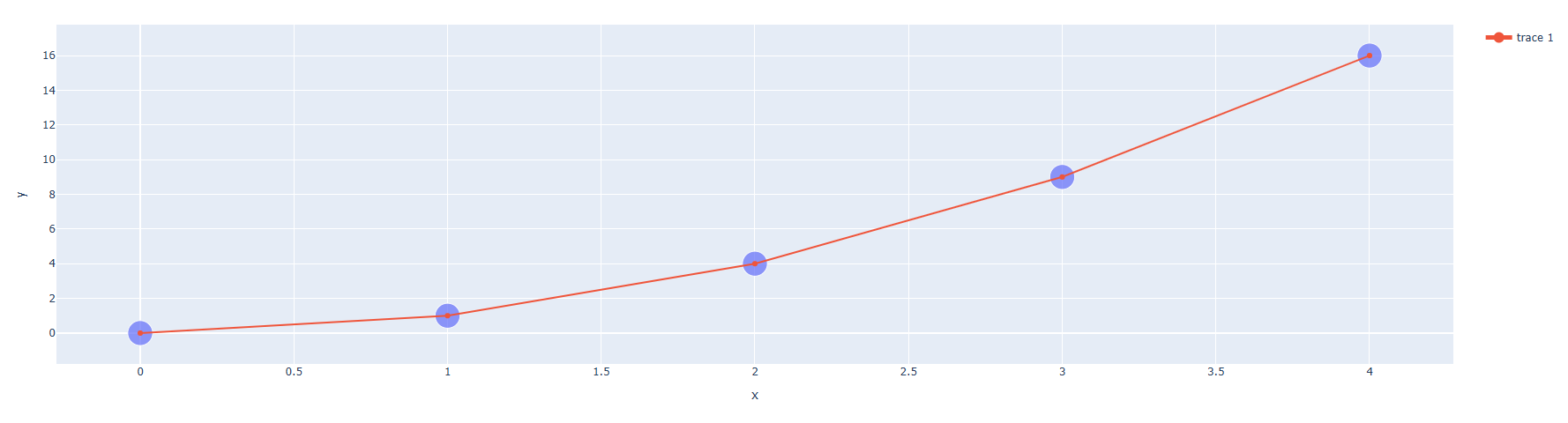
fig.add_trace() 를 활용해서 점과 점 사이를 잇는 Trace를 추가하였습니다. 이렇게 Base 그래프를 생성하고 생성한 Figrue에 add_trace() 함수로 추고하고자 하는 Trace 그래프를 차곡차곡 추가를 하면 하나의 Figure에 여러개의 그래프를 겹처 그릴수 있습니다.
예시 2
다음으로 graph_objects를 통해 생성한 figure 를 겹쳐 그리는 예시를 설명드리겠습니다.
1.Base 그래프 그리기
import plotly.graph_objects as go

# Base Figure 생성
fig = go.Figure()

fig.show()
실행 결과
먼저 go.Figure() 를 통해 빈 Figure를 생성합니다.
2.추가 할 그래프 그리기
import plotly.graph_objects as go

#데이터 생성
import numpy as np
np.random.seed(1)

N = 100
random_x = np.linspace(0, 1, N)
random_y0 = np.random.randn(N) + 5
random_y1 = np.random.randn(N)
random_y2 = np.random.randn(N) - 5

# Base Figure 생성
fig = go.Figure()

# 추가 할 그래프 그리기
fig.add_trace(go.Scatter(x=random_x, y=random_y0,
                    mode='lines',
                    name='lines'))
fig.add_trace(go.Scatter(x=random_x, y=random_y1,
                    mode='lines+markers',
                    name='lines+markers'))
fig.add_trace(go.Scatter(x=random_x, y=random_y2,
                    mode='markers',
                    name='markers'))

fig.show()
실행 결과
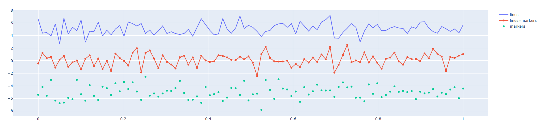
fig.add_trace() 를 활용해서 총 3개의 Trace를 추가하였습니다.
1) 첫번째로 맨위에 Line으로만 구성된 Trace
fig.add_trace(go.Scatter(x=random_x, y=random_y0,
                    mode='lines',
                    name='lines'))
2) 두번째로 Line과 marker 가 같이 있는 Trace
fig.add_trace(go.Scatter(x=random_x, y=random_y1,
                    mode='lines+markers',
                    name='lines+markers'))
3) 세번째 Marker로만 구성 된 Trace
fig.add_trace(go.Scatter(x=random_x, y=random_y1,
                    mode='lines+markers',
                    name='lines+markers'))
04-09 Plotly 여러개의 그래프 나눠 그리기
기본 사용 방법
그래프를 나눠 그리는 방법은 2단계를 거칩니다.
- 그래프를 나누어 그릴 공간 생성
- 그래프를 나누어 그릴 공간을 생성하는 과정입니다..
- make_subplots() 통해 생성합니다.
- 각 공간에 Trace 채워넣기
- fig.add_trace() 를 활용해서 각 공간에 Trace를 채워 넣습니다.
- 이때 fig.add_trace( row = , col = ) row와 col을 통해 각 공간의 index를 지정해줘야 합니다.
1단계: 그래프 나눠그리는 공간 생성
# make_subplots 패키지 불러오기
from plotly.subplots import make_subplots

# 나눠그릴 공간 생성
fig = make_subplots(rows= 행의 갯수, cols= 열의 갯수)
make_subplots() 함수를 통해 생성되는 공간은 격자 무늬의 공간입니다. 따라서 생성할 행의 수는 row 에 생성할 열의 수는 col 에 넣어줍니다.
예제 1)
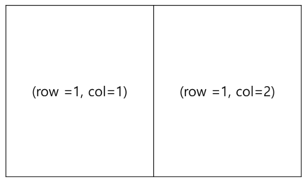
fig = make_subplots(rows= 1, cols= 2)1행 2열의 공간을 생성하면 Figure의 형태 및 공간 별 행, 열 index는 아래와 같습니다.
예제 2)
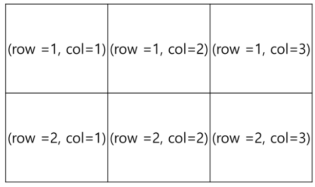
fig = make_subplots(rows= 2, cols= 3)2행 3열의 공간을 생성하면 Figure의 형태 및 공간 별 행, 열 index는 아래와 같습니다.
2단계: 각 공간에 Trace 채워넣기
fig.add_trace(row= 행 index, col= 열 index)add_trace() 함수를 활용하여 각각의 공간에 Trace 를 추가합니다. 이때 추가할 공간의 행과 열의 index를 잘 맞춰서 지정을 해야합니다.
예제 #1)
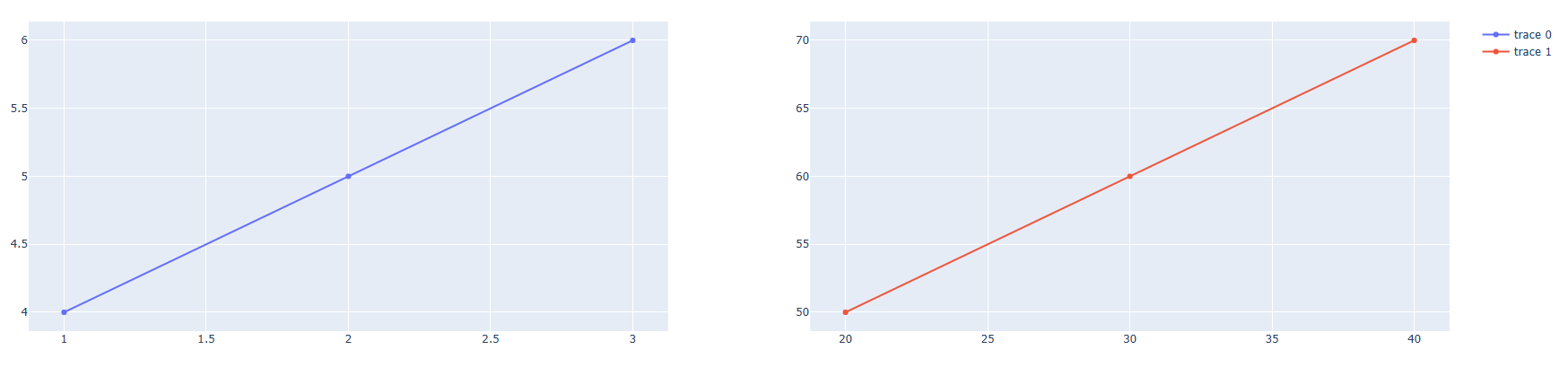
2행 1열의 공간을 생성해서 Scatter Trace를 채워보겠습니다.
from plotly.subplots import make_subplots
import plotly.graph_objects as go

# 나눠서 그릴 공간 생성
fig = make_subplots(rows=1, cols=2)

# 각 공간에 Trace 채워넣
fig.add_trace(
    go.Scatter(x=[1, 2, 3], y=[4, 5, 6]),
    row=1, col=1
)
fig.add_trace(
    go.Scatter(x=[20, 30, 40], y=[50, 60, 70]),
    row=1, col=2
)
fig.show()
실행 결과
예제 #2)
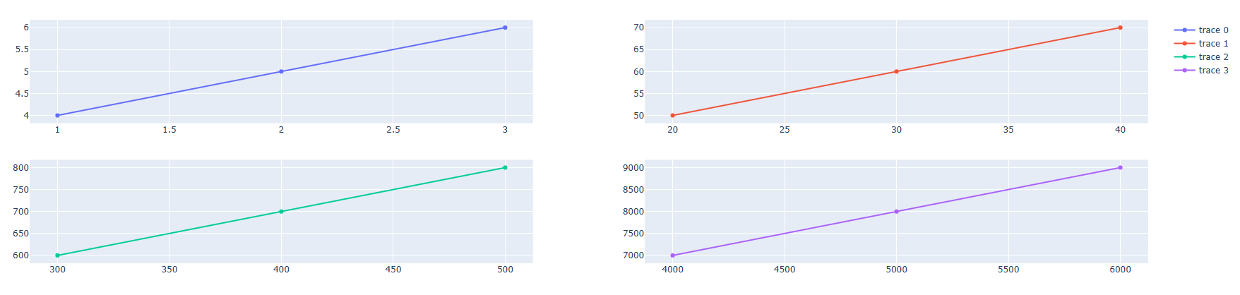
2행 2열의 공간을 생성해서 Scatter Trace를 채워보겠습니다.
from plotly.subplots import make_subplots
import plotly.graph_objects as go

# 나눠서 그릴 공간 생성
fig = make_subplots(rows=2, cols=2)

# 각 공간에 Trace 채워넣기
fig.add_trace(go.Scatter(x=[1, 2, 3], y=[4, 5, 6]),
              row=1, col=1)

fig.add_trace(go.Scatter(x=[20, 30, 40], y=[50, 60, 70]),
              row=1, col=2)

fig.add_trace(go.Scatter(x=[300, 400, 500], y=[600, 700, 800]),
              row=2, col=1)

fig.add_trace(go.Scatter(x=[4000, 5000, 6000], y=[7000, 8000, 9000]),
              row=2, col=2)

fig.show()
실행 결과
각 그래프 별 서브 타이틀 달기
fig.subplot_titles(row= 행 index, col= 열 index,
subplot_titles=("First", "Second", "Third",...))
[사용 함수]
- fig.subplot_titles()
[함수 input 내용]
- subplot_titles= (튜플 형태) , 각 공간별 서브타이틀을 순서대로 튜플형태로 넣어줍니다.
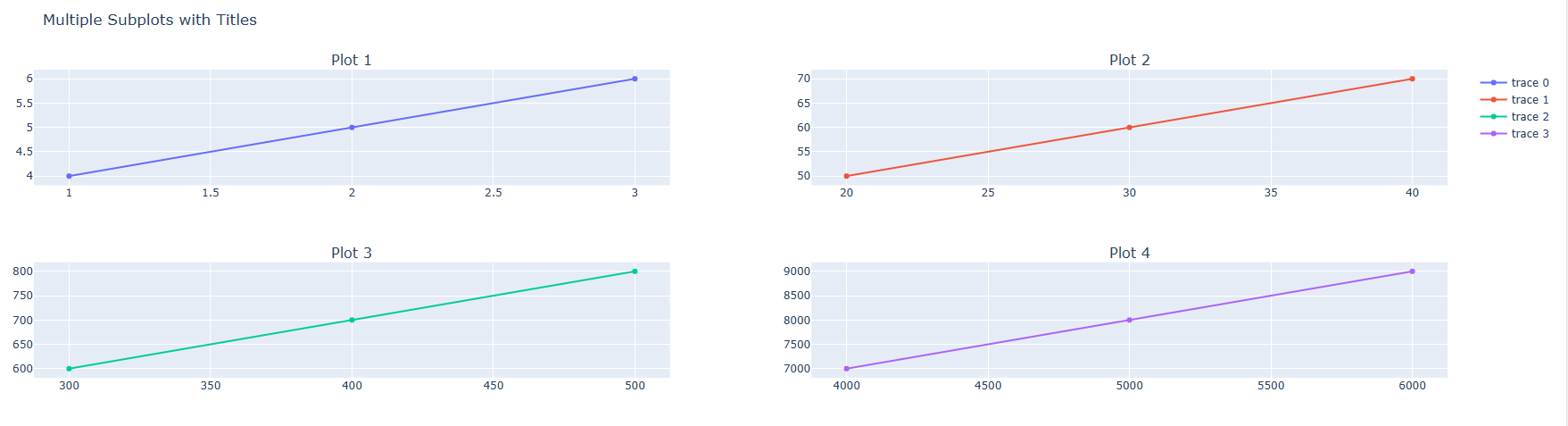
예제)
from plotly.subplots import make_subplots
import plotly.graph_objects as go

# 나눠서 그릴 공간 생성
fig = make_subplots(
    rows=2, cols=2,
    subplot_titles=("Plot 1", "Plot 2", "Plot 3", "Plot 4"))

# 각 공간에 Trace 채워넣기
fig.add_trace(go.Scatter(x=[1, 2, 3], y=[4, 5, 6]),
              row=1, col=1)

fig.add_trace(go.Scatter(x=[20, 30, 40], y=[50, 60, 70]),
              row=1, col=2)

fig.add_trace(go.Scatter(x=[300, 400, 500], y=[600, 700, 800]),
              row=2, col=1)

fig.add_trace(go.Scatter(x=[4000, 5000, 6000], y=[7000, 8000, 9000]),
              row=2, col=2)

fig.update_layout(title_text="Multiple Subplots with Titles")

fig.show()
실행 결과
각 공간별 크기 비율 지정하기
fig.subplot_titles(row= 행 index, col= 열 index,
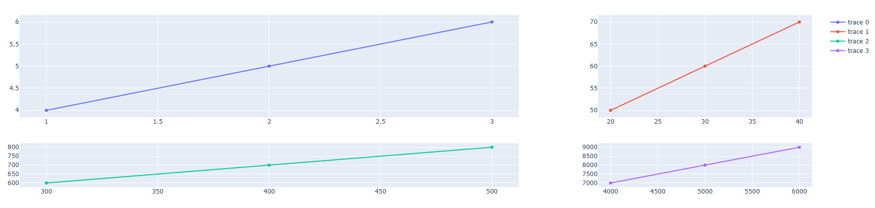
column_widths=[0.7, 0.3], row_heights =[0.7, 0.3])
[사용 함수]
- fig.subplot_titles()
[함수 input 내용]
- column_widths = [ , ] 리스트 형태로 컬럼 별 길이 비율을 넣습니다.
- row_heights = [ , ] 리스트 형태로 행 별 길이 비율을 넣습니다.
예제)
from plotly.subplots import make_subplots
import plotly.graph_objects as go

# 나눠서 그릴 공간 생성
fig = make_subplots(
    rows=2, cols=2,
    column_widths=[0.7, 0.3], row_heights =[0.7, 0.3])

# 각 공간에 Trace 채워넣기
fig.add_trace(go.Scatter(x=[1, 2, 3], y=[4, 5, 6]),
              row=1, col=1)

fig.add_trace(go.Scatter(x=[20, 30, 40], y=[50, 60, 70]),
              row=1, col=2)

fig.add_trace(go.Scatter(x=[300, 400, 500], y=[600, 700, 800]),
              row=2, col=1)

fig.add_trace(go.Scatter(x=[4000, 5000, 6000], y=[7000, 8000, 9000]),
              row=2, col=2)

fig.show()
실행 결과
공간 별 축 공유하기
fig.subplot_titles(row= 행 index, col= 열 index,
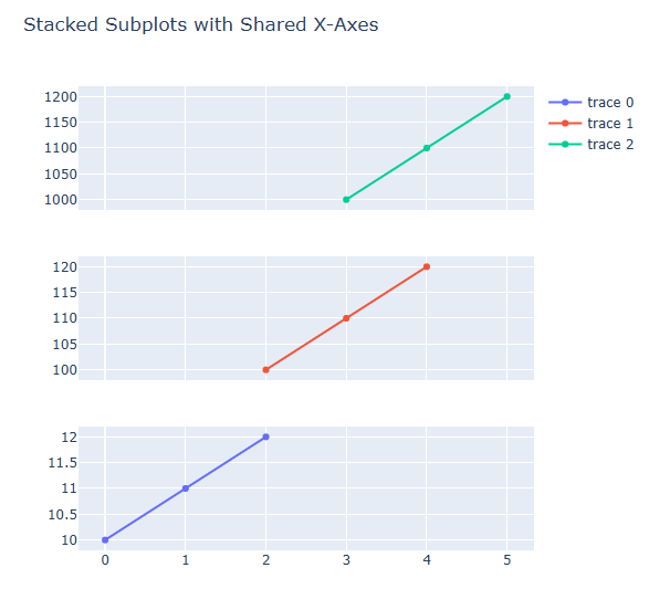
shared_xaxes=(True or False), shared_yaxes=(True or False))
[사용 함수]
- fig.subplot_titles()
[함수 input 내용]
- shared_xaxes= (True or False) 같은 행끼리 x축 공유 여부.
- shared_yaxes= (True or False) 같은 열끼리 y축 공유 여부.
예제)
from plotly.subplots import make_subplots
import plotly.graph_objects as go

# 나눠서 그릴 공간 생성
fig = make_subplots(
    rows=3, cols=1,
    shared_xaxes=True)

# 각 공간에 Trace 채워넣기
fig.add_trace(go.Scatter(x=[0, 1, 2], y=[10, 11, 12]),
              row=3, col=1)

fig.add_trace(go.Scatter(x=[2, 3, 4], y=[100, 110, 120]),
              row=2, col=1)

fig.add_trace(go.Scatter(x=[3, 4, 5], y=[1000, 1100, 1200]),
              row=1, col=1)

# Figure 크기, 타이틀 설정
fig.update_layout(height=600, width=600,
                    title_text="Stacked Subplots with Shared X-Axes")

fig.show()
실행 결과
분할 공간 병합하기
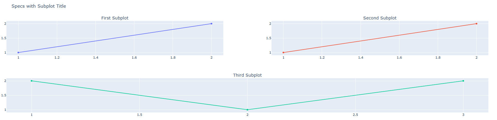
아래 그림과 같이 격자무늬가 아닌 공간을 병합하는 방법에 대해 알려드리겠습니다.

fig.subplot_titles(row= 행 index, col= 열 index,
specs = [원하는 구조 입력])
[사용 함수]
- fig.subplot_titles()
[함수 input 내용]
- specs = [[첫번째행 구조],[두번째행 구조]....[마지막행 구조] ], 리스트 형태로 원하는 격자구조를 입력하면 됩니다.
- 아래 예제를 보고 다시 설명드리겠습니다.
예제)
from plotly.subplots import make_subplots
import plotly.graph_objects as go

# 나눠서 그릴 공간 생성
fig = make_subplots(
    rows=2, cols=2,
    specs=[[{}, {}],
           [{"colspan": 2}, None]],
    # Ensure this line is correctly indented
    subplot_titles=("First Subplot","Second Subplot", "Third Subplot"))

# 각 공간에 Trace 채워넣기
fig.add_trace(go.Scatter(x=[1, 2], y=[1, 2]),
                 row=1, col=1)

fig.add_trace(go.Scatter(x=[1, 2], y=[1, 2]),
                 row=1, col=2)
fig.add_trace(go.Scatter(x=[1, 2, 3], y=[2, 1, 2]),
                 row=2, col=1)

# Figure 타이틀 설정
fig.update_layout(showlegend=False, title_text="Specs with Subplot Title")

fig.show()
실행 결과
specs=[[{}, {}],
[{"colspan": 2}, None]]- 1행 : [[{}, {}] 모두 사용하기 때문에 Trace를 뜻하는 {} 로 1,2열 모두 표시
- 2행 : [{"colspan": 2}, None]] 1열을 2열까지 병합하기에 1열 자리에 {"colspan": 2} 넣고 2열 자리는 None 이라고 표시