중앙 정렬
인라인 요소는 text-align 속성을 이용하여 가운데 정렬이 가능. 블럭 요소는 불가능
- 고정폭의 블럭 요소 중앙 정렬
블럭 요소를 정렬하기 위해서는 정렬하려는 요소의 넓이를 반드시 설정해줘야 합니다.
p{
	width: 100px;
    margin: 0 auto; // 왼쪽, 오른쪽 마진을 대등하게 나눔
}- 포지션이 absolute일 때 중앙 정렬
left의 값을 50%로 설정하고 margin-left의 값을 정렬하고자 하는 요소의 (넓이 값/ 2) 만큼 음수 값으로 설정
.centered{
    width: 400px;
    position: absolute;
    left: 50%;
    margin-left: -200px;
}- 포지션이 absolute일 때 너비가 고정되지 않은 경우
transform 속성을 이용하여 요소의 너비의 절반만큼 이동
.centered{
    width: 400px;
    position: absolute;
    left: 50%;
    transform: translateX(-50%);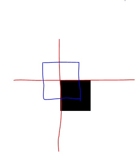
}- 포지션이 absolute, fixed일 때 가로, 세로 중앙 정렬
상위 요소(position: relative)의 높이 값이 존재해야 함.
left, top값을 50%롤 설정하면 기준점 기준으로 정렬이 되어있기 때문에 box가 파란색 위치로 이동하도록 transform 속성을 사용하여 이동시켜줍니다.
.box{
    width: 100px;
    height: 100px;
    background-color: #000;
    position: absolute;
    left: 50%;
    top: 50%;
    transform: translate(-50%, -50%);
}- line-hieght 속성 이용
이 방법은 요소 안의 텍스트가 한 줄일 경우에만 유효합니다. 박스의 높이값과 line-height를 동일하게 설정합니다.
<div>- flex를 이용한 정렬
포지션이 absolute, fixed 아닐 때 유용하다.
    <div class="wrapper">
        <div class="box"></div>
    </div>
display 속성을 flex로 선언시 flex-direction의 기본 값은 row로 선언됩니다.
주축이 row일 경우 justify-content 속성은 주축을 기준으로 정렬을 하고 align-items 속성은 교차축(column)을 기준으로 정렬을 합니다.
.wrapper{
	height: ; //
    display: flex;
    justify-content: center;
    align-items: center;
}
반대로 flex-direction: column이라면 주축은 column이 되고 align-items 속성이 주축에 기준으로 정렬을 하고 justify-content은 교차축(row) 기준으로 정렬을 합니다.