1. CSS-in-JS
1) 자바스크립트 코드로 CSS 코드를 작성하여 컴포넌트를 꾸미는 방식
- VScode 플러그인 설치(styled-components)
- yarn에서 설치(yarn add styled-components
- styled. 뒤에 html태그
- 조건부 스타일링 가능
// src/App.js

import React from "react";
// styled-components에서 styled 라는 키워드를 import 합니다.
import styled from "styled-components";

// styled키워드를 사용해서 styled-components 방식대로 컴포넌트를 만듭니다.
const StBox = styled.div`
	// 그리고 이 안에 스타일 코드를 작성합니다. 스타일 코드는 우리가 알고 있는 css와 동일합니다.
  width: 100px;
  height: 100px;
  border: 1px solid red;
  margin: 20px;
`;

const App = () => {
	// 그리고 우리가 만든 styled-components를 JSX에서 html 태그를 사용하듯이 사용합니다.
  return <StBox>박스</StBox>;
};

export default App;

----------------------------------------------------------------------------------

//조건부 스타일링 예시
// src/App.js

import React from "react";
import styled from "styled-components";

// 1. styled-components를 만들었습니다.
const StBox = styled.div`
  width: 100px;
  height: 100px;
  border: 1px solid ${(props) => props.borderColor}; // 4.부모 컴포넌트에서 보낸 props를 받아 사용합니다.
  margin: 20px;
`;

const App = () => {
  return (
    <div>
			{/* 2. 그리고 위에서 만든 styled-components를 사용했습니다. */}
			{/* 3. 그리고 props를 통해 borderColor라는 값을 전달했습니다. */}
      <StBox borderColor="red">빨간 박스</StBox>
      <StBox borderColor="green">초록 박스</StBox>
      <StBox borderColor="blue">파랑 박스</StBox>
    </div>
  );
};

export default App;
2) CSS reset
- 웹 브라우저마다 default값으로 스타일이 적용되기 때문에 동일한 CSS 스타일을 보여주기 위해 default값의 초기화가 필요하다.
- 사용법
- CSS 폴더에 reset.css 파일을 생성 후 아래 초기화 코드를 입력한다.
- 사용중인 styles.css 파일에 @import "reset.css" 해서 사용한다.
html, body, div, span, applet, object, iframe,
h1, h2, h3, h4, h5, h6, p, blockquote, pre,
a, abbr, acronym, address, big, cite, code,
del, dfn, em, img, ins, kbd, q, s, samp,
small, strike, strong, sub, sup, tt, var,
b, u, i, center,
dl, dt, dd, ol, ul, li,
fieldset, form, label, legend,
table, caption, tbody, tfoot, thead, tr, th, td,
article, aside, canvas, details, embed,
figure, figcaption, footer, header, hgroup,
menu, nav, output, ruby, section, summary,
time, mark, audio, video {
	margin: 0;
	padding: 0;
	border: 0;
	font-size: 100%;
	font: inherit;
	vertical-align: baseline;
}
/* HTML5 display-role reset for older browsers */
article, aside, details, figcaption, figure,
footer, header, hgroup, menu, nav, section {
	display: block;
}
body {
	line-height: 1;
}
ol, ul {
	list-style: none;
}
blockquote, q {
	quotes: none;
}
blockquote:before, blockquote:after,
q:before, q:after {
	content: '';
	content: none;
}
table {
	border-collapse: collapse;
	border-spacing: 0;
}
3) CSS nesting
- 리액트에서는 index.js와 index.html로 각종 컴포넌트들이 합쳐지기 때문에 방대한 양의 className들이 겹쳐서 오류가 발생할 수 있다. 이를 방지하기 위한 방법에 CSS nesting이다.
// 예시용 html
render() {
    return (
      <div className="Login"> // 최상의 Element의 이름은 컴포넌트의 이름과 통일시키는 것이 유지 보수할 때 좋다.
        <div className="login-form">      // 부모
          <img src={img} alt="Logo" />    // 자식
          <input                          // 자식
            className="userId"
            type="text"
            placeholder="전화번호, 사용자 이름 또는 이메일"
            onChange={this.idInputCheck}
          />

          <input                          // 자식
            className="userPw"
            type="password"
            placeholder="비밀번호"
            onChange={this.pwInputCheck}
          />

          <button                         // 자식
            className="loginBtn"
            type="button"
            style={{ backgroundColor: this.state.btnColor }}
            onClick={this.btnClick}
          >
          로그인
          </button>
        </div>
      </div>
    );
  }
/* css nesting 예시 */
/* 최상위 Element */
.Login {
box-sizing: border-box;
background-color: rgba(var(--b3f, 250, 250, 250), 1);
min-height: 100vh;
display: flex;
align-items: center;
justify-content: center;
/* 부모 */
.login-form {
margin: 0 auto;
display: flex;
flex-direction: column;
background-color: white;
border: 1px solid rgba(var(--b6a, 219, 219, 219), 1);
width: 350px;
height: 300px;
padding: 0px 25px;
/* 자식 1 */
img {
padding: 30px 45px 45px 45px;
margin-bottom: 0px;
}
/* 자식 2 */
.userId {
background-color: rgba(var(--b3f, 250, 250, 250), 1);
margin-bottom: 10px;
padding: 8px;
border-radius: 4px;
border: 1px solid #cdced0;
}
/* 자식 3 */
.userPw {
background-color: rgba(var(--b3f, 250, 250, 250), 1);
padding: 8px;
border-radius: 4px;
margin-bottom: 15px;
border: 1px solid #cdced0;
}
/* 자식 4 */
.loginBtn {
color: white;
font-weight: bold;
padding: 3px 0;
border: 1px solid #b2dffc;
border-radius: 4px;
}
}
}4) styled-components 의 global-styles
- 웹 어플리케이션 개발 시에는 개별 컴포넌트가 아닌 모든 컴포넌트에 동일한 스타일을 적용하는 편이 유리한 경우가 많다.
- 어플리케이션 레벨 스타일을 지원하기 위해서 Styled Components는 createGlobalStyle()라는 함수를 제공하고 있다.
- createGlobalStyle() 함수로 생성한 전역 스타일 컴포넌트를 어플리케이션의 최상위 컴포넌트에 추가해주면 하위 모든 컴포넌트에 해당 스타일이 일괄 적용된다.
// GlobalStyle.jsx

import { createGlobalStyle } from "styled-components";

const GlobalStyle = createGlobalStyle`
  *, *::before, *::after {
    box-sizing: border-box;
  }

  body {
    font-family: "Helvetica", "Arial", sans-serif;
    line-height: 1.5;
  }

  body {
    font-family: "Helvetica", "Arial", sans-serif;
    line-height: 1.5;
  }

  h2, p {
    margin: 0;
  }

  h2 {
    font-size: 1.5rem;
  }

  p {
    font-size: 1rem;
  }
`;

export default GlobalStyle;
import GlobalStyle from "./GlobalStyle";
import BlogPost from "./BlogPost";
function App() {
return (
<>
<GlobalStyle />
<BlogPost title="Styled Components 전역 스타일링">
이번 포스팅에서는 Styled Components로 전역 스타일을 정의하는 방법에
대해서 알아보겠습니다.
</BlogPost>
</>
);
}
export default App;2. useEffect
1) 리액트 컴포넌트가 렌더링 될때마다 특정 작업을 수행하도록 만드는 Hook
- import React, { useEffect } from "react"; 로 import 해서 사용한다.
useEffect(() => {
// 실행하고 싶은 함수
},[의존성 배열]);
2) 의존성 배열
-
의존성 배열은 useEffect가 바라보고 있는 곳으로, 해당하는 의존성배열의 상태가 변경되면 useEffect가 실행 된다.
-
의존성 배열란을 제거하면 해당 컴포넌트가 리렌더링(update) 될때마다 실행된다.
useEffect(() => { // 실행하고 싶은 함수 },); -
의존성 배열에 빈값을 넣으면 처음 리렌더링(mount) 될때에만 1번 실행 된다.
useEffect(() => { // 실행하고 싶은 함수 },[]); -
의존성 배열에 값을 넣으면 해당하는 값의 상태가 변경될때마다(update) 실행 된다.
 useEffect(() => {
 // 실행하고 싶은 함수
 },[value]);
3) clean up
- 컴포넌트가 화면에서 사라졌을때(umount) 무언가를 실행하고싶으면 return값에 실행하고 싶은 함수를 넣어준다.
// src/App.js
import React, { useEffect } from "react";
const App = () => {
	useEffect(()=>{
		// 화면에 컴포넌트가 나타났을(mount) 때 실행하고자 하는 함수를 넣어주세요.
		return ()=>{
			// 화면에서 컴포넌트가 사라졌을(unmount) 때 실행하고자 하는 함수를 넣어주세요.
		}
	}, [])
	return <div>hello react!</div>
};
export default App;
3. REDUX
1) REDUX를 사용하는 이유
- useState의 props-Drilling의 불편함
- 컴포넌트에서 컴포넌트로 State를 보내기위해서는 반드시 부-모 관계가 되어야 한다.
- 조부모 컴포넌트에서 손자 컴포넌트로 값을 보내고자 할때도 반드시 부모 컴포넌트를 거쳐야만 한다.
즉, 정작 부모컴포넌트에서는 그 값이 필요가 없어도 단순히 손자 컴포넌트에게 전달하기 위해 불필요하게 거쳐야만 하는 것을 의미한다. (조부모 → 부모 → 손자) - 자식 컴포넌트에서 부모 컴포넌트로 값을 보낼 수 없다.
- Global state와 Local state
- Local state : 컴포넌트 내에서 useState를 이용하여 생성한 state
- Global state : 중앙 state 관리소에서 생성한 state, 이를 전역 상태 관리라고 한다.
2) REDUX 란?
-
중앙 state 관리소를 사용할 수 있게 도와주는 패키지(라이브러리)이다.
-
설치 : 터미널 창에 "yarn add redux react-redux"" 입력
-
폴더 구조
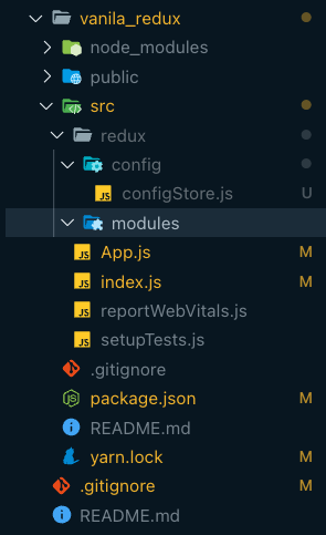
- src 폴더 안에 redux 폴더 생성
  - redus : 리덕스와 관련된 코드를 모아놓은 폴더
- redux 폴더 안에 config, modules 생성
  - config : 리덕스 설정과 관련된 파일을 모아 놓은 폴더
  - modules : 우리가 만들 State들의 그룹, 예를 들어 "todolist"를 만들때 필요한 state들이 모두 모여있을 todo.js를 생성하게 될텐데, 이 todo.js 파일이 하나의 모듈이 된다.
- config 폴더 안에 configStore.js 파일 생성
  - configStore : 중앙 state 관리소인 Store를 만드는 설정 코드가 있는 파일
-
redux 사용 순서
- 위의 구조대로 폴더 구조 생성
- configStore.js 파일에 store와 rootReducer 생성
import { createStore } from "redux"; import { combineReducers } from "redux"; const rootReducer = combineReducers({}); const store = createStore(rootReducer); export default store;- index.js에 store와 provider import 및 APP 컴포넌트 감싸주기
// 원래부터 있던 코드 import React from "react"; import ReactDOM from "react-dom/client"; import App from "./App"; import reportWebVitals from "./reportWebVitals"; // 우리가 추가할 코드 import store from "./redux/config/configStore"; import { Provider } from "react-redux"; const root = ReactDOM.createRoot(document.getElementById("root")); root.render( //App을 Provider로 감싸주고, configStore에서 export default 한 store를 넣어줍니다. <Provider store={store}> <App /> </Provider> ); reportWebVitals();-
버튼이든 뭐든 구현
-
구현한 것의 이벤트 핸들러에 dispatch({액션객체}) 넣어주기
-
리듀서로 로직 구현
-
초기값 설정
-
카운터 모듈을 스토어에 연결
-
유즈 셀럭터로 app.js에서 불러오기
4. react-router-dom
1) react-router-dom 이란?
- 페이지를 구현할 수 있게 해주는 패키지
- 설치 : yarn add react-router-dom
- 사용방법
- src폴더에 pages폴더를 만들고 그안에 페이지 컴포넌트 생성
- Router.js 생성 및 router 설정 코드 작성
- URL(Route)페이지 1개당 페이지 컴포넌트 매칭
- App.js에 import 및 적용
- 페이지 이동 테스트
// src/shard/Router.js
import React from "react";
// 1. react-router-dom을 사용하기 위해서 아래 API들을 import 합니다.
import { BrowserRouter, Route, Routes } from "react-router-dom";

// 2. Router 라는 함수를 만들고 아래와 같이 작성합니다.
const Router = () => {
  return (
    <BrowserRouter>
      <Routes>
      </Routes>
    </BrowserRouter>
  );
};

export default Router;
// src/shard/Router.js
// 4개의 페이지 컴포넌트마다 Route를 설정
import React from "react";
import { BrowserRouter, Route, Routes } from "react-router-dom";
import Home from "../pages/Home";
import About from "../pages/About";
import Contact from "../pages/Contact";
import Works from "../pages/Works";
const Router = () => {
return (
<BrowserRouter>
<Routes>
{/*
Routes안에 이렇게 작성합니다.
Route에는 react-router-dom에서 지원하는 props들이 있습니다.
paht는 우리가 흔히 말하는 사용하고싶은 "주소"를 넣어주면 됩니다.
element는 해당 주소로 이동했을 때 보여주고자 하는 컴포넌트를 넣어줍니다.
*/}
<Route path="/" element={<Home />} />
<Route path="about" element={<About />} />
<Route path="contact" element={<Contact />} />
<Route path="works" element={<Works />} />
</Routes>
</BrowserRouter>
);
};
export default Router;// App.js에 Route.js import
import React from "react";
import Router from "./shared/Router";
function App() {
return <Router />;
}
export default App;2) useNavigate
- 이벤트핸들러에 코드를 작성하여 클릭했을때 이동시키는 Hook
// src/App.js

const App = () => {
  const navigate = useNavigate();

  return (
    <button
      onClick={() => {
        navigate("/works");
      }}
    >
      works로 이동
    </button>
  );
}

export default App;
3) Link
- JSX에서 a 태그 사용시 페이지를 이동하면서 브라우저가 새로고침된다. 모든 컴포넌트가 렌더링되야하고, 리덕스나 useState를 통해 구축해 놓은 메모리상의 모든 값들이 초기화 된다.
- 페이지를 이동시키고자 할때는 useNavigate 또는 Link를 사용한다.
// src/App.js

import React from "react";
import { Link } from "react-router-dom";

const App = () => {
  return <Link to="/contact">Home</Link>;
};

export default App;
성욱