titanic 데이터를 이용해서 grouped bar plot을 그려보자.
import seaborn as sns
import matplotlib.pyplot as plt
import numpy as np

titanic = sns.load_dataset('titanic')
class 별로 사망자를 확인하고 싶으니 df.groupby를 이용해서 분류해주자.
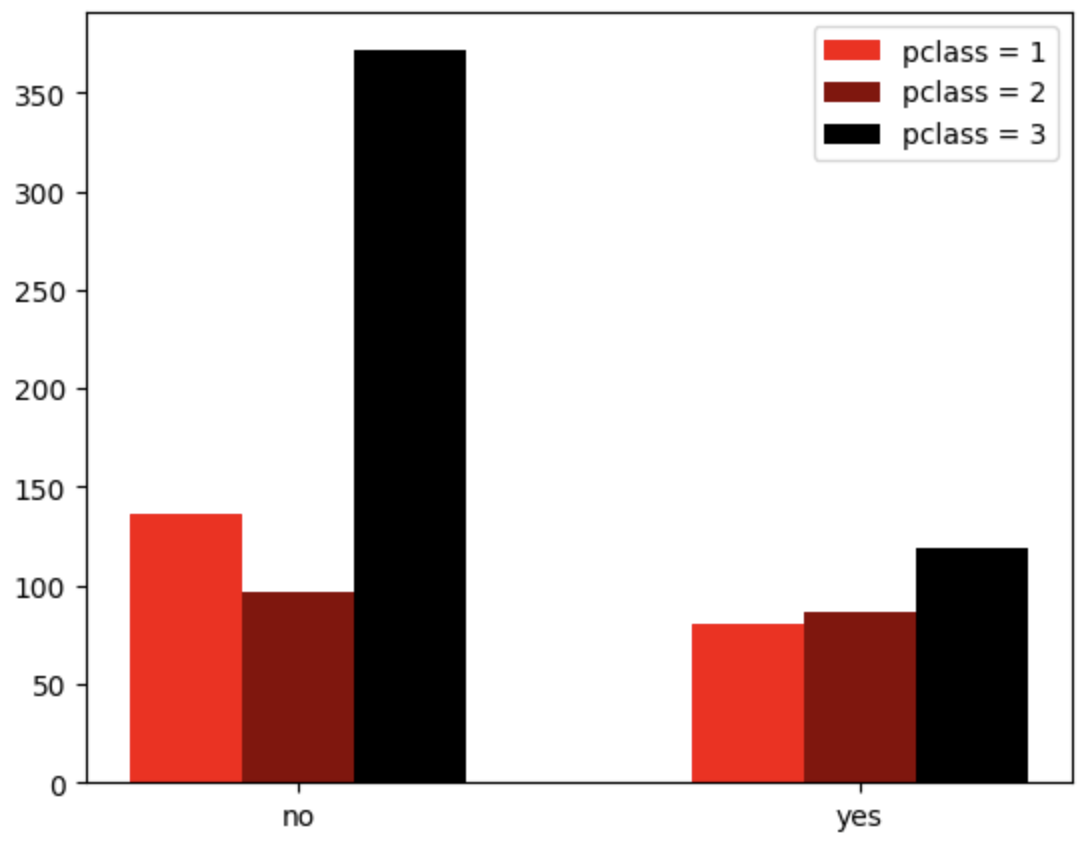
pclass = titanic.groupby('pclass')['survived'].value_counts()titanic 데이터를 확인해보면 알겠지만, pclass는 1등석, 2등석, 3등석 3개의 범주가 존재하고, survived == 0이 사망, survived ==1이 생존으로 2가지 범주이다. 이렇게 3개의 그룹에 대해서 bar plot을 그릴 때, bar plot의 x 좌표는 아래와 같이 설정할 수 있다.
= 범주의 개수
i = index (0번째, 1번째, ...)
width = bar plot의 너비 (보통 0.3 이런 값으로 설정)
위 식에 따르면 3개의 범주가 있는 pclass의 경우 , , 로 x 좌표를 설정하면 된다는 것을 알 수 있다.
# Plotting grouped bar plot

idx = np.arange(len(pclass[1].index))
width = 0.3

plt.figure()
plt.bar(idx-width, pclass[1], color='red', width=width, label='pclass = 1')
plt.bar(idx, pclass[2], color='darkred', width=width, label='pclass = 2')
plt.bar(idx+width, pclass[3], color='black', width=width, label='pclass = 3')
plt.legend()
여기에 survived 여부가 0, 1로 표시된 것을 각각 'no', 'yes'로 고쳐주자.
plt.xticks([0, 1])
plt.xticklabels(['no', 'yes'])
그러면 아래와 같이 pclass별 생존 여부를 한 눈에 볼 수 있는 grouped bar graph를 그릴 수 있다.

Let it code