나는 주로 matplotlib으로 그림을 그려왔는데, 또다른 강력한 시각화 모듈인 seaborn을 공부해보자.
seaborn은 시각화 뿐만 아니라 데이터를 가져오는 기능도 있다.
import seaborn as sns

# load the data
tbl = sns.load_dataset('titanic')
countplot 그리기
countplot은 범주형 데이터에 대한 히스토그램이라고 생각하면 되겠다.
sns.countplot(x='pclass', data=tbl, order=sorted(tbl['pclass'].unique()))
# sns.countplot(y='pclass', data=tbl)  -> 가로 방향의 countplot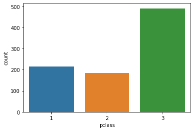
가장 기본적으로는 위와 같이 각 class에 얼마나 많은 사람이 탑승했는지 보여주는 countplot을 그릴 수 있다.
hue 옵션을 사용하면 데이터의 구분 기준을 정해서 색깔로 구분해서 보여준다. 예를 들어, 각 class에서 생존/사망한 케이스들을 구분해서 보고싶다면, hue='survived'로 지정해서 분리해서 볼 수 있다.
sns.countplot(x='pclass', data=tbl, hue='survived', order=sorted(tbl['pclass'].unique()))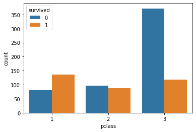
원하는 색깔로 바꾸고 싶다면 palette 옵션을 사용하자.
boxplot 그리기
sns.boxplot(x='age', data=tbl)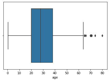
위와 같이 그려서 타이타닉 탑승객들의 나이의 사분위수를 시각화 할 수 있다.
아래와 같이 범주에 따라 나누어서 boxplot을 나누어 그릴 수도 있다.
sns.boxplot(x='pclass', y='age', data=tbl)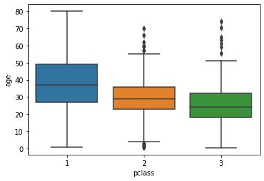
hue 옵션을 추가하면 특정 key에 따라서 분포를 볼 수도 있다.
sns.boxplot(x='pclass', y='age', hue='survived', data=tbl)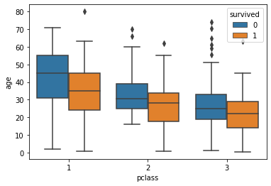
violin plot 그리기
violin plot은 boxplot처럼 대표값을 보여주면서도 실제 분포를 표현해준다.
그러나 존재하지 않는 범위까지 데이터가 표시되는 등 문제가 있으므로 시각화할 때 주의해야 한다.
sns.violinplot(x='age', data=tbl)    # subplot 1
sns.violinplot(x='pclass', y='age', data=tbl)    # subplot 2
sns.violinplot(x='pclass', y='age', hue='survived', data=tbl)   # subplot 3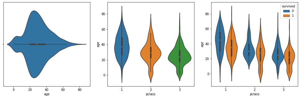
split=True 옵션을 사용하면 범주 하나에 대해서 하나의 violin plot으로 합치되 반쪽은 하나의 feature, 다른 반쪽은 다른 feature로 그려진다.
이외에도 boxenplot, swarmplot, stripplot 등이 있으니 상황에 맞게 사용하도록 하자.
histogram 그리기
# histogram
sns.histplot(x='age', data=tbl)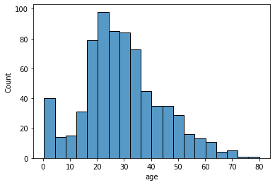
히스토그램은 bin 조정하는 것에 항상 주의하자.
히스토그램도 hue 옵션을 이용해서 여러 데이터를 동시에 히스토그램으로 그릴 수도 있다.
sns.histplot(x='age', data=tbl, hue='sex', multiple='stack')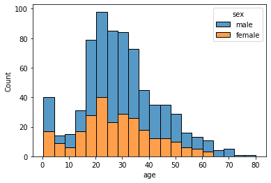
multiple 옵션은 여러 개의 히스토그램을 동시에 나타낼 때 어떤 방식으로 나타낼지를 정하는 옵션인데, default는 'layer'이다. 그러나 'layer'는 겹치면 회색으로 나타나서 분석에 방해가 되므로 'stack' 등으로 조절하자. 상대적인 비율을 확인하기에는 'fill'이 괜찮다.
확률 밀도 함수 그리기
# probability density (Kernel Density Estimate; KDE)
# similar to plt.hist(histtype='step', density=True)
sns.kdeplot(x='age', data=tbl)

# cumulative distribution
# similar to plt.hist(histtype='step', density=True, cumulative=True)
sns.ecdfplot(x='age', data=tbl)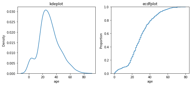
sns.kdeplot는 확률 밀도 함수 (스무딩 되어 있음. 보다 섬세하게 나타내려 bw_method 옵션의 숫자를 조정하자.)
sns.ecdfplot는 누적 확률 밀도로 나타낸 것
kdeplot과 ecdfplot도 모두 hue 옵션을 이용해서 여러 데이터를 동시에 나타낼 수 있다.
2차원 분포 그리기
seaborn에서는 histplot에서 y도 설정을 해주면 x와 y의 bivariate distribution을 볼 수 있다. bin을 적당한 크기로 설정하는 것이 중요하겠다.
sns.histplot(x='age', y='fare', data=tbl, bins=(20, 10), cbar=True)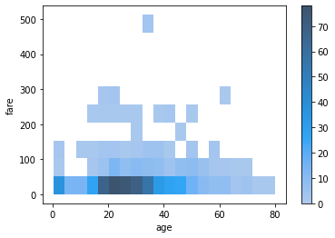
contour map 그리기
kdeplot을 이용하면 contour map도 그릴 수 있다.
sns.kdeplot(x='age', y='fare', data=tbl, fill=True)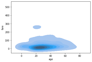
scatter plot 그리기
sns.scatterplot(x='age', y='fare', data=tbl, hue='survived')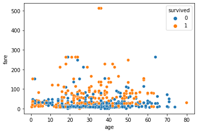
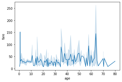
line plot 그리기
sns.lineplot(x='age', y='fare', data=tbl)자동으로 평균과 표준 편차를 계산해서 음영으로 오차범위를 보여준다.
마찬가지로 hue 옵션을 추가하면 다른 범주의 데이터도 함께 그릴 수 있다.
regplot 그리기
seaborn에서 regplot은 데이터 포인트들의 linear regression model fit (회귀선)을 함께 보여주는 scatter plot이다.
sns.regplot(x='age', y='fare', data=tbl)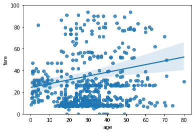
옵션을 조절해서 regression 방식을 바꾸거나, 2차식 이상의 피팅을 할 수도 있다. 자세한 것은 공식 documentation 참조.
heatmap 그리기
seaborn을 사용하면 상관 관계를 시각화하기 좋은 heatmap도 그릴 수 있다.
# tbl should be pandas DataFrame
sns.heatmap(tbl.corr(method='pearson', numeric_only=True))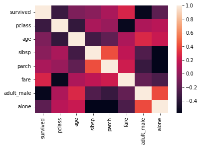
vmin, vmax 옵션을 이용해서 상관 관계가 잘 드러나도록 값을 조절해보자. (+ center)
cmap을 사용해서 색조를 변경할 수도 있다.
annot=True로 설정하면 correlation coefficient 값을 각 칸마다 표시할 수 있다. fmt='.2f' 등으로 형식을 조절해서 너무 복잡하게 나타나지 않도록 하자.
heatmap은 대칭적인 모양으로 나타나기 때문에 대각선 부분을 굳이 나타낼 필요는 없다. 대각선 부분을 나타내지 않으려면 마스크를 추가해주면 된다.
import numpy as np

mask = np.zeros_like(tbl.corr())
mask[np.triu_indices_from(mask)] = True

sns.heatmap(tbl.corr(), mask=mask)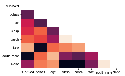
scatter plot with marginal histogram
scatter plot에서 alpha (투명도) 값을 조정하지 않으면 데이터 포인트가 겹치는 경우 정확한 분포를 알기 어렵다. (그리고 투명도를 조정하는 것도 한계가 있다.) 이 때 marginal histogram을 함께 그린다면 데이터의 분포를 보다 더 효과적으로 나타낼 수 있다.
seaborn의 jointplot 이 scatter plot with marginal histogram을 잘 그려준다.
sns.jointplot(x='age', y='fare', data=tbl)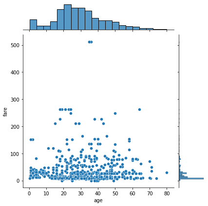
hue 옵션을 추가해서 범주별로 나누어 볼 수도 있다.
sns.jointplot(x='age', y='fare', hue='sex', data=tbl)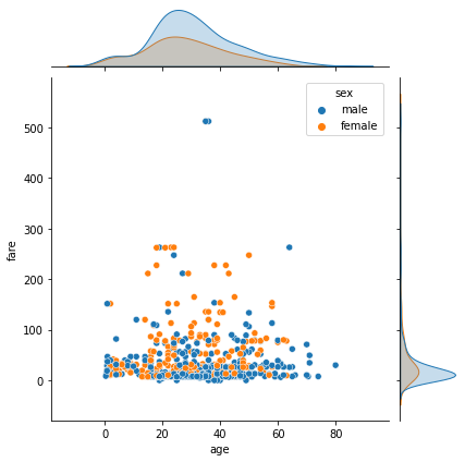
pair plot
pair plot (a.k.a. scatterplot matrix)는 각 변수 쌍의 관계를 한 눈에 보여주는 그림이다. 같은 변수끼리 비교하는 칸은 그 변수의 히스토그램을 보여주고 다른 변수끼리 비교하는 칸은 두 변수 간의 관계를 보여주는 산점도를 보여준다.
sns.pairplot(data=tbl) # StudentPerformance.csv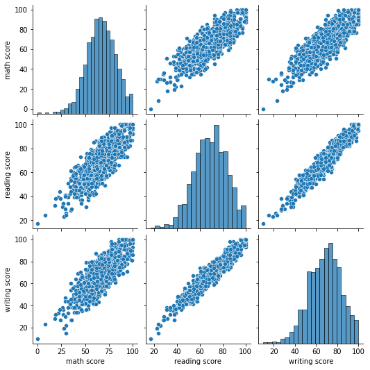
hue 옵션을 추가해서 범주별로 나누어 볼 수도 있다.
sns.pairplot(data=tbl, hue='gender') # StudentPerformance.csv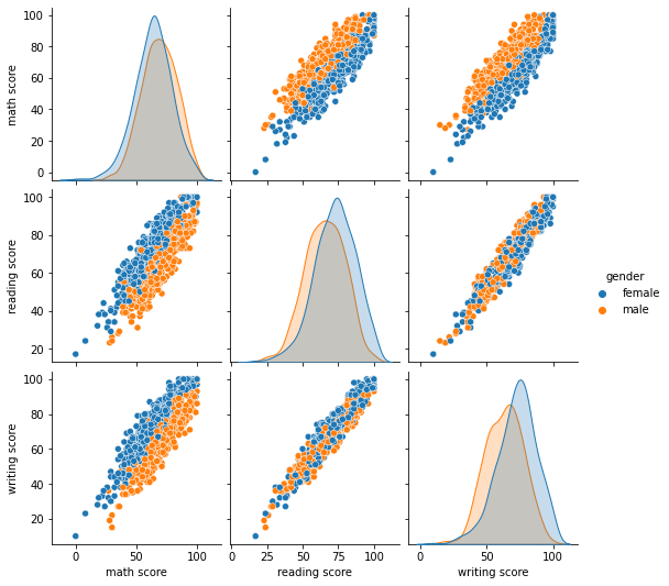
pair plot도 heatmap처럼 대각선을 기준으로 대칭이기 때문에 나머지 부분을 표시하지 않으려면 corner=True 옵션을 추가하면 된다.
matplotlib과의 연동
편리하게도 seaborn은 matplotlib과 연동성이 좋다.
from matplotlib import pyplot as plt

fig, ax = plt.subplots(1, 2, figsize=(12, 5))
sns.countplot(x='pclass', data=tbl, hue='survived', ax=ax[0])
sns.countplot(x='sex', data=tbl, hue='survived', ax=ax[1])
plt.show()