
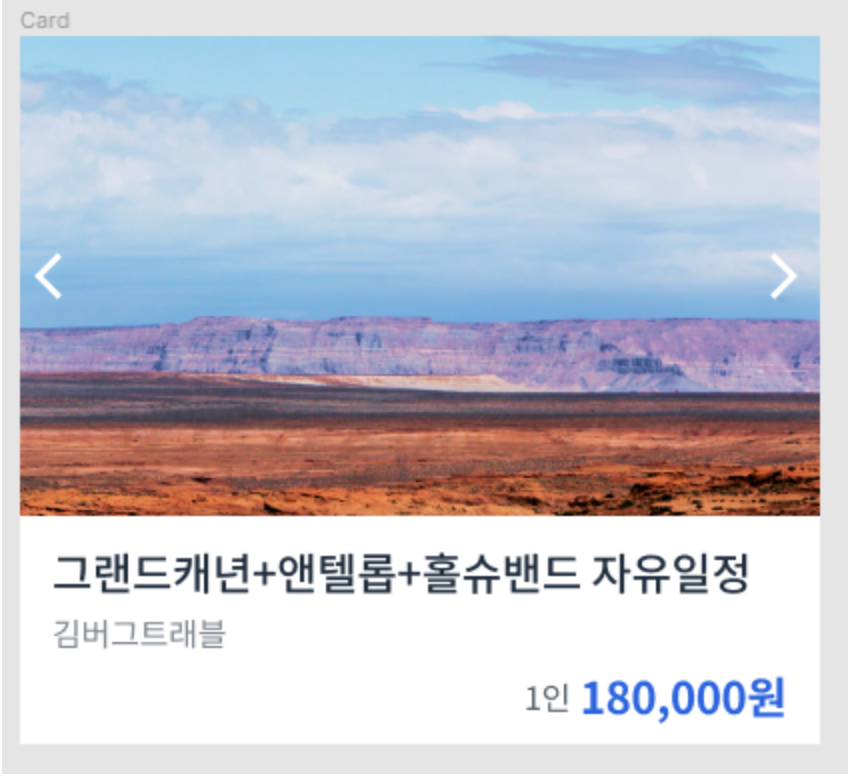
예제 1 (product card)
CSS source code
* {
  box-sizing: border-box;
  margin: 0;
}

body {
  font-family: "Noto Sans KR", sans-serif;
  letter-spacing: -0.02em;
}

h1 {
  font-size: 22px;
  font-weight: 500;
  color: #1f2d3d;
  line-height: 1.4545454545;
}

span {
  font-size: 14px;
  font-weight: 400;
  color: #7d858f;
  line-height: 1.5;
}

strong {
  font-size: 22px;
  color: #2860e1;
  line-height: 1.0909090909;
}

strong span {
  font-size: 16px;
  font-weight: 400;
  color: #525d69;
  line-height: 1.5;
}

button {
  display: block;
  width: 28px;
  height: 28px;
  border: none;
  background-size: contain;
  background-repeat: no-repeat;
  background-position: center center;
  background-color: transparent;
}

#prev {
  background-image: url(./assets/icon-backward.svg);
}

#next {
  background-image: url(./assets/icon-forward.svg);
}

.card {
  width: 400px;
}

.card-carousel {
  position: relative;
}

.card-carousel img {
  display: block;
  width: 100%;
  height: auto;
}

#prev, #next {
  position: absolute;
  transform: translateY(-50%);
}

#prev {
  top: 50%;
  left: 0;
}

#next {
  top: 50%;
  right: 0;
}

.card-content {
  padding: 12px 16px;
}

.card-content h1 {
  margin-bottom: 2px;
}

.card-content strong {
  display: block;
  margin-top: 8px;
  text-align: right;
}
HTML source code
<!DOCTYPE html>
<html lang="ko">
  <head>
    <meta charset="UTF-8" />
    <meta name="viewport" content="width=device-width, initial-scale=1.0" />
    <title>Position 2</title>
    <link href="https://fonts.googleapis.com/css?family=Noto+Sans+KR:400,500,700&display=swap" rel="stylesheet" />
    <link rel="stylesheet" href="./style.css" />
  </head>
  <body>
    <div class="card">
      <div class="card-carousel">
        <img src="./assets/img-card.jpg" alt="그랜드캐년" />
        <button type="button" aria-label="이전" id="prev"></button>
        <button type="button" aria-label="다음" id="next"></button>
      </div>
      <div class="card-content">
        <h1>
          그랜드캐년+앤텔롭+홀슈밴드 자유일정
        </h1>
        <span>
          김버그트래블
        </span>
        <strong>
          <span>
            1인
          </span>
          180,000원
        </strong>
      </div>
    </div>
  </body>
</html>
Transform
- '변형시키다'라는 뜻으로 스타일 요소의 모양을 변형시키는 CSS property.
- rotate(각도 조정), scale(크기 조정), translate(위치 이동) 등 다양하다.
transform: translate(x, y);
자기 자신을 기준으로 x축과 y축, 혹은 각각의 축으로 위치를 이동시킬 수 있다. ('-'는 위로, '+'는 아래 방향으로)position: absolute;를 적용할 때 가운데 정렬은 항상 'translate'으로 잡아준다.
Questions & Learned
- 이지미 크기를 조정할 때, 부모 클래스의 width값을 설정해 준 후, 이미지 클래스의 width: 100%로 설정하면, 전체 width를 맞출 수 있다.
Tip. 이미지 크기 조정할 때 자주 쓰이는 조합
	display: block;
	width: 100%;
height: auto;- 이미지 가운데 배치는 % 값을 사용한다. -> top: 50%; 기준점에서 50% 떨어진 곳에 위치. 기준값: absolute의 기준점
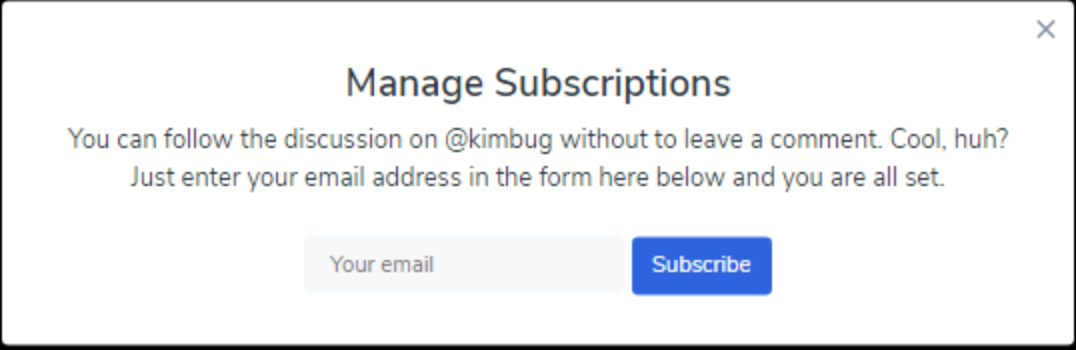
예제 2 (subscription modal)
CSS source code
* {
  box-sizing: border-box;
  margin: 0;
}

body {
  width: 100%;
  height: 100vh;
  font-family: "Nunito Sans", sans-serif;
  color: #273444;
  background-color: #000;
}

input:focus,
input:active,
button:focus,
button:active {
  box-shadow: none;
  outline: none;
}

.modal {
  background-color: #fff;
}

.modal-title {
  font-size: 24px;
  font-weight: 600;
  line-height: 1.6666666667;
}

.modal-desc {
  font-size: 16px;
  line-height: 1.5;
}

.input-group input,
.input-group button {
  font-size: 14px;
  font-family: "Nunito Sans", sans-serif;
  line-height: 1.4285714286;
}

.close-button {
  width: 20px;
  height: 20px;
  border: none;
  background-color: transparent;
  background-image: url(./assets/icon-close.svg);
  background-position: center center;
  background-size: contain;
  background-repeat: no-repeat;
}

.modal {
  position: fixed;
  top: 50%;
  left: 50%;
  transform: translate(-50%, -50%);
  padding: 32px 40px;
  border-radius: 4px;
}

.modal-title, .modal-desc {
  text-align: center;
}

.modal-title {
  margin-bottom: 4px;
}

.modal-desc {
  max-width: 590px;
  margin-bottom: 24px;
}

.close-button {
  position: absolute;
  top: 8px;
  right: 8px;
}

.input-group {
  text-align: center;
}

.input-group input {
  width: 200px;
  height: 36px;
  padding: 8px 16px;
  border: none;
  border-radius: 4px;
  background-color: #F6F8FA;
}

.input-group button {
  padding: 8px 13px;
  border: none;
  border-radius: 4px;
  color: white;
  background-color: #2860E1;
}
HTML source code
<!DOCTYPE html>
<html lang="en">
  <head>
    <meta charset="UTF-8" />
    <meta name="viewport" content="width=device-width, initial-scale=1.0" />
    <title>Position 3</title>
    <link href="https://fonts.googleapis.com/css?family=Nunito+Sans:400,600&display=swap" rel="stylesheet" />
    <link rel="stylesheet" href="./style.css" />
  </head>
  <body>
    <aside class="modal">
      <h1 class="modal-title">Manage Subscriptions</h1>
      <p class="modal-desc">
        You can follow the discussion on @kimbug without to leave a comment. Cool, huh? Just enter your email address in
        the form here below and you are all set.
      </p>
      <div class="input-group">
        <input type="email" placeholder="Your email" />
        <button type="button">Subscribe</button>
      </div>
      <button type="button" class="close-button" aria-label="Close the modal"></button>
    </aside>
  </body>
</html>
Questions & Learned
- block 요소를 가운데 정렬할 때,
margin: 0 auto;를 쓴다. (margin 왼쪽과 오른쪽을 골고루 배분한다) - 'subscribe button'의 경우 width를 따로 설정하지 않고, padding으로 설정했는데, 이는 나중에 버튼 글자가 수정될 경우(재사용성)를 고려한 것이다.
-> 왜? 글자가 늘어나면, width값도 재설정해야한다. 하지만 padding은 그대로 유지된다. - modal 화면 가운데 배치시
position: fixed;(컨텐츠 크기만큼 크기 자동조정)
top: 50%; left: 50%;transform: translate(-50%, -50%)(x축 뒤로, Y축 위로)
출처: '김버그의 HTML&CSS는 재밌다'를 학습하고 정리한 내용입니다.
