StoryBook
StoryBook
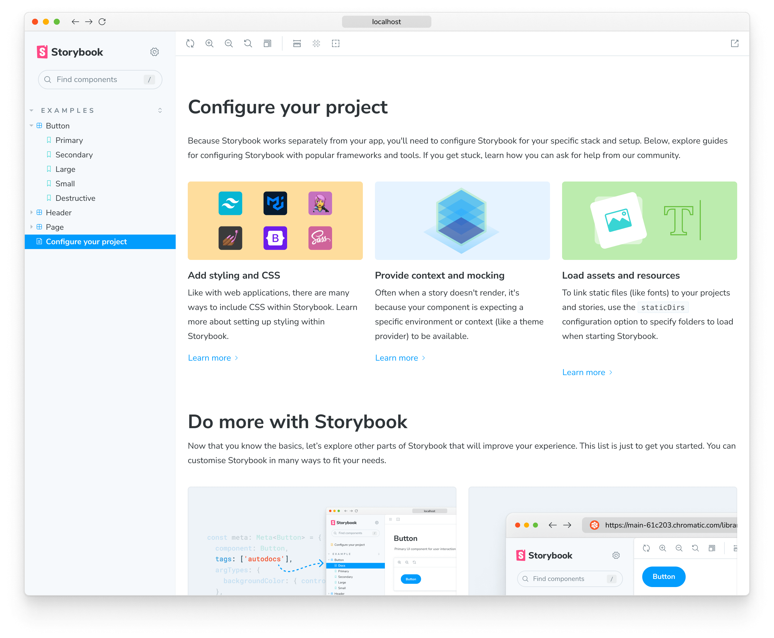
Storybook is a frontend workshop for building UI components and pages in isolation. Thousands of teams use it for UI development, testing, and documentation. It’s open source and free.
스토리북은 UI 구성 컴포넌트와 페이지를 개별적으로 구축하기 위한 프론트엔드 개발도구이다.
advantage
- 독립적인 환경에서 컴포넌트를 다룰 수 있다.
- 컴포넌트 문서화, 테스트가 가능하다
- figma 연동이 가능해 디자이너와 커뮤니케이션에 효율적이다.
1. Setup and Start
- npx storybook@latest init
- npm run storybook
2. Guide
1. main.ts
import type { StorybookConfig } from "@storybook/react-vite";

const config: StorybookConfig = {
  stories: ["../src/**/*.mdx", "../src/**/*.stories.@(js|jsx|mjs|ts|tsx)"],
  addons: [
    "@storybook/addon-links",
    "@storybook/addon-essentials",
    "@storybook/addon-onboarding",
    "@storybook/addon-interactions",
  ],
  framework: {
    name: "@storybook/react-vite",
    options: {},
  },
  docs: {
    autodocs: "tag",
  },
};
export default config;
2.preview.ts
import type { Preview } from "@storybook/react";

// global하게 적용되는 포맷을 설정할 수 있다.
const preview: Preview = {
  parameters: {
    actions: { argTypesRegex: "^on[A-Z].*" },
    controls: {
      matchers: {
        color: /(background|color)$/i,
        date: /Date$/i,
      },
    },
  },
};

export default preview;
3.example.stories.tsx
import type { Meta, StoryObj } from '@storybook/react';

import { YourComponent } from './YourComponent';

//👇 This default export determines where your story goes in the story list
const meta: Meta<typeof YourComponent> = {
  component: YourComponent,
  title: "Title"
};

export default meta;
type Story = StoryObj<typeof YourComponent>;

export const FirstStory: Story = {
  args: {
    color:" black"
    size: "small"
  },
};
공식문서 https://storybook.js.org/docs/get-started/why-storybook
리액트번역 문서 https://storybook.js.org/tutorials/design-systems-for-developers/react/ko/introduction/