시작
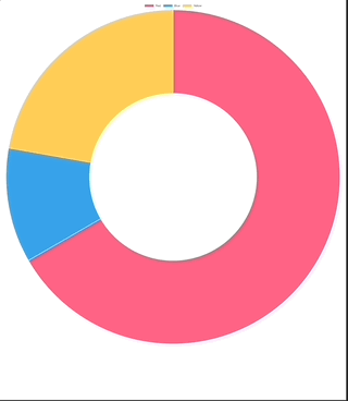
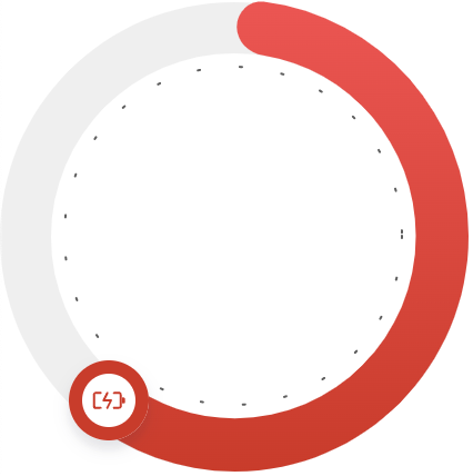
- 다음과 같은 doughnut chart를 그려야 한다
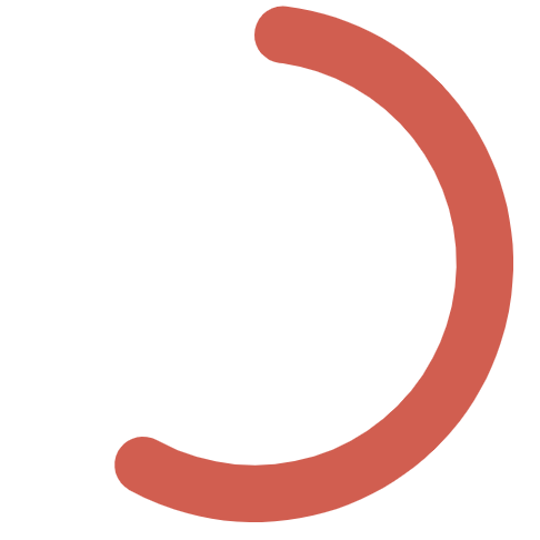
- 차트 endpoint를 다음 그림 처럼 커스터마이징 해야한다.
- 애니메이션은 둥글게 펼쳐지는 방식

구현과정
도넛차트 사용해보기
- 일단 chartjs 라는 좋은 라이브러리가 있기에 여기서 doughnut chart를 사용해보았다.
<canvas id="doughnutChartCanvas"></canvas>const canvas = document.getElementById("doughnutChartCanvas");
const data = {
labels: ["Red", "Blue", "Yellow"],
datasets: [
{
label: "My First Dataset",
data: [300, 50, 100],
backgroundColor: [
"rgb(255, 99, 132)",
"rgb(54, 162, 235)",
"rgb(255, 205, 86)",
],
hoverOffset: 4,
},
],
};
new Chart(canvas, {
type: "doughnut",
data,
});
Color, Border, Radius 적용
- 우리가 원하는 차트는 상단에 범례표시가 없고, 빨강색에 radius가 있는 등등 여러 조건들이 있다. 해당조건들을 적용시켜보자
- 게이지를 표시 할 것이므로 datasets의 data를 두 종류로 표시하되 data[0]에 실제 데이터, data[1]는 보이지 않도록 적용해주자
- 백분율이므로 data: [value, 100-value] 로 구성을 해주자
- data[1]을 투명하게 하기 위해서 rgba값을 #ffffff00 으로 지정 (알파채널이 00 이면 된다.)
- cutout 적용
- 도넛의 굵기를 cutout으로 조절할 수 있다.
pie에서 얼마만큼 잘라낼(cutout) 것인가?
const canvas = document.getElementById("doughnutChartCanvas");
const value = 60;
const data = {
  datasets: [
    {
      data: [value, 100 - value],
      backgroundColor: ["#e15449", "#ffffff00"],
      borderWidth: 0,
      borderRadius: 30,
    },
  ],
};
const options = {
  cutout: '78%',
}
new Chart(canvas, {
  type: "doughnut",
  data,
  options,
});
Size와 Background
- 크기를 지정하지 않으면 화면을 꽉 채워버리기에 원하는 크기 지정을 하자
- canvas에 크기 지정을 할 때 유의
- 반응형을 원하는 경우 chartjs docs에서는 다음과 같이 추천하고 있다
- https://www.chartjs.org/docs/latest/configuration/responsive.html
이는 canvas element로부터 크기 변화를 감지할 수 없기 때문이라 이야기 하고 있다.
- 현재 우린 고정된 크기의 차트를 우선 그려보기 위해 다음과 같이 Size를 지정해보자
- legend: false를 지정해줘야 상단 부분의 여백이 사라진다. (범례(legend)를 위한 공간을 자동으로 만들어두기에)
<div class="doughnut-chart" id="doughnutChart">
  <canvas id="doughnutChartCanvas"></canvas>
</div>
.doughnut-chart {
position: relative;
width: 200px;
height: 200px;
background: url("./images/doughnutBackground.svg");
background-repeat: no-repeat;
background-position: center center;
background-size: cover;
}const canvas = document.getElementById("doughnutChartCanvas");
const value = 60;
const data = {
datasets: [
{
data: [value, 100 - value],
backgroundColor: ["#e15449", "#ffffff00"],
borderWidth: 0,
borderRadius: 30,
},
],
};
const options = {
cutout: '78%',
hover: { mode: null },
plugins: {
legend: {
display: false,
},
tooltip: {
enabled: false,
},
},
}
new Chart(canvas, {
type: "doughnut",
data,
options,
});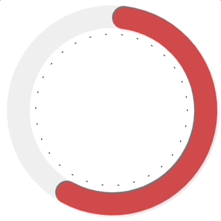
이제 좀 그린거 같다.
대망의 endpoint
-
원하는 endpoint를 canvas에 그려야 하고 해당 endpoint가 animation과 함께 움직여야 한다.
-
chartjs에서는 animation중일 때 다음과 같은 callback을 지원한다.
- https://www.chartjs.org/docs/latest/configuration/animations.html#animation-callbacks
- onProgress는 animation이 진행되는 동안의 각 단계마다
- onComplete는 animation이 완료된 직후
- 호출된다.
-
canvas 요소에서 애니메이션을 구현하는 방식 (mdn docs)
-
초기 상태 저장
-
애니메이션 할 도형을 그림
-
저장한 시점으로 캔버스 복원
-
2~4 반복
-
요약하자면 animation 처럼 보이도록 계속 그리고 지우고를 반복하는 것이다.
-
그럼 endpoint를 그리려면?
- 매번의 animation 마다 endpoint가 그려질 좌표를 찾아서
- 해당 좌표에 원하는 endpoint를 그려준다.
-
chartjs는 chart를 canvas에 그리기 위해 chart 객체 내에 data를 저장해둔다.
-
console로 chart 객체를 보자
animation: {
  onProgress: function (animation) {
    console.log(animation.chart);
  },
},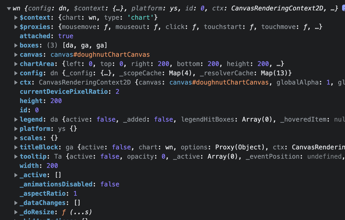
- 여기서 getDatasetMeta를 이용하여 차트의 메타데이터를 얻을수 있다.
animation: {
  onProgress: function (animation) {
    console.log(animation.chart.getDatasetMeta(0).data[0]);
  },
},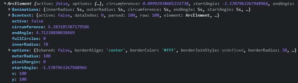
- 위 데이터 중 우린 다음의 데이터를 사용하여 endPoint의 좌표를 지정해줄 것이다
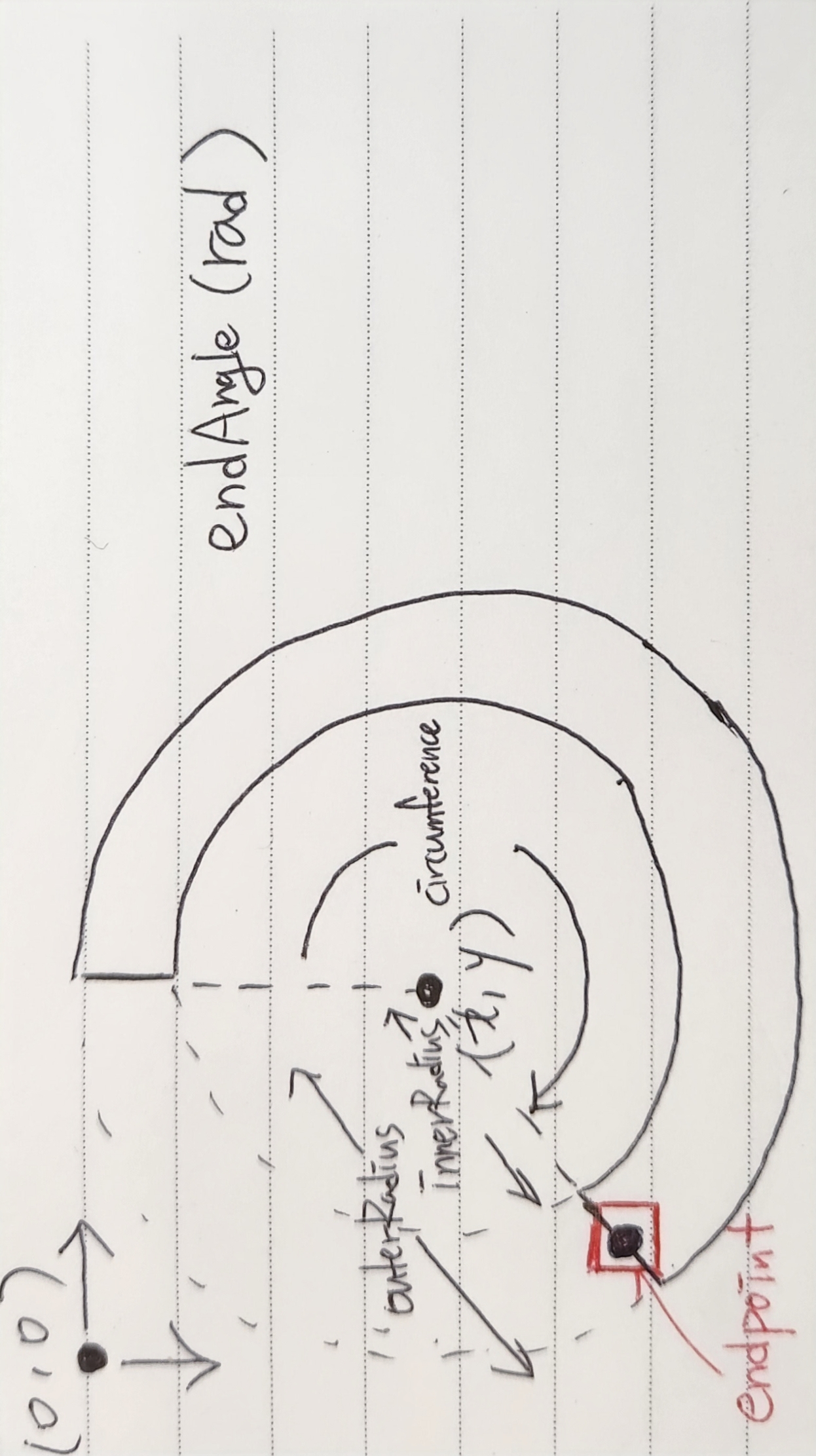
- endPoint 좌표 계산
-
중심(x,y)으로부터 endPoint까지의 길이
-
각도 계산
-
중심좌표
-
endPoint 중심좌표
-
endPoint canvas 시작좌표
-
즉, 3번의 좌표에서 endPoint를 그려나가면 된다. 코드로 표현해보자
function drawEndPoint(context, image) {
  // endpoint draw
  const curChart = context.chart;
  const curCtx = context.chart.ctx;
  const endPointRad =
    curChart.getDatasetMeta(0).data[0].outerRadius / 2 +
    curChart.getDatasetMeta(0).data[0].innerRadius / 2; // length from center to endPoint
  const er = 23; // endpoint radius (half image size)
  // endPoint canvas start point (px, py)
  const px =
      curChart.getDatasetMeta(0).data[0].x -
      endPointRad *
      Math.sin(
          curChart.getDatasetMeta(0).data[0].circumference - Math.PI
      ) -
      er;
  const py =
      curChart.getDatasetMeta(0).data[0].y +
      endPointRad *
      Math.cos(
          curChart.getDatasetMeta(0).data[0].circumference - Math.PI
      ) -
      er;
  // draw endPoint image to canvas
  curCtx.drawImage(image, px, py);
}
위와같이 구현된다.
추가고려사항
- endPoint가 큰 경우 canvas에 padding을 부여하여 canvas 영역에 일정 공간을 부여해야 endPoint가 잘려나가지 않음
- 결국 canvas 영역에 그리기 때문에 endPoint가 animation 되는동안 그려질 공간을 확보해야한다.
- 위 영상을 자세히 보면 padding이 없어서 잘려나감
notion에 쓴걸 복붙하다보니 양식이 개판인건 양해부탁합니다
개발 지식 공부
잘봤어요! 근데 궁금한게 있는데요.. 저도 같이 따라서 해봤는뎅, borderRadius를 줬을 때 각 데이터 간에 borderRadius값이 따로 들어가던데.. 맨 끝쪽에만 값이 들어가는거죠?? 제가 사용한 버전은 4.2.1 이에요!