📌 CSS 이용하기
📖 CSS 트랜지션으로 애니메이션 넣기
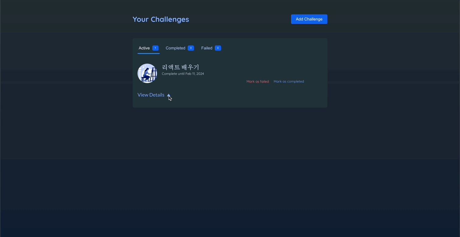
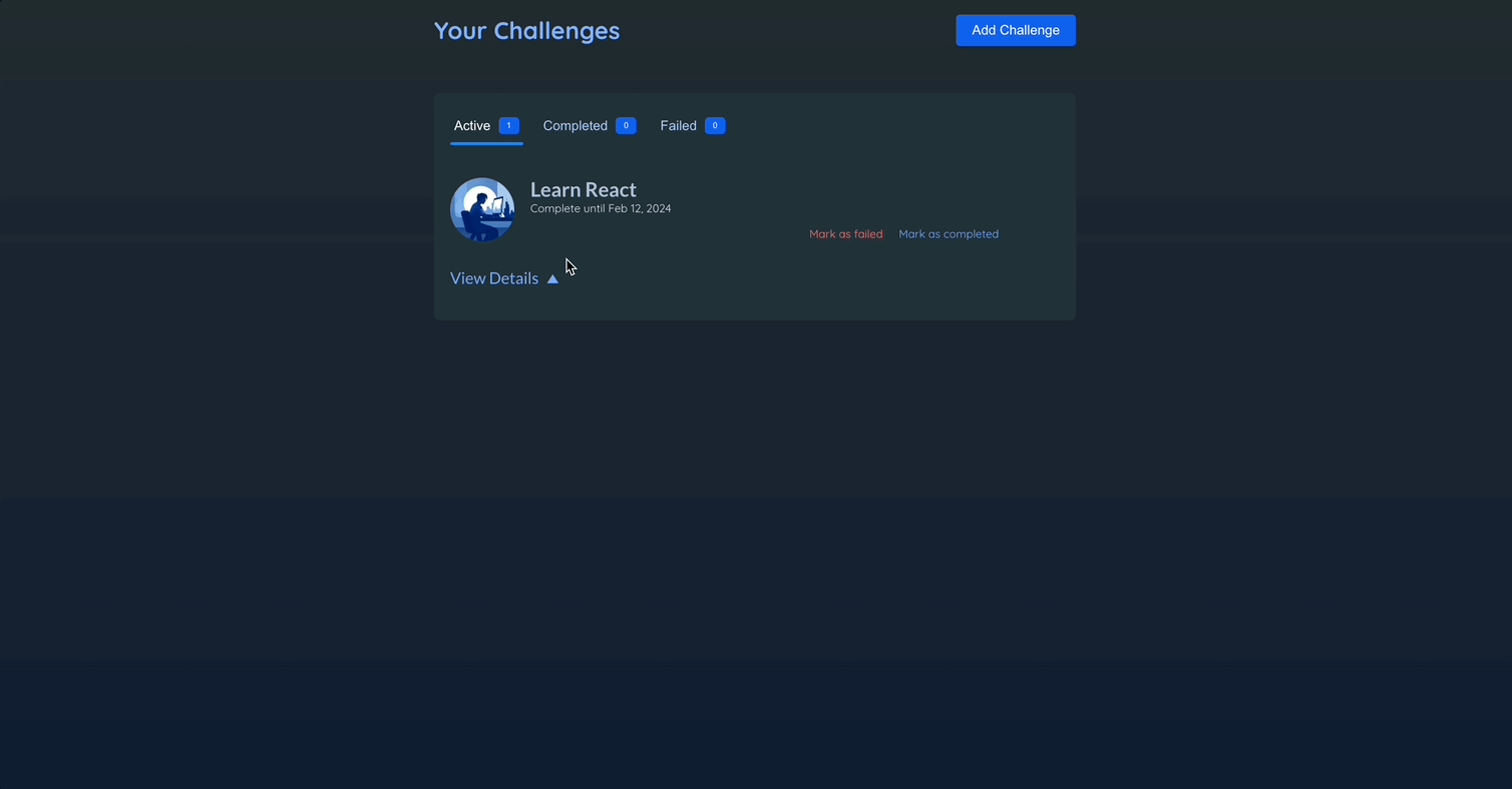
challenge-item-details-icon에 대한 애니메이션을 추가할 것이다.
💎 참고 : ChanllengeItem.jsx
{
/* ... */
}
<div className={`challenge-item-details ${isExpanded ? "expanded" : ""}`}>
<p>
<button onClick={onViewDetails}>
View Details <span className="challenge-item-details-icon">▲</span>
</button>
</p>
{/* ... */}
</div>;💎 index.css
.challenge-item-details-icon {
  display: inline-block;
  font-size: 0.85rem;
  margin-left: 0.25rem;
  transition: transform 0.3s ease-out;
  /* 트랜스폼에 변화가 있다면 값변화에 애니메이션을 적용하겠다! */
  /* 지속시간 설정 */
  /* 애니메이션의 속도 조절 */
}

.challenge-item-details.expanded .challenge-item-details-icon {
  transform: rotate(180deg);
  /* 아이콘을 회전하겠다~ */
}- CSS 트랜지션을 사용하려면
transition프로퍼티를 추가하면 된다. - 아이콘의 기본 규칙으로 추가할 것이다.
📖 CSS 애니메이션으로 애니메이션 넣기
@keyframes라는 특수한 구문으로 직접 애니메이션 작성
.modal {
  top: 10%;
  border-radius: 6px;
  padding: 1.5rem;
  width: 30rem;
  max-width: 90%;
  z-index: 10;
  animation: slide-up-fade-in 0.3s ease-out forwards; /* 요소가 DOM에 추가될 때 CSS에 의해 자동으로 실행된다. */
  /* forwards: 지속시간이 끝나 애니메이션이 종료되면 최종 상태를 유지하라는 의미. */
}

@keyframes slide-up-fade-in {
  /* 요소가 DOM에 포함되지 않아도 초기 상태를 정의할 수 있고 최종 상태와 중간 상태도 정의할 수 있다. */
  /* from{} to{} 혹은 0%{} 100%{}로 표현할 수 있다. */
  0% {
    transform: translateY(30px);
    opacity: 0; /* 처음엔 보이지 않게 */
  }

  100% {
    transform: translateY(0);
    opacity: 1;
  }
}
📌 프레이머 모션
📖 프레이머 모션 소개
- CSS로 DOM에서 나타나게 하는 애니메이션을 적용할 수 있지만 사라지는 애니메이션은 어렵다.
- CSS로는 복잡한 애니메이션은 적용시키기 힘들다.
- 설치하기 :
npm install framer-motion
📖 프레이머 모션 기초
📖 조건 값 사이에 애니메이션 넣기
isExpaned가 true이면 180도 회전, false이면 회전하지 않는다.
export default function ChallengeItem() {
return (
<motion.span
animate={{ rotate: isExpanded ? 180 : 0 }}
className="challenge-item-details-icon"
>
▲
</motion.span>
);
}
📖 진입 애니메이션 추가하기
💎 Modal.jsx
import { createPortal } from "react-dom";
import { motion } from "framer-motion";

export default function Modal({ title, children, onClose }) {
  return createPortal(
    <>
      <div className="backdrop" onClick={onClose} />
      <motion.dialog
        initial={{ opacity: 0, y: 30 }}
        animate={{ opacity: 1, y: 0 }}
        open
        className="modal"
      >
        <h2>{title}</h2>
        {children}
      </motion.dialog>
    </>,
    document.getElementById("modal")
  );
}initial속성을 통해 해당 요소가 DOM에 추가된 직후 곧바로 재생될 애니메이션의 초기상태를 정의. → 시작 상태를 지정.
📖 요소가 사라지는/삭제되는 애니메이션 넣기
💎 Modal.jsx
import { createPortal } from "react-dom";
import { motion } from "framer-motion";

export default function Modal({ title, children, onClose }) {
  return createPortal(
    <>
      <div className="backdrop" onClick={onClose} />
      <motion.dialog
        initial={{ opacity: 0, y: 30 }}
        animate={{ opacity: 1, y: 0 }}
        exit={{ opacity: 0, y: 30 }} // 요소가 DOM에서 삭제될 때 적용하고 싶은 애니메이션 상태
        open
        className="modal"
      >
        <h2>{title}</h2>
        {children}
      </motion.dialog>
    </>,
    document.getElementById("modal")
  );
}exit: 요소가 DOM에서 삭제될 때 적용하고 싶은 애니메이션 상태
💎 Header.jsx
import { useState } from "react";
import { AnimatePresence } from "framer-motion";

import NewChallenge from "./NewChallenge.jsx";

export default function Header() {
  const [isCreatingNewChallenge, setIsCreatingNewChallenge] = useState();

  function handleStartAddNewChallenge() {
    setIsCreatingNewChallenge(true);
  }

  function handleDone() {
    setIsCreatingNewChallenge(false);
  }

  return (
    <>
      {/* 프레이머모션이 해당 코드를 실행할때 코드가 렌더링하는 요소(모달)이 즉시 삭제되는 것을 방지하고 exit 속성이 있는지 확인. */}
      {/* exit을 확인하면 exit 애니메이션부터 실행한 뒤, 삭제한다. */}
      <AnimatePresence>
        {isCreatingNewChallenge && <NewChallenge onDone={handleDone} />}
      </AnimatePresence>
      <header id="main-header">
        <h1>Your Challenges</h1>
        <button onClick={handleStartAddNewChallenge} className="button">
          Add Challenge
        </button>
      </header>
    </>
  );
}AnimatePresence: 어떤 요소에 애니메이션을 적용할때(요소를 사라지게하는 애니메이션) 조건에 따라 요소를 표시하거나 삭제하는 코드를 감싸는 래퍼로 쓰인다.- 프레이머 모션이 해당 코드를 실행할때 코드가 렌더링하는 요소(모달)이 즉시 삭제되는 것을 방지하고
exit속성이 있는지 확인. exit을 확인하면exit애니메이션부터 실행한 뒤, 삭제한다.
📖 마우스 오버 애니메이션으로 튀어나오는 듯한 효과 주기
💎 Header.jsx
import { useState } from "react";
import { AnimatePresence, motion } from "framer-motion";

import NewChallenge from "./NewChallenge.jsx";

export default function Header() {
  const [isCreatingNewChallenge, setIsCreatingNewChallenge] = useState();

  function handleStartAddNewChallenge() {
    setIsCreatingNewChallenge(true);
  }

  function handleDone() {
    setIsCreatingNewChallenge(false);
  }

  return (
    <>
      <AnimatePresence>
        {isCreatingNewChallenge && <NewChallenge onDone={handleDone} />}
      </AnimatePresence>
      <header id="main-header">
        <h1>Your Challenges</h1>
        <motion.button // 튀어나오는 모션
          whileHover={{ scale: 1.1 }}
          transition={{ type: "spring", stiffness: 500 }} // 튕김 애니메이션 추가
          onClick={handleStartAddNewChallenge}
          className="button"
        >
          Add Challenge
        </motion.button>
      </header>
    </>
  );
}while~: 사용자가 탭하거나 커서를 올릴때 등 특수한 상황에만 적용하는 애니메이션 상태를 정의.
📖 애니메이션 상태 재사용하기 - variants
💎 Modal.jsx
import { createPortal } from "react-dom";
import { motion } from "framer-motion";

export default function Modal({ title, children, onClose }) {
  // const hiddenAnimationState = { opacity: 0, y: 30 }; -> 방법 1 : 값을 지정해서 직접 설정하는 방법
  return createPortal(
    <>
      <div className="backdrop" onClick={onClose} />
      <motion.dialog
        variants={{
          hidden: { opacity: 0, y: 30 }, //원하는 키값 설정 가능
          visible: { opacity: 1, y: 0 },
        }} // 애니메이션 상태 재사용에 유용
        initial="hidden"
        animate="visible"
        exit="hidden"
        open
        className="modal"
      >
        <h2>{title}</h2>
        {children}
      </motion.dialog>
    </>,
    document.getElementById("modal")
  );
}- 방법 1 : 상수를 이용해 별도로 애니메이션을 지정해서 직접 설정하는 방법
- 방법 2 :
variants를 이용. 원하는 키 값을 설정 가능하여 애니메이션 상태를 재사용하는데 유용하다.
📖 중첩 애니메이션과 배리언트 - variants
-
애니메이션 상태를 정의하고 재사용하는 것 뿐만 아니라 컴포넌트 트리 안 깊숙한 곳에서 애니메이션을 트리거하는데 쓰일 수도 있다.
-
조상 컴포넌트에서 애니메이션을 특정 베리언트로 설정하면 된다.
-
래퍼나 부모 컴포넌트에서 특정 애니메이션 상태를 배리언트로 설정하고 래핑된 컴포넌트 또는 자식 컴포넌트 안에서 동일한 배리언트를 쓸 수 있다.(일종의 상속..?)
💎 NewChallenge.jsx
import { useContext, useRef, useState } from "react";
import { motion } from "framer-motion";

import { ChallengesContext } from "../store/challenges-context.jsx";
import Modal from "./Modal.jsx";
import images from "../assets/images.js";

export default function NewChallenge({ onDone }) {
  // ...

  return (
    <Modal title="New Challenge" onClose={onDone}>
      <form id="new-challenge" onSubmit={handleSubmit}>
        {/* ... */}
        <ul id="new-challenge-images">
          {images.map((image) => (
            <motion.li
              variants={{
                hidden: { opacity: 0, scale: 0.5 }, // 부모 컴포넌트가 활성화될때 자동으로 함께 활성화
                visible: { opacity: 1, scale: 1 },
              }}
              // 자식 컴포넌트에서는 배리언트의 키를 사용하지 못한다..
              exit={{ opacity: 1, scale: 1 }} // 모달의 exit을 오버라이드
              transition={{ type: "spring" }}
              key={image.alt}
              onClick={() => handleSelectImage(image)}
              className={selectedImage === image ? "selected" : undefined}
            >
              <img {...image} />
            </motion.li>
          ))}
        </ul>
        {/* ... */}
      </form>
    </Modal>
  );
}- 자식 컴포넌트에서의
variants를 선언하여 부모의 키 값 애니메이션 동안, 자식은 어떤 동작을 할 지 선언. - 모달이 닫히는데 딜레이가 발생 → 부모의 exit 속성 때문이다. 모달이 닫히면서 다시 사진이
hidden상태로 변화하고 이미지가 다시 변화한 뒤에 그제서야 모달이 닫힌다. exit을 오버라이드 → 해당 컴포넌트 안에서만 적용된다. 이로써 이미지는 exit일때 부모 컴포넌트(modal)에서 지정한 exit 애니메이션과는 다르게 동작 → 모달 닫는데 딜레이가 사라질것- 이때, 자식 컴포넌트에서는 부모에서 사용했던 키를 사용하지 못한다..!

📖 리스트 애니메이션에 스테거링 효과 주기
- 스테거링 : 리스트 항목이 애니메이션으로 나타나는 데 시차를 두는 것. 즉, 동시에 플레이 되는 것이 아니라 하나씩 플레이 되는 것.
- 리스트 항목의 부모 요소로 간다
- 모션 요소로 바꾼다.
💎 NewChallenge.jsx
import { useContext, useRef, useState } from "react";
import { motion } from "framer-motion";

import { ChallengesContext } from "../store/challenges-context.jsx";
import Modal from "./Modal.jsx";
import images from "../assets/images.js";

export default function NewChallenge({ onDone }) {
  // ...

  return (
    <Modal title="New Challenge" onClose={onDone}>
      <form id="new-challenge" onSubmit={handleSubmit}>
        {/* ... */}

        <motion.ul
          id="new-challenge-images"
          variants={{
            visible: { transition: { staggerChildren: 0.05 } },
          }}
        >
          {images.map((image) => (
            <motion.li
              variants={{
                hidden: { opacity: 0, scale: 0.5 },
                visible: { opacity: 1, scale: 1 },
              }}
              exit={{ opacity: 1, scale: 1 }}
              transition={{ type: "spring" }}
              key={image.alt}
              onClick={() => handleSelectImage(image)}
              className={selectedImage === image ? "selected" : undefined}
            >
              <img {...image} />
            </motion.li>
          ))}
        </motion.ul>

        {/* ... */}
      </form>
    </Modal>
  );
}staggerChildren: 해당 옵션은 부모 요소에 속한 자식 요소가 애니메이션을 시작하는 시점의 차이를 조절하는데 쓰인다.- 기본값은 모두 동시에 시작하도록 설정
- 해당 속성을 0이 아닌 값으로 설정하면 모든 자식 항목 사이에 그에 해당하는 시차가 생긴다.

📖 색상 애니메이션 추가 및 키 프레임으로 효과 주기
💎 Header.jsx
<motion.button
  whileHover={{ scale: 1.1, backgroundColor: "#8b11f0" }} // 색상 코드
  transition={{ type: "spring", stiffness: 500 }}
  onClick={handleStartAddNewChallenge}
  className="button"
>
  Add Challenge
</motion.button>
💎 NewChallenge.jsx
<motion.li
  variants={{
    hidden: { opacity: 0, scale: 0.5 },
    visible: { opacity: 1, scale: [0.8, 1.3, 1] }, // 크기가 80 -> 130 -> 100%로 변경
  }}
  exit={{ opacity: 1, scale: 1 }}
  transition={{ type: "spring" }}
  key={image.alt}
  onClick={() => handleSelectImage(image)}
  className={selectedImage === image ? "selected" : undefined}
>
  <img {...image} />
</motion.li>- 속성에 대한 값으로 배열을 넣으면 항목들이 애니메이션으로 표시될 때 프레이머 모션이 거치는 키 프레임의 배열을 생성하게 된다.
📖 명령적 접근법으로 애니메이션 구현하기 - useAnimate
- 사용자가 폼에 입력하지 않은 채로 제출하려할 때, 해당 입력창이 흔들리는 효과를 주자.
import { useContext, useRef, useState } from "react";
import { motion, useAnimate, stagger } from "framer-motion";

import { ChallengesContext } from "../store/challenges-context.jsx";
import Modal from "./Modal.jsx";
import images from "../assets/images.js";

export default function NewChallenge({ onDone }) {
  //...

  const [scope, animate] = useAnimate();

  if (
    !challenge.title.trim() ||
    !challenge.description.trim() ||
    !challenge.deadline.trim() ||
    !challenge.image
  ) {
    animate(
      "input, textarea",
      { x: [-10, 0, 10, 0] },
      { type: "spring", duration: 0.2, delay: stagger(0.05) }
    );
    return;
  }
  //...

  return (
    <Modal title="New Challenge" onClose={onDone}>
      <form id="new-challenge" onSubmit={handleSubmit} ref={scope}>
        {/* ... */}
      </form>
    </Modal>
  );
}-
useAnimate는 배열에 두 개의 요소를 반환한다.- ref(animate함수에서 설정하는 선택자의 범위를 정해주는 JSX요소에 연결된다)
- 함수
-
animate함수에는 총 세 개의 인수가 필요하다.- 애니메이션화 되어야 하는 요소 타게팅 하기 위해 css 선택자..
- 애니메이션을 설명하는 객체를 입력
- 설정 객체. 애니메이션이 어떤 식으로 플레이되는지 설정 가능
-
form에 해당 애니메이션 함수를 발생시키기 위해 scope 연결
📖 레이아웃 변화에 애니메이션 적용하기
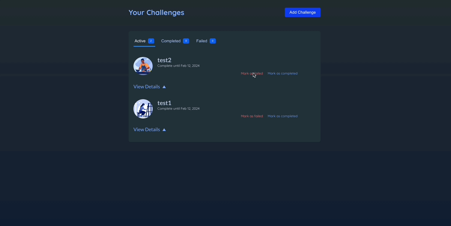
💎 ChallengeItem.jsx
export default function ChallengeItem() {
  return <motion.li layout>{/* ... */}</motion.li>;
}layout: 모션 컴포넌트에 해당 속성을 추가하면 프레이머 모션이 해당 컴포넌트에 속한 레이아웃 변화에 자동으로 애니메이션을 적용함.
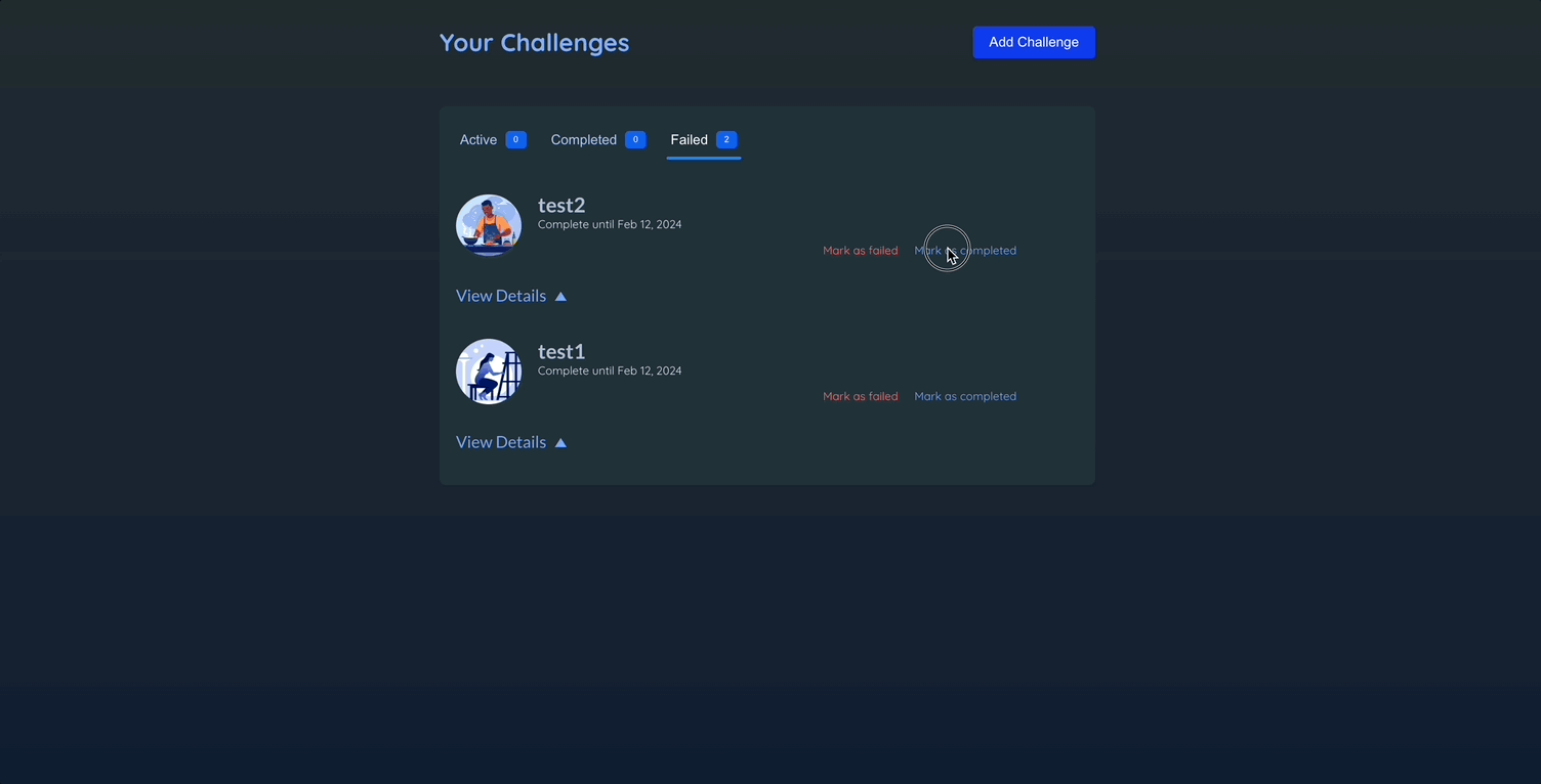
📖 여러 요소 애니메이션 조율하기
💎 Challenges.jsx
import { useContext, useState } from "react";
import { AnimatePresence, motion } from "framer-motion";
import { ChallengesContext } from "../store/challenges-context.jsx";
import ChallengeItem from "./ChallengeItem.jsx";
import ChallengeTabs from "./ChallengeTabs.jsx";
export default function Challenges() {
const { challenges } = useContext(ChallengesContext);
const [selectedType, setSelectedType] = useState("active");
const [expanded, setExpanded] = useState(null);
function handleSelectType(newType) {
setSelectedType(newType);
}
function handleViewDetails(id) {
setExpanded((prevId) => {
if (prevId === id) {
return null;
}
return id;
});
}
const filteredChallenges = {
active: challenges.filter((challenge) => challenge.status === "active"),
completed: challenges.filter(
(challenge) => challenge.status === "completed"
),
failed: challenges.filter((challenge) => challenge.status === "failed"),
};
const displayedChallenges = filteredChallenges[selectedType];
return (
<div id="challenges">
<ChallengeTabs
challenges={filteredChallenges}
onSelectType={handleSelectType}
selectedType={selectedType}
>
{/* mode="sync"가 기본값 : 동시에 플레이 */}
{/* mode="wait" : 첫번째 요소가 사라지기를 기다렸다가 나타나는 애니메이션 추가를 취해 wait 모션.. */}
<AnimatePresence mode="wait">
{displayedChallenges.length > 0 && (
<motion.ol
key="list" // 별개의 애니메이션을 알리기 위함. -> AnimatePresence안에 1개 이상의 요소가 있음
exit={{ y: -30, opacity: 0 }}
className="challenge-items"
>
<AnimatePresence>
{displayedChallenges.map((challenge) => (
<ChallengeItem
key={challenge.id}
challenge={challenge}
onViewDetails={() => handleViewDetails(challenge.id)}
isExpanded={expanded === challenge.id}
/>
))}
</AnimatePresence>
</motion.ol>
)}
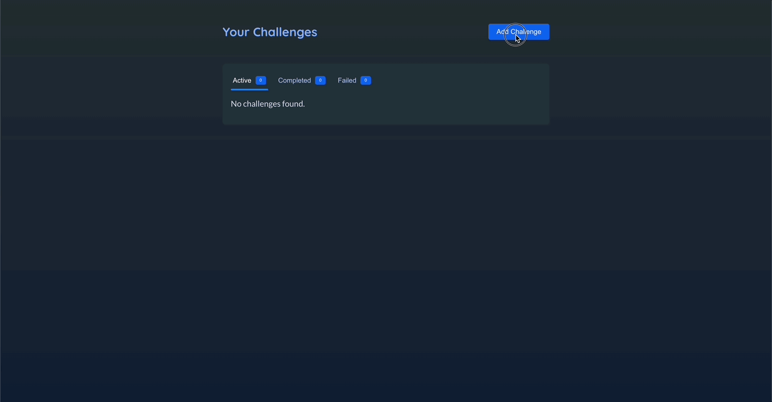
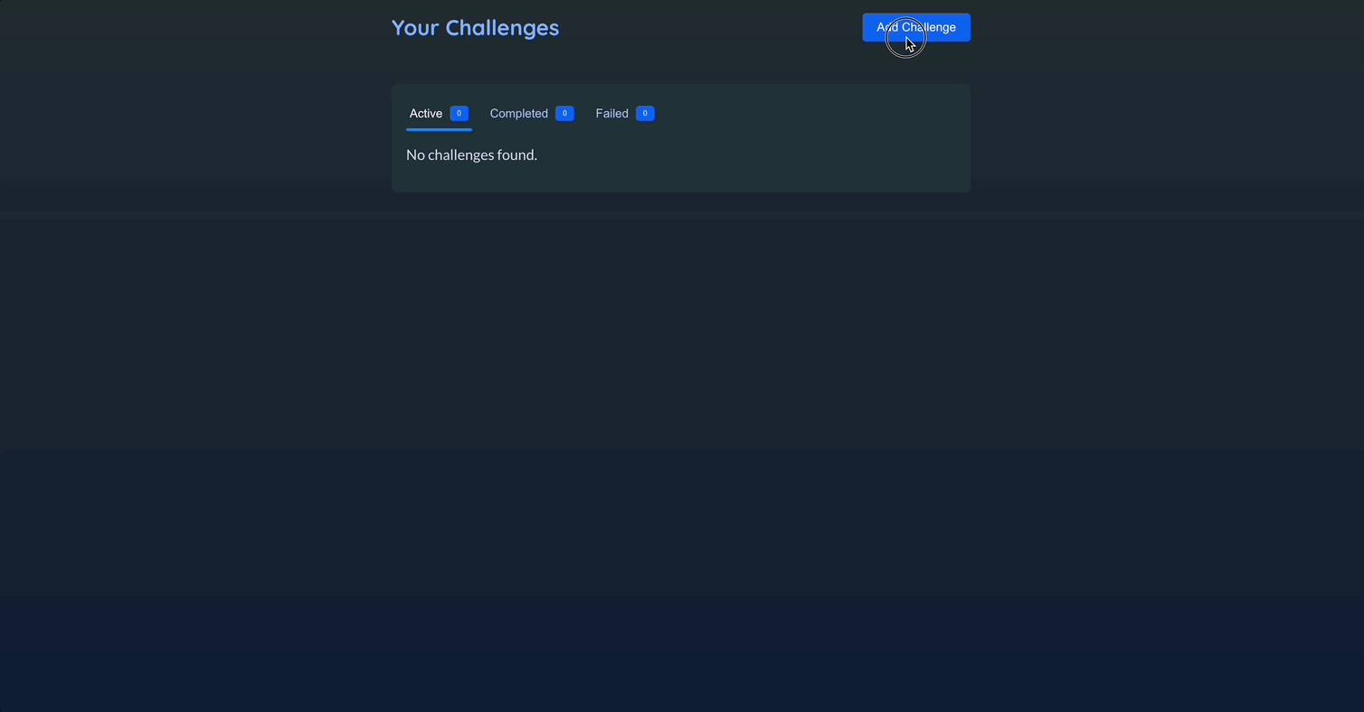
{displayedChallenges.length === 0 && (
<motion.p
key="fallback"
initial={{ opacity: 0, y: -20 }}
animate={{ opacity: 1, y: 0 }}
exit={{ opacity: 0, y: -20 }}
>
No challenges found.
</motion.p>
)}
</AnimatePresence>
</ChallengeTabs>
</div>
);
}- 현재
AnimatePresence안에motion.ol, motion.p가 있다. 이 둘을 구분하기 위해 key 속성을 각각 부여하여 별개의 애니메이션임을 구분시켜준다. AnimatePresence의 모드를 wait으로 설정함으로써 첫번째 요소가 사라진 뒤에 약간 기다렸다가 두번째 요소가 나타나도록 한다.
📖 레이아웃 애니메이션과 다른 애니메이션 통합하기
- ChallengeItem의
layout으로 인해서 자동으로 애니메이션이 적용되고 있다. 이로 인해서 View Details 버튼을 눌렀을 때 애니메이션이 약간 울렁이는 듯한 모습이 보인다.
💎 ChallengeItem.jsx
import { useContext } from "react";
import { AnimatePresence, motion } from "framer-motion";
import { ChallengesContext } from "../store/challenges-context.jsx";
export default function ChallengeItem({
challenge,
onViewDetails,
isExpanded,
}) {
const { updateChallengeStatus } = useContext(ChallengesContext);
const formattedDate = new Date(challenge.deadline).toLocaleDateString(
"en-US",
{
day: "2-digit",
month: "short",
year: "numeric",
}
);
function handleCancel() {
updateChallengeStatus(challenge.id, "failed");
}
function handleComplete() {
updateChallengeStatus(challenge.id, "completed");
}
return (
<motion.li layout exit={{ y: -30, opacity: 0 }}>
<article className="challenge-item">
<header>
<img {...challenge.image} />
<div className="challenge-item-meta">
<h2>{challenge.title}</h2>
<p>Complete until {formattedDate}</p>
<p className="challenge-item-actions">
<button onClick={handleCancel} className="btn-negative">
Mark as failed
</button>
<button onClick={handleComplete}>Mark as completed</button>
</p>
</div>
</header>
<div className="challenge-item-details">
<p>
<button onClick={onViewDetails}>
View Details{" "}
<motion.span
animate={{ rotate: isExpanded ? 180 : 0 }}
className="challenge-item-details-icon"
>
▲
</motion.span>
</button>
</p>
{/* 디테일 설명 애니메이션 추가 */}
<AnimatePresence>
{isExpanded && (
<motion.div
initial={{ height: 0, opacity: 0 }}
animate={{ height: "auto", opacity: 1 }}
exit={{ height: 0, opacity: 0 }}
>
<p className="challenge-item-description">
{challenge.description}
</p>
</motion.div>
)}
</AnimatePresence>
</div>
</article>
</motion.li>
);
}- 디테일 설명이 나타날 때의 애니메이션을 기술함으로써 해결한다.
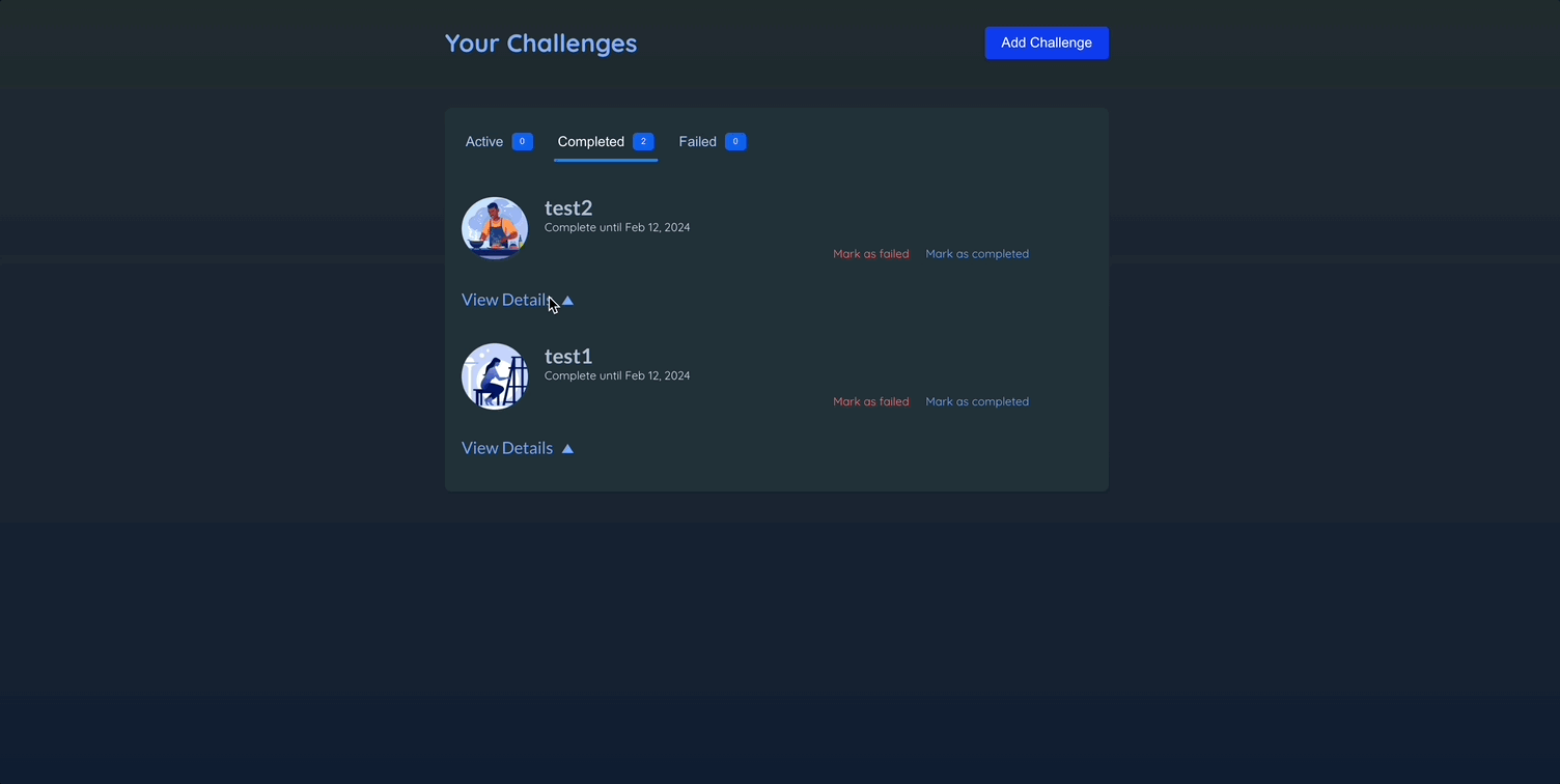
📖 공유된 요소에 애니메이션 적용하기
💎 ChallengeTabs.jsx
import { motion } from "framer-motion";

function Tab({ isSelected, onSelect, badgeCaption, children }) {
  return (
    <li>
      <button
        className={isSelected ? "selected" : undefined}
        onClick={onSelect}
      >
        {children}
        <Badge caption={badgeCaption}></Badge>
      </button>
      {isSelected && (
        <motion.div layoutId="tab-indicator" className="active-tab-indicator" /> // layoutId 추가
      )}
    </li>
  );
}layoutId: 모션 요소에 layoutId를 추가하면 프레이머 모션이 애니메이션 적용.- 페이지의 다른 위치에 있는 같은 layoutId를 지닌 다른 요소가 렌더링 되는 때를 자동으로 감지해서 애니메이션을 적용.
📖 키를 활용해 애니메이션 다시 트리거하기
- 항목에 변경이 있을 때마다 탭에 속한 항목을 표시해주는 숫자 배지에 애니메이션 적용하기
💎 Badge.jsx
import { motion } from "framer-motion";

export default function Badge({ caption }) {
  return (
    <motion.span
      animate={{ scale: [1, 1.2, 1] }}
      transition={{ duration: 0.3 }}
      className="badge"
    >
      {caption}
    </motion.span>
  );
}- Badge에 적용할 애니메이션 기술
- 가장 처음에만 실행되고 그 다음부턴 실행이 되지 않음.
💎 ChallengeTabs.jsx
function Tab({ isSelected, onSelect, badgeCaption, children }) {
  return (
    <li>
      <button
        className={isSelected ? "selected" : undefined}
        onClick={onSelect}
      >
        {children}
        <Badge key={badgeCaption} caption={badgeCaption}></Badge>
      </button>
      {isSelected && (
        <motion.div layoutId="tab-indicator" className="active-tab-indicator" />
      )}
    </li>
  );
}- Badge에 key 속성을 추가함으로써 리액트에게 해당 컴포넌트를 재실행하도록 함.

📖 스크롤 기반 애니메이션
💎 Welcome.jsx
import { Link } from "react-router-dom";
import { motion, useScroll, useTransform } from "framer-motion";

import cityImg from "../assets/city.jpg";
import heroImg from "../assets/hero.png";

export default function WelcomePage() {
  const { scrollY } = useScroll();

  const yCity = useTransform(scrollY, [0, 200], [0, -100]);
  const opacityCity = useTransform(
    scrollY,
    [0, 200, 300, 500],
    [1, 0.5, 0.5, 0]
  );
  // 아예 스크롤을 내리지 않으면 opacity : 1 -> 200픽셀 내리면 0.5로 opacity 설정 -> 500픽셀까지 내리면 opacity는 0으로 설정.

  const yHero = useTransform(scrollY, [0, 200], [0, -150]);
  const opacityHero = useTransform(scrollY, [0, 300, 500], [1, 1, 0]);
  const yText = useTransform(scrollY, [0, 200, 300, 500], [0, 50, 50, 300]);
  const scaleText = useTransform(scrollY, [0, 300], [1, 1.5]);

  return (
    <>
      <header id="welcome-header">
        <motion.div
          id="welcome-header-content"
          style={{ scale: scaleText, y: yText }}
        >
          <h1>Ready for a challenge?</h1>
          <Link id="cta-link" to="/challenges">
            Get Started
          </Link>
        </motion.div>
        <motion.img
          style={{ opacity: opacityCity, y: yCity }} // motion에서 좀 더 향상된 속성. 프레이머 모션이 값의 변화를 감지하여 애니메이션 적용.
          src={cityImg}
          alt="A city skyline touched by sunlight"
          id="city-image"
        />
        <motion.img
          style={{ opacity: opacityHero, y: yHero }}
          src={heroImg}
          alt="A superhero wearing a cape"
          id="hero-image"
        />
      </header>
      {/* ... */}
    </>
  );
}-
useScroll: 스크롤 이벤트를 보고 사용자가 스크롤을 얼마나 내렸는지 파악한다.scrollY: 사용자가 얼마나 스크롤을 내렸는지 픽셀로 알려줌 -scrollX도 있다.scrollYProgress: 상대적인 스크롤링 값을 제공. 0~1까지 있고 1은 사용자가 완전히 아래까지 스크롤을 내렸음을 0은 내리지 않았음을 나타냄.
-
useTransform: 애니메이션에 사용할 수 있는 값으로 전환한다.useTransform(변환되어야하는 값, 중단점으로 구성된 배열, 중단점들과 그 중단점들 사이에 있는 값들이 변환되어야하는 값의 배열)- 값이 변할 때, 컴포넌트는 재실행되지 않는다.