display
display: flex; 내 자식태그를 정렬(수직/수평)시킴
justify-content: space-between; display: flex의 옵션 ~ 수평 이동
align-items: center; display: flex의 옵션 ~ 수직 이동
html
    <header id="hd">
        <div class="container">
            <h1><a href="">로고</a></h1>
            <ul id="gnb">
                <li class="gnb1"><a href="">대메뉴1</a></li>
                <li class="gnb2"><a href="">대메뉴2</a></li>
                <li class="gnb3"><a href="">대메뉴3</a></li>
                <li class="gnb4"><a href="">대메뉴4</a></li>
            </ul>
        </div>
    </header>
CSS
<style>
    *{
        margin: 0; /* 바깥쪽 여백 */
        padding: 0; /* 안쪽 여백 */
    }

    li{ list-style-type: none; }
    a{ text-decoration: none; }

    .container{
        width: 1000px;
        margin: 0 auto; /* 상하좌우 같으면 값 생략, 가운데 정렬 */

    }
    #hd { border-bottom: 1px solid black;}

    #hd .container{
        justify-content: space-between; /* display: flex의 옵션 ~ 수평 이동 */
        align-items: center;            /* display: flex의 옵션 ~ 수직 이동 */
    }

    #hd .container,
    #gnb{
        display: flex; /* display: flex = 내 자식태그를 정렬(수직/수평)시킴 */
    }
</style>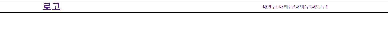
margin
html
<body>
    <div id="box1">box1</div>
    <div id="box2">box2</div>
    <div id="box3">box3</div>
    <div id="box4">box4</div>
</body>
CSS
    <style>
        div{
            position: fixed;
            width: 100px;
            height: 100px;
            background-color: black;
            color: white;
        }

        #box1{
            right: 10px; /* 오른쪽 간격 10px */
            bottom: 10px; /* 맨 밑 간격 10px */
        }
        #box2{
            left: 10px;
            bottom: 10px;
        }
        #box3{
            left: 10px;
            top: 10px;
        }
        #box4{
            right: 10px;
            top: 10px;
        }
    </style>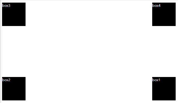
position
position : top left right bottom z-index등 위치값을 움직이게 하는 '기준'
- fixed : 화면을 기준으로
- absoulte : 부모를 기준으로
- relative : 가장 가까이 있는 상위 객체 기준으로 (유기적으로 움직임)
html
<body>
    <div id="box1">box1</div>
    <div id="box2">box2</div>
    <div id="box3">box3</div>
    <div id="box4">box4</div>
</body>
CSS
- min-width : 최소 너비
- max-width : 최대 너비
- 1rem : 매체가 가진 기본 폰트 (ex.10 rem = 기본폰트 10배)
- 1vw : 화면 너비의 10분의 1 (for 반응형)
- 1vh : 화면 높이 기준으로 (for 반응형)
    <style>
        div{
            position: fixed;
            min-width: 80px; /* min-width : 최소 너비 */
            max-width : 130px; /* max-width : 최대 너비 */
            width: 10vh; /* 1vw : 화면 너비의 10분의 1 (for 반응형) */
            height: 10vh;/* 1vh : 화면 높이 기준으로 (for 반응형) */
            background-color: black;
            color: white;
            border-radius: 50% 0;
        }

        #box1{
            right: 10rem; /* 1rem : 매체가 가진 기본 폰트 */
            bottom: 10rem;
        }
        #box2{
            left: 10px;
            bottom: 10px;
        }
        #box3{
            left: 10px;
            top: 10px;
        }
        #box4{
            right: 10px;
            top: 10px;
        }
    </style>