실습 예시
1. 나의 답
1-1) 내가 생각한 것
1-2) 내가 생각한 코드
.container>ul.row>li.cjText.col-6+li.cjImg.col-6
<div class="container">
    <ul class="row">
        <li class="cjText col-6"></li>
        <li class="cjImg col-6"></li>
    </ul>
</div>
strong.d-block
span.d-block
ul.threeList>li>a
span.d-block
.titleImg>img
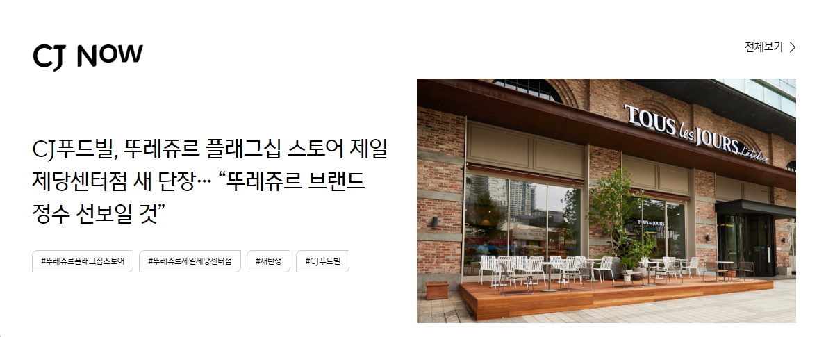
1-3) 나의 결과물
2. 정답
2-1) 맞는 형태

2-2) 맞는 코드
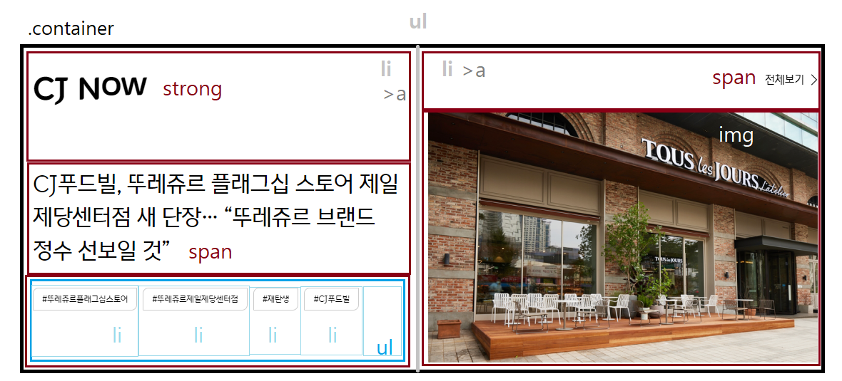
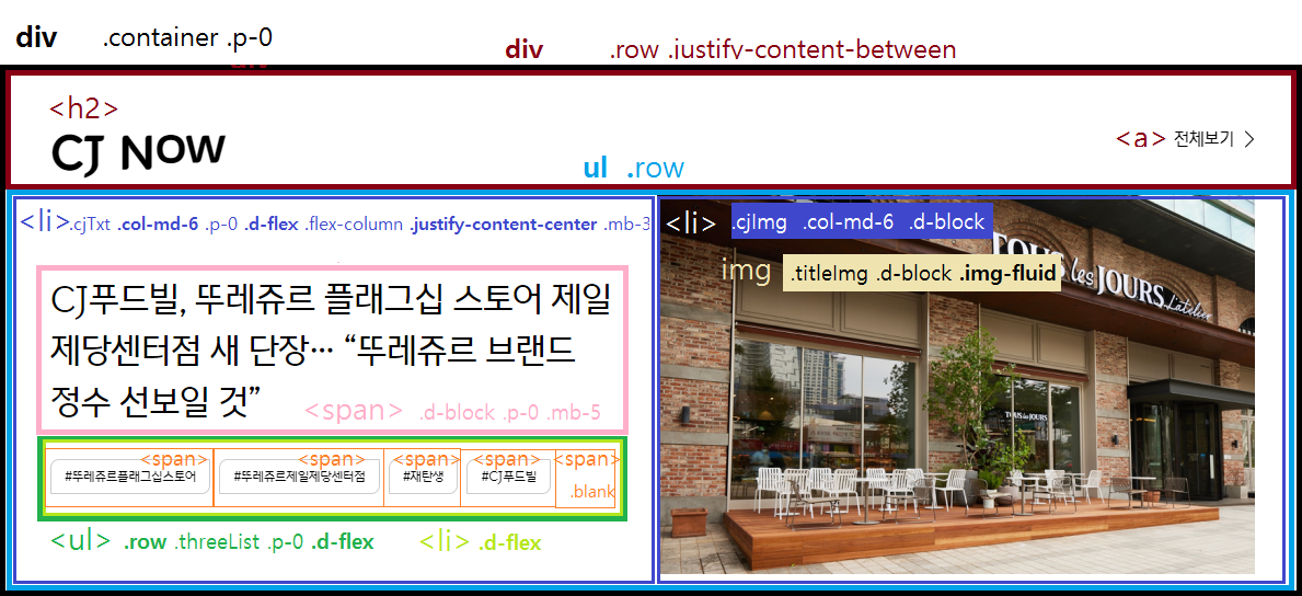
<div class="container p-0">
<div class="row justify-content-between">
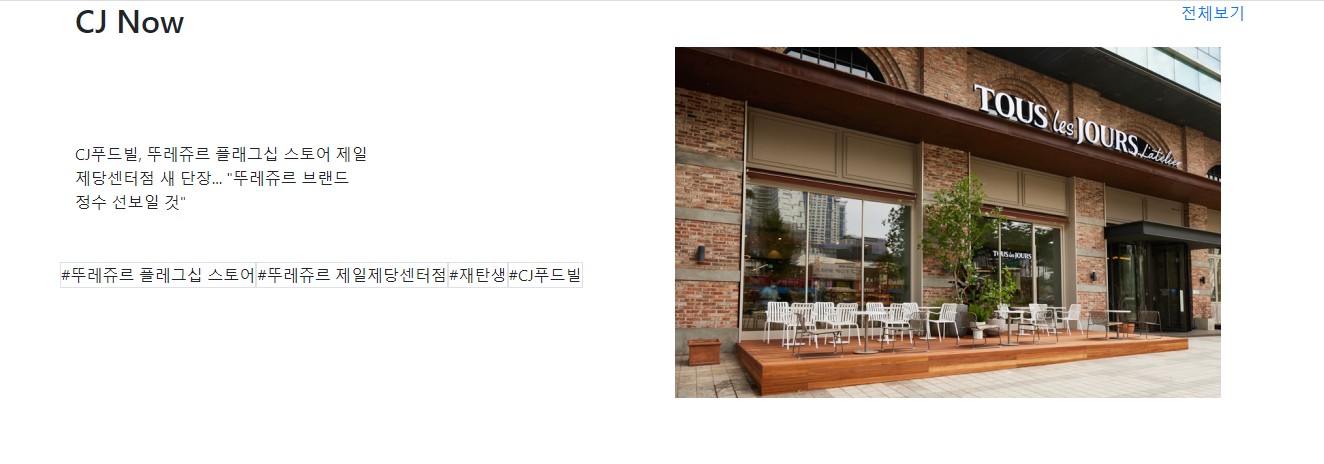
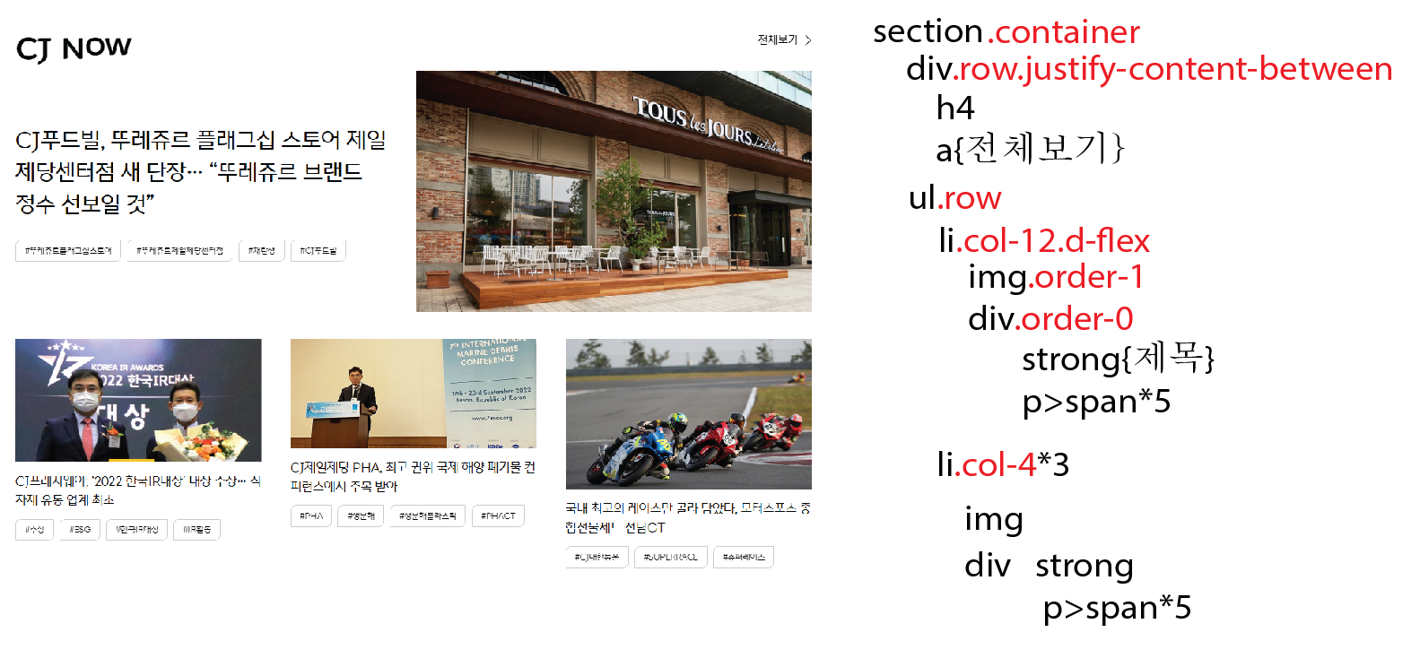
<h2 class="bd-highlight">CJ Now</h2>
<a href="">전체보기</a>
</div>
<ul class="row">
<li class="cjText col-md-6 p-0 d-flex flex-column justify-content-center bd-highlight mb-3">
<span class="d-block p-0 bd-highlight mb-5">CJ푸드빌, 뚜레쥬르 플래그십 스토어 제일<br>
제당센터점 새 단장... "뚜레쥬르 브랜드<br>정수 선보일 것"</span>
<ul class="row threeList p-0 bd-highlight d-flex">
<li class="d-flex">
<span class=" fs border p-0 bd-highlight">#뚜레쥬르 플레그십 스토어</span>
<span class=" ct border p-0 bd-highlight">#뚜레쥬르 제일제당센터점</span>
<span class=" renew border p-0 bd-highlight">#재탄생</span>
<span class=" food border p-0 bd-highlight">#CJ푸드빌</span>
<span class=" blank p-0 bd-highlight"></span>
</li>
</ul>
</li>
<li class="cjImg col-md-6 d-block">
<div class="titleImg d-block img-fluid"><img src="./img/CJ.png" alt=""></div>
</li>
</ul>
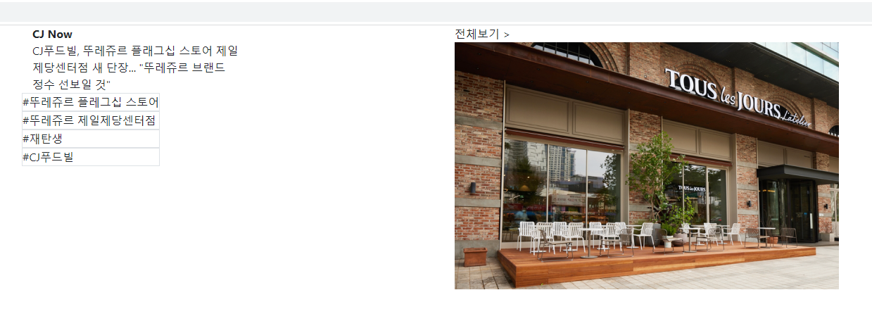
</div>2-3) 결과물
3. 오답체크
justify-content-center 가운데정렬 div class="justify-content-center"
d-block 남발 금지 - span태그 일렬로 나열해야 하는데 왜 죄다 block 해둠
mb-5 세로 컨텐츠 간 여백은 margin-bottom
4. (추가) 응용 문제
4-1) 형태
4-2) 코드
4-2-1) d-flex와 row 차이
- d-flex = flex + width-100 (반응형 됨)
- row = flex + width-100 + flex-wrap(아래로 자동으로 내려감) (BUT row 반응형 안됨)
.container에 마진이 15px씩 더 들어와서 margin-right -15, margin-left -15 해야 하는데, 그 값을 줄 수가 없음. 즉, d-flex와 row 중 뭘 쓸지 선택!
ul.nowlist.d-flex.flex-wrap.w-100
    li.col-12
    li.col-4*3
같은 말
ul.nowlist.row.mx-0
li.col-12
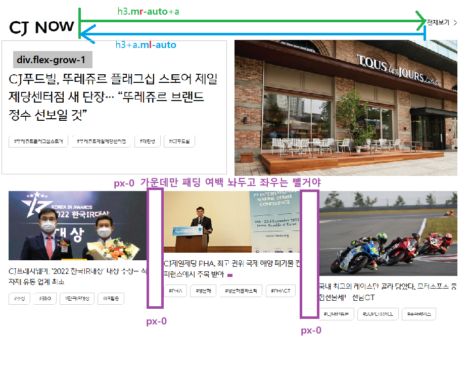
li.col-4*34-2-2) .continer>div 가운데 정렬하는 3가지 방법
.continer
    div.row.justity-content-between>h3+a
    ul.nowlist.row
        li.col-12.d-flex.px-0
        <!-- 가운데만 패딩 여백 놔두고, 좌우는 뺄거야 -->
            img
            div>strong.name+p>a*5>span{#키워드}
        li.col-4.px-0
        <!-- 가운데만 패딩 여백 놔두고, 좌우는 뺄거야 -->
        li.col-4
        li.col-4.px-0
같은말
.continer>div.row.justity-content-between>h3+a (div 태그에 row justity-content-between)
.continer>div.row>h3.mr-auto+a (h3태그에 margin-right 걸어 a를 오른쪽으로)
.continer>div.row>h3+a.ml-auto (a태그에 margin-left 걸어 h3를 오른쪽으로)
4-2-3) 다시보니, li 4개를 나열한 게시판 형태였음
ul.nowlist.row
<!-- 너비100% 쓰는 col-12 / div+img 나란히 d-flex / padding rl 0 -->
li.col-12.d-flex.px-0 <!-- 가운데만 패딩 여백 놔두고, 좌우는 뺄거야 -->
img
div>strong.name+p>a*5>span{#키워드}
li.col-4.px-0 <!-- px-0 가운데만 패딩 여백 놔두고, 좌우는 뺄거야 -->
li.col-4
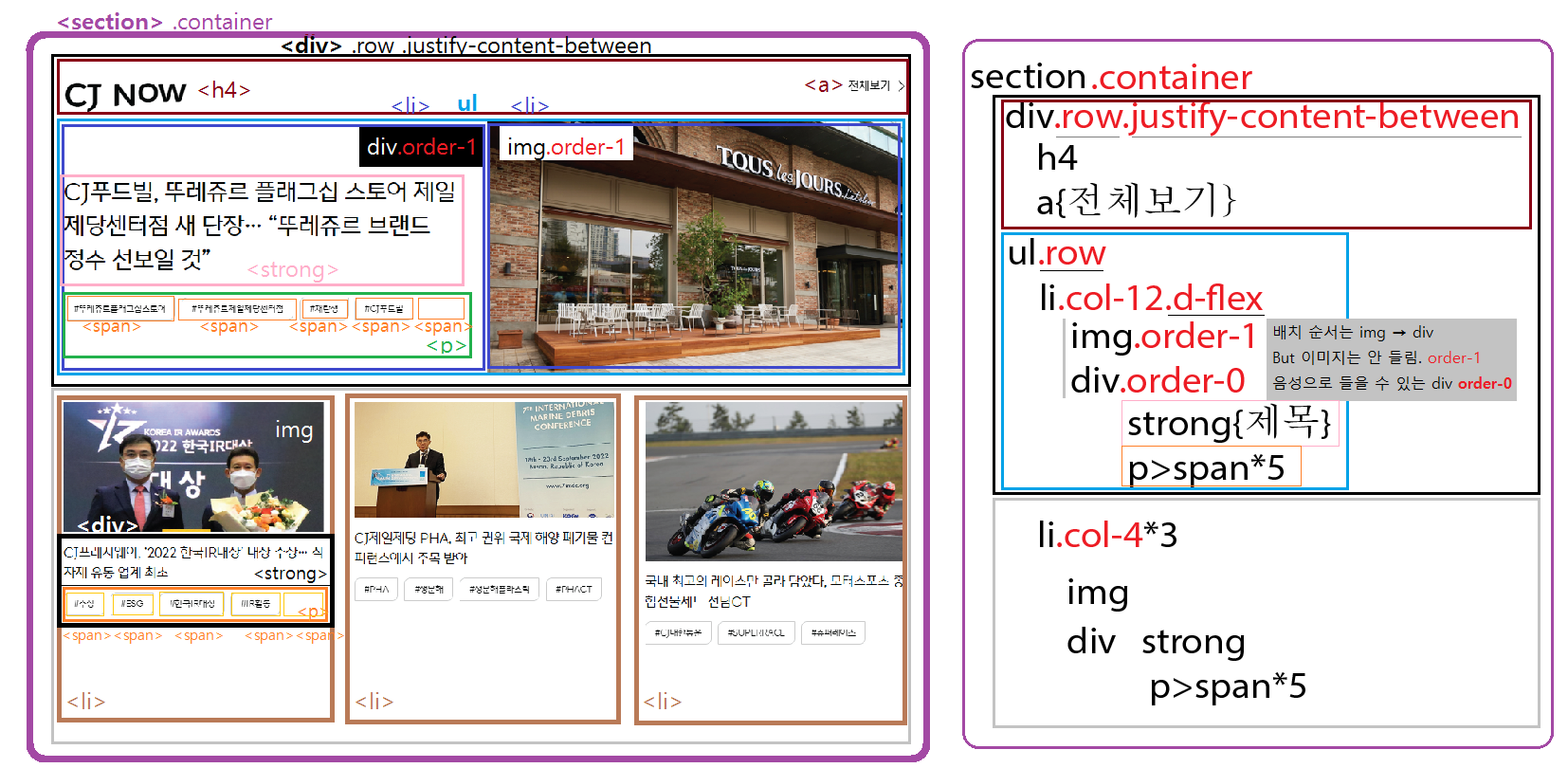
li.col-4.px-0 <!-- px-0 가운데만 패딩 여백 놔두고, 좌우는 뺄거야 --> 4-2-4) .flex-grow-1 그리고 .order-0 + 1
-
.flex-grow-1 : CJ푸드빌, 뚜레쥬르 플래그십 스토어 제일제당센터점 새단장~#CJ푸드빌
div 옆의 img가 공간을 얼마나 차지할지 모르니, col 쓸수없어. 그러니까
"이미지.img 너비를 제외하고 남는 공간 생기면 너 다 써!" -
.order-0 / .order-1 : 접근성 준수!
장애인 사용자를 위해 div(소리있음)와 img(소리없음) 배치가 바뀜. (실제 태그 구조는 그대로)
.continer
    div.row.justity-content-between>h3+a
    ul.nowlist.row
        li.col-12.d-flex.px-0
            img.order-1 <!-- 접근성 준수! -->
            div.flex-grow-1.order-0>strong.name+p>a*5>span{#키워드}
            <!-- flex-grow-1 "이미지 빼고 남는 공간 너 다 써!" -->

        li.col-4.px-0
        li.col-4
        li.col-4.px-0