flexbox라 불리는 Flexible Box module은 flexbox 인터페이스 내의 아이템 간 공간 배분과 강력한 정렬 기능을 제공하기 위한 1차원 레이아웃 모델 로 설계되었습니다. (from. mdn web docs)
간단히 말하면 웹페이지의 레이아웃을 구성할 때 box의 공간을 자동으로 배분하고, 정렬을 해준다는것이다.
직접적으로 코드를 살펴보자.
1. 전체 코드
<!DOCTYPE html>
<html>

<head>
    <link rel="stylesheet" href="style.css" />
    <title>Flexbox 연습</title>
</head>

<body>
    <div class="container">
        <div class="item-1">contentOne</div>
        <div class="item-2">contentTwo</div>
        <div class="item-3">contentThree</div>
    </div>
</body>

</html>
.container {
display: flex;
justify-content: center;
align-items: center;
height: 70vh;
width: 800px;
background-color: rgb(0, 255, 21);
font-size: 2rem;
}
.item-1 {
width: 200px;
border: 3px solid #333;
background-color: lightblue;
height: 100px;
}
.item-2 {
width: 200px;
border: 3px solid #333;
background-color: pink;
height: 100px;
}
.item-3 {
width: 200px;
border: 3px solid #333;
background-color: orange;
height: 100px;
}2. flexbox의 핵심
1. html부분
<div class="container">
    <div class="item-1">contentOne</div>
    <div class="item-2">contentTwo</div>
    <div class="item-3">contentThree</div>
</div>- 박스들을 담을 공간이 필요하다. 즉, 부모 요소가 필요하다.
- 부모 태그 하위로 아이템들을 삽입한다.
- 이 아이템들이 css에 정의된 속성에 따라 박스들의 공간이 지정 되고 정렬 된다.
2. css부분
.container {
    display: flex;
    justify-content: center;
    align-items: center;
}- display를 flex로 속성 지정을 해준다.
- justify-content는 수평으로 아이템들(자식태그)을 어떻게 정렬을 해야 하는지에 대한 속성이다.
- align-items는 수직으로 아이템들(자식태그)을 어떻게 정렬을 해야 하는지에 대한 속성이다.
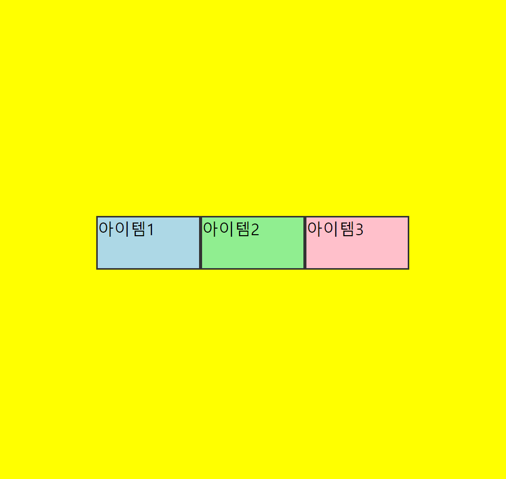
justify-content: center
justify-content: space-around
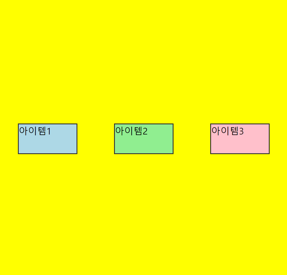
이처럼 justify-content의 속성에 따라 아이템들이 위치 하는 곳이 달라진다.
참고 하면 좋은 자료 https://poiemaweb.com/css3-flexbox

시작.