Flutter I/O Extended Korea 2022에서 발표한 "애니메이션 적용기" 정리글 입니다.
1. 공부하게 될 것
- FooTransition(Slide, Fade, Rotation, Size) 애니메이션 사용법
2. 기본 필수 개념
좌표계와 애니메이션의 종류
좌표계
- 왼쪽 상단을 기준 0,0
- 오른쪽 하단이 화면의 넓이와 높이
애니메이션 종류
플러터 공식 애니메이션 가이드 입니다.
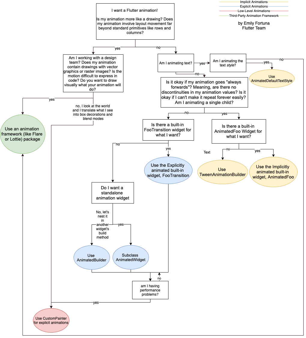
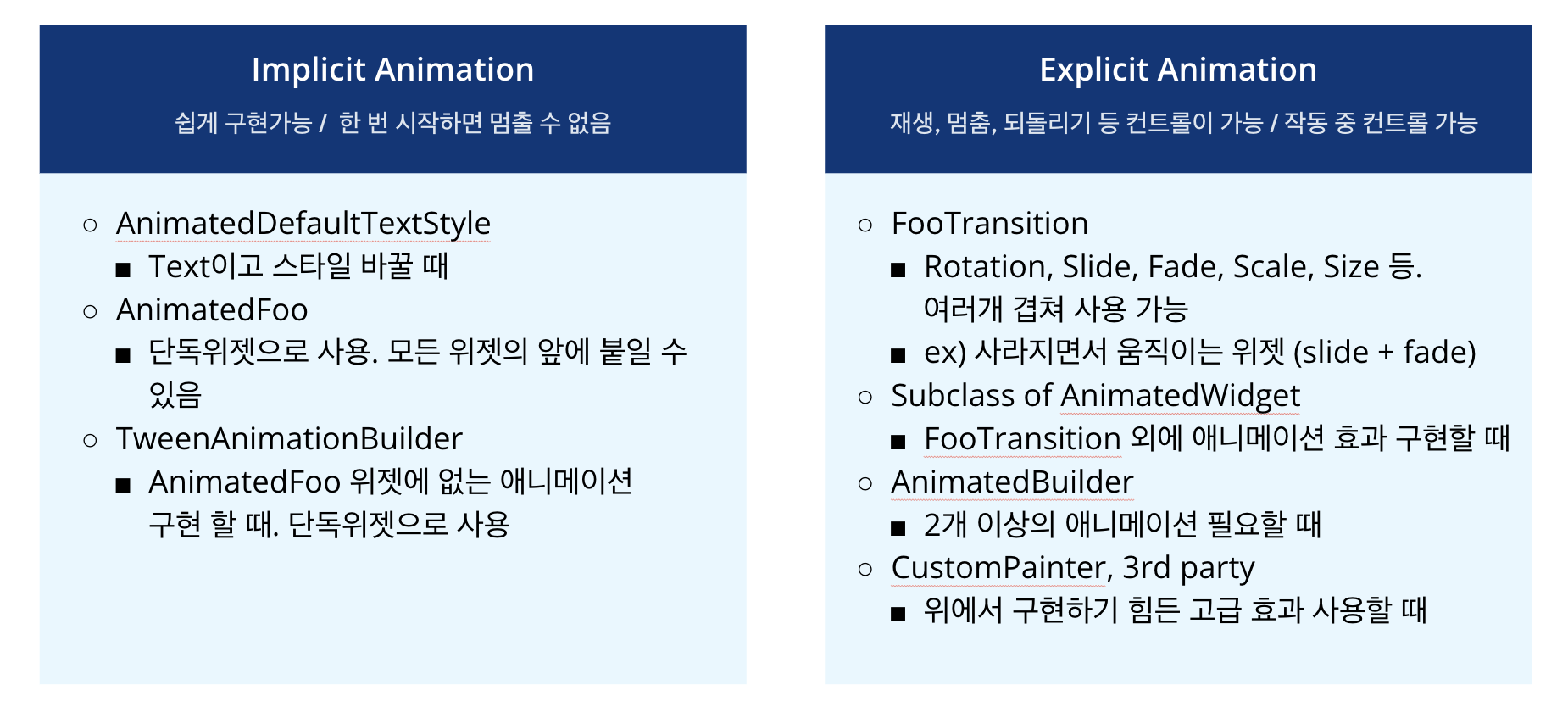
제가 정리해본 애니메이션의 종류 입니다.
AnimationController, Tween, Curve, SingleTickerProviderMixin
AnimationController
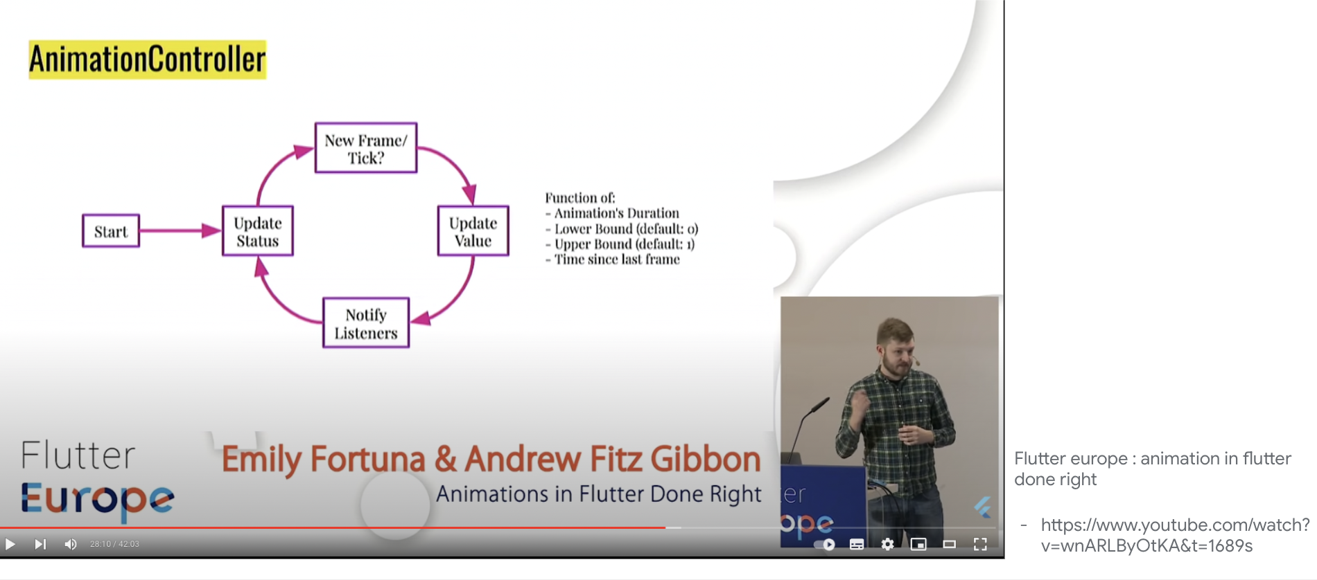
일반적으로 재생, 일시 중지, 되돌리기, 중지하는데 사용. 현재 진행률과 진행상태도 알 수 있으며, 리스너도 달 수 있습니다. 타이머 역할을 하는 TickerProvider 과 같이 사용되며, 보통 1개의 AnimationController를 사용하는 SingleTickerProviderMixin 클래스를 씁니다.
class _Page2State extends State<Page2> with
SingleTickerProviderStateMixin {
late final AnimationController controller ;
void initState() {
controller= AnimationController(vsync: this, duration: const Duration(seconds: 1));
}
주로 사용하는 AnimationController의 메소드는
- controller.forward();
- controller.reverse();
- controller.repeat();
- controller.stop();
- controller.reset();
가 있고, 리스너의 콜백을 받는 addStatusListener 도 자주 사용 됩니다.
- controller.addStatusListener();
Tween, Curve
애니메이션의 시작과 끝의 효과 입니다. 주로 메소드 체이닝으로 animate() 를 호출해 사용됩니다. animate()를 호출하면, Animation 이 리턴되는데 플러터에서 관리하는 Animation의 진행 상태를 나타내는 값 입니다. Curve를 받아 진행 속도를 커스텀 할 수 있습니다.
Tween
<T>(begin: 시작 효과의 상대적 값, end: 끝 효과의 상대적 값).animate(AnimationController인스턴스)
SizeTransition에서 위젯의 width가 200, height가 100인 경우
//크기가 0에서 width 200, height 100으로 커짐
Tween<double>(begin:0.0, end: 1.0)
//width 200, height 100에서 작아지다 없어짐
Tween<double>(begin:1.0, end: 0.0)
FadeTransition에서
//사라진 상태에서 나타남 (fade in)
Tween<double>(begin:0.0, end: 1.0)
//사라짐
Tween<double>(begin:1.0, end: 0.0)
RotationTransition에서
//90도 회전
Tween<double>(begin:0.0, end: 0.25)

//180도 회전
Tween<double>(begin:0.0, end: 0.5)
SlideTransition에서 위젯의 width가 200, height가 100인 경우
//화면 오른쪽으로 200, 아래로 100만큼 이동
Tween<Offset>(begin:Offset(0,0), end: Offset(1,1)

//화면 왼쪽으로 200, 위로 100만큼 이동
Tween<Offset>(begin:Offset(0,0), end: Offset(-1,-1)

//화면 왼쪽으로 100, 아래로 50만큼 이동
Tween<Offset>(begin:Offset(0,0), end: Offset(-0.5,0.5)
StepTween<int>
단계 별로 애니메이션이 필요할 때 사용. 예를 들어 텍스트가 1개씩 나타나는 애니메이션이 필요할 때 사용합니다.
StepTween(begin: 0, end: text.length)SingleTickerProviderStateMixin
애니메이션 구현시 타이머 역할을 하는 클래스. 매 프레임마다 Ticker를 호출하는 객체. 여러개의 AnimationController가 필요한 경우 TickerProviderStateMixin 사용합니다.
3. 구현
팁
공통으로 사용하는 위젯이나 속성을 찾고, 파일하나에서 공통으로 사용하도록 관리합니다.
- 주요 색깔 : 연한 파랑,짙은 파랑, 빨강
- 글씨 폰트 : 제목, 본문, 헤더, 달력
- 공통 컴포넌트 : 달력모양
순서
- 디자인만 구현
- 차례대로 애니메이션을 적용
2페이지에만 있는 애니메이션만 설명하면 4가지 모두 설명됩니다. 다른 애니메이션은 깃헙 코드 참고해주세요.
- 배경 더 연한 파란색 FadeInTransition
- 컵의 SlideTransition + RotationTransition
- Search for 텍스트 위젯의 SizeTransition or StepTween 사용
AnimationController 선언
class _Page2State extends State<Page2> with SingleTickerProviderStateMixin {
late final AnimationController controller;
void initState() {
super.initState();
controller = AnimationController(duration: const Duration(seconds: 3), vsync: this);
controller.forward();
}
앱바의 컵 SlidTransition + RotationTransition + FadeTransition위젯
선언
Animation<Offset> cupSlideUpAnimation =
    Tween(
        begin: 0.0, end: 0.07).animate(
            CurvedAnimation(
                parent: controller,
                curve: const ShakeCurve(count: 3)));
Animation<double> cupRotateAnimation =
    Tween(
        begin: Offset(0, 1), end: Offset(0, 0)).animate(
            CurvedAnimation(
                parent: controller,
                curve: Curves.elasticOut));

Animation<double> cupFadeInAnimation =
    Tween(
        begin: 0.0, end: 1.0).animate(
            CurvedAnimation(
                parent: controller,
                curve: Curves.easeOutCubic));
적용
FooTransition은 중첩 적용이 가능합니다.
Widget build(BuildContext context) {
return FadeTransition(
opacity: cupFadeInAnimation,
child: SlideTransition(
position: cupSlideUpAnimation,
child: RotationTransition(turns: cupRotateAnimation, child: child),
),
);
}Search for... 텍스트 위젯
SizeTransition과 StepTween 2가지 방법으로 구현 가능합니다.
SizeTransition 사용
속성을 잘 보면 , axis로 크기가 변하는 방향, axisAlignment로 시작 위치를 지정합니다.
Widget build(BuildContext context) {
Animation<double> sizeFactorTween =
Tween<double>(begin: 0, end: 1).animate(controller);
return Positioned(
top: 150,
left: 20,
child: SizeTransition(
sizeFactor: sizeFactorTween,
axis: Axis.horizontal, //수평방향으로
axisAlignment: -1, //위젯 왼쪽에서
child: Padding(
padding: const EdgeInsets.only(left: 10),
child: Text(appBarSearchText,
style: const TextStyle(
fontSize: 22,
color: Colors.white,
fontWeight: FontWeight.bold))),
),
);
}StepTween 으로 구현
late Animation<int> textStepAnimation;
final String appBarSearchText = "Search for ...";
void initState() {
textStepAnimation = StepTween(begin: 0, end: appBarSearchText.length)
.animate(CurvedAnimation(parent: controller, curve: Curves.easeIn));
}
...
child: AnimatedBuilder(
builder: (context, child) {
String text =
appBarSearchText.substring(0, textStepAnimation.value);
return Text(text,
style: const TextStyle(
fontSize: 22,
color: Colors.white,
fontWeight: FontWeight.bold));
},
animation: textStepAnimation,
),4. 마무리
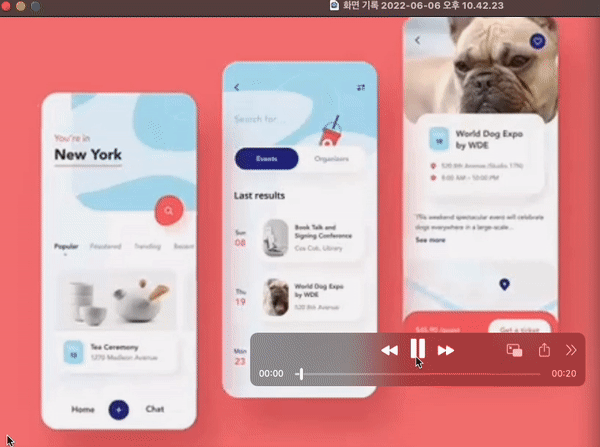
위에서 설명한 애니메이션은 아래 깃헙에서 전체 코드 확인할 수 있습니다. 애니메이션 구현, 쉽습니다. 찡긋
https://github.com/larsien/UIChallenge_event_ios_mobile_app_animation_by_ronasit
https://github.com/larsien/UIChallenge_event_ios_mobile_app_animation_by_ronasit2
reference
- 플러터 io 2022 extended 발표자료
- Sine 그래프 그려보기 : https://www.desmos.com/calculator/6gbvrm5i0s
- 앱바의 컵 출처 - https://api.flutter.dev/flutter/material/Icons-class.html
- StepTween animation -
https://www.youtube.com/watch?v=B4OrUmy7jm4 - Ticker - https://youtu.be/PbcILiN8rbo?t=156
- Flutter Europe Animations in Flutter done right - https://www.youtube.com/watch?v=wnARLByOtKA