flex_20260629
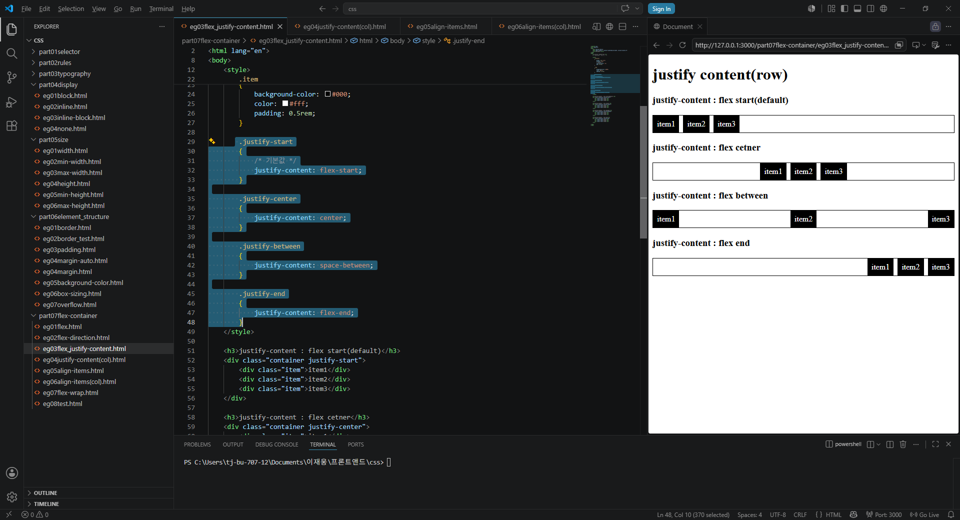
css의 꽃이다.
알아서 맞춰주는 기능이다.
마치 .net 프레임워크에서 자동행렬 버튼과 비슷하다
단지 코딩으로 써줘야 된다는것
.justify-start
{
/ 기본값 /
justify-content: flex-start;
}
    .justify-center
    {
        justify-content: center;
    }

    .justify-between
    {
        justify-content: space-between;
    }

    .justify-end
    {
        justify-content: flex-end;
    }

    유의할 사항은 start->center->space-between->flex-end 순이며

    이중 div에서 최하단 <div class="item">item1</div>

item은 기본적으로 글에만 해당된다.Quiz
<style>
    .container
    {
        border: 1px solid;
        display: flex;
        gap: 0.5rem;
        width: 300px;
        height:50px;
        padding:1em;
    }

    .container1
    {
        border: 1px solid;
        display: flex;
        gap: 0.5rem;
        width: 300px;
        padding-top:1em;
        padding-bottom:1em;

    }

    .item
    {
        width: 30px;
        padding: 0.9rem;
        background-color: #000;
        color: #fff;
        text-align: center;
    }

     .justify-center
    {
        justify-content: center;
    }

     .justify-between
    {
        justify-content: space-between;
    }

</style>

 <h3>align-items:stretch (center)</h3>
<div class="container justify-center">

    <div class="item">item3</div>
</div>

<!-- 20260629 it's difficult -->
<h3>align-items:stretch (between)</h3>
<div class="container1 justify-between">
    <div class="item">item1</div>
    <div class="item">item2</div>

</div>
just for programming test