React Portal 이란?
React Portal은 컴포넌트의 렌더링 트리를 변경하지 않으면서도 DOM의 다른 위치에 자식을 렌더링할 수 있게 해주는 기능입니다.
이는 기본적으로 부모-자식 관계가 아닌 DOM 요소 간에 렌더링 트리를 유지하면서 특정 요소를 원하는 위치에 렌더링할 수 있도록 도와줍니다.
사용 방법
- React 애플리케이션이 화면에 랜더링될 위치를 정의하는 진입점인 index.html에 body 안에 아래의 코드를 추가한다.
 <body>
    <div id="root"></div>
    <div id="modal"></div> // modal portal을 위해 추가함
    <script type="module" src="/src/main.jsx"></script>
</body>- ModalPortal.js 파일을 만들어 아래의 코드를 작성한다.
import ReactDOM from 'react-dom';

function ModalPortal({ children }) {
  const el = document.getElementById('modal');
  return ReactDOM.createPortal(children, el);
}

export default ModalPortal;
childrenprop을 받는데,children은 이 컴포넌트 내부에서 렌더링할 React 요소들을 포함한다.const el = document.getElementById('modal');:
- DOM에서
id가 'modal'인 요소를 찾는다.return ReactDOM.createPortal(children, el);:
createPortal함수를 사용하여children을el(즉,id="modal"인 요소)에 렌더링한다.- 포탈을 사용함으로써, 이 컴포넌트의 자식 요소가
modal요소 안에 직접 렌더링된다.
- 모달이 여러개인데 공통되는 부분이 많은 경우 ModlaFrame으로 한번 더 빼준다. 이때 ModalPortal 컴포넌트 안에 코드를 작성한다.
import React from 'react';
import ModalPortal from './ModalPortal';
import ModalClose from '@/assets/icons/modalClose.svg';
import PropTypes from 'prop-types';

function ModalFrame({ children, handleExit, tag, title }) {
  return (
    <ModalPortal>
      <div className="fixed inset-0 set-center bg-opacity-50 bg-neutral-black">
        <div className="bg-neutral-white p-1000 flex flex-col items-center relative rounded-[20px]">
          <button
            onClick={handleExit}
            className="absolute top-[29px] right-[29px]"
          >
            <img src={ModalClose} alt="Close icons" />
          </button>
          <div className="skyblue-box text-detail-3-semibold mb-400">{tag}</div>
          <span className="text-body-2-bold text-neutral-black mb-900">
            {title}
          </span>
          {children}
        </div>
      </div>
    </ModalPortal>
  );
}

ModalFrame.propTypes = {
  children: PropTypes.node.isRequired,
  handleExit: PropTypes.func.isRequired,
  tag: PropTypes.string.isRequired,
  title: PropTypes.string.isRequired,
};

export default ModalFrame;
해당 디자인에서 기대평 입력하는 input 위로는 모두 공통되는 디자인이여서 input 기준으로 윗부분과 아랫부분으로 나누어서 아랫부분은 children을 통해 받고 윗 부분은 props로 받는 tag, title을 이용해 넣어준다.
여기서 버튼은 회원가입을 할때 막아놓는 경우가 있어 일부로 children 안에서 관리한다.
- 각각의 모달에서 위에서 정의한 ModalFrame의 자식요소로 넣어준다.
import React, { useState, useContext } from 'react';
import PropTypes from 'prop-types';
import { AuthContext } from '@/context/authContext';
import { postComment } from '@/api/comment/index';
import ModalFrame from './ModalFrame';
import BlueButton from '@/components/buttons/BlueButton';
function CommentInputModal({
closeCommentModal,
AlreadyPostComment,
setResultModalOpen,
}) {
const { userInfo, setUserInfo } = useContext(AuthContext);
const [inputComment, setInputComment] = useState('');
const handleInputText = e => {
if (e.target.value.length > 50) {
e.target.value = e.target.value.slice(0, 50);
}
setInputComment(e.target.value);
};
const handleComment = async () => {
try {
const response = await postComment(userInfo.accessToken, inputComment);
if (response.code === 'ALREADY_REVIEWED') {
AlreadyPostComment();
closeCommentModal();
} else {
setResultModalOpen('toolBox');
}
} catch (error) {
console.error('댓글 등록 API 통신 실패:', error);
}
};
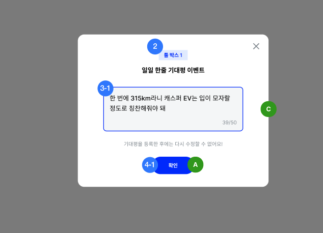
return (
<ModalFrame
handleExit={closeCommentModal}
tag="툴 박스 1개"
title="일일 한줄 기대평 이벤트"
>
<div className="px-3000 set-center flex-col relative">
<textarea
placeholder={`월드컵을 하면서 알게 된 캐스퍼 EV의 기능에 대한\n센스있는 한줄 기대평을 작성해보아요.`}
onChange={handleInputText}
maxLength="50"
className="w-[440px] h-[200px] p-500 mb-700 text-detail-2-medium text-neutral-black placeholder:text-detail-2-medium placeholder-neutral-500 bg-neutral-50 rounded-lg resize-none"
></textarea>
<span className="absolute top-[45%] left-[70%] text-detail-3-regular text-neutral-500">{`${inputComment.length}/50`}</span>
<p className="mb-700 text-neutral-500 text-detail-3-regular">
기대평을 등록한 후에는 다시 수정할 수 없어요!
</p>
{inputComment != '' ? (
<BlueButton
value="확인"
onClickFunc={handleComment}
styles="px-2000 py-200 text-body-3-semibold"
/>
) : (
<BlueButton
value="확인"
onClickFunc={handleComment}
styles="px-2000 py-200 text-body-3-semibold"
disabled={true}
/>
)}
</div>
</ModalFrame>
);
}
CommentInputModal.propTypes = {
closeCommentModal: PropTypes.func.isRequired,
AlreadyPostComment: PropTypes.func.isRequired,
setResultModalOpen: PropTypes.func.isRequired,
};
export default CommentInputModal;
위의 코드를 잘 살펴보면 ModalFrame이 바깥에서 감싸고 그 안에 각각의 모달이 수행해야할 기능 및 layout이 들어가 있다.
React Portal 의 장점
유연한 UI
부모 컴포넌트의 스타일이나 레이아웃에 영향을 받지 않기 때문에 원하는 위치에 자유롭게 렌더링할 수 있습니다.

소통하며 성장하는 프론트엔드 개발자 이승섭입니다! 👋