styled-components 설치
npm i styled-component
타입스크립트 - 타입정의 받기
npm i -D @types/styled-components
코드 분리
styled-components를 사용할때 보통 테마/전역스타일 코드를 분리하여 사용한다.
추가로 내가 생성할 styled-components의 타입을 지정하기 위한 styled.d.ts 파일을 추가로 생성하자.
스타일-타입정의 모음 : src/styles/styled.d.ts
전역-스타일 모음 : src/styles/global-style.ts
스타일-테마 모음 : src/styles/theme.ts
styled.d.ts
styled-components 공식문서 : typescript 적용하기
styled-components의 타입정의를 불러와 내가 사용할 신규 타입정의 추가 & 확장함
// import original module declarations
import 'styled-components'

// and extend them!
declare module 'styled-components' {
  // 우리가 아는 타입지정을 여기서 다해주고 불러서 쓰기
  // 1. 인터페이스 지정
  export interface 인테페이스명지정 {
    속성1 : 타입지정;
  }
  // 2. 타입속성지정
  export type // 타입~~~지정지정해~

  // ThemeProvider theme에 적용할 타입으로, theme의 속성과 동일하게 작성
  export interface DefaultTheme {
    dark: {
      mainBackground: string;
      // neutral color
      title: string;
      primaryText: string;
      secondaryText: string;
      disable: string;
      border: string;
      divider: string;
      background: string;
      tableHeader: string;
    };
    light: {
      mainBackground: string;
      // neutral color
      title: string;
      primaryText: string;
      secondaryText: string;
      disable: string;
      border: string;
      divider: string;
      background: string;
      tableHeader: string;
      // point-color
      // point-color
    };
    response: {};
  }
}
defaultTheme인터페이스는node_modules/@types/styled-components/ts3.7/index.d.ts에 정의되어있다(빈객체 상태). 해당 인터페이스를 확장하는 개념이다!
createGlobalStyle 적용하기
reset-css를 적용할 것인데 npm을 둘러보니 styled-components용 reset-css인 styled-reset이 있어 받아보았다.
npm i styled-reset으로 설치
적용방법은 2가지로
1) styled-reset이 제공하는 컴포넌트를 불러 최상위에 위치시킴
2) styled-reset이 제공하는 css변수를 createGlobalStyled에 적용
나는 2번으로 적용할 예정, 나중에 추가로 전역 스타일 설정할때 추가해 줄수 있기 때문에~
1) <Reset />으로 전역스타일 설정
import { Reset } from 'styled-reset';

const App = () => (
  <>
    <Reset /> {/* 여기에 리셋-컴포넌트 위치 */}
    <div>여기는 최상위 컴포넌트</div>
  </>
);
2) createGlobalStyled으로 전역스타일 설정
- 먼저 전역스타일 파일을 생성하여 코드를 분리 :
src/styles/global-style.ts - 파일 위치는 원하는 곳에 잘 정리해두기
// global-style.ts
import { createGlobalStyle } from 'styled-components';
import { reset } from 'styled-reset';

// 외부에서 import 할거니까 모듈 내보내자~!
export const GlobalStyle = createGlobalStyle`
  ${reset}
  /* 그밖에 글로벌 스타일 작성하기  */
`;

// 최상위 컴포넌트 : App.js 또는 index.js 등등 원한느 최상위에 코드 추가
import {GlobalStyle} from '파일경로/global-style.ts'

const App = () => (
  <>
    <GlobalStyle /> {/* 여기에 글로벌-스타일-컴포넌트 위치 */}
    <div>여기는 최상위 컴포넌트</div>
  </>
);
공유스타일 작성 (theme)
// theme.js
import styled, { css } from 'styled-components';
export const theme:defaulTheme = {
dark: {
mainBackground: `#333`,
// neutral color
title: `rgba(255,255,255,0.85)`,
primaryText: `rgba(255,255,255,0.65)`,
secondaryText: `rgba(255,255,255,0.45)`,
disable: `rgba(255,255,255,0.25)`,
border: `rgba(255,255,255,0.15)`,
divider: `rgba(255,255,255,0.06)`,
background: `rgba(255,255,255,0.04)`,
tableHeader: `rgba(255,255,255,0.02)`,
// point-color
},
light: {
mainBackground: `#fff`,
// neutral color
title: `rgba(0, 0, 0, 0.85)`,
primaryText: `rgba(0, 0, 0, 0.75)`,
secondaryText: `rgba(0, 0, 0, 0.45)`,
disable: `rgba(0, 0, 0, 0.25)`,
border: `rgba(0, 0, 0, 0.15)`,
divider: `rgba(0, 0, 0, 0.06)`,
background: `rgba(0, 0, 0, 0.04)`,
tableHeader: `rgba(0, 0, 0, 0.02)`,
// point-color
},
response: {},
};
response: {},
};
// _app.tsx or App.jsx
// 최상위컴포넌트에서 ThemeProvider 사용하기
import { ThemeProvider } from 'styled-components';
import { theme } from './../src/styles/theme';
// ... 상단 생략
return (// 기본 라이트 모드 지정
<ThemeProvider theme={theme.light}>
<Component />
</ThemeProvider>
)
// Component.tsx or Component.js : 하위 컴포넌트 전체에서
// 스타일드-컴포넌트 정의
const Container = styled.div`
background-color: ${(props) => props.theme.mainBackground};
color: ${(props) => props.theme.primaryText};
`;
// 컴포넌트 정의
const Component = () => {
return (
<Container>
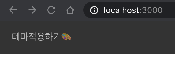
<h1>테마적용하기🎨</h1>
</Container>
);
};- theme.dark 모드
- theme.light 모드

-
예제와 같이 theme객체에 같은 이름의 key를 갖는 mode객체를 만들어 ThemeProvider 컴포넌트에 props를 넘겨 전체 컴포넌트 모드변경할때 적용색상이 변경하도록 함!
-
theme 객체를 작성할때 depth가 깊어지지 않도록 주의! 하위컴포넌트에서 theme속성 적용할 때 이름이 길어진다!
스타일 작성하기
참고 자료 : Styled Components & TypeScript - 😍
1) 단일 props 사용시
styled-components를 작성할 때 여러개 props를 사용하여 컴포넌트를 정의한다면 인터페이스를 사용하여 분리하여 사용할 수 있다.
컴포넌트에 타입지정할때는 styled.div<인터페이스명> 와 같이 사용한다.
// styled-components에 1개 props 타입지정
// const Container = styled.div< {프롭스명 : 타입지정} >`
const Container = styled.div< { age : number } >`
  color: ${(props) => (props.age > 20 ? 'red' : 'gray')};
`;
2) 다수 props 사용시: interface 작성
인터페이스로 분리하여 타입지정하는 것 이외에 사용법은 동일!
// Container styled-components에 적용할 interfacer를 작성
interface Container extends 상속타입 {
  isActive: boolean;
  age: number;
  프롭스명: 타입지정;
}
// styled-components에 interface 타입 지정하기
const Container = styled.div<Container>`
  color: ${(props) => (props.age > 20 ? 'red' : 'gray')};
  background-color: ${(props) => (props.isActive ? 'red' : 'gray')};
`;
3) 상속 컴포넌트에 타입지정
interface 상속받기
// 상속컴포넌트의 타입 상속받기
interface Container {
  isActive: boolean;
  age: number;
  프롭스명: 타입지정;
}

// 상속받은 컴포넌트에 타입 추가하기
const Container = styled(상속받을 컴포넌트명)<Container>`
  color: ${(props) => (props.age > 20 ? 'red' : 'gray')};
  background-color: ${(props) => (props.isActive ? 'red' : 'gray')};
`;
단일 props 타입지정하기
// 기존 방식과 동일하게 사용
const Container = styled(상속받을 컴포넌트명)< { age : number } >`
  color: ${(props) => (props.age > 20 ? 'red' : 'gray')};
`;

// 위 방식에 문제가 있을경우 아래와 같이 사용.. 하나 복잡!
const Container = styled(({ age, ...parentProps }) => (
  <상속받을컴포명 {...parentProps} />
))<{
  age: number;
}>`
  color: ${(props) => (props.active ? 'red' : 'blue')};
`;- 상속컴포넌트명을 콜백 함수(callback function)으로 전달
- 매개변수는 신규 타입:age과, 부모의 타입:parentProps을 전개연산자(...parentProps)로 지정
- 신규타입은 제네릭으로 기존과 동일하게 전달!
미디어 템플릿 적용
타입스크립트와 크게 관련없지만, 미디어쿼리 구성 참고~ (나중에 필요할 때 보기위한 기록)
보통 디바이스의 폭을 기준으로 나누어작업 (상황에 따라 높이도 적용)
const customMediaQuery = (maxWidth: number):string => {
  // 최대폭을 입력하면. 문자열을 밷는다!
  return `@media (max-width: ${maxWidth}px)`;
}
// 각 디바이스에 따라 최대폭 값을 변수화
const media = {
  custom: customMediaQuery,
  desktop: customMediaQuery(922),
  tablet: customMediaQuery(768),
  phone: customMediaQuery(576),
};

const Content = styled.div`
  height: 3em;
  width: 3em;
  background: papayawhip;

  ${media.desktop} {
    background: dodgerblue;
  }
  ${media.tablet} {
    background: mediumseagreen;
  }
  ${media.phone} {
    background: palevioletred;
  }
`;
${media.desktop} { color: red;} === @media (max-width: 922px) {color:red}
참고 https://velog.io/@hwang-eunji/styled-component-typescript