오늘 한 일
오늘은 어제에 이어 친구의 포트폴리오 메인 페이지를 만들었다. 어제는 html 위주로 작성했고, 오늘은 거기에 css를 합쳐 디자인을 좀더 추가했다.
일단 1차로 내용을 넣은 후에 내일부턴 모바일 반응형 부분을 만들 예정이다.
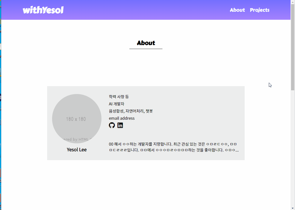
포트폴리오 메인페이지
google font 사용
<!--google font-->
<link rel="preconnect" href="https://fonts.googleapis.com">
<link rel="preconnect" href="https://fonts.gstatic.com" crossorigin>
<link href="https://fonts.googleapis.com/css2?family=Black+Han+Sans&family=Carter+One&family=Noto+Sans+KR&family=Roboto+Slab:wght@200;400&display=swap" rel="stylesheet">
    ...
font awesome 사용
css에서 <i>태그의 폰트를 따로 처리해주어야 아이콘 이미지가 잘 뜬다.
<script src="https://kit.fontawesome.com/키트고유번호.js" crossorigin="anonymous"></script>
...
<li>
  <a href="#"><i class="fab fa-brands fa-github"></i></a>
  <a href="#"><i class="fab fa-brands fa-linkedin"></i></a>
</li>
.fab {
font-family: "Font Awesome 5 Brands";
font-size: 25px;
margin-right: 5px;
}그라데이션 배경색 넣기
background: linear-gradient(#746FFF, #A381FF);특정 영역을 화면 중앙에 두기
#about .about-content {
    height: 300px;
    position: relative;
    transform: translateY(50%);
    background-color: #ededed;
    padding: 30px 20px;
}
마우스 hover 시 이미지 움직임
.img-wrap {
    overflow: hidden;
}
.profile-img-wrap {
    width: 200px;
    height: 200px;
    border-radius: 50%;
    margin-bottom: 10px;
}
#profile img:hover {
    cursor: pointer;
    transform: scale(1.1);
    transition: 0.3s;
}
여러 줄 말줄임
#introduction p.description {
    display: -webkit-box;
    overflow: hidden;
    -webkit-line-clamp: 2;
    -webkit-box-orient: vertical;
    max-height: 55px;
}
바닥에 붙게 위치 조정
.project-content .btn_more {
    position: absolute;
    bottom: 0;
    right: 0;
    font-size: 14px;
    background-color: #A6E22E;
    padding: 5px 15px;
    float: right;
    border-radius: 20px;
}
영역을 화면 가득 채우기: viewport 높이 활용
내부 내용이 화면 높이를 넘어서는 경우에 영역을 벗어나는 경우가 있었다. 그 부분은 따로 height: auto로 내부 길이가 부모에 반영되도록 변경해주었다.
.main-section {
    width: 100%;
    height: 100vh;
    padding-top: 150px;
}
문서화를 좋아하는 개발자