학습내용
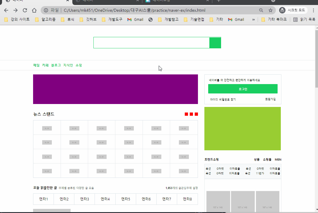
네이버 쇼핑페이지 header, main 만들기
github소스코드
원래 과정에선 자바스크립트도 포함되어 있었는데, 진도에 맞추다보니 자바스크립트를 공부할 시간은 따로 주지 못하게 되었다고 한다. 자바스크립트 강의 영상은 제공해준다고 하니 오늘부터는 정해진 분량보다 조금씩 더 땡겨서 공부하려고 한다.
default css class 만들기
- 자주 사용하게 되는 css 속성들을 담은 클래스를 미리 만든 후 html 태그에 넣어주는 방식을 많이 사용했다.
- 특히 이번 페이지는 복잡한 레이아웃이 반복되고 있어서 필요한 속성을 가진 클래스를 나누어서 하나의 태그가 여러 개의 클래스를 가지고 있도록 구성한 부분이 많았다.
- main에서 사용한
container와 구분하기 위해shop-container를 만들어서 사용하였다.
/* shop 페이지 초기설정 */
#shop-body {
    background-color: #e9ece8;
}
.shop-container {
    width: 1300px;
    margin: 0 auto;
}
.shop-border {
    border: solid 1px #ced2d7;
}
.w-100 {
    width: 100%;
}
.h-100 {
    height: 100%;
}
header
- 미리 만들어 둔
shop-container활용하였다. main-header와 구분하기 위해shop-header라고 붙여주었다.
main
shop list 공간 만들기
shop-container안에list-wrap이라는 공간을 만들고, 그 안에list-item이라는 이름의 공간을 여러 개 만들어주었다.list-item은 고정 넓이값을 가지고 있고, 그 부모 태그에flexwrap:wrap을 적용하여 자연스럽게 줄바꿈이 되도록 했다.- 추후 리스트 공간을 절반씩 차지하는
list-half자식 태그의 위치를 조정하기 위해 부모 태그인list-item에position:relative적용해주었다.
#shop-main .list-wrap {
    display: flex;
	flex-wrap: wrap;
	justify-content: space-between;
}
#shop-main .list-item {
    position: relative;
    width: 308px;
    height: 496px;
    background-color: transparent;
    margin-bottom: 20px;
}
shop list item 1: 카테고리 & 인기상품
- 고정 넓이값을 가진 왼쪽, 오른쪽 영역을 x축 정렬하기 위해 부모 태그에
overflow:hidden, 자식 태그들에float을 사용하였다. 이 때 이유는 알 수 없지만 border의 값이 1.33px로 측정되어서 그에 맞게 width를 조금씩 조절해주었다. - border를 넣는
shop-border클래스, 객체 크기를 100%로 조절해주는w-100,h-100등의 클래스를 사용했다. 이 때 list 태그에 직접 사용하지 않고 다시 div로 감싸주었는데, 지금 생각해보니 나중에 half를 고려해서 만든 것 같다. - category의 글자 색상은 rgba()로 넣어주었다.
<div class="list-item">
    <div class="category-wrap shop-border w-100 h-100">

      <div class="category-left h-100">
            <h3>CATEGORY</h3>
            <ul>...
          	</ul>
      </div>

      <div class="category-right h-100">
        <div class="category-right-top w-100">
          <div class="category-info">...
          </div>
          <div class="image-wrap">...
          </div>
        </div>
        <div class="category-right-bottom">
          <span class="headline">추천태그</span>
          <div class="tag-wrap">...
          </div>
        </div>
      </div>
    </div>
</div>
shop list item 2: banner
- list 크기에 맞게 사진을 가득 채우기만 하면 된다. 기존의 list-item 클래스를 그대로 가지고 있어 공간의 크기는 일정하게 유지하고, 새로운
banner클래스를 추가하여 별도로 지정할 수 있도록 했다.
<div class="list-item banner">
  <div class="w-100 h-100 shop-border">
    <img src="img/apple.jpg" alt="">
  </div>
</div>
#shop-main .list-item.banner img {
width: 100%;
height: 100%;
}shop list item 3: half list
- 기존 리스트 안에서 상하 2개의 공간으로 나누기
1.lisf-half로는 공간의 크기만 정해주기list-half-top,list-half-bottom으로 위치만 지정하기
- 페이지 전체에 이 구조가 많이 사용되는데, 내부 구조의 순서만 다를 뿐 공간의 크기 및 상하배치 구조는 동일하기 때문에 이렇게 속성값을 나누어 준 것 같다.
- 리스트의 header가 차지하는 공간까지는 동일하다.
#shop-main .list-item .list-half {
    width: 100%;
    height: 240px;
    background-color: #ffffff;
}
#shop-main .list-item .list-half.list-half-top {
    position: absolute;
    left: 0;
    top: 0;
}
#shop-main .list-item .list-half.list-half-bottom {
    position: absolute;
    left: 0;
    bottom:0;
}
#shop-main .list-item .list-half .list-half-header {
    position: relative;
    width: 100%;
    height: 62px;
    background-color: #ffffff;
    padding-top: 10px;
    border-bottom: solid 1px #e7e7e7;

    text-align: center;
}
half item 1: 헤더 공간
- 두 가지 종류의 header를 만들기 위해 크기 등 공유하는 속성을 만드는 클래스와 개별적인 속성을 가지는 클래스를 구분했다.
- 검은색 header 부분에 배경으로 사진이 깔리고, 그 위에 검은색 배경을 겹치게 만들기 위해 header 태그에 배경사진 삽입을 위한
list-half-bg클래스를 만들어주었다. - 헤더 안에 있는 오버레이를 영역 위로 겹치게 하기 위해 header는
position:relative, overlay는position:absolute를 사용하고 크기를 공간과 동일하게 만들어준 후 배경색을 반투명하게 만들어주었다. - 부모가 relative이기 때문에 overlay는 부모 객체인 list header를 기준으로 크기 및 위치가 정해진다.
<div class="list-half list-half-top shop-border">
  <div class="list-half-header list-half-bg">
    <div class="half-overlay"></div>
    <h3 class="shop-title-border">백화점 상품 그대로</h3>
  </div>
</div>
#shop-main .list-item .list-half .list-half-header .half-overlay {
position: absolute;
width: 100%;
height: 100%;
background-color: rgb(0, 0, 0, 0.5);
}
#shop-main .list-item .list-half .list-half-header.list-half-bg {
padding-top: 0;
border-bottom: solid 1px #ffffff;
background-image: url(../img/checkbox.png);
}half item 2: content 공간
- content 부분은 내부 리스트 개수에 따라 2개짜리, 3개짜리 클래스를 별도로 만들었다.
- 영상에서는 3개짜리 리스트와 2개짜리 리스트를 다른 방법으로 x축 정렬했는데, 정렬방식을 통일해서 사용해도 되었을 것 같다.
- 사진 위에 할인율이 겹쳐서 표시되는 것을 만들기 위해 감싸는 영역 만든 후 그 안에서 absolute, z-index 등 사용해 겹쳐주었다.
- 가격 표시할 때 사용된
<em>태그는 강조 표시로 기본적으로font-style:italic을 가지고 있어 초기화가 필요하다. - 글자 태그 내용을 정 중앙에 오게 하기:
line-height를 공간 높이와 동일하게 맞추고text-align:center
  <!-- 요소 개수에 따라 class 이름 구분 -->
<div class="list-half list-half-top shop-border">
  <ul class="content-lists content-lists-3">
    <li>
      <img src="https://via.placeholder.com/102x100" alt="">
      <h3>생활공작소 과탄산소다</h3>
      <span>1.5kg x 4입</span>
    </li>
  </ul>
</div>
#shop-main .list-item .list-half .content-lists {
overflow: hidden;
height: 177px;
}
#shop-main .list-item .list-half .content-lists.content-lists-3 li {
float: left;
width: 33.33%;
height: 100%;
border-right: solid 1px #f0f0f0;
text-align: center;
}
#shop-main .list-item .list-half .content-lists.content-lists-2 {
display: flex;
justify-content: center;
padding-top: 11px;
}
#shop-main .list-item .list-half .content-lists.content-lists-2 li {
width: 130px;
height: 150px;
margin-right: 8px;
}
#shop-main .list-item .list-half .content-lists.content-lists-2 li .content-image-wrap .discount {
position: absolute;
display: inline-block;
width: 42px;
height: 42px;
background-color: orangered;
border-radius: 50%;
font-size: 14px;
color: #ffffff;
line-height: 42px;
text-align: center;
top: 6px;
right: 5px;
}shop list item 4: 쇼핑몰 소식
- 상단 반쪽은 3번째 리스트의 흰색 헤더 부분을 그대로 사용했다.
- 같은 영역에 다른 클래스 효과도 cascading으로 없앨 수 있다. 예를 들어 하나의 태그에
border,one이라는 클래스 2개가 있고border클래스에서 전체 테두리가 적용되어 있을 때,one클래스를 나중에 작성하면 border값을 바꿀 수 있다.
#shop-main .list-item .list-row-3 {
    background-color: #ffffff;
    border-top: none;
}
어려웠던 점
- 복잡한 구조가 중첩되어있어서 파악하기 힘들었다. 하나의 태그에 적용되는 속성을 여러 클래스로 잘 나누어서 수정 및 복사, 붙여넣기가 쉽게 만든 것이 대단하다고 생각했는데 실제로 처음부터 하려면 쉽지 않을 것 같았다.
- css 코드가 길어지다 보니 슬슬 클래스를 찾기가 어려워진다.
해결방법
- 아마 예시 코드 없이 만들게 되면 웹사이트의 구조를 미리 설계해서 만들어야 오늘과 같은 구성이 가능할 것 같다.
- 유일한 값인 id를 잘 활용해야겠다.
소감
중복되는 속성값을 여러 클래스로 잘 나누었더니 html 요소를 순서도 바꿔서 복사해서 넣는데도 레이아웃에 아무런 문제가 없는 것을 보고 대단하다고 생각했다. 지금은 네이버라는 레이아웃 예시가 있고, 그것을 카피캣한 코드도 내가 직접 볼 수 있으니 가능하지만, 예제 페이지 없이 내가 직접 만든다고 하면 그냥 html을 작성하기 시작하는 것이 아니라 레이아웃 설계를 생각보다 아주 자세하게 하고 시작해야 할 것 같다.

문서화를 좋아하는 개발자