Tailwind CSS 란?
Tailwind CSS는 유틸리티 퍼스트 CSS 프레임워크로, 미리 정의된 클래스를 사용하여 신속하게 사용자 인터페이스를 구축할 수 있게 해준다. Tailwind CSS는 컴포넌트 스타일링을 위해 CSS 클래스를 직접 작성하지 않고도 다양한 스타일을 쉽게 적용할 수 있도록 도와준다.
1. Tailwind CSS 설치
npm install tailwindcss
2. Tailwind CSS 설정 파일 생성
npx tailwindcss init
3.tailwind.config.js 설정
module.exports = {
    content: [
        './src/pages/**/*.{js,ts,jsx,tsx,mdx}',
        './src/components/**/*.{js,ts,jsx,tsx,mdx}',
        './src/app/**/*.{js,ts,jsx,tsx,mdx}',
    ],
    theme: {
         fontFamily: {
                chicken: ['Ownglyph_eunbyul21-Rg', 'sans-serif'],
            },
            colors: {
                'custom-blue': '#004076',
            },
            fontSize: {
                base: '1.15rem',
                '2xl': '1.4rem',
            },
    },
    plugins: [],
};
content : 스타일을 적용할 파일들을 지정한다. 위의 예제에서는 .js, .ts, .jsx, .tsx, .mdx 확장자를 가진 파일들이 포함한다.
theme : theme 부분은 Tailwind의 기본 스타일을 우리가 원하는 대로 변경할 수 있도록 설정한다. 위의 예제에서는 폰트와 폰트사이즈, 컬러를 지정하였다.
plugins : plugins 부분은 Tailwind에 추가 기능을 더하고 싶을 때 사용한다. 예제에서는 아무런 추가 기능이 없지만, 나중에 필요할 때 여기에 플러그인을 추가할 수 있다.
4. 글로벌 CSS 파일에 Tailwind 디렉티브 추가
@tailwind base;
@tailwind components;
@tailwind utilities;
5. Tailwind CSS를 React/Next.js에서 사용하기
자주 사용하는 그리드, 플렉스, 폰트 크기, 배경색 등의 배치를 Tailwind CSS로 구현해보았다.
import React from 'react';
const TailwindExample = () => {
return (
<div className="container mx-auto p-4">
<header className="bg-custom-blue text-white text-center p-4 rounded">
<h1 className="text-3xl font-bold">Tailwind CSS Example</h1>
</header>
<main className="mt-4">
<div className="flex flex-col lg:flex-row justify-between">
<div className="bg-white p-4 rounded shadow mb-4 lg:mb-0 lg:mr-4 flex-1">
<h2 className="text-2xl font-semibold">Flexbox</h2>
<p className="text-lg mt-2">This is an example of a flexbox layout using Tailwind CSS.</p>
</div>
<div className="bg-white p-4 rounded shadow flex-1">
<h2 className="text-2xl font-semibold">Grid</h2>
<div className="grid grid-cols-2 gap-4 mt-2">
<div className="bg-gray-200 p-2 rounded">Grid Item 1</div>
<div className="bg-gray-200 p-2 rounded">Grid Item 2</div>
<div className="bg-gray-200 p-2 rounded">Grid Item 3</div>
<div className="bg-gray-200 p-2 rounded">Grid Item 4</div>
</div>
</div>
</div>
</main>
<footer className="bg-gray-800 text-white text-center p-4 rounded mt-4">
<p>© 2023 My Website</p>
</footer>
</div>
);
};
export default TailwindExample;
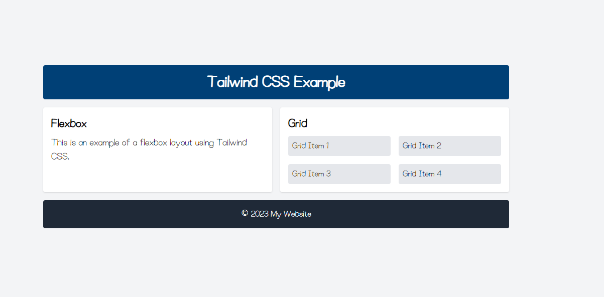
결과 화면
- 위의 예제에 사용된 각각의 클래스의 기능에 대해 아래 표로 간략하게 정리하였다.
레이아웃 클래스
| 클래스 | 설명 |
|---|---|
container | 최대 너비와 자동 마진을 제공하는 컨테이너 |
mx-auto | 가로 중앙 정렬 |
p-4 | 패딩 설정 |
mt-4, mb-4, lg:mb-0, lg:mr-4 | 마진 설정 |
flex, flex-col, lg:flex-row | 플렉스 박스 레이아웃 설정 및 반응형 방향 변경 |
grid, grid-cols-2, gap-4 | 그리드 레이아웃 설정 및 간격 설정 |
타이포그래피 클래스
| 클래스 | 설명 |
|---|---|
text-3xl, text-2xl, text-lg | 텍스트 크기 설정 |
font-bold, font-semibold | 텍스트 두께 설정 |
text-center | 텍스트 중앙 정렬 |
text-white | 텍스트 색상 설정 |
기타 클래스
| 클래스 | 설명 |
|---|---|
bg-custom-blue, bg-white, bg-gray-200, bg-gray-800 | 배경 색상 설정 |
rounded | 둥근 모서리 설정 |
shadow | 그림자 설정 |

매일매일 틀깨기