Home Screen
import Link from 'next/link';

export default function Home() {
  return (
    <div className="flex flex-col justify-between items-center min-h-screen">
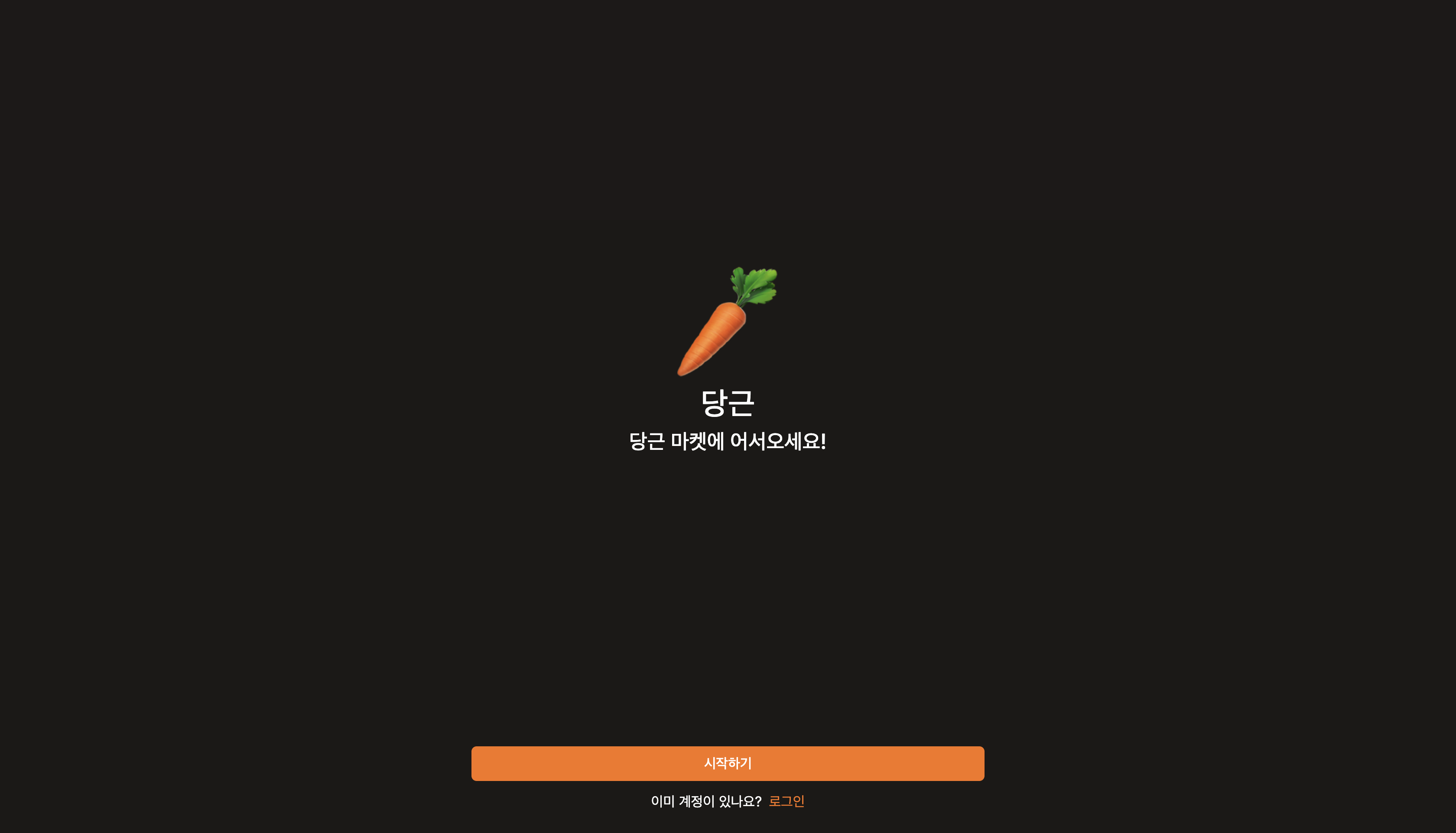
      <div className="my-auto flex flex-col items-center gap-2 *:font-medium">
        <span className="text-9xl">🥕</span>
        <h1 className="text-4xl ">당근</h1>
        <h2 className="text-2xl">당근 마켓에 어서오세요!</h2>
      </div>
      <div className="flex flex-col items-center gap-3 w-full p-6">
        <Link
          href="/create-account"
          className="w-full bg-orange-500 text-white font-medium py-2 rounded-md text-center
          hover:bg-orange-400 transition-colors"
        >
          시작하기
        </Link>
        <div className="flex gap-2">
          <span>이미 계정이 있나요?</span>
          <Link href="/login" className="hover:underline underline-offset-4">
            로그인
          </Link>
        </div>
      </div>
    </div>
  );
}
여기서, 링크의 기본 텍스트 색상을 변경하기 위해서 @layer base를 사용
 ---> 이 코드를 사용하면 모든
 <a> 태그에 대해 기본 텍스트 색상이 text-orange-500으로 설정된다.
또한, 모바일 버전을 기준으로 만들어가기 위해서
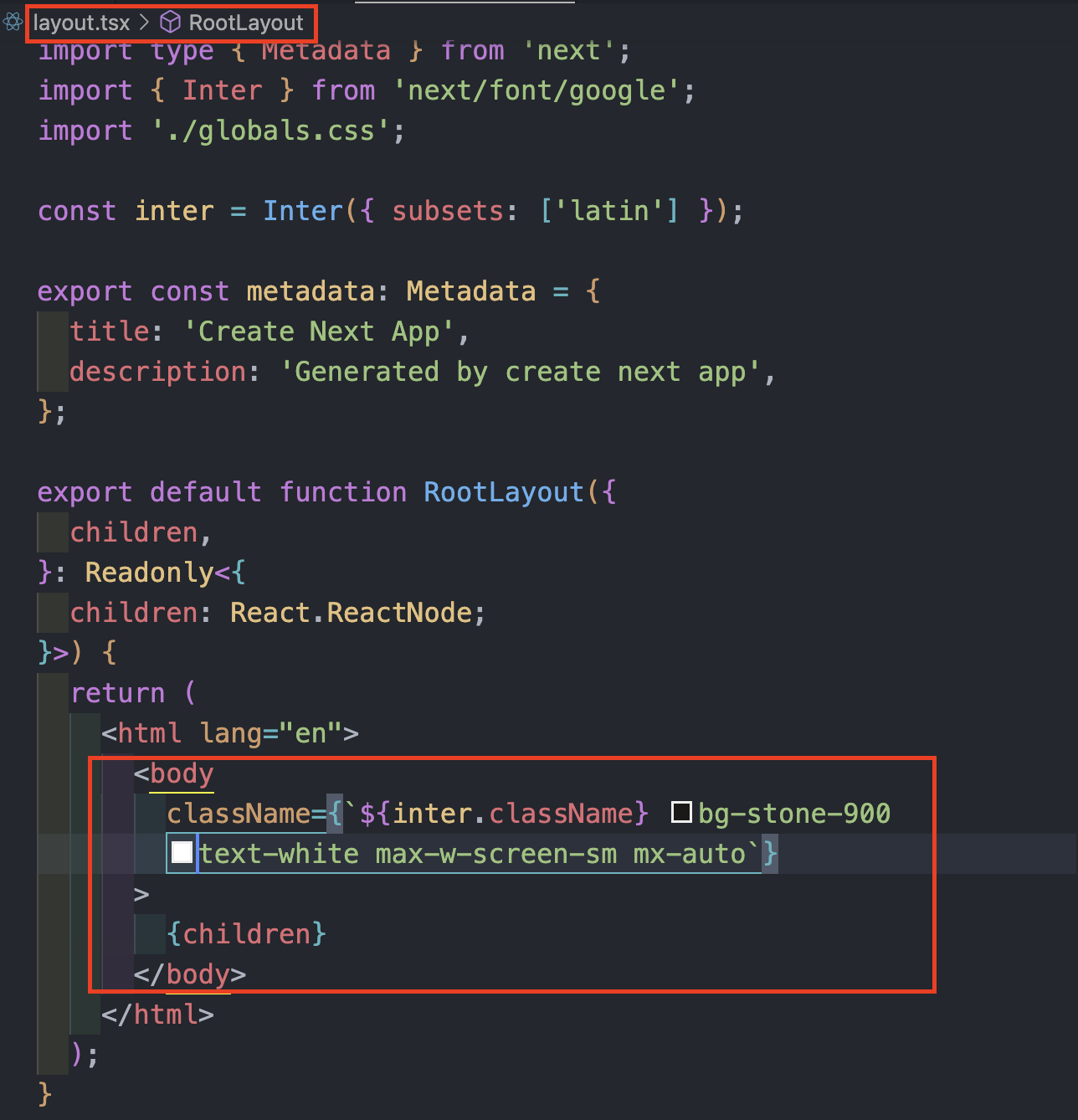 layout에서
 <body> 태그에 max-w-screen-sm으로 설정해 두었다.
Home Screen UI
Create Account Screen
import { ChatBubbleOvalLeftEllipsisIcon } from '@heroicons/react/24/solid';
import Link from 'next/link';

export default function CreateAccount() {
  return (
    <div className="flex flex-col gap-10 py-8 px-6">
      <div className="flex flex-col gap-2 *:font-medium">
        <h1 className="text-2xl">안녕하세요!</h1>
        <h2 className="text-xl">Fill in the form below to join!</h2>
      </div>
      <form className="flex flex-col gap-3">
        <div className="flex flex-col gap-2">
          <input
            className="bg-transparent rounded-md w-full h-10 focus:outline-none ring-1 focus:ring-2
            ring-neutral-200
            focus:ring-orange-500
            border-none
            placeholder:text-neutral-400"
            type="text"
            placeholder="Username"
            required
          />
          <span className="text-red-500 font-medium">Input Error</span>
        </div>
        <button className="primary-btn h-10">Create account</button>
      </form>
      <div className="w-full h-px bg-neutral-500" />
      <div>
        <Link
          href="/sms"
          className="primary-btn h-10 flex items-center justify-center gap-3"
        >
          <span>
            <ChatBubbleOvalLeftEllipsisIcon className="size-6" />
          </span>
          <span>Sign up with SMS</span>
        </Link>
      </div>
    </div>
  );
}
여기서 살펴봐야할 부분은 primary-btn 부분이다. 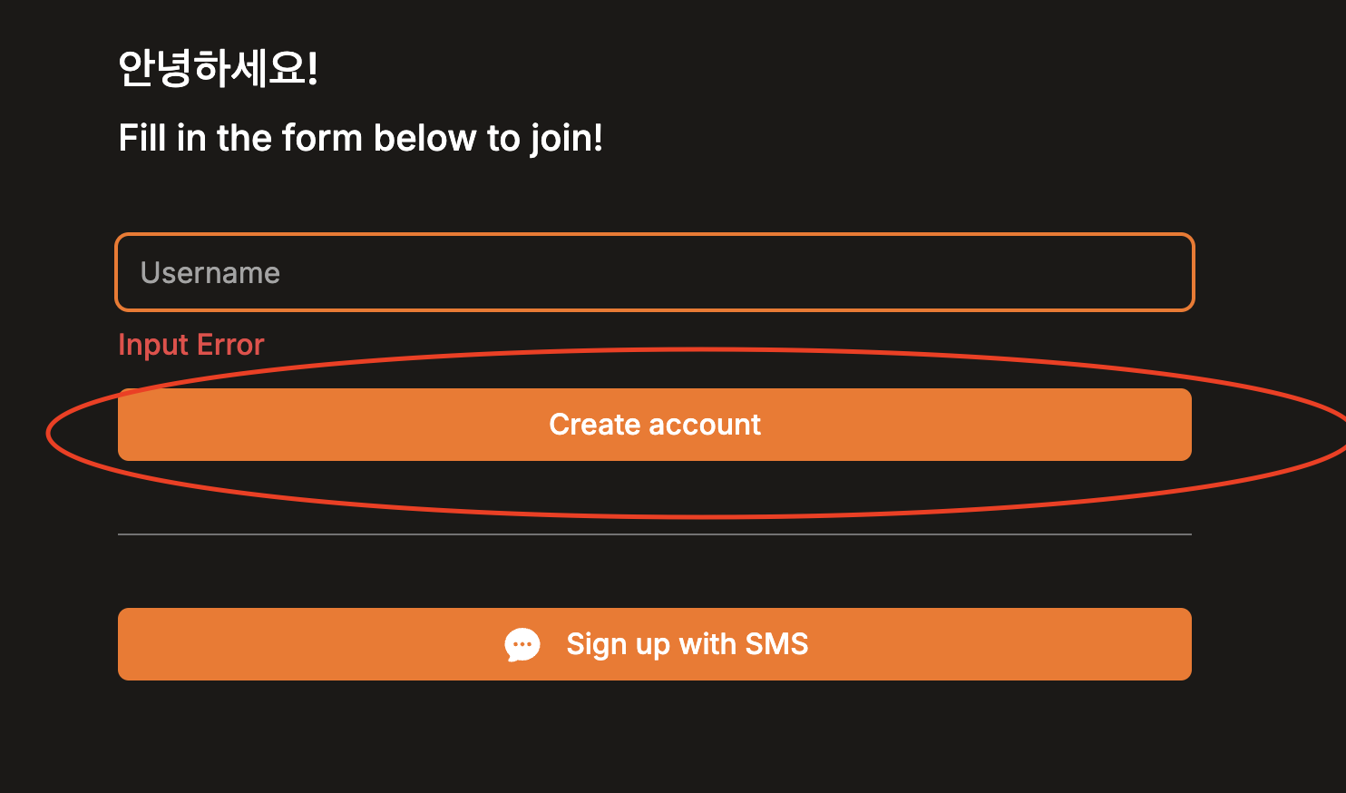 완전히 똑같지는 않지만, 기본적인 button의 속성은 비슷하기 때문에,
@layer components로 .primary-btn 클래스를 생성해서 여러 곳에서 공유할 수 있도록 해주었다. 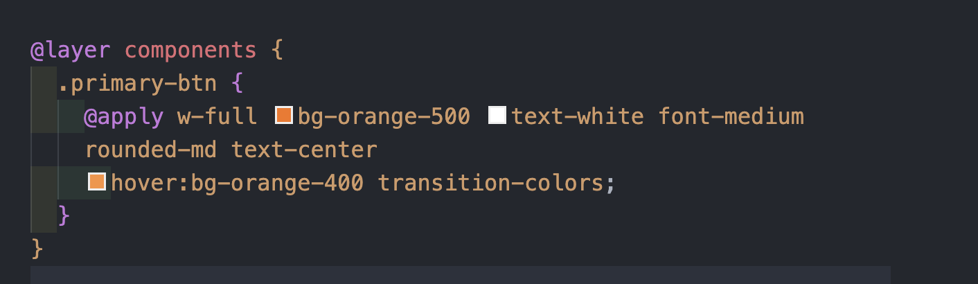 이렇게 @layer components로
 .primary-btn을 정의하고, 이를 필요한 곳에서 가져다 쓰고, 이외의 크기나 글씨 크기는 개별적으로 적용시키면 된다!
heroicons
heroicons는 tailwinds에서 만든 다양한 icon들을 제공해주는 곳이다.
npm install @heroicons/react로 설치해주고, 해당 사이트에서 필요한 아이콘을 찾은 뒤,  요렇게 불러와서 사용할 수 있다.
className으로 사이즈 및 상세 설정을 할 수도 있다!
Form Components
이제 컴포넌트를 생성해보려고 한다.
위에서 회원가입할 때, input을 Username 하나만 생성했다
--> email, password등이 필요하지만, 코드가 중복이 발생하기 때문
먼저 input 부분을 컴포넌트로 생성해보자
form-input.tsx
interface IFormInput {
  type: string;
  placeholder: string;
  required: boolean;
  errors: string[];
}

export default function FormInput({
  type,
  placeholder,
  required,
  errors,
}: IFormInput) {
  return (
    <div className="flex flex-col gap-2">
      <input
        className="bg-transparent rounded-md w-full h-10 focus:outline-none ring-2 focus:ring-4 transition ring-neutral-200 focus:ring-orange-500 border-none placeholder:text-neutral-400"
        type={type}
        placeholder<={placeholder}
        required={required}
      />
      {errors.map((error, index) => (
        <span key={index} className="text-red-500 font-medium">
          {error}
        </span>
      ))}
    </div>
  );
}
<FormInput/> 컴포넌트를 생성해주면서 props로 {type, placeholder, required, error} 를 각각 받아온다.
이렇게 input을 컴포넌트로 생성하게 되면, username, email등 여러 input을 만들어도, 그에 맞게 props를 전달만 해주고 <FormInput/> 를 불러 사용하기만 하면 된다.
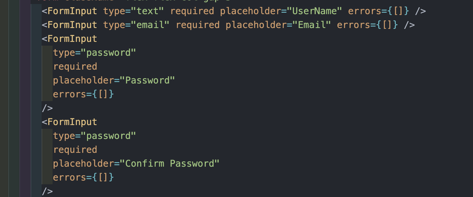 이렇게 사용할 input에 맞게 props를 전달해주면 된다.
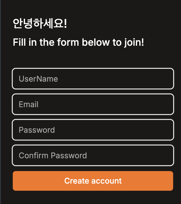 이렇게 input이 생성이 되었다.
이제 위에 "Create account" 버튼도 component로 생성해보려고 한다.
form-btn.tsx
interface IFormButton {
  loading: boolean;
  text: string;
}

export default function FormButton({ loading, text }: IFormButton) {
  return (
    <button
      disabled={loading}
      className="primary-btn h-10 disabled:bg-neutral-400  disabled:text-neutral-300 disabled:cursor-not-allowed"
    >
      {loading ? '로딩 중...' : text}
    </button>
  );
}
FormButton 컴포넌트를 만들어서 폼 제출 버튼에 로딩 중일 때 disabled 상태를 추가해주었다.
Tailwind CSS를 사용하여 버튼이 disabled 상태일 때 배경색, 텍스트 색상, 그리고 커서 상태를 정의를 해주었다.

<FormButton/>또한 props {loading, text}를 보내주면 된다.
loading={true}일 경우는 어떻게 될까? 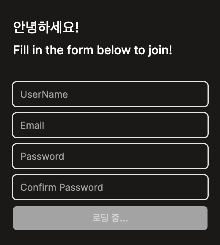 로딩 중, 즉 회원가입 중임을 나타내면서
 cursor-not-allowed를 통해서 마우스 사용이 금지 되었다.
social-login.tsx
이제 마지막 컴포넌트 social-login.tsx를 생성해 주었다.
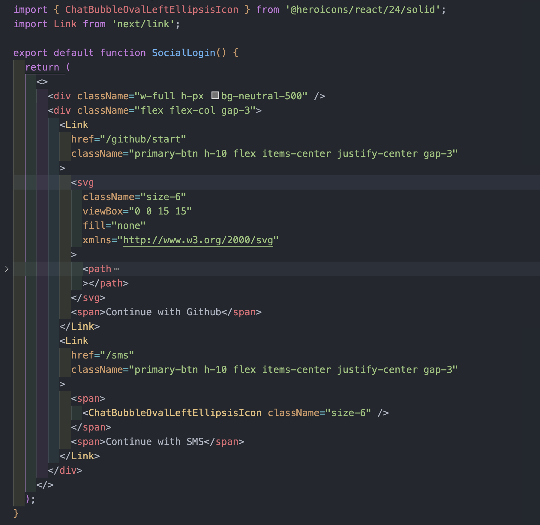 깃허브 로그인도 하나 추가해 주었다.
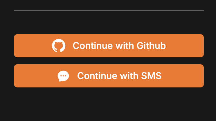 이제 social Login이 필요한 곳에
 <SocialLogin /> 를 불러서 사용하면 된다!
결론적으로 /create-account page.tsx를 살펴보면
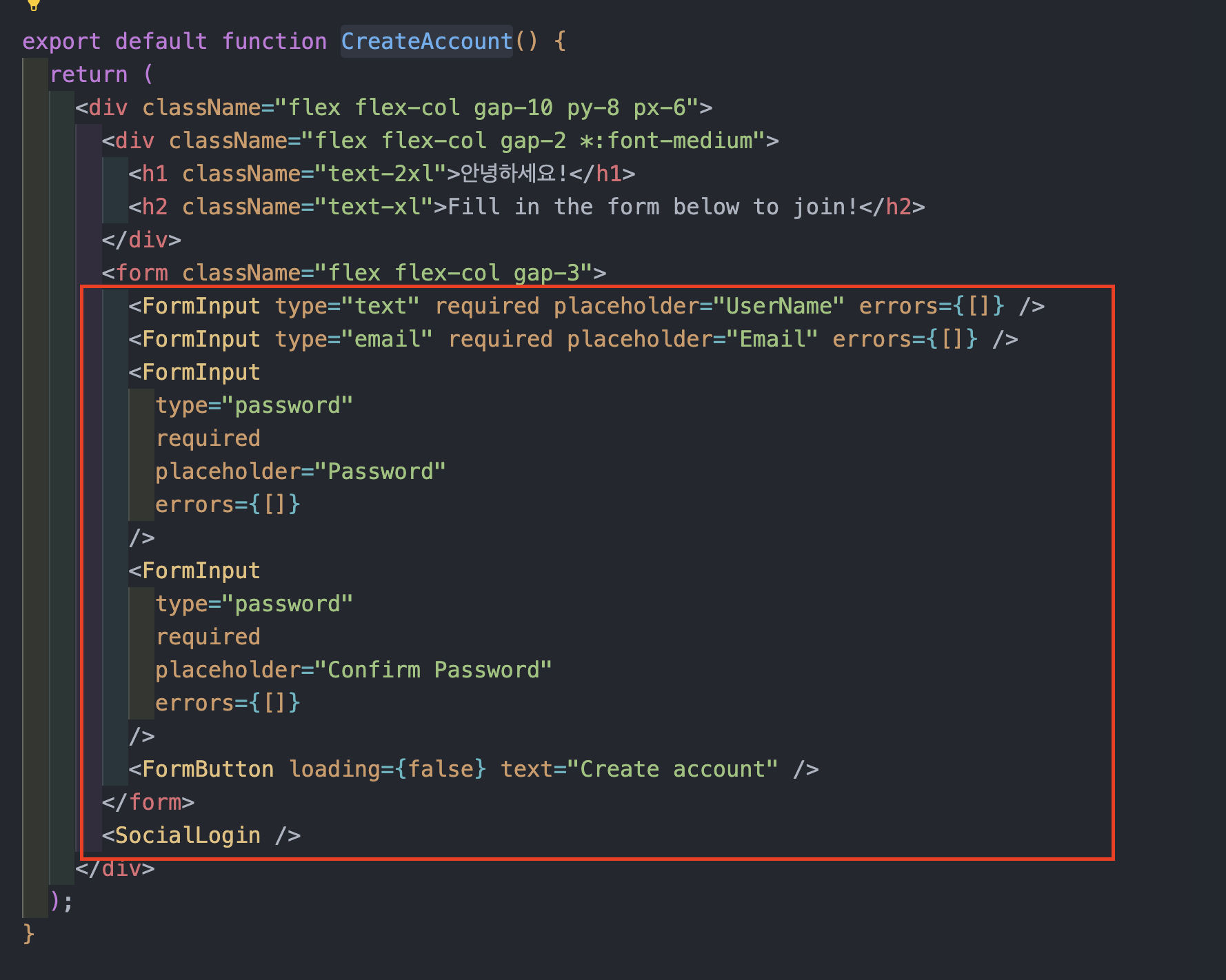
컴포넌트를 생성함으로써, 코드의 중복을 제거하고 더욱 깔끔하고 일관된 코드를 작성할 수 있는 것을 확인할 수 있다.
/login page.tsx
그럼 로그인 페이지도 구성해보자
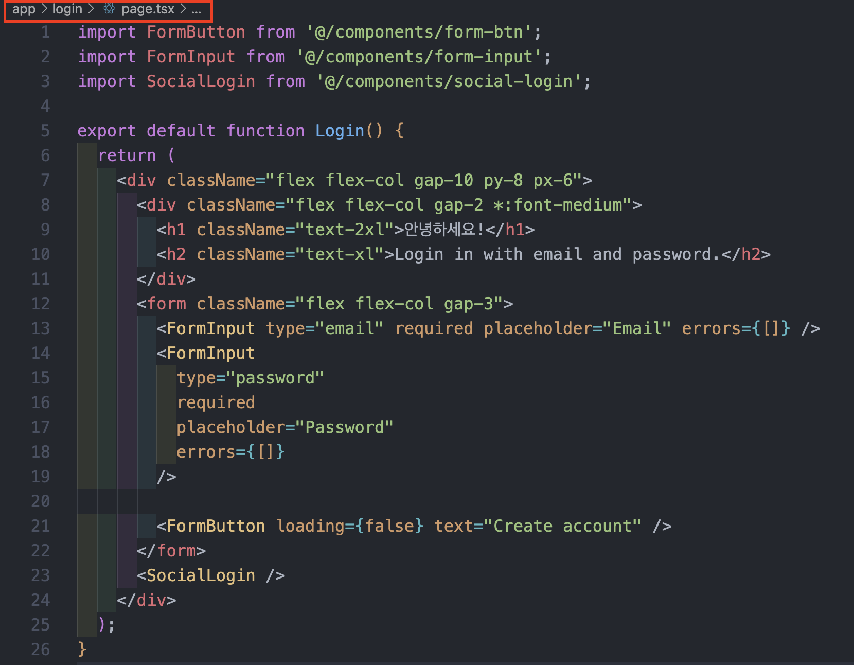
/login 폴더에 page.tsx에 구성하면 된다.
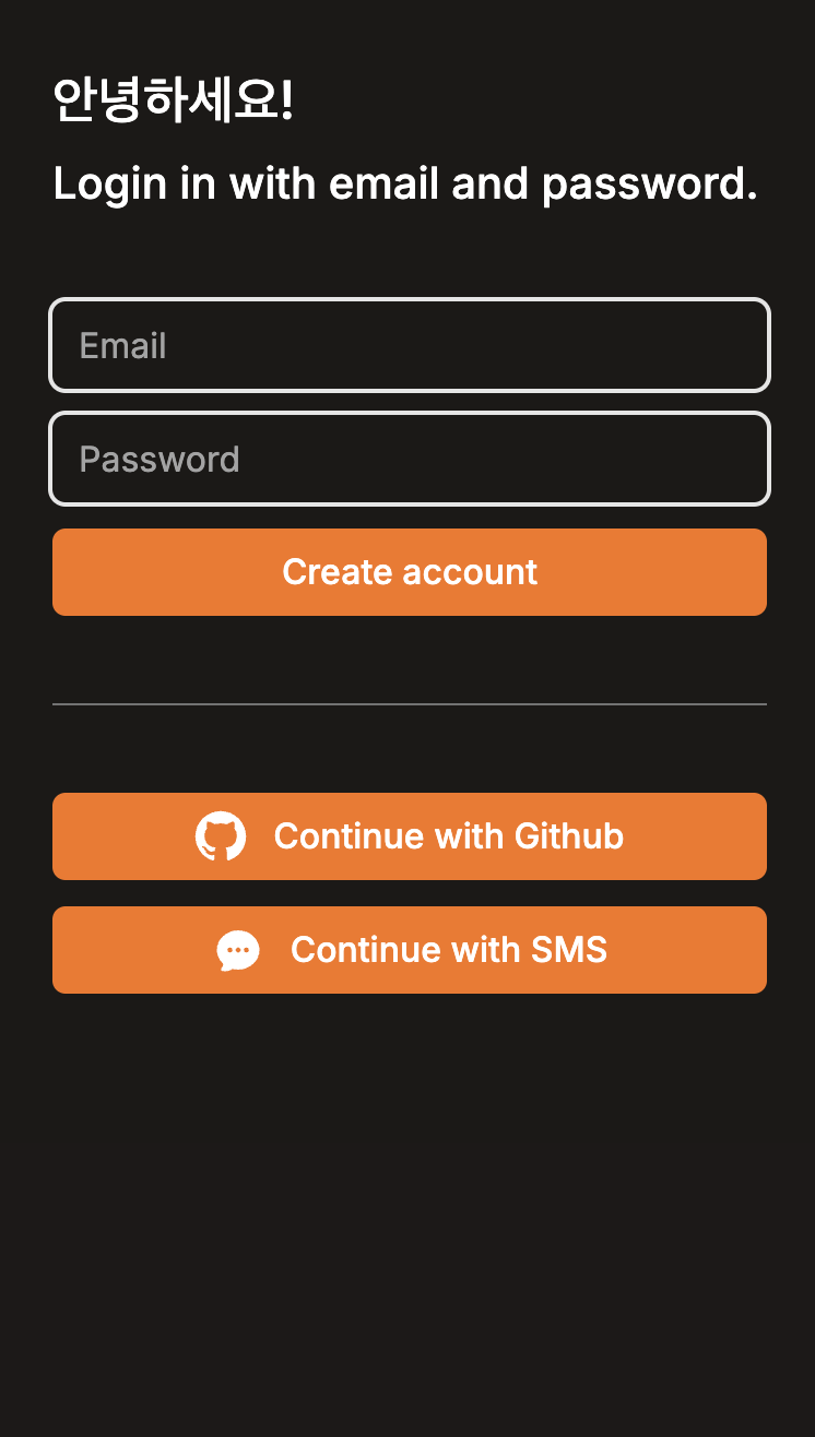
회원가입과 거의 비슷하기 때문에 설명은 생략하겠다!
/sms page.tsx
"Continue with SMS" 를 눌렀을 때, 이동할 페이지도 생성해주겠다.
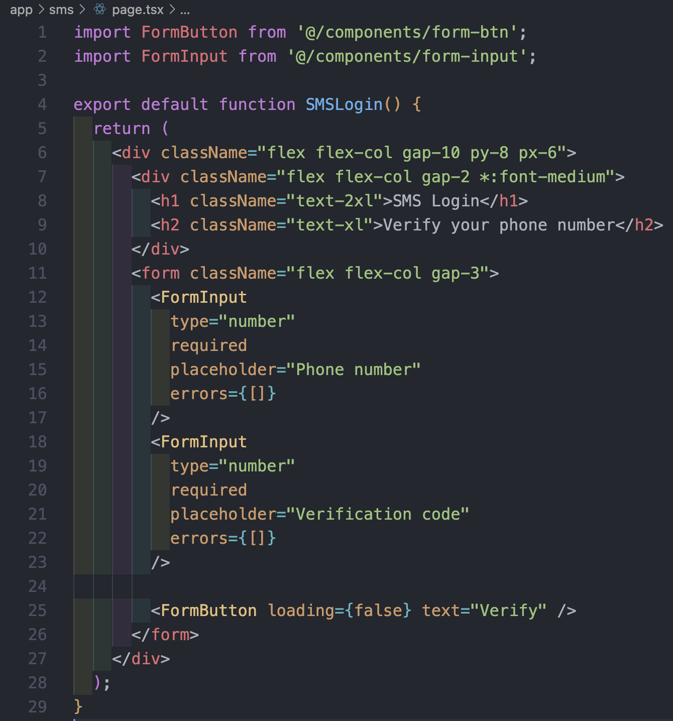
/login과 /sms 페이지를 확인해보면
/login
/sms
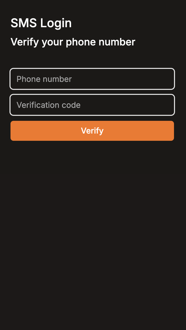
이렇게 구성되어있다!