💡 회사에서 디자인 시스템을 구축하는 업무를 맡게 되었다. 거기서 사용하는 오픈소스 라이브러리 중 하나가 radix-ui이다. 그 유명한 shadcn/ui가 이 radix-ui를 기반으로 만들어졌다고 한다. radix-ui에 대한 기본적인 이해를 거치면 업무 수행이 좀 더 수월할 것 같기도 하고, 데보션 프로젝트에서도 활용해 볼 만한 라이브러리인 것 같아서 공부를 해 보면 좋을 것 같다. 영어 문서를 눈으로 번역하는 거라서 오역이 많을 수도... 미리 죄송합니다🙇
radix-ui 공식 홈페이지
radix-ui 공식 github
📌 Introduction
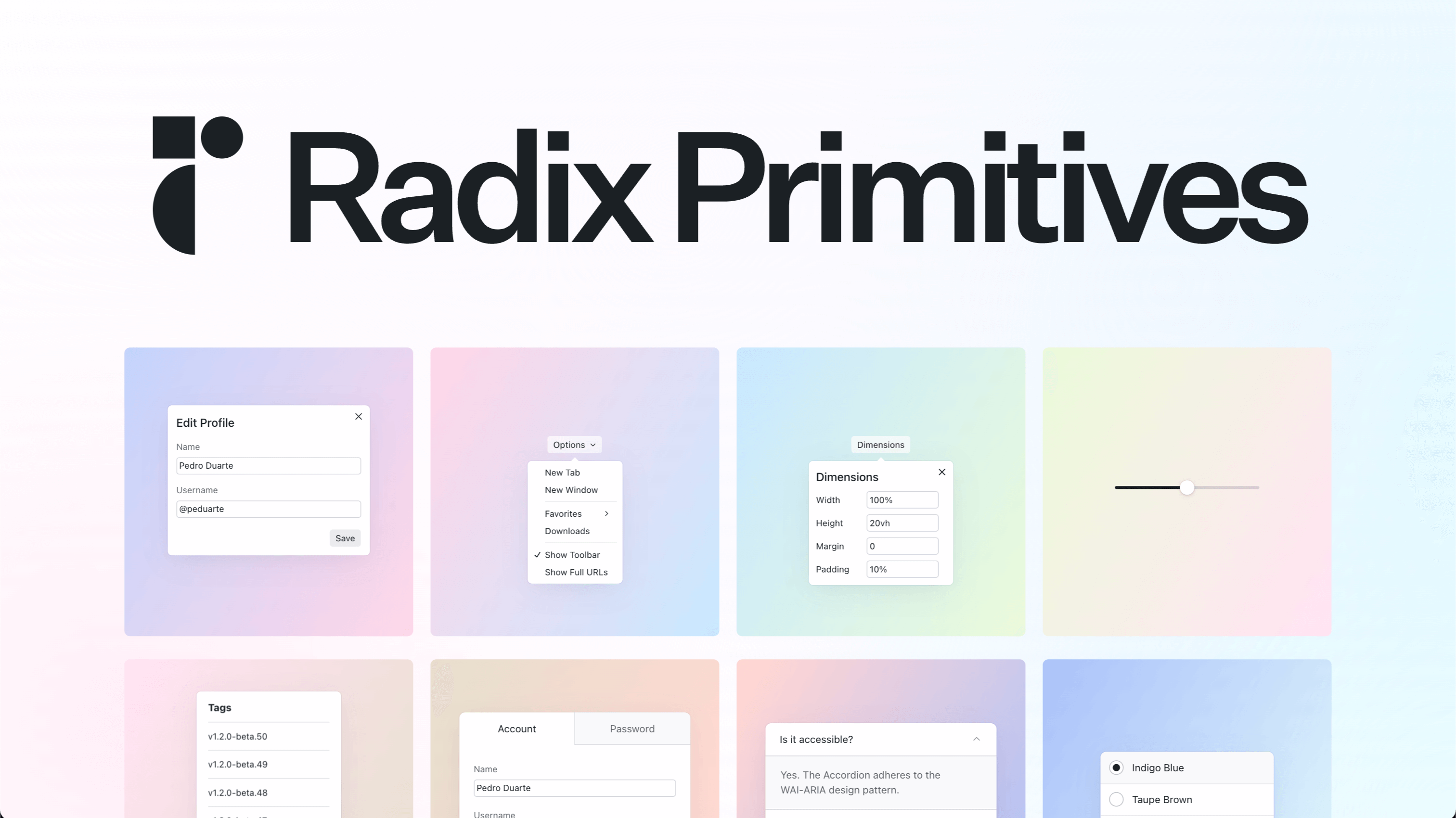
🌟 고품질, 접근 가능한 디자인 시스템과 웹앱을 구축하는 데 사용하는 오픈소스 UI 컴포넌트 라이브러리
-
Radix Primitives는 접근 가능성, 커스텀, DX에 집중한 low-level UI 컴포넌트 라이브러리
-
그만큼 개발자가 커스텀 하기 쉬운 headless UI 같은 느낌입니다
-
독보적인 UI/UX를 가진 팀들이 사용하기에 좋을 것 같은!
-
사용자(개발자) 개인의 디자인 시스템의 base layer로서 사용하기에도 좋고,
점진적으로 적용해나가기도 좋다!
✅ Vision
- accordion, checkbox, combobox, dialog, dropdown, select 등등 기본 UI 패턴들을 딱 봤을 때, 우리에게 공유되는 기본적인 개념이 있음
- 하지만 웹 플랫폼에서 제공하는 이런 컴포넌트들에 대한 구현은 불충분하다!
- 따라서 개발자들은 강제적으로 커스텀 컴포넌트를 만들 수밖에 없었고, 이는 어려운 작업이다...
→ radix-ui의 목표는 개발자 커뮤니티가 쉽게 디자인 시스템을 구축할 수 있도록 돕는 오픈소스 컴포넌트 라이브러리를 만드는 것!
✅ Key Features
1. Accessible
- WAI-ARIA Design Patterns 활용
- arai, role 속성과 focus, 키보드 navigation 등 접근성과 관련된 많은 디테일들을 처리함
2. Unstyled
- 컴포넌트는 스타일 없이 제공됨 → 사용자(개발자)가 덧입힐 수 있게!
- vanilla CSS, CSS preprocessors, CSS-in-JS 등 어떤 것으로든 덧입혀질 수 있다
3. Opened
- 사용자의 니즈에 맞게 커스텀 가능하도록 설계됨
- 각 컴포넌트 부분마다 세분화된 접근을 제공 → 부분부분마다 이벤트 리스너, props, refs 등등 다양하게 추가 가능
4. Uncontrolled
- 특정 경우에는 기본적으로 제어X
- 하지만 동작들이 내부적으로 잘 처리되므로, 특별히 로컬 상태 만들 필요 없이 이용 가능함
5. Developer experience
- Full-typed API 제공
- 모든 컴포넌트는 일관되고 예측 가능한 개발자 경험을 만드는 비슷한 API를 서로 공유함
6. Incremental Adoption
각 Primitives는 개별적으로 설치 가능
npm install @radix-ui/react-dialog
npm install @radix-ui/react-dropdown-menu
npm install @radix-ui/react-tooltip
버저닝도 독립적으로 된다고 함 (미쳤다)
📌 Getting Started
npm install @radix-ui/{특정 radix primitive}@latest -E 참고로 -E는 --save-exact로 버전명과 정확히 일치하는 패키지를 받음
// index.jsx
import * as React from 'react';
import * as Popover from '@radix-ui/react-popover';

const PopoverDemo = () => (
  <Popover.Root>
    <Popover.Trigger>More info</Popover.Trigger>
    <Popover.Portal>
      <Popover.Content>
        Some more info…
        <Popover.Arrow />
      </Popover.Content>
    </Popover.Portal>
  </Popover.Root>
);

export default PopoverDemo;
가져온 primitive가 Popover라고 했을 때, 이런 식으로 사용 가능
// index.jsx
import * as React from 'react';
import * as Popover from '@radix-ui/react-popover';
import './styles.css';

const PopoverDemo = () => (
  <Popover.Root>
    <Popover.Trigger className="PopoverTrigger">Show info</Popover.Trigger>
    <Popover.Portal>
      <Popover.Content className="PopoverContent">
        Some content
        <Popover.Arrow className="PopoverArrow" />
      </Popover.Content>
    </Popover.Portal>
  </Popover.Root>
);

export default PopoverDemo;
/* styles.css */
.PopoverTrigger {
background-color: white;
border-radius: 4px;
}
.PopoverContent {
border-radius: 4px;
padding: 20px;
width: 260px;
background-color: white;
}
.PopoverArrow {
fill: white;
} 스타일을 추가하려면 이런 식으로 사용할 수 있다
📌 Styling
.AccordionItem {
  border-bottom: 1px solid gainsboro;
}

.AccordionItem[data-state='open'] {
  border-bottom-width: 2px;
}
상태에 따라 스타일이 달라질 수 있는 부분들은 이미 radix 단에서 data-state가 지정되어 있다
따라서 data-state에 맞게 스타일을 적용해 줄 수 있다!
📌 Animation
@keyframes fadeIn {
  from {
    opacity: 0;
  }

  to {
    opacity: 1;
  }
}

@keyframes fadeOut {
  from {
    opacity: 1;
  }

  to {
    opacity: 0;
  }
}


.DialogOverlay[data-state='open'],
.DialogContent[data-state='open'] {
  animation: fadeIn 300ms ease-out;
}

.DialogOverlay[data-state='closed'],
.DialogContent[data-state='closed'] {
  animation: fadeOut 300ms ease-in;
}
애니메이션도 위와 같이 예측 가능한 형태로 줄 수 있다
📌 Composition
Radix의 기능과 사용자의 컴포넌트를 compose 하려면, asChild prop을 사용하자!!
Element type 변경
- 대부분의 경우 Radix의 element type을 바꾸게 될 일은 없긴 하지만 방법은 있다
Tooltip.Trigger가 좋은 예시- 디폴트로는
button에 붙어서 hover 했을 때 Tooltip이 나타나게 되어 있는데,a링크에 나타나게 수정할 수 있다
import * as React from 'react';
import * as Tooltip from '@radix-ui/react-tooltip';

export default () => (
  <Tooltip.Root>
    <Tooltip.Trigger asChild>
      <a href="https://www.radix-ui.com/">Radix UI</a>
    </Tooltip.Trigger>
    <Tooltip.Portal>…</Tooltip.Portal>
  </Tooltip.Root>
);
asChild는 문자 그대로 child로서 쓰인다는 의미인듯- 보통 이렇게 수정해서 사용하는 경우는 드물고, 사용자가 만든 리액트 컴포넌트를 사용하게 될 것
- 그래도 알아두면 좋다!
내가 만든 React 컴포넌트와 Composing
asChild와 원리는 거의 유사함- 하지만 몇 가지 주의해야 할 부분이 있다
1. props
- Radix는 사용자의 component를 복제할 때 그것의 props와 이벤트 핸들러를 pass함
- 만약 사용자의 component가 이러한 props를 지원하지 않는다면, 오류 발생!
- 이는 모든 props를 DOM 노드에 spread 하여 수행함
// before
const MyButton = () => <button />;

// after
const MyButton = (props) => <button {...props} />;
2. forwardRef
- Radix는 종종 사용자의 컴포넌트에
ref를 붙여야 하는 경우가 있음 - 이때 컴포넌트가 ref를 받지 않는다면, 오류 발생!
React.forwardRef를 통해 수행됨
// before
const MyButton = (props) => <button {...props} />;

// after
const MyButton = React.forwardRef((props, forwardedRef) => (
  <button {...props} ref={forwardedRef} />
));
모든 부분에 필요한 건 아니지만, 그냥 습관처럼 항상 하는 걸 권장한다고 함
Radix primitives끼리 Composing
asChild는 depth를 중첩해서 깊게 사용할 수도 있음Tooltip.Trigger와Dialog.Trigger를 같이 사용하는 예시
import * as React from 'react';
import * as Dialog from '@radix-ui/react-dialog';
import * as Tooltip from '@radix-ui/react-tooltip';

const MyButton = React.forwardRef((props, forwardedRef) => (
  <button {...props} ref={forwardedRef} />
));

export default () => {
  return (
    <Dialog.Root>
      <Tooltip.Root>
        <Tooltip.Trigger asChild>
          <Dialog.Trigger asChild>
            <MyButton>Open dialog</MyButton>
          </Dialog.Trigger>
        </Tooltip.Trigger>
        <Tooltip.Portal>…</Tooltip.Portal>
      </Tooltip.Root>
      <Dialog.Portal>...</Dialog.Portal>
    </Dialog.Root>
  );
}; - 이렇게 하면 hover 했을 때는
Trigger가 나오고, 눌렀을 때는Dialog가 나올 수 있게,Button하나에Trigger,Dialog가 걸리게 할 수 있는 듯!
📌 Server-side rendering
Radix primitive는 SSR이든 Static rendering에서든 사용 가능!
📌 Primitives 종류
현재 하고 있는 프로젝트에서 쓸 수 있을 만한 primitive를 몇 가지 정리해 보자! tailwind css를 사용하게 될 것 같긴 하지만, 블로그 포스팅용 정리이기 때문에 가독성상 CSS를 이용한 코드로 가져와 보았다.
✅ Accordion
import React from 'react';
import * as Accordion from '@radix-ui/react-accordion';
import classNames from 'classnames';
import { ChevronDownIcon } from '@radix-ui/react-icons';
import './styles.css';

const AccordionDemo = () => (
  <Accordion.Root className="AccordionRoot" type="single" defaultValue="item-1" collapsible>
    <Accordion.Item className="AccordionItem" value="item-1">
      <AccordionTrigger>Is it accessible?</AccordionTrigger>
      <AccordionContent>Yes. It adheres to the WAI-ARIA design pattern.</AccordionContent>
    </Accordion.Item>

    <Accordion.Item className="AccordionItem" value="item-2">
      <AccordionTrigger>Is it unstyled?</AccordionTrigger>
      <AccordionContent>
        Yes. It's unstyled by default, giving you freedom over the look and feel.
      </AccordionContent>
    </Accordion.Item>

    <Accordion.Item className="AccordionItem" value="item-3">
      <AccordionTrigger>Can it be animated?</AccordionTrigger>
      <Accordion.Content className="AccordionContent">
        <div className="AccordionContentText">
          Yes! You can animate the Accordion with CSS or JavaScript.
        </div>
      </Accordion.Content>
    </Accordion.Item>
  </Accordion.Root>
);

const AccordionTrigger = React.forwardRef(({ children, className, ...props }, forwardedRef) => (
  <Accordion.Header className="AccordionHeader">
    <Accordion.Trigger
      className={classNames('AccordionTrigger', className)}
      {...props}
      ref={forwardedRef}
    >
      {children}
      <ChevronDownIcon className="AccordionChevron" aria-hidden />
    </Accordion.Trigger>
  </Accordion.Header>
));


const AccordionContent = React.forwardRef(({ children, className, ...props }, forwardedRef) => (
  <Accordion.Content
    className={classNames('AccordionContent', className)}
    {...props}
    ref={forwardedRef}
  >
    <div className="AccordionContentText">{children}</div>
  </Accordion.Content>

));

export default AccordionDemo; - forwardRef로 AccordionTrigger, AccordionContent를 지정해 줌으로써 부모 요소에서 해당 요소들에 접근할 수 있게 함
- 참고 링크
- 일반적으로 컴포넌트의 DOM 노드는 비공개
- 하지만 forwardRef를 사용하면 자식을 부모에게 노출시킬 수 있다!
✅ Checkbox
import React from 'react';
import * as Checkbox from '@radix-ui/react-checkbox';
import { CheckIcon } from '@radix-ui/react-icons';
import './styles.css';

const CheckboxDemo = () => (
  <form>
    <div style={{ display: 'flex', alignItems: 'center' }}>
      <Checkbox.Root className="CheckboxRoot" defaultChecked id="c1">
        <Checkbox.Indicator className="CheckboxIndicator">
          <CheckIcon />
        </Checkbox.Indicator>
      </Checkbox.Root>
      <label className="Label" htmlFor="c1">
        Accept terms and conditions.
      </label>
    </div>
  </form>
);

export default CheckboxDemo;
✅ Dialog
import React from 'react';
import * as Dialog from '@radix-ui/react-dialog';
import { Cross2Icon } from '@radix-ui/react-icons';
import './styles.css';

const DialogDemo = () => (
  <Dialog.Root>
    <Dialog.Trigger asChild>
      <button className="Button violet">Edit profile</button>
    </Dialog.Trigger>
    <Dialog.Portal>
      <Dialog.Overlay className="DialogOverlay" />
      <Dialog.Content className="DialogContent">
        <Dialog.Title className="DialogTitle">Edit profile</Dialog.Title>
        <Dialog.Description className="DialogDescription">
          Make changes to your profile here. Click save when you're done.
        </Dialog.Description>
        <fieldset className="Fieldset">
          <label className="Label" htmlFor="name">
            Name
          </label>
          <input className="Input" id="name" defaultValue="Pedro Duarte" />
        </fieldset>
        <fieldset className="Fieldset">
          <label className="Label" htmlFor="username">
            Username
          </label>
          <input className="Input" id="username" defaultValue="@peduarte" />
        </fieldset>
        <div style={{ display: 'flex', marginTop: 25, justifyContent: 'flex-end' }}>
          <Dialog.Close asChild>
            <button className="Button green">Save changes</button>
          </Dialog.Close>
        </div>
        <Dialog.Close asChild>
          <button className="IconButton" aria-label="Close">
            <Cross2Icon />
          </button>
        </Dialog.Close>
      </Dialog.Content>
    </Dialog.Portal>
  </Dialog.Root>
);

export default DialogDemo;
✅ Form
Built-in validation과 custom validation 모두 제공하는 야무진 녀석이다...
import React from 'react';
import * as Form from '@radix-ui/react-form';
import './styles.css';

const FormDemo = () => (
  <Form.Root className="FormRoot">
    <Form.Field className="FormField" name="email">
      <div style={{ display: 'flex', alignItems: 'baseline', justifyContent: 'space-between' }}>
        <Form.Label className="FormLabel">Email</Form.Label>
        <Form.Message className="FormMessage" match="valueMissing">
          Please enter your email
        </Form.Message>
        <Form.Message className="FormMessage" match="typeMismatch">
          Please provide a valid email
        </Form.Message>
      </div>
      <Form.Control asChild>
        <input className="Input" type="email" required />
      </Form.Control>
    </Form.Field>
    <Form.Field className="FormField" name="question">
      <div style={{ display: 'flex', alignItems: 'baseline', justifyContent: 'space-between' }}>
        <Form.Label className="FormLabel">Question</Form.Label>
        <Form.Message className="FormMessage" match="valueMissing">
          Please enter a question
        </Form.Message>
      </div>
      <Form.Control asChild>
        <textarea className="Textarea" required />
      </Form.Control>
    </Form.Field>
    <Form.Submit asChild>
      <button className="Button" style={{ marginTop: 10 }}>
        Post question
      </button>
    </Form.Submit>
  </Form.Root>
);

export default FormDemo;
✅ Popover
import React from 'react';
import * as Popover from '@radix-ui/react-popover';
import { MixerHorizontalIcon, Cross2Icon } from '@radix-ui/react-icons';
import './styles.css';

const PopoverDemo = () => (
  <Popover.Root>
    <Popover.Trigger asChild>
      <button className="IconButton" aria-label="Update dimensions">
        <MixerHorizontalIcon />
      </button>
    </Popover.Trigger>
    <Popover.Portal>
      <Popover.Content className="PopoverContent" sideOffset={5}>
        <div style={{ display: 'flex', flexDirection: 'column', gap: 10 }}>
          <p className="Text" style={{ marginBottom: 10 }}>
            Dimensions
          </p>
          <fieldset className="Fieldset">
            <label className="Label" htmlFor="width">
              Width
            </label>
            <input className="Input" id="width" defaultValue="100%" />
          </fieldset>
          <fieldset className="Fieldset">
            <label className="Label" htmlFor="maxWidth">
              Max. width
            </label>
            <input className="Input" id="maxWidth" defaultValue="300px" />
          </fieldset>
          <fieldset className="Fieldset">
            <label className="Label" htmlFor="height">
              Height
            </label>
            <input className="Input" id="height" defaultValue="25px" />
          </fieldset>
          <fieldset className="Fieldset">
            <label className="Label" htmlFor="maxHeight">
              Max. height
            </label>
            <input className="Input" id="maxHeight" defaultValue="none" />
          </fieldset>
        </div>
        <Popover.Close className="PopoverClose" aria-label="Close">
          <Cross2Icon />
        </Popover.Close>
        <Popover.Arrow className="PopoverArrow" />
      </Popover.Content>
    </Popover.Portal>
  </Popover.Root>
);

export default PopoverDemo;
✅ RadioGroup
import React from 'react';
import * as RadioGroup from '@radix-ui/react-radio-group';
import './styles.css';

const RadioGroupDemo = () => (
  <form>
    <RadioGroup.Root className="RadioGroupRoot" defaultValue="default" aria-label="View density">
      <div style={{ display: 'flex', alignItems: 'center' }}>
        <RadioGroup.Item className="RadioGroupItem" value="default" id="r1">
          <RadioGroup.Indicator className="RadioGroupIndicator" />
        </RadioGroup.Item>
        <label className="Label" htmlFor="r1">
          Default
        </label>
      </div>
      <div style={{ display: 'flex', alignItems: 'center' }}>
        <RadioGroup.Item className="RadioGroupItem" value="comfortable" id="r2">
          <RadioGroup.Indicator className="RadioGroupIndicator" />
        </RadioGroup.Item>
        <label className="Label" htmlFor="r2">
          Comfortable
        </label>
      </div>
      <div style={{ display: 'flex', alignItems: 'center' }}>
        <RadioGroup.Item className="RadioGroupItem" value="compact" id="r3">
          <RadioGroup.Indicator className="RadioGroupIndicator" />
        </RadioGroup.Item>
        <label className="Label" htmlFor="r3">
          Compact
        </label>
      </div>
    </RadioGroup.Root>
  </form>
);

export default RadioGroupDemo;
✅ Tabs
import React from 'react';
import * as Tabs from '@radix-ui/react-tabs';
import './styles.css';

const TabsDemo = () => (
  <Tabs.Root className="TabsRoot" defaultValue="tab1">
    <Tabs.List className="TabsList" aria-label="Manage your account">
      <Tabs.Trigger className="TabsTrigger" value="tab1">
        Account
      </Tabs.Trigger>
      <Tabs.Trigger className="TabsTrigger" value="tab2">
        Password
      </Tabs.Trigger>
    </Tabs.List>
    <Tabs.Content className="TabsContent" value="tab1">
      <p className="Text">Make changes to your account here. Click save when you're done.</p>
      <fieldset className="Fieldset">
        <label className="Label" htmlFor="name">
          Name
        </label>
        <input className="Input" id="name" defaultValue="Pedro Duarte" />
      </fieldset>
      <fieldset className="Fieldset">
        <label className="Label" htmlFor="username">
          Username
        </label>
        <input className="Input" id="username" defaultValue="@peduarte" />
      </fieldset>
      <div style={{ display: 'flex', marginTop: 20, justifyContent: 'flex-end' }}>
        <button className="Button green">Save changes</button>
      </div>
    </Tabs.Content>
    <Tabs.Content className="TabsContent" value="tab2">
      <p className="Text">Change your password here. After saving, you'll be logged out.</p>
      <fieldset className="Fieldset">
        <label className="Label" htmlFor="currentPassword">
          Current password
        </label>
        <input className="Input" id="currentPassword" type="password" />
      </fieldset>
      <fieldset className="Fieldset">
        <label className="Label" htmlFor="newPassword">
          New password
        </label>
        <input className="Input" id="newPassword" type="password" />
      </fieldset>
      <fieldset className="Fieldset">
        <label className="Label" htmlFor="confirmPassword">
          Confirm password
        </label>
        <input className="Input" id="confirmPassword" type="password" />
      </fieldset>
      <div style={{ display: 'flex', marginTop: 20, justifyContent: 'flex-end' }}>
        <button className="Button green">Change password</button>
      </div>
    </Tabs.Content>
  </Tabs.Root>
);

export default TabsDemo;
📌 종합
보면 볼수록 야무진 녀석인 것 같다. 기반이 정말 단단하고 사용하기에도 직관적이라는 느낌을 받았다. 예전에 MUI 한 번 잘못 썼다가 버전 이슈로 호되게 혼나고 이후로 UI 라이브러리 사용에 묘한 거부감이 있었는데, 요즘은 이런 라이브러리 잘 쓰는 것도 하나의 스킬이라는 생각이 들었다. 업무 보면서 점점 더 익숙해져야겠다!


l