사용하기에 앞서서..
const text = "";
return (
  <Container>
    //Mobile 에서만 보이는 이미지 ->  <img src="sorce" alt="이미지">
    //PC에서는 컴퓨터, Mobile 에서는 모바일 -> {text}
      <Component />
  </Container>
)
먼저 react-responsive를 왜 사용하는지 부터 알아보자. 반응형 웹을 고려하며 UI를 설계하게 되는데, 미디어 쿼리를 이용하여 PC, Mobile 등의 기기를 고려한다.
만약에 특정 기기에서만 다른 구조를 보여주거나 변경되는 값이 있다고 가정해보자.
  <PcContainer>
      <img src="sorce" alt="이미지">
      컴퓨터
      <Component />
  </PcContainer>
  <MobileContainer>
      모바일
      <Component />
  </MobileContainer>
react-responsive를 사용하지 않는다면, PC와 Mobile에 대한 Container를 따로 만들고 안에서 Component를 불러온다. 그 후 모바일은 display none하고, 미디어쿼리를 이용하여 특정 뷰포트에서 display block 와 같은 방법으로 UI를 출력한다. 이때, PC는 모바일에서 보이지 않도록 위와 비슷한 방법으로 처리하면 될 것이다.
물론 가독성이 떨어지는 방법은 아니지만 조금 더 효율적이고 높은 가독성의 코드가 보고싶다.
설치
yarn add react-responsive
yarn add @types/react-responsive
useMediaQuery 조건부 렌더링
import { useMediaQuery } from 'react-responsive'

const isPC = useMediaQuery ({
query : "(min-width : 768px) and (max-width :1920px)"
});
useMediaQuery라는 Hooks를 사용할 수 있다. query에 min값이나 max값 또는 둘 모두를 설정하면 된다. 현재 뷰포트에 맞게 true나 false를 반환하는 boolean 값을 가진다. 위의 경우 768~1920px에서 true이다.
이제 이전에 알아보았던 예제를 useMediaQuery를 사용하여 해결해보자.
import { useMediaQuery } from 'react-responsive'

const Example = () => {
  const isPC = = useMediaQuery ({query : "(min-width : 768px)"});

  const text = isPC ? "컴퓨터" : "모바일";
  return (
    <Container>
        {!isPC && <img src="sorce" alt="이미지">}
        {text}
        <Component />
    </Container>
  )
}
이미지는 모바일에서만 보일 것이고, 뷰포트에 맞게 isPC값을 이용하여 text를 초기화하고 렌더링 해줄 것이다.
react-responsive를 사용하면 이렇게 조건부 렌더링으로 해결할 수 있다. 최적화된 조건부 렌더링 에서 알 수 있듯이 reflow를 많이 발생시키는 작업도 아니기 때문에 효율적이다.
또한 useMediaQuery({ minWidth: 1024 })와 같이 camel-cased 를 사용할 수도 있다.
import { useMediaQuery } from 'react-responsive'

const Example = () => {
  const isDesktopOrLaptop = useMediaQuery(
     { minDeviceWidth: 1224 },
     { deviceWidth: 1600 } // `device` prop
  )

  return (
    <div>
      {isDesktopOrLaptop &&
        <p>
          this will always get rendered even if device is shorter than 1224px,
          that's because we overrode device settings with 'deviceWidth: 1600'.
        </p>
      }
    </div>
  )
}
상황에 맞게 출력도 가능하다.
onChange
import React from 'react'
import { useMediaQuery } from 'react-responsive'

const Example = () => {

  const handleMediaQueryChange = (matches) => {
    // matches will be true or false based on the value for the media query
  }
  const isDesktopOrLaptop = useMediaQuery(
    { minWidth: 1224 }, undefined,  handleMediaQueryChange
  );

  return (
    <div>
      ...
    </div>
  )
}
isDesktopOrLaptop에 따라 호출 될 핸들러를 설정할 수 있다. 이것도 매우 유용해 보인다.
import React from 'react'
import MediaQuery from 'react-responsive'

const Example = () => {

  const handleMediaQueryChange = (matches) => {
    // matches will be true or false based on the value for the media query
  }

  return (
    <MediaQuery minWidth={1224} onChange={handleMediaQueryChange}>
      ...
    </MediaQuery>
  )
}
위의 방법을 MediaQuery로 사용할 수도 있는데, 이렇게 하면 뭔가 styled-components를 어떻게 적용할지.. 모르겠다.
Easy Mode
import { useMediaQuery } from 'react-responsive'

const Desktop = ({ children }) => {
  const isDesktop = useMediaQuery({ minWidth: 992 })
  return isDesktop ? children : null
}
const Tablet = ({ children }) => {
  const isTablet = useMediaQuery({ minWidth: 768, maxWidth: 991 })
  return isTablet ? children : null
}
const Mobile = ({ children }) => {
  const isMobile = useMediaQuery({ maxWidth: 767 })
  return isMobile ? children : null
}
const Default = ({ children }) => {
  const isNotMobile = useMediaQuery({ minWidth: 768 })
  return isNotMobile ? children : null
}

const Example = () => (
  <div>
    <Desktop>Desktop or laptop</Desktop>
    <Tablet>Tablet</Tablet>
    <Mobile>Mobile</Mobile>
    <Default>Not mobile (desktop or laptop or tablet)</Default>
  </div>
)

export default Example
이것도 유용해보인다. 한눈에 봐도 쉽게 알아볼 수 있어 직관적이고, 설계하기도 편리할 것 같다. 커스터마이징도 쉬워 보인다.
이 외에 더 많은 사용법이나 Context에 대한 내용이 궁금하면 react-responsive 공식 문서를 참고하자
문제 발견
Next 환경에서 const isMobile = useMediaQuery({ query: '(max-width :768px)' }); 와 같이 react-responsive를 사용하고 있었다. 화면을 줄여보면서 테스트하고 있었기에 정상적으로 동작하는 줄 알았다. 그런데 모바일 창으로 고정시켜놓고 테스트를 수행하던 중에 여태까지 하던것들이 적용이 안된 것을 볼 수 있었다.
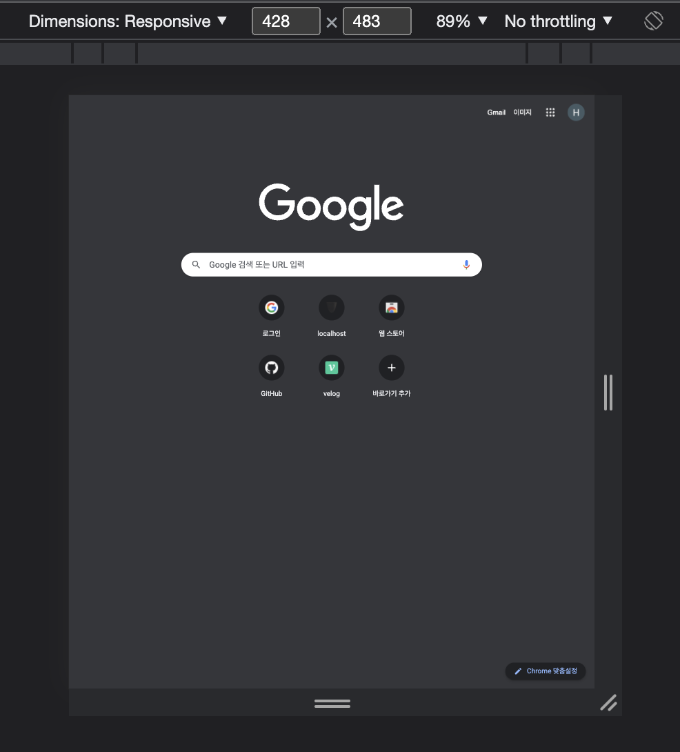
크롬에서 위와 같이 모바일 크기로 고정시켜놓았으면, isMobile값이 적용되기 위해서는 화면을 키웠다가 다시 줄여야한다. useMediaQuery를 사용하면 next환경에서는 처음에 false를 반환하는 것 같다.
Stackoverflow와 Github issues를 찾아보다 전체적으로 한번 참고하면 좋을만한 이슈가 있어 첨부했다.
해결
//useIsClient.ts
import { useEffect, useState } from 'react';

export const useIsClient = () => {
  const [isClient, setIsClient] = useState(false);

  useEffect(() => {
    if (typeof window !== 'undefined') {
      setIsClient(true);
    }
  }, []);
  return isClient;
};
Custom Hook 을 생성했다. window 객체가 undefined가 아닐 경우에 isClient state를 ture로 변경하고 리턴한다.
동기적으로 수행하고 painting 작업을 거치게 하기 위해 useLayoutEffect를 사용하려고 했는데
Warning: useLayoutEffect does nothing on the server, because its effect cannot be encoded into the server renderer's output format. This will lead to a mismatch between the initial, non-hydrated UI and the intended UI. To avoid this, useLayoutEffect should only be used in components that render exclusively on the client.
와 같은 경고문이 나타났다.
그러나 먼저 useEffect로 시작하고 문제가 발생하는 경우에만 useLayoutEffect를 시도하는 것이 좋습니다.
공식문서에서 위와 같이 말하고 있다. react-layout-effect 라는 것을 사용할 수 있는것 같았지만 useEffect 사용해도 문제없어서 설치하지 않았다.
  const isMobile = useMediaQuery({ query: '(max-width :768px)' });
  const isClient = useIsClient();

//...

<Component introduce={isClient && isMobile ? mobile[0] : pc[0]} />
생성한 Custom Hook를 사용하여 모바일인지 아닌지에 따른 값을 컴포넌트에 props로 넘겨서 사용하고 있다. 다른 컴포넌트에서 react-responsive를 사용하는 부분도 위와 같이 커스텀 훅을 이용하니 원하던 동작이 정상적으로 수행된다.
같이 보면 좋은 글 : useEffect와 useLayoutEffect