
Sass란?
Sass는 햄튼 캐틀린이 설계하고 나탈리 바이첸바움이 개발한 스타일시트 언어이다. 가독성, 효율적 설계, 유지보수 등을 위해 사용한다.
Sass문법에 맞게 CSS를 작성하고, Sass 컴파일러를 사용하면 된다.
노드(Node Sass Compiler)와 루비계열이 있는데, 엄밀하게 사용하려면 노드를 사용하는것이 좋다.(루비는 업데이트가 끝남)
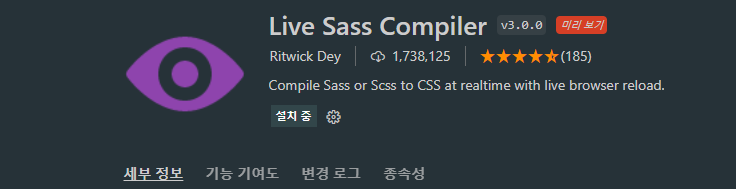
Sass 컴파일을 위한 VScode Extension을 추가해주었다.
//SCSS
$font-stack: Helvetica, sans-serif;
$primary-color : #333;

body {
	font: 100% $font-stack;
	color: $primary-color;
}
//Sass
$font-stack: Helvetica, sans-serif
$primary-color : #333
body
font: 100% $font-stack
color: $primary-colorSCSS 방식과 Sass방식이 있다. 여기서는 Scss에 방식에 대해서 설명해보겠다.
Scss를 사용하더라도 너무 중첩된 코드는 삼가하자
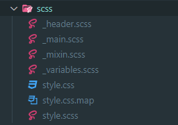
언더바(_)가 있는 파일이 보인다. 이 파일들은 style.scss에서 import 되어 불러와진다. 컴파일할때 생성되는 파일은 style.css 하나다.
Scss 파일분리와 Nesting
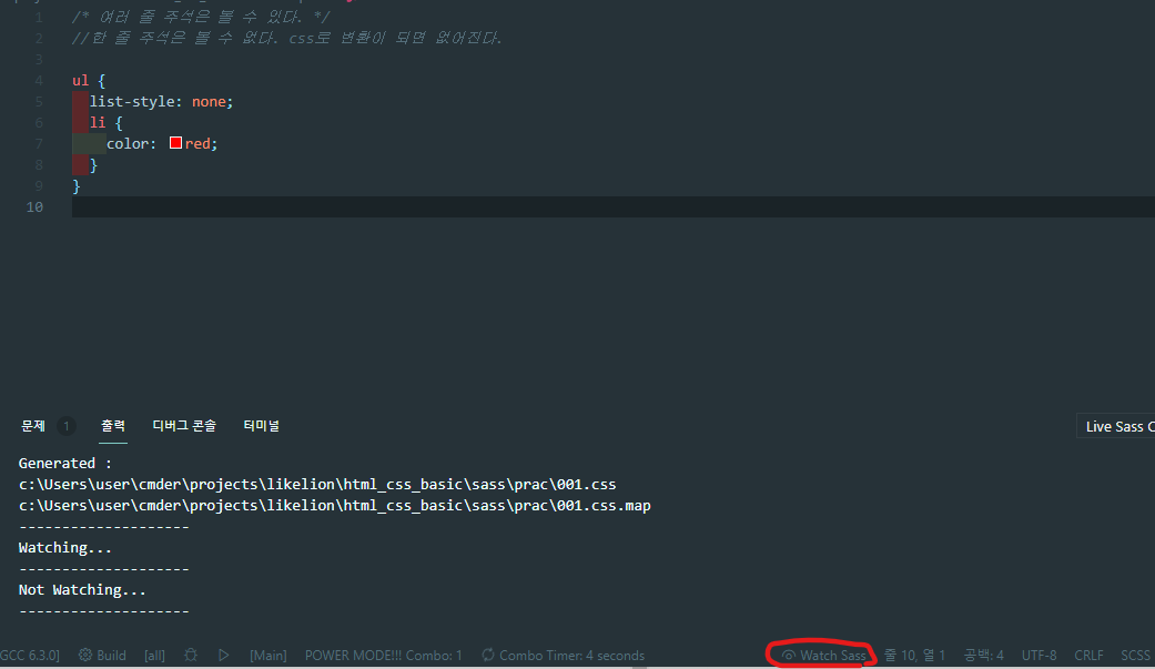
마크업처럼 중첩하여 사용했다. 이제 빨간 동그라미로 쳐져있는 Watch Sass를 클릭하자.
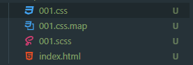
001.css와 001.css.map 이라는 파일이 자동적으로 생성되었다.
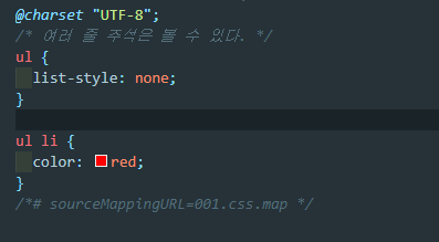
001.css를 보니, scss에서 중첩해서 사용했지만 일반 css파일에서는 우리가 자주 사용하던 형식으로 바뀌어있다.
//scss
.add-icon {
  background : {
    image: url("./assets/arrow-right-solid.svg");
    position: center center;
    repeat: no-repeat;
    size: 14px 14px;
  }
}
/* css */
.add-icon {
background-image: url("./assets/arrow-right-solid.svg");
background-position: center center;
background-repeat: no-repeat;
background-size: 14px 14px;
}background에 대한 많은 옵션을 scss에서는 위와같이 사용할 수 있다. css에서는 일일이 작성해주어야 한다.
//Scss
.box {
  width: 100px;
  height: 100px;
  background-color: green;
  transition: all 0.3s;
  &:hover {
    background-color: red;
  }
}
/* css */
.box {
width: 100px;
height: 100px;
background-color: green;
-webkit-transition: all 0.3s;
transition: all 0.3s;
}
.box:hover {
background-color: red;
}&는 상위부모 선택자를 가리킨다 . nth-child나 가상요소도 scss에서는 이런 형식으로 사용하면 된다.
&-yellow 와 같은 방법으로 공통 클래스 명을 가진 선택자들을 중첩시킬 수도 있다.
//SCSS
.article {
  display: flex;
  justify-content: space-between;
  align-items: center;
  margin-top: 10px;
    .article-content {
        font-size: 14px;
        opacity: 0.7;
        @at-root i {
        opacity: 0.5;
        }
    }
}
/* css */
.article {
display: -webkit-box;
display: -ms-flexbox;
display: flex;
-webkit-box-pack: justify;
-ms-flex-pack: justify;
justify-content: space-between;
-webkit-box-align: center;
-ms-flex-align: center;
align-items: center;
margin-top: 10px;
}
.article .article-content {
font-size: 14px;
opacity: 0.7;
}
i {
opacity: 0.5;
}@at-root 을 사용하면 중첩에서 벗어날 수 있다. 중첩된 선택자에게만 사용 가능하다.
변수
$ 를 사용하여 뒤에 스타일을 적용할 값을 명시해주면 된다. 바로 예시로 넘어가보자.
- 변수 선언
//색상
$red: #ee4444;
$black: #222;
$bg-color: #3e5e9e;
$link-color : #red;
$p-color : #282A36;

//폰트사이즈
$font-p : 13px;
$font-h1 : 28px;

//폰트
$base-font : 'Noto Sans KR', sans-serif;

body{
		background-color : $bg-color;
		font-size : $font-p;
		font-family : $base-font;
}

h1{
   font-size : $font-h1;
	 color : $black;
}

p{
	font-size : $font-p;
	color : $black;
}ont-p라는 변수에 13px값을 넣어주었다.
font-size : $font-p;는 font-size : 13px;라는 의미가 된다.
-
변수 Type
- numbers : 1, .82, 20px, 2em 등
- strings : "./images/a.png", bold, left, uppercase 등
- colors : green, #FFF, rgba(255,0,0,.5) 등
- booleans : true, false
- null
- list
- maps
보통 프로그래밍 언어는 배열에서 0부터 시작하지만, Sass에서는 1부터 시작이라는 것을 주의하자. grid의 선같다..
//SCSS list
$font-size: 10px 12px 16px; //폰트사이즈 리스트

div {
  font-size: nth($font-size, 2);
}
font-size:12px 가 된다. nth의 2번째 인자에 -1을 넣으면 16px가 될 것이다.
//SCSS maps
$font-weights: (
  "regular": 400,
  "medium": 500,
  "bold": 700,
);

div {
  font-weight: map-get($font-weights, "medium");
}
font-weight: 500; 이 된다.
- 변수의 Scope
//SCSS
.info{
	$line-normal : 1.34; // 지역변수
	font-size : 15px;
	line-height : $line-normal;
	text-align : right;
  span{
		line-height : $line-normal;
	}
}

/*p{
	line-height : $line-normal;
}*/
현재 line-normal은 지역변수이다. 선언한 자기자신을 감싸고 있는 중괄호 { } 안에서 사용되고, 하위 단계에서도 사용할 수있다.
하지만 아래 주석처리된 p태그에는 적용되지 않는다. 모든곳에 사용하고 싶다면 전역변수로 선언해야 한다.
- 비교 연산자
@debug 100 > 50; // true
@debug 10px < 17px; // true
@debug 96px >= 1in; // true
@debug 1000ms <= 1s; // true

@debug 100px > 10s; //Error (단위 때문에)
@debug 100 > 50px; // true
@debug 10px < 17; // true

// 숫자
@debug 1px == 1px; // true
@debug 1px != 1em; // true
@debug 1 != 1px; // true
@debug 96px == 1in; // true

// 문자
@debug "Poppins" == Poppins; // true
@debug "Open Sans" != "Roboto"; // true

// 색상
@debug rgba(53, 187, 169, 1) == #35bba9; // true
@debug rgba(179, 115, 153, 0.5) != rgba(179, 115, 153, 0.8); // true

// 리스트
@debug (5px 7px 10px) != (5px, 7px, 10px); // true
@debug (5px 7px 10px) != [5px 7px 10px]; // true
@debug (5px 7px 10px) == (5px 7px 10px); // true

@debug 10s + 15s; // 25s
@debug 1in - 10px; // 0.8958333333in
@debug 5px * 3px; // 15px*px
@debug 1in % 9px; // 0.0625in (1in == 96px)
@debug 100px + 10s; //Error (단위 때문에)

@debug "Helvetica" + " Neue"; // "Helvetica Neue"
@debug sans- + serif; // sans-serif
@debug sans - serif; // sans-serif


@debug "Elapsed time: " + 10s; // "Elapsed time: 10s";
@debug true + " is a boolean value"; // "true is a boolean value";

@debug not true; // false
@debug not false; // true

@debug true and true; // true
@debug true and false; // false

@debug true or false; // true
@debug false or false; // false
Mixin
- mixin 사용
코드의 중복을 처리하기위해 사용된다.
@mixin 이름(매개변수) //생성
@include 이름(인수)  //사용
중복되는 코드는 mixin으로 만들어 놓고 원하는 선택자 블럭에 mixin을 include하면 된다.
//SCSS
@mixin flex-center {
  display: flex;
  justify-content: center;
  align-items: center;
}

.card {
  @include flex-center;
  background: gray;
}

.aside {
  @include flex-center;
  background: white;
}
/* css */
.card {
display: -webkit-box;
display: -ms-flexbox;
display: flex;
-webkit-box-pack: center;
-ms-flex-pack: center;
justify-content: center;
-webkit-box-align: center;
-ms-flex-align: center;
align-items: center;
background: gray;
}
.aside {
display: -webkit-box;
display: -ms-flexbox;
display: flex;
-webkit-box-pack: center;
-ms-flex-pack: center;
justify-content: center;
-webkit-box-align: center;
-ms-flex-align: center;
align-items: center;
background: white;
}Mixin이 잘 적용된 것을 볼 수 있다.
- Arguments(인수)
//SCSS
@mixin image-style($ul, $size, $repeat, $positionX:20%, $positionY:20%) {
  background-image: url($ul);
  background-size: $size;
  background-repeat: $repeat;
  background-position: $positionX $positionY;
}

.profile {
  @include image-style("./assets/user.jpg", cover, no-repeat, center, center);
}

.box-one {
  @include image-style(url("/images/poster1.svg"), cover, no-repeat, 40%, 50%);
}
/* css */
.profile {
background-image: url("./assets/user.jpg");
background-size: cover;
background-repeat: no-repeat;
background-position: center center;
}
.box-one {
background-image: url(url("/images/poster1.svg"));
background-size: cover;
background-repeat: no-repeat;
background-position: 40% 50%;
}함수에 값 들어가는것 처럼 Sass에서도 위와같이 사용할 수 있다.
디폴트값도 설정해놓을 수 있다. 값이 들어오지 않으면 그 값이 되는것이다.
위에서 4, 5번째 인자에 값을 넣지 않으면 background-position: 20% 20%; 가 될 것이다.
또한, @content를 사용하면 원하는 부분에 스타일을 추가할 수 있다.
Extend
mixin은 관계 없는 선택자에서 조금 다른 스타일을 적용 할 때 사용한다. extend는 관계 있는 선택자들의 동일한 소스코드 적용시 사용한다.
- extend 사용 방법 1
// Scss
.profile-user {
  background-image: url("../assets/user.jpg");
  background-size: cover;
  background-position: 50% 50%;
  border-radius: 50%;
  width: 50px;
  height: 50px;
}

.comment-user {
  @extend .profile-user;
}
/* css */
.profile-user, .comment-user {
background-image: url("../assets/user.jpg");
background-size: cover;
background-position: 50% 50%;
border-radius: 50%;
width: 50px;
height: 50px;
}profile-user class의 값을 그대로 comment-user class에 가져왔다. 여기에 스타일을 더 추가할 수도 있다.
- extend 사용 방법 2
// Scss
%base-button {
  width: 133px;
  height: 44px;
  display: flex;
  justify-content: center;
  align-items: center;
  font-size: 14px;
  border-radius: 10px;
}

.follow-button {
  @extend %base-button;
  background-color: #ffffff;
  color: #ff375f;
  border: 3px solid #ff375f;
}

.message-button {
  @extend %base-button;
  background-color: #ff375f;
  color: white;
}
/* css */
.follow-button, .message-button {
width: 133px;
height: 44px;
display: -webkit-box;
display: -ms-flexbox;
display: flex;
-webkit-box-pack: center;
-ms-flex-pack: center;
justify-content: center;
-webkit-box-align: center;
-ms-flex-align: center;
align-items: center;
font-size: 14px;
border-radius: 10px;
}
.follow-button {
background-color: #ffffff;
color: #ff375f;
border: 3px solid #ff375f;
}
.message-button {
background-color: #ff375f;
color: white;
}보면 볼수록 Sass 정말 좋은거같다.
vendor prefix를 따로 작성할 필요 없이 알아서 해준다.
조건문
//SCSS
// circle이 false면 사각형을, true이면 원형으로 스타일함
@mixin avatar($size, $circle: false) {
  width: $size;
  height: $size;

  @if $circle {
    border-radius: $size / 2;
  }
}

.square-av {
  @include avatar(100px, $circle: false);
}
.circle-av {
  @include avatar(100px, $circle: true);
}
프로그래밍 언어의 if문과 비슷하다. circle 변수의 디폴트값을 false로 주었다. true면 border-radius: $size / 2;을 통해 원이 된다.
/* css */
.square-av {
  width: 100px;
  height: 100px;
}

.circle-av {
  width: 100px;
  height: 100px;
  border-radius: 50px;
}
css에서는 이렇게 확인된다.
//SCSS
$light-background: #f2ece4;
$light-text: #036;
$dark-background: #6b717f;
$dark-text: #d2e1dd;

@mixin theme-colors($light-theme: true) {
  @if $light-theme {
    background-color: $light-background;
    color: $light-text;
  } @else {
    background-color: $dark-background;
    color: $dark-text;
  }
}

.banner {
  @include theme-colors($light-theme: true);
  body.dark & {
    @include theme-colors($light-theme: false);
  }
}
banner class는 $light-theme: true이기 때문에 $light-background값을 갖는다.
body.dark &는 body.dark의 부모에 속성을 주려는 것이다. $light-theme: false이므로 $dark-background가 된다.
/* css */
.banner {
  background-color: #f2ece4;
  color: #036;
}

body.dark .banner {
  background-color: #6b717f;
  color: #d2e1dd;
}
css에서도 body.dark .banner보면 body.dark의 부모인 banner class에 속성을 주고있다.
반복문
// for문을 이용해 nth-선택자에게 각각의 image를 배경에 넣어준다.
@for $i from 1 through 5 {
    .photo-box:nth-child(#{$i}) {
      background-image: url("../assets/phoster#{$i}.png");
    }
  }
변수는 현재 i이다. 1에서 5까지 증가한다. "../assets/phoster#{$i}.png"이므로, nth-child마다 각각 다른 이미지를 부여하는 것이다.
$color-palette: #dad5d2 #3a3532 #375945 #5b8767 #a6c198 #dbdfc8;

@each $color in $color-palette {
  $i: index($color-palette, $color);
  .color-circle:nth-child(#{$i}) {
    background: $color;
    width: 20px;
    height: 20px;
    border-radius: 50%;
  }
}
each문도 있다.. 뭔가 JS랑 점점 닮아가는 것 같다.
index는 list의 내장함수이다. color-palette에서 color가 몇번째 index인지 알려준다.
즉, #dad5d2일때 index i는 1이 되고, .color-circle:nth-child(1)는 background: #dad5d2;가 되는 것이다.
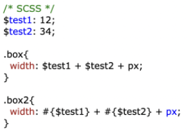
#{}는 보간법이다. 위의 예제로 이해해보자.
box는 46px가 될 것이고, box2는 1234px이다.
함수
$normal-font-size: 16px;

@function scale-below($value, $base, $ratio: 2) {
  @while $value > $base {
    $value: ($value/$ratio);
  }
  @return $value;
}

.sup {
  font-size: scale-below(20px, 4px);
}
드디어 함수가 나왔다. while문 value > 4 조건을 지키며 돌면서 value는 10 -> 5 -> 2.5 가 된다.
2.5 > 4가 아니므로 retrun이 된다.
여기에서 유용한 함수들을 참고하자.
Sass is a famous programming language with connections Geometry Dash Lite in many countries around the world.