✨ Masked Gradient Text Animation과 이미지 확장 효과 구현기 (Part 2 -Parallax Scroll,패럴렉스 스크롤)
Javascript
✨ Masked Gradient Text Animation과 이미지 확장 효과 구현기 (Part 2 -Parallax Scroll,패럴렉스 스크롤)
📌 도입
지난 글 Part 1에서는 텍스트 애니메이션과 영상 삽입 효과를 중심으로 다뤘습니다.
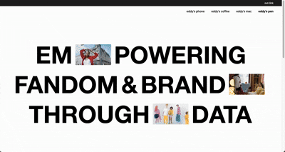
이번 글은 그 연장선으로, 스크롤 시 이미지가 커지고 위치가 이동하며 자연스럽게 다음 섹션으로 이어지는 패럴렉스 이미지 확장 효과에 대해 정리합니다.
👉 실전 사이트: www.flatten.co.kr
🎯 목표
1.텍스트 사이에 삽입된 비디오가 스크롤에 따라 커지며 확대
2.Lenis.js를 활용해 부드러운 스크롤 흐름 구현
3.비디오 요소가 다음 섹션과 자연스럽게 전환되고 사라짐
4.반응형 환경에서 자연스럽게 동작
🧱 핵심 구조
html
<section class="cover web">
  <p>
    <span class="f skip" data-id="9">
      <span class="window">
        <video src="..." autoplay muted loop playsinline></video>
      </span>
    </span>
    <span class="f" data-id="10">data</span>
  </p>
</section>

<section class="why-eddy">
  <div class="img-wrapper">
    <img data-id="1" src="..." />
    <img data-id="2" src="..." />
    <img data-id="3" src="..." />
  </div>
</section>
script
<script>
  $(document).ready(function () {
    lenis = new Lenis({
      duration: 1.2,
      easing: (t) => Math.min(1, 1.001 - Math.pow(2, -10 * t)),
      smooth: true,
    });

    function raf(time) {
      lenis.raf(time);
      requestAnimationFrame(raf);
    }
    requestAnimationFrame(raf);

    $('.f').addClass('on');

    const initParallax = (selector) => {
      const $win9 = $(`${selector} .f[data-id="9"] .window`);
      const $video = $win9.find('video');
      const $nextSec = $('.why-eddy');
      const $cover = $(selector);
      const isMobile = $cover.hasClass('mobile');

      let coverH, initialTop, initialLeft, finalY, lastScroll;

      const scrollFactor = 1;

      function getBias(progress) { // 💡 왼쪽이 더 빨리 커지는 비율 조정값
        if (isMobile) return 0;
        if (progress < 0.1) return 0.45;
        const t = (progress - 0.1) / 0.9;
        return 0.45 * Math.pow(1 - t, 1.25);
      }

      function getBrightness(progress) {
        const capped = Math.min(progress / 0.9, 1);
        return 1 - capped;
      }

      function getDynamicImgRatio(progress) {
        const ratioStart = isMobile ? 52 / 84 : 140 / 240;
        const ratioEnd = isMobile ? (52+130)  / 84 : (140 + 60) / 240; // 모바일 최종 크기 ⬅️ 증가함
        if (progress < 0.5) return ratioStart;
        const t = (progress - 0.5) * 2;
        return ratioStart + (ratioEnd - ratioStart) * t;
      }


      function recalcValues(currentScroll = 0) {
        $win9.css('transform', 'none');
        $('.window').css('transition', 'none');
        $win9[0].offsetHeight;

        coverH = $cover.height();
        initialTop = $win9.offset().top - $cover.offset().top;
        initialLeft = $win9.offset().left;
        finalY = coverH - initialTop;

        const targetWidth = $nextSec.outerWidth();
        const rawProgress = currentScroll / coverH;
        const progress = Math.min(rawProgress / scrollFactor, 1);
        const bias = getBias(progress);
        const leftProgress = Math.min(progress + bias * progress, 1); // 💡 왼쪽 확장 속도 보정

        const width = $win9.outerWidth() + (targetWidth - $win9.outerWidth()) * progress;
        const imgRatio = getDynamicImgRatio(progress);
        const height = width * imgRatio;

        $win9.css({ height });
        $video.css({ width, height });

        const y = currentScroll * (finalY / coverH);
        const translateX = -initialLeft * leftProgress;

        $win9.css({
          transform: `translate(${translateX}px, ${y}px)`
        });
        const brightness = getBrightness(progress);
        $win9.css({ filter: `brightness(${brightness})` });
      }

      function updateTransform() {
        const sc = lenis.scroll;
        lastScroll = sc;
        const rawProgress = sc / coverH;
        const progress = Math.min(rawProgress / scrollFactor, 1);
        const bias = getBias(progress);
        const leftProgress = Math.min(progress + bias * progress, 1); // 💡 왼쪽 확장 속도 보정

        const y = sc * (finalY / coverH);
        const translateX = -initialLeft * leftProgress;

        const targetWidth = $nextSec.outerWidth();
        const width = $win9.outerWidth() + (targetWidth - $win9.outerWidth()) * progress;
        const imgRatio = getDynamicImgRatio(progress);
        const height = width * imgRatio;

        $win9.css({ height });
        $video.css({ width, height });

        $win9.css({ transform: `translate(${translateX}px, ${y}px)` });
        const brightness = getBrightness(progress);
        $win9.css({ filter: `brightness(${brightness})` });

        if (sc >= coverH) {
          // 원하는 css 효과는 class로 관리 하여 addClass로 처리하는것이 좋음
          $win9.css({ zIndex: '-999', opacity: 0 });
          $nextSec.css({ backgroundColor: '#000', color: '#fff' });
          $nextSec.find('.img-wrapper img').addClass('fadeup');

        } else {
          $win9.css({ zIndex: '', opacity: 1 });
          $nextSec.css({ backgroundColor: '#fff', color: '#fff' });
          $nextSec.find('.img-wrapper img').removeClass('fadeup');
        }
      }

      recalcValues(0);
      lenis.on('scroll', updateTransform);

      $(window).on('resize', function () {
        $('.window').css('transition', 'none');
        recalcValues(lastScroll || lenis.scroll);
        lenis.resize();
      });

      lenis.emit();
    }


    $('.cover.web .f[data-id="9"]').one('animationend webkitAnimationEnd', function () {
      initParallax('.cover.web');
    });

  });
</script>
⚙️ Lenis.js를 이용한 스크롤 컨트롤
🔍 Lenis.js란?
Lenis는 부드러운 스크롤(smooth scroll)을 구현하기 위한 자바스크립트 라이브러리입니다.
scroll-behavior: smooth만으로는 부족한 경우, 예를 들어 패럴렉스 애니메이션이나 정밀한 스크롤 타이밍 제어가 필요한 인터랙션에 적합합니다.
이 프로젝트에서는 요소의 위치와 크기를 스크롤 값에 따라 부드럽게 조정하기 위해 Lenis를 도입했습니다.
🧪 Lenis 초기 설정 코드
lenis = new Lenis({
  duration: 1.2,
  easing: (t) => Math.min(1, 1.001 - Math.pow(2, -10 * t)),
  smooth: true,
});
| 옵션 | 설명 |
|---|---|
| duration | 스크롤 애니메이션의 지속 시간. 숫자가 클수록 느림 (기본 1.2초) |
| easing | 스크롤 가속도 곡선. 여기선 ease-out처럼 초반 빠르고 후반 느리게 설정 |
| smooth | true일 경우 requestAnimationFrame을 통해 자연스러운 스크롤 처리 |
그리고 아래 코드로 매 프레임마다 Lenis의 애니메이션을 갱신해줍니다.
function raf(time) {
  lenis.raf(time);
  requestAnimationFrame(raf);
}
requestAnimationFrame(raf);
🎬 initParallax() 함수 완전 해부
목적
.cover.web 내 특정 영상 요소(.window 안에 video or img)를
스크롤 위치에 따라 크기와 위치를 동적으로 변화시키는 역할을 합니다.
초기 변수 셋업
const $win9 = $('.f[data-id="9"] .window'); // 비디오를 감싸는 wrapper
const $video = $win9.find('video');
const $nextSec = $('.why-eddy'); // 다음 섹션
const $cover = $(selector); // 현재 섹션
const isMobile = $cover.hasClass('mobile'); // 모바일 여부 판별
🔧 내부 함수 설명
1. getBias(progress)
왼쪽으로 확장되는 X 좌표 이동 보정을 위한 함수
function getBias(progress) {
  if (isMobile) return 0;
  if (progress < 0.1) return 0.45;
  const t = (progress - 0.1) / 0.9;
  return 0.45 * Math.pow(1 - t, 1.25);
}- 초반에는 0.45만큼 왼쪽으로 더 빨리 확장시켜주고,
- 진행될수록 보정값을 줄임
- 확장되는 비디오 or 이미지의 최초 위치가 화면의 중앙이 아니기 때문에 만든 함수
- 중앙 이라면 필요없음
2. getBrightness(progress)
스크롤이 진행될수록 비디오를 어둡게 처리하는 효과
function getBrightness(progress) {
  const capped = Math.min(progress / 0.9, 1);
  return 1 - capped;
}
3. getDynamicImgRatio(progress)
비디오의 비율을 동적으로 변경해 자연스럽게 커지도록 하는 함수
function getDynamicImgRatio(progress) {
  const ratioStart = isMobile ? 52 / 84 : 140 / 240;
  const ratioEnd = isMobile ? (52+130) / 84 : (140 + 60) / 240;
  if (progress < 0.5) return ratioStart;
  const t = (progress - 0.5) * 2;
  return ratioStart + (ratioEnd - ratioStart) * t;
}- 진행도 50% 이전에는 고정 비율
- 이후에는 ratioEnd까지 서서히 확대
4. recalcValues(currentScroll)
초기 계산 및 리사이즈 시 재계산
function recalcValues(currentScroll = 0) {
  // 초기 크기, 위치 측정
  coverH = $cover.height();
  initialTop = $win9.offset().top - $cover.offset().top;
  initialLeft = $win9.offset().left;
  finalY = coverH - initialTop;

  // 현재 스크롤 기준으로 너비, 비율 계산
  const targetWidth = $nextSec.outerWidth();
  const rawProgress = currentScroll / coverH;
  const progress = Math.min(rawProgress, 1);
  const bias = getBias(progress);
  const leftProgress = Math.min(progress + bias * progress, 1);

  const width = $win9.outerWidth() + (targetWidth - $win9.outerWidth()) * progress;
  const imgRatio = getDynamicImgRatio(progress);
  const height = width * imgRatio;

  $win9.css({ height });
  $video.css({ width, height });

  const y = currentScroll * (finalY / coverH);
  const translateX = -initialLeft * leftProgress;
  $win9.css({ transform: `translate(${translateX}px, ${y}px)`, filter: `brightness(${getBrightness(progress)})` });
}
5. updateTransform()
Lenis의 scroll 이벤트마다 호출됨
function updateTransform() {
  const sc = lenis.scroll;
  const progress = Math.min(sc / coverH, 1);
  const bias = getBias(progress);
  const leftProgress = Math.min(progress + bias * progress, 1);

  const y = sc * (finalY / coverH);
  const translateX = -initialLeft * leftProgress;

  const targetWidth = $nextSec.outerWidth();
  const width = $win9.outerWidth() + (targetWidth - $win9.outerWidth()) * progress;
  const imgRatio = getDynamicImgRatio(progress);
  const height = width * imgRatio;

  $win9.css({ height, transform: `translate(${translateX}px, ${y}px)`, filter: `brightness(${getBrightness(progress)})` });
  $video.css({ width, height });

  // 다음 섹션 진입 시 비디오 감추고 다음 배경 처리
  // 원하는 css 효과는 class로 관리 하여 addClass로 처리하는것이 좋음
  if (sc >= coverH) {
    $win9.css({ zIndex: '-999', opacity: 0 });
    $nextSec.css({ backgroundColor: '#000', color: '#fff' });
    $nextSec.find('.img-wrapper img').addClass('fadeup');
  } else {
    $win9.css({ zIndex: '', opacity: 1 });
    $nextSec.css({ backgroundColor: '#fff', color: '#fff' });
    $nextSec.find('.img-wrapper img').removeClass('fadeup');
  }
}
6. 이벤트 바인딩
recalcValues(0); // 최초 계산
lenis.on('scroll', updateTransform); // 스크롤 시 실행

// 화면 리사이즈 시 다시 계산
$(window).on('resize', function () {
  $('.window').css('transition', 'none');
  recalcValues(lastScroll || lenis.scroll);
  lenis.resize();
});
7. 애니메이션 종료 후 시작
$('.cover.web .f[data-id="9"]').one('animationend webkitAnimationEnd', function () {
  initParallax('.cover.web');
});- .f[data-id="9"]의 등장이 끝나야 initParallax() 실행
- → 스크롤 애니메이션과 충돌 방지 목적
🧵 결과 화면
css
#eddy_home {
  margin: 0 auto;
  width: 100%;
  min-height: 100vh;
  .cover {
    display: flex;
    align-items: center;
    justify-content: center;
    flex-direction: column;
    height: calc(100vh - 79px);
    min-height: calc(100vh - 79px);
    background-color: white;

    &.web {
      p {
        display: flex;
        align-items: center;
        justify-content: center;
        margin: calc(20 / 1920 * 100vw) 0;
        font-family: 'Helvetica Neue', Helvetica, Arial, 'Apple SD Gothic Neo', 'Noto Sans KR', sans-serif !important;
        font-size: calc(160 / 1920 * 100vw);
        font-style: normal;
        font-weight: 700;
        line-height: 100%;
        text-align: center;
        text-transform: uppercase;

        span {
          font-family: 'Helvetica Neue', Helvetica, Arial, 'Apple SD Gothic Neo', 'Noto Sans KR', sans-serif !important;
          -webkit-transition: -webkit-mask-position 1s cubic-bezier(0.6, 0, 0.2, 1);
          transition: -webkit-mask-position 1s cubic-bezier(0.6, 0, 0.2, 1);
          -o-transition: mask-position 1s cubic-bezier(0.6, 0, 0.2, 1);
          transition: mask-position 1s cubic-bezier(0.6, 0, 0.2, 1);
          transition: mask-position 1s cubic-bezier(0.6, 0, 0.2, 1),
            -webkit-mask-position 1s cubic-bezier(0.6, 0, 0.2, 1);
          -webkit-mask-image: -webkit-gradient(
            linear,
            left top,
            right top,
            color-stop(33.3%, #fff),
            color-stop(66.6%, rgba(255, 255, 255, 0.1))
          );
          -webkit-mask-image: linear-gradient(90deg, #fff 33.3%, rgba(255, 255, 255, 0.1) 66.6%);
          mask-image: -webkit-gradient(
            linear,
            left top,
            right top,
            color-stop(33.3%, #fff),
            color-stop(66.6%, rgba(255, 255, 255, 0.1))
          );
          mask-image: linear-gradient(90deg, #fff 33.3%, rgba(255, 255, 255, 0.1) 66.6%);
          -webkit-mask-position: 100% 100%;
          mask-position: 100% 100%;
          -webkit-mask-size: 300% 100%;
          mask-size: 300% 100%;

          &.on {
            -webkit-mask-position: 0 100%;
            mask-position: 0 100%;
          }

          &.skip,
          &.skip * {
            -webkit-mask-image: none;
            mask-image: none;
            mask-position: 0;
          }
        }

        span.f[data-id='10'] {
          padding-right: calc(7 / 1920 * 100vw);
        }

        span.f[data-id='2'],
        span.f[data-id='7'],
        span.f[data-id='9'] {
          display: flex;
          padding: calc(10 / 1920 * 100vw) 0;
          height: calc(160 / 1920 * 100vw);
          box-sizing: border-box;

          .window {
            display: inline-block;
            position: relative;
            z-index: 5;
            width: 0;
            -webkit-transition: width 0.8s cubic-bezier(0.6, 0, 0.2, 1), opacity 0.5s linear;
            -o-transition: width 0.8s cubic-bezier(0.6, 0, 0.2, 1), opacity 0.5s linear;
            transition: width 0.8s cubic-bezier(0.6, 0, 0.2, 1), opacity 0.5s linear;
            border-radius: calc(4 / 1920 * 100vw);
            will-change: width;
            opacity: 0;
            aspect-ratio: 240 / 140;

            video {
              width: 100%;
              height: 100%;
              pointer-events: none;
              border-radius: inherit;
              -o-object-fit: cover;
              object-fit: cover;
            }

            img {
              width: 100%;
              height: 100%;
              pointer-events: none;
              border-radius: inherit;
              -o-object-fit: cover;
              object-fit: cover;
            }
          }
        }

        span.f[data-id='9'] {
          margin: 0 calc(10 / 1920 * 100vw);

          .window {
            transform-origin: left center;
            will-change: transform;
          }
        }

        span.f[data-id='5'] {
          margin: 0 calc(20 / 1920 * 100vw);
        }

        span.f[data-id='2'].on,
        span.f[data-id='7'].on,
        span.f[data-id='9'].on {
          .window {
            width: calc(240 / 1920 * 100vw);
            opacity: 1;
          }
        }

        span.f[data-id='1'].on {
          transition-delay: 0ms;
        }
        span.f[data-id='3'].on {
          transition-delay: 150ms;
        }
        span.f[data-id='4'].on {
          transition-delay: 150ms;
        }
        span.f[data-id='5'].on {
          transition-delay: 300ms;
        }
        span.f[data-id='6'].on {
          transition-delay: 320ms;
        }
        span.f[data-id='8'].on {
          transition-delay: 470ms;
        }
        span.f[data-id='10'].on {
          transition-delay: 600ms;
        }

        span.f[data-id='2'].on {
          animation: expandWidthBounce 1s forwards;
          animation-delay: 750ms;
          .window {
            transition-delay: 750ms;
          }
        }

        span.f[data-id='7'].on {
          animation: expandWidthBounce 1s forwards;
          animation-delay: 900ms;
          .window {
            transition-delay: 900ms;
          }
        }

        span.f[data-id='9'].on {
          animation: expandWidthBounce 1s forwards;
          animation-delay: 1050ms;
          .window {
            transition-delay: 1050ms;
          }
        }
      }
    }
  }

  .why-eddy {
    padding: calc(160 / 1920 * 100vw) 0;
    display: flex;
    gap: calc(80 / 1920 * 100vw);
    align-items: center;
    justify-content: center;
    flex-direction: column;
    background-color: white;
    font-family: 'Helvetica Neue';
    text-align: center;
    .img-wrapper {
      position: relative;
      width: 75%;
      height: auto;
      aspect-ratio: 1440 / 840;

      img[data-id='1'] {
        position: absolute;
        bottom: 0;
        left: 22.4%;
        z-index: 2;
        width: calc(639 / 1920 * 100vw);
        aspect-ratio: 639 / 501;
        opacity: 0;
        &.fadeup {
          animation: fadeUp 1s ease-out forwards;
          animation-delay: 0.6s;
        }
      }

      img[data-id='2'] {
        position: absolute;
        top: 14.4%;
        left: 0;
        width: calc(480 / 1920 * 100vw);
        opacity: 0;
        aspect-ratio: 480 / 360;

        &.fadeup {
          animation: fadeUp 1s ease-out forwards;
          animation-delay: 0.4s;
        }
      }

      img[data-id='3'] {
        position: absolute;
        top: 0;
        right: 0;
        width: calc(814 / 1920 * 100vw);
        aspect-ratio: 814 / 565;
        opacity: 0;

        &.fadeup {
          animation: fadeUp 1s ease-out forwards;
          animation-delay: 0.2s;
        }
      }
    }
  }
}

@keyframes expandWidthBounce {
  0% {
  }
  50% {
    margin: 0 calc(40 / 1920 * 100vw);
  }
  100% {
    margin: 0 calc(20 / 1920 * 100vw);
  }
}
✅ 마치며
이번 글에서는 Lenis.js를 활용한 부드러운 스크롤 기반의 패럴렉스 이미지 확장 애니메이션을 구현하는 방법을 단계별로 살펴보았습니다. 짧은 시간 안에 구현한 메인 페이지였지만, 단순한 스크롤 기반 인터랙션을 넘어서, 요소의 크기와 위치, 밝기, 비율까지 조절하면서 시각적으로 자연스럽게 다음 섹션으로 연결되는 전환을 만들어냈습니다.
감사합니다.
👉 Part 1 보러가기