
📝 오늘 한 것
- flexbox
📚 배운 것
1. flexbox
1) flex-wrap
flexbox는 기본적으로 flex-wrap이 nowrap(기본값)일 때 그 item들에 부여된 width 값을 무시하면서 모든 item들을 한 줄에 위치시킨다.
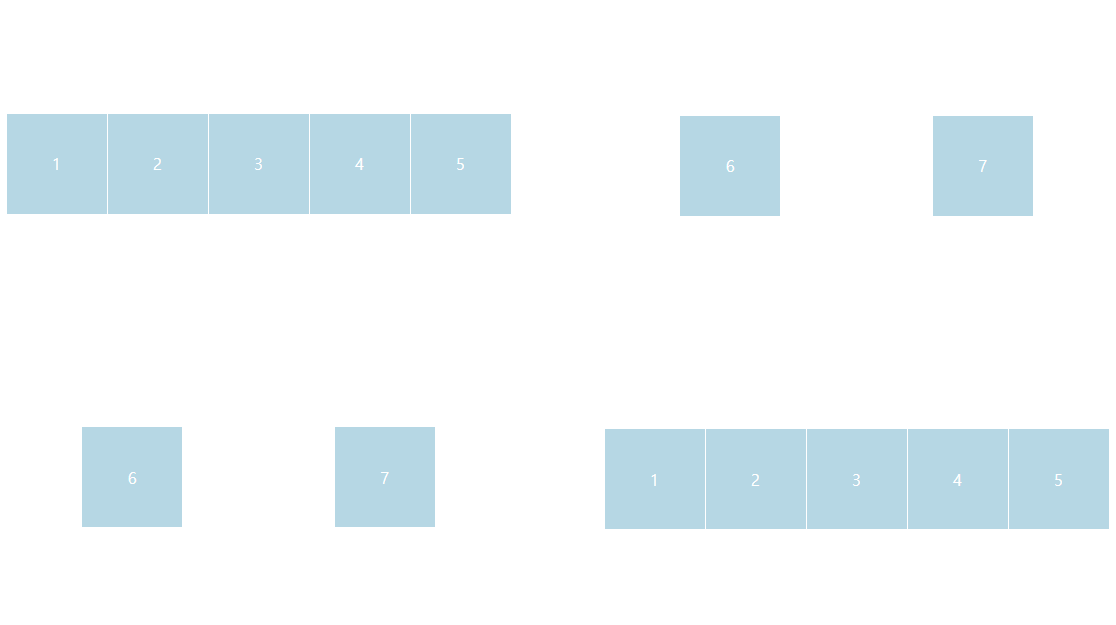
flex-wrap: wrap을 지정하면 flexbox의 item에 부여한 프로퍼티(width 등)에 따라 item들이 배치된다.
2) wrap-reverse
<div class="father">
  <div class="child">1</div>
  <div class="child">2</div>
  <div class="child">3</div>
  <div class="child">4</div>
  <div class="child">5</div>
  <div class="child">6</div>
  <div class="child">7</div>
</div>
.father {
display: flex;
justify-content: space-around;
align-content: space-around;
flex-wrap: wrap; /* 또는 flex-wrap: wrap-reverse */
height: 100vh;
}
.child {
width: 100px;
height: 100px;
color: white;
background-color: lightblue;
/* 💡 자식 div에 flex 속성을 부여한 이유는 div 안의 텍스트를 중앙 정렬하기 위해서이다. */
display: flex;
justify-content: center;
align-items: center;
}💡 flex-direction에 row-reverse 또는 column-reverse 값을 주었을 때와 구분해야 한다.
flex-direction에서의 reverse는주축의 시작점과 끝점을 바꾸는 반면,
flex-wrap에서의 reverse는요소가 나열되는 시작점과 끝점을 바꾼다.
3) align-content
cross axis 상에 item들 외에도 남은 공간이 있을 때(flex container에 height 값을 따로 지정해준 경우 등) flex container 내에서 line을 정렬하기 위해 사용한다.
justify-content를 main axis 내의 각각의 item들을 정렬할 때 사용하는 것과 비슷하다.
4) flex-shrink, flex-grow
(1) flex-shrink
flex-shrink의 기본값은 1이다.
screen 크기를 변경함에 따라 flex container의 크기가 줄어들어 flex item의 크기가 flex container의 크기보다 커졌을 때 모든 flex item들의 크기를 일정하게 작게 만든다.
값이 0일 때는 screen을 아무리 줄여도 주변의 다른 item이 보이지 않게 될지언정 flex-shrink를 0으로 지정한 item의 크기는 원래 크기에서 변하지 않는다.
값이 2가 되면 다른 item들보다 2배만큼 더 작게 줄어든다.
(2) flex-grow
flex-grow의 기본값은 0이다.
screen 크기를 변경함에 따라 flex container의 크기가 커져 flex item의 크기가 flex container의 크기보다 작아져 공간이 남아도(추가로 공간이 생겨도) flex item의 크기는 변하지 않는다.(커지지 않는다.)
많은 item들 중 하나의 item의 flex-grow 값이 1일 때는 해당 item의 크기가 screen이 커짐에 따라 추가로 생긴 공간을 모두 차지한 만큼의 크기로 커지게 된다.
flex-grow 값이 각각 1, 2인 item이 두 개가 있다면 screen이 커짐에 따라 추가로 생긴 공간을 1:2의 비율로 나눠 가지며 그만큼 item의 크기가 커지게 된다.
5) flex-basis
flex item의 크기가 변하기 전에 초기 크기를 설정하기 위해 사용한다.
flex grow를 사용하면 flex-basis 값은 무시된다.
6) flexbox froggy
통과
✨ 내일 할 것
- grid
