🔨 layout 잡기
Next.js 프로젝트에서 페이지를 만들 때, 가장 먼저 해야 할 일은 ‘구조를 고정하는 것’이다.
아직 콘텐츠(히어로, 기능 소개)가 하나도 없어도, 레이아웃과 페이지의 역할을 분리해두면
이후 모든 작업이 깔끔하게 이어진다.
🎯 목표 — “한 번 정한 구조는 흔들리지 않게”
랜딩 페이지는 한눈에 서비스의 핵심을 보여주는 곳이다.
그래서 시각적 요소보다 먼저, 어떤 섹션들이 어떤 순서로 등장할지를 확정해야 했다.
이번 단계의 목표는 세 가지다
1. 페이지의 기본 틀(layout + page)을 완성한다.
→ 섹션이 들어갈 자리만 확보한다.
2. 헤더(Header)와 푸터(Footer)를 제작해 layout에 고정시킨다.
→ 페이지의 외형(크롬)을 완성해 이후 작업을 안정화한다.
3. SSG + ISR 구조를 전제한다.
→ 성능과 SEO를 모두 잡기 위한 기본 설계다.
🧱 구조 설계 — App Router에서 랜딩 전용 그룹 만들기
Next.js의 App Router는
app/디렉터리 아래에 라우트 그룹을 만들어 페이지를 구성한다.
나는 서비스 내에서 마케팅 전용 페이지들을 따로 관리하기 위해
(marketing)그룹을 만들었다.
(이미 만들어 놨었음 공동 컴포넌트 개발 (페이지 파일 추가 부분 확인)src/ └─ app/ └─ (marketing)/ ├─ layout.tsx // 랜딩 공통 크롬 + 기본 metadata └─ page.tsx // 랜딩 섹션을 순서대로 조립
layout.tsx
랜딩 전체의 공통 껍데기다.
헤더나 푸터 같은 요소가 들어올 자리를 미리 만들어두고,
페이지 전반의<html lang="ko">,<body>구조와 기본 메타데이터를 설정한다.
page.tsx
실제 랜딩 콘텐츠를 담는 진입점이다.
여기서 모든 섹션을 순서대로 임포트해서 배치한다.
(히어로 → 기능 1 → 기능 2 → 특별 기능)
⚙️ SSG + ISR 세팅 — “한 번 빌드, 주기적 갱신”
랜딩은 콘텐츠가 자주 바뀌지 않으므로 정적 생성(SSG) 이 적합하다.
하지만 만약 텍스트나 이미지가 CMS를 통해 바뀌는 경우를 대비해
ISR(Incremental Static Regeneration) 주기를 설정해둔다.
- 전역 ISR:
page.tsx상단에export const revalidate = 21600;(6시간 주기)- 섹션별 ISR: 섹션 내부에서
fetch()를 쓴다면next: { revalidate: 21600 }옵션으로 제어이렇게 하면 빌드 없이도 새 데이터로 HTML이 다시 생성된다. (자세한 내용은 아래
🧭 SEO와 접근성 원칙
골격을 세우는 동시에, 구조적인 SEO 규칙도 함께 박아뒀다.
1. 페이지당 H1은 한 번만 (히어로에만)
2. 이미지는 모두alt필수, 키보드 포커스 가능한 모든 요소는aria-label명시
3. canonical과 메타데이터는layout.tsx에서 통합 관리
4. CLS/LCP 최적화: 섹션별 컨테이너 높이를 미리 고정해 레이아웃 점프를 최소화이렇게 설계하면 크롤러는 완성된 HTML을 바로 읽을 수 있고,
사용자는 로딩 중에도 시각적 안정성을 느낀다.
1️⃣ 화면 전체를 감싸는 공통 래퍼 — LandingWrapper
layout에 헤더와 푸터를 올려두면 기본 골격은 갖춰지지만,
화면 전체 높이(min-h-screen), 세로 플렉스 구조, fixed 헤더 높이 보정 같은 “페이지 레벨” 설정은 따로 해두는 게 좋다.
그래서 랜딩 전용으로 한 겹 더 감싸는 컴포넌트를 두었다. 그게LandingWrapper다.// src/components/landing/LandingWrapper.tsx import * as React from "react"; import { cn } from "@/lib/utils"; import { LandingWrapperProps } from "@/types/landing" // NOTE: // 지금은 예시라서 props 타입을 이 파일 안에 선언했지만, // 실제 프로젝트에서는 `src/types/landing.ts`처럼 별도 타입 파일로 분리해서 재사용하는 게 맞다. // (여기서는 "이 컴포넌트가 어떤 props를 받는지"를 바로 보여주려고 안에 적어둔 것) type LandingWrapperProps = { children: React.ReactNode; className?: string; }; export function LandingWrapper({ children, className }: LandingWrapperProps) { return ( <div className={cn( "min-h-screen flex flex-col bg-background text-foreground", className, )}> {children} </div> ); }여기서 맨 앞
"min-h-screen flex flex-col …"은 이 컴포넌트가 반드시 가져야 하는 기본 스타일이고,
그 뒤에 붙는className은 페이지별로 조금씩 다르게 쓰고 싶을 때 덮어쓰는 부분이다.
현실에서는 이런 요구가 거의 무조건 온다
1. 어떤 랜딩만 배경을 살짝 다르게 하고 싶다. →bg-slate-50
2. 프리뷰/데모 모드일 때만 위에 패딩을 더 주고 싶다. →pt-8
3. 모바일에서만 좌우 패딩을 없애고 싶다. →sm:px-0
4. 같은 래퍼를 다른 라우트에서 재사용하는데, 그쪽은 어두운 배경을 쓰고 싶다. →bg-muted
이걸 전부 컴포넌트 안에 조건문으로 넣어버리면 금방 더러워지니까
“기본 건 내가 줄게, 필요한 거 있으면 className으로 덧칠해” 하는 형태로 뚫어둔 거다.
3) 실제로는 이렇게 쓴다
// app/(marketing)/(landing)/layout.tsx
<LandingWrapper className="bg-[var(--color-gray-50)]">
  <LandingHeader />
  <main className="flex-1">{children}</main>
  <LandingFooter />
</LandingWrapper>
이렇게 하면
- 기본:
min-h-screen flex flex-col bg-background text-foreground- 추가:
bg-[var(--color-gray-50)]- 최종: 기본 + 추가가 합쳐진 클래스
여기서
cn()이 하는 일이 “있으면 붙이고, 없으면 무시” 이거다.
4) 왜 아예
className을 안 받게 만들지 않았나
- 지금은 딱히 안 필요해 보여도
“지금은 흰색 랜딩인데, 이 페이지만 파스텔톤으로 해볼까?” 같은 요구는 진짜 자주 온다.- 이 prop이 없으면 그때마다
LandingWrapper파일을 열어서 수정해야 한다.- prop이 열려 있으면 layout에서 한 줄로 끝이다.
- 그리고 이 프로젝트는 어차피 나중에 props를
types/landing.ts로 뺄 거니까
className?: string;은 기본으로 넣어두는 게 일관성에 좋다.
⚙️ layout.tsx에 실제로 배치
이제 이 컴포넌트를
layout.tsx안에 직접 넣는다.// app/(marketing)/(landing)/layout.tsx import * as React from "react"; import { LandingWrapper } from "@/components/landing/LandingWrapper"; import { LandingHeader } from "@/components/landing/LandingHeader"; import { LandingFooter } from "@/components/landing/LandingFooter"; export default function LandingLayout({ children }: { children: React.ReactNode }) { return ( <html lang="ko"> <body> <LandingWrapper /* headerOffset={64} ← 헤더가 fixed면 여기서 보정 */> {/* 페이지 본문 섹션들이 들어가는 자리 */} <main className="flex-1">{children}</main> {/* 하단 공통 푸터 */} <LandingFooter /> </LandingWrapper> </body> </html> ); }이렇게 하면 레이아웃이 더 이상 “비어 있는 껍데기”가 아니고,
실제 페이지의 외형(틀) 이 완성된다.
2️⃣ 헤더 & 푸터 구성 — 랜딩의 상하단 크롬 만들기
이제 래퍼 안에 들어갈 실제 UI 를 만든다.
헤더는 서비스의 “첫 인상”이고, 푸터는 “마지막 인사”이기 때문에 둘 다layout에 고정해두는 게 맞다.
본문(page.tsx)에 넣지 않고layout에 두면
- 다른 마케팅 페이지를 추가해도 같은 헤더/푸터 재사용 가능
ISR로 본문이 다시 생성돼도 헤더/푸터는 변하지 않아서 안정적<header>,<footer>시맨틱이 고정되므로SEO 구조가 더 예쁘게 나온다
🧩 2-1. 헤더 —
LandingHeader.tsx// src/components/landing/LandingHeader.tsx import { cn } from "@/lib/utils"; import { LandingNavBar } from "./LandingNavBar"; export function LandingHeader() { return ( <header className={cn("w-full")} role="banner"> <LandingNavBar /> </header> ); }
- 여기서는 고정 헤더(fixed/sticky) 안 썼다.
나중에 필요하면sticky top-0만 추가하면 되도록 여유만 남겨둔 상태다.role="banner"로 스크린리더가 문서의 상단 랜드마크를 정확히 인식한다.- 헤더의 실제 레이아웃(높이·정렬·간격)은 내부
LandingNavBar가 담당한다. 헤더는 의미적 래퍼 역할에 집중.
🧩 내비게이션 —
LandingNavBar.tsx// src/components/landing/LandingNavBar.tsx // src/components/landing/LandingNavBar.tsx import { cn } from "@/lib/utils"; import Image from "next/image"; import Link from "next/link"; export function LandingNavBar() { return ( <nav className={cn("mx-auto flex h-[9.6rem] max-w-[128rem] items-center justify-between px-6")} aria-label="Global navigation"> {/* 좌측: 로고 (이미지) */} <Link href="/" aria-label="MyPlanMate 홈으로 이동"> <Image src="/images/logo3.png" alt="MyPlanMate 로고" width={150} height={150} className="object-contain select-none" draggable={false} /> </Link> {/* 우측: 언어 토글 + 로그인 */} <div className="flex items-center gap-12"> <button type="button" className="t-16-m text-[var(--color-gray-600)] hover:text-[var(--color-gray-900)] cursor-pointer" aria-label="언어 전환"> 한국어 </button> <Link href="/login" className="t-16-m text-[var(--color-gray-600)] hover:text-[var(--color-gray-900)]" aria-label="로그인페이지로 이동"> 로그인 </Link> </div> </nav> ); }
- 높이:
h-[9.6rem]로 네브바의 세로 크기를 명시해, 컨텐츠에 따라 위아래로 들썩이는 현상을 방지했다.- 컨테이너 폭:
max-w-[128rem]+mx-auto로 본문에서 사용할 최대 폭 그리드와 정렬 라인을 맞췄다. (좌우 패딩은px-6)- 좌측 로고:
next/image로 렌더링.width/height지정 +object-contain/select-none/draggable={false}로 CLS와 사용감을 개선했다.
(현재 경로는/images/logo3.png, 접근성 라벨은 링크에aria-label="MyPlanMate 홈으로 이동"로 부여)- 우측 액션:
한국어(언어 표시/전환 버튼)와 로그인 링크.
- 한국어 버튼은 추후 실제 토글 시
aria-pressed로 상태를 전달 예정- 로그인 링크에는 목적을 분명히 하기 위해
aria-label="로그인페이지로 이동"을 추가했다- 시맨틱/접근성:
nav에aria-label="Global navigation"을 명시해 전역 내비게이션임을 알렸다.참고: 로고 표시는 현재
width/height로 기본 렌더 크기를 주고, 필요 시 표시 크기를 CSS로 제어한다.
로고 원본 PNG에 투명 여백이 많다면 trimming(예: ImageMagick-trim)으로 시각적 크기를 키우는 것이 좋다.완성본
🧩 2-2. 푸터 —
LandingFooter.tsx// src/components/landing/LandingFooter.tsx import Image from "next/image"; import Link from "next/link"; import { LandingCopyright } from "./LandingCopyright"; import { LandingFooterColumn } from "./LandingFooterColumn"; type FooterLink = { // => types로 나누어야함 label: string; href: string; }; export function LandingFooter() { const productLinks: FooterLink[] = [ { label: "기능 소개", href: "/features" }, { label: "요금제", href: "/pricing" }, { label: "업데이트", href: "/changelog" }, ]; const supportLinks: FooterLink[] = [ { label: "FAQ", href: "/faq" }, { label: "문의하기", href: "/support" }, { label: "개인정보처리방침", href: "/privacy" }, ]; return ( <footer role="contentinfo" className="border-t border-[var(--color-gray-100)] bg-[var(--color-gray-50)] text-[var(--color-gray-600)]"> <div className="mx-auto flex max-w-[128rem] flex-col gap-10 px-12 py-12"> {/* 상단: 좌우 컬럼 + 중앙 로고 */} <div className="flex flex-row items-center gap-10 justify-between"> {/* 좌측: 제품 관련 링크 */} <LandingFooterColumn title="제품" links={productLinks} /> {/* 중앙: 브랜드 로고/문구 */} <div className="flex flex-col items-center gap-5"> <Link href="/" aria-label="MyPlanMate 홈으로 이동" className="flex items-center gap-2"> <Image src="/images/logo.png" alt="MyPlanMate 로고" width={150} height={150} className="object-contain select-none" draggable={false} /> </Link> <p className="t-14-m text-[var(--color-gray-500)]"> 하루를 정리하는 나만의 플래너, MyPlanMate </p> </div> {/* 우측: 지원/정책 링크 */} <LandingFooterColumn title="지원" links={supportLinks} /> </div> {/* 하단: 구분선 + 저작권 */} <div className="mt-4 border-t border-[var(--color-gray-100)] pt-6"> <div className="flex flex-row items-center justify-between gap-4 "> <LandingCopyright /> <p className="t-12-r text-[var(--color-gray-400)]"> 서비스 관련 안내 및 공지사항은 홈페이지를 통해 제공됩니다. </p> </div> </div> </div> </footer> ); }
- 레이아웃은 이미지처럼 좌(제품 컬럼) – 중앙(로고) – 우(지원 컬럼) 구조.
- 모바일에선
flex-col, 데스크탑에선md:flex-row로 가로 정렬.- 링크 데이터는
productLinks,supportLinks배열로 분리해서 유지보수 쉽게.
컬럼 컴포넌트 —
LandingFooterColumn.tsx// src/components/landing/LandingFooterColumn.tsx import Link from "next/link"; type FooterLink = { // => types로 나누어야함 label: string; href: string; }; type LandingFooterColumnProps = { // => types로 나누어야함 title: string; links: FooterLink[]; }; export function LandingFooterColumn({ title, links }: LandingFooterColumnProps) { return ( <div className="flex flex-col gap-3"> <h3 className="t-16-m text-[var(--color-gray-900)] text-center">{title}</h3> <ul className="flex flex-col gap-3 text-center"> {links.map((link) => ( <li key={link.label}> <Link href={link.href} className="t-14-m text-[var(--color-gray-500)] hover:text-[var(--color-gray-900)] hover:border-b hover:border-[var(--color-gray-900)]"> {link.label} </Link> </li> ))} </ul> </div> ); }
- 제목 + 링크 리스트를 하나의 패턴으로 묶어서
나중에 컬럼을 더 늘리고 싶어도LandingFooterColumn만 추가로 쓰면 됨.- any 없이
FooterLink,LandingFooterColumnProps로 타입 분리.
저작권 —
LandingCopyright.tsx// src/components/landing/LandingCopyright.tsx export function LandingCopyright() { const year = new Date().getFullYear(); return ( <p className="text-center text-sm text-[var(--color-gray-500)]"> © {year} MyPlanMate. All rights reserved. </p> ); }
- 하단 구분선 아래 좌측에 배치.
- 문장형 텍스트로 유지해서 스크린리더/SEO 모두 안전.
정리 및 완성본
- 기존의
LandingFooterLinks단일 리스트 구조 →
좌/우 두 컬럼 + 중앙 로고 구조로 변경했다.- 링크들은
제품 / 지원두 개의 컬럼으로 쪼개서 사용자가 정보를 더 빨리 스캔할 수 있게 했다.- 중앙에 로고와 한 줄 브랜드 문구를 두어,
푸터가 단순한 링크 뭉치가 아니라 서비스의 정체성을 다시 한 번 상기시키는 영역이 되도록 했다.
⚙️ layout.tsx에 실제로 배치
이제 이 컴포넌트들을
layout.tsx안에 직접 넣는다.// app/(marketing)/(landing)/layout.tsx import * as React from "react"; import { LandingWrapper } from "@/components/landing/LandingWrapper"; import { LandingHeader } from "@/components/landing/LandingHeader"; import { LandingFooter } from "@/components/landing/LandingFooter"; export default function LandingLayout({ children }: { children: React.ReactNode }) { return ( <html lang="ko"> <body> <LandingWrapper /* headerOffset={64} ← 헤더가 fixed면 여기서 보정 */> {/* 상단 공통 헤더 */} <LandingHeader /> {/* 페이지 본문 섹션들이 들어가는 자리 */} <main className="flex-1">{children}</main> {/* 하단 공통 푸터 */} <LandingFooter /> </LandingWrapper> </body> </html> ); }이 시점부터는 히어로, 기능 소개 같은 본문 섹션만 신경 쓰면 된다.


🌿 랜딩 페이지 본문 — LandingMainSection 설계
이제 페이지의 틀(layout) 위에 실제 콘텐츠가 들어갈 ‘몸통’을 세운다.
헤더와 푸터가 상·하단 크롬이라면, 메인 섹션은 사용자가 실제로 보는 이야기의 무대다.
🎯 목표 — “각 섹션을 담아낼 단일 좌표계 만들기”
이전 단계까지는 다음처럼 골격이 완성돼 있었다
<html>
 ├─ <body>
 │   ├─ <LandingHeader />
 │   ├─ <LandingWrapper>
 │   │   ├─ <main>{children}</main>
 │   │   └─ <LandingFooter />
 │   └─
이제
main안에 들어갈 구조를 잡을 차례다.
하지만 바로Hero, Feature, SpecialFeature를 넣기보다는
모든 섹션이 공통으로 따를 수 있는 레이아웃 규칙을 먼저 정해야 한다.
그걸 위해LandingMainSection을 하나 두고,
그 안에서 섹션 간 간격·정렬·여백·반응형 기준을 통일한다.
🧩 구조 설계 — 공통 레이아웃으로서의
LandingMainSection
LandingMainSection은 단순히<main>태그를 감싸는 래퍼가 아니라,
“랜딩의 콘텐츠 좌표계”를 정의하는 핵심이다.// src/components/landing/LandingMainSection.tsx import * as React from "react"; import { cn } from "@/lib/utils"; type LandingMainSectionProps = { // types 폴더에서 꺼내온거임 children: React.ReactNode; className?: string; }; /** * LandingMainSection * - 랜딩 페이지 본문 전체를 감싸는 공통 레이아웃. * - Hero / Features1 / Features2 / SpecialFeatures 등이 이 안에서 순서대로 쌓인다. */ export function LandingMainSection({ children, className }: LandingMainSectionProps) { return ( <main id="landing-main" className={cn( // 중앙정렬 + 반응형 폭 통일 "mx-auto w-full max-w-[128rem] px-6", // 섹션 간 기본 간격 (100px ≒ 10rem) "space-y-[10rem]", className, )}> {children} </main> ); }역할 요약
책임 설명 섹션 간 간격 통일 Hero → Feature1 → Feature2 → SpecialFeature 간 여백( space-y) 고정가로 폭 정렬 헤더/푸터와 동일한 max-w-[128rem]유지반응형 여백 모바일 환경에서 좌우 패딩 px-6으로 일관 유지콘텐츠 시작 기준점 SEO/접근성을 위해 id="landing-main"부여 → “Skip to content” 링크 가능이 한 줄(
LandingMainSection)이 있으면
각 섹션은 더 이상 margin/padding을 들고 다니지 않아도 된다.
🧱 페이지 조립 예시
app/(marketing)/(landing)/page.tsx에서 이제는
LandingMainSection을 기반으로 섹션들을 쌓기만 하면 된다.// app/(marketing)/(landing)/layout.tsx import * as React from "react"; import { LandingHeader } from "@/components/landing/LandingHeader"; import { LandingFooter } from "@/components/landing/LandingFooter"; import { LandingMainSection } from "@/components/landing/LandingMainSection"; interface LandingLayoutProps { children: React.ReactNode; } /** * (marketing)/(landing) 전용 레이아웃 * - 헤더/푸터는 여기에서 공통으로 렌더링 * - 본문은 LandingMainSection(main 태그) 안에서만 쌓이도록 강제 */ export default function LandingLayout({ children }: LandingLayoutProps) { return ( <> <LandingHeader /> <LandingMainSection>{children}</LandingMainSection> <LandingFooter /> </> ); }
🦹 랜딩 페이지 히어로 — LandingHeroSection 전체 설계
랜딩 페이지에서 히어로는 브랜드의 “첫 장면”이다.
사용자가 가장 먼저 보는 영역이기 때문에, 여기서
무슨 서비스인지 · 무엇을 할 수 있는지 · 지금 무엇을 해야 하는지 를 한 번에 보여줘야 한다.
🎯 목표 — “역할이 분리된 4개의 슬롯으로 설계하기”
이전 단계에서
LandingMainSection으로 본문 좌표계를 만들었으니,
이제 그 첫 줄에 들어갈 히어로를 4개의 책임으로 나눠서 설계한다.3) Hero 섹션 — (Landing-Hero) └─ src/components/landing/ ├─ LandingHeroSection.tsx // 랜딩 첫 화면. LCP 대상. H1은 여기서 1회만. ├─ LandingHeroTitle.tsx // 메인 카피/서브카피. ├─ LandingHeroCtas.tsx // shared/HeroButton 3종 정렬. └─ LandingHeroAnimation.tsx // 오른쪽 비디오/애니메이션. 필요 시 client, 지연 로딩.이렇게 나누는 이유는 단순하다.
- Section: 레이아웃과 시맨틱 (
<section>, grid, id/aria)- HeroTitle: 텍스트 카피만 책임 (타이포·문구 수정이 쉬움)
- Ctas: 행동 버튼만 모듈화 (공유 버튼 컴포넌트 재사용)
- Animation: 비디오/애니메이션만 따로 관리 (클라이언트/지연 로딩 분리)
이 구조를 만들어 두면, 나중에 카피 교체 / CTA 변경 / 애니메이션 교체를 각각 독립적으로 수정할 수 있다.
🧩 구조 설계 — Section · HeroTitle · Ctas · Animation
1)
LandingHeroSection— 히어로 전체 레이아웃// src/components/landing/LandingHeroSection.tsx import * as React from "react"; import { cn } from "@/lib/utils"; import { LandingHeroTitle } from "@/components/landing/LandingHeroTitle"; import { LandingHeroCtas } from "@/components/landing/LandingHeroCtas"; import { LandingHeroAnimation } from "@/components/landing/LandingHeroAnimation"; type LandingHeroSectionProps = { // types 폴더에서 꺼내온거임 className?: string; }; /** * LandingHeroSection * - 랜딩 페이지 최상단 히어로 전체를 감싸는 섹션. * - 좌측: Headline + CTA / 우측: Animation(비디오) 2열 구조. * - H1은 이 컴포넌트 안에서만 1회 사용한다. */ export function LandingHeroSection({ className }: LandingHeroSectionProps) { return ( <section id="landing-hero" aria-labelledby="landing-hero-title" className={cn( // LandingMainSection 안에서 2열 레이아웃만 책임진다. "grid gap-10", "md:grid-cols-[minmax(0,1.1fr)_minmax(0,0.9fr)] md:items-center", className, )}> <div className="space-y-8"> <LandingHeroTitle /> <LandingHeroCtas /> </div> <LandingHeroAnimation /> </section> ); }
2)
LandingHeroTitle— 메인 카피/서브 카피// src/components/landing/LandingHeroTitle.tsx import * as React from "react"; /** * LandingHeroTitle * - 히어로 영역의 메인 문구와 보조 설명만 담당. * - 타이포그래피 유틸은 globals.css(t-58-b, tb-18-m 등)를 그대로 사용한다. */ export function LandingHeroTitle() { return ( <header className="space-y-8"> <h1 id="landing-hero-title" className={cn("t-40-b leading-tight text-[var(--color-gray-900)]", "md:t-58-b")}> 나만의 데일리 플래너 <br /> PlanMate </h1> <p className={cn("t-14-m text-[var(--color-gray-600)]", "md:t-18-m")}> 원하는 기능만 골라 쓰는 맞춤형 일정 관리 서비스입니다. </p> </header> ); }
3)
LandingHeroCtas— HeroButton 3종 정렬// src/components/landing/LandingHeroCtas.tsx import { cn } from "@/lib/utils"; import { Button } from "@/shared/button"; import { Icon } from "@/shared/Icon"; import Link from "next/link"; /** * LandingHeroCtas * - 히어로 영역의 주요 CTA 버튼들을 정렬한다. * - shared/Button 프리셋을 그대로 재사용한다. */ export function LandingHeroCtas() { return ( <div className={cn("flex items-center flex-col gap-6 mt-10", "md:flex-row md:gap-12 md:mt-20")}> <Link href="/login"> <Button preset="hero" size="sm" className={cn("animate-bounce", "md:t-18-m md:px-[3rem] md:h-[5.4rem]")} <span className="inline-flex items-center gap-4"> <Icon name="monitor" className="h-6 w-6 md:h-9 md:w-9" /> <span>Desktop</span> </span> </Button> </Link> <Link href="/login"> <Button preset="hero" size="sm" className="md:t-18-m md:px-[3rem] md:h-[5.4rem]"> <span className="inline-flex items-center gap-4"> <Icon name="laptop" className="h-6 w-6 md:h-9 md:w-9" /> <span>Mac</span> </span> </Button> </Link> <Link href="/login"> <Button preset="hero" size="sm" className="md:t-18-m md:px-[3rem] md:h-[5.4rem]"> <span className="inline-flex items-center gap-4"> <Icon name="smartphone" className="h-6 w-6 md:h-9 md:w-9" /> <span>iOS</span> </span> </Button> </Link> </div> ); }
4)
LandingHeroAnimation— 오른쪽 비디오 카드// src/components/landing/LandingHeroAnimation.tsx "use client"; import * as React from "react"; import { cn } from "@/lib/utils"; /** * LandingHeroAnimation * - 히어로 오른쪽에 위치한 비주얼 영역. * - 실제 배포에서는 비디오/애니메이션을 lazy-loading 할 수 있도록 * 별도의 client 컴포넌트로 분리했다. */ export function LandingHeroAnimation() { return ( <div className="relative"> <div className={cn( "group relative overflow-hidden rounded-2xl bg-[var(--color-white)]", "shadow-[0_12px_40px_rgba(0,0,0,0.12)]", "aspect-video w-full", )}> <video className="h-full w-full object-cover" src="/videos/landing-hero.mp4" // public/videos/landing-hero.mp4 autoPlay loop muted playsInline aria-label="PlanMate 데일리 플래너 사용 예시 영상" /> </div> </div> ); }
역할 요약
컴포넌트 책임 설명 LandingHeroSection히어로 전체 섹션 레이아웃, 시맨틱 태그( section,id,aria) 관리LandingHeroTitle메인 헤드라인/서브 문구, 타이포 계층 정의 ( h1, 보조 텍스트)LandingHeroCtasButton 3종 정렬 LandingHeroAnimation오른쪽 비디오/애니메이션 카드, 그림자·비율·클라이언트 렌더링 및 지연 로딩 고려 영역 담당 이렇게 4개로 나누면
“카피만 바꾸고 싶을 때”, “버튼 구성을 바꾸고 싶을 때”, “영상만 교체하고 싶을 때”를
서로 건드리지 않고 수정할 수 있다.
🧱 페이지 조립에서의 위치
히어로 전체는 이전에 만든
LandingMainSection안에서 첫 번째 섹션으로만 등장한다.// app/(marketing)/(landing)/page.tsx import * as React from "react"; import { LandingHeroSection } from "@/components/landing/LandingHeroSection"; import { LandingFeaturesSection1 } from "@/components/landing/LandingFeaturesSection1"; import { LandingFeaturesSection2 } from "@/components/landing/LandingFeaturesSection2"; import { LandingSpecialFeaturesSection } from "@/components/landing/LandingSpecialFeaturesSection"; export const revalidate = 21600; export default function LandingPage() { return ( <> <LandingHeroSection /> <LandingFeaturesSection1 /> // 나중에 추가 <LandingFeaturesSection2 /> // 나중에 추가 <LandingSpecialFeaturesSection /> // 나중에 추가 </> ); }
- 레이아웃(main) 은
LandingMainSection이 책임지고,- 그 안에서 첫 번째 콘텐츠 섹션만
LandingHeroSection으로 고정하는 구조다.
🧭 SEO · 접근성 포인트
LandingHeroTitle안의h1이 페이지 내 유일한h1로 설정되어 있다.
→ 검색엔진이 페이지 주제를 명확히 인식할 수 있음.
LandingHeroSection은id="landing-hero"+aria-labelledby="landing-hero-title"로
→ 스크린리더 및 “맨 위로 이동” 같은 내부 링크에 대응.
- 비디오는
autoPlay muted loop playsInline속성으로
→ 사용자의 조작 없이도 부드럽게 반복되지만, 음소거 상태를 유지해 접근성을 확보.
- LCP 최적화를 위해
poster이미지를 추가하면
→ 정적 썸네일 → 영상 재생 순으로 자연스럽게 로딩 가능.
➕ 랜딩 페이지 기능 소개 섹션 1 — LandingFeaturesSection1 설계
히어로가 브랜드의 ‘첫인상’을 담당했다면,
그다음 섹션은 사용자가 “이 서비스로 무엇을 할 수 있는가”를
기능 단위로 빠르게 이해하도록 돕는 역할을 한다.즉, 플래너의 6가지 핵심 모듈(일간·주간·월간·To-Do·습관·메모)을
좌측 리스트와 우측 미리보기 화면으로 연결해서 보여주는 게 목표다.
🎯 목표 — “6가지 핵심 모듈과 실제 화면을 연결해 보여주기”
히어로 섹션 아래에서 사용자가 스크롤을 내리면
바로 “아, 이 서비스는 이런 기능들로 구성돼 있구나”가 눈에 들어와야 한다.
그래서LandingFeaturesSection1은 단순히 카드 몇 개를 나열하는 게 아니라,
“기능(왼쪽)”과 “화면(오른쪽)”을 연결해서 보여주는 구조로 설계했다.
이를 위해 컴포넌트를 두 부분으로 나눴다.
구성 설명 Section 전체 섹션의 틀을 담당한다. 왼쪽에는 제목과 기능 리스트가, 오른쪽에는 실제 플래너 미리보기가 배치된다. Grid 왼쪽의 기능 리스트를 구성한다. 6개의 FeatureButton을 1열(모바일) → 2열(데스크탑)로 나열하고, 마우스를 올리면 오른쪽 이미지가 해당 기능 화면으로 바뀌게 한다.예를 들어 사용자가 왼쪽에서 ‘월간’ 버튼에 마우스를 올리면,
Grid쪽에서 상태만 바꿔주고,Section은 그 상태를 읽어서 오른쪽 이미지를
“월간 플래너 화면”으로 갈아끼우는 식으로 동작한다.
이때 각 기능의 이름, 설명, 아이콘, 미리보기 이미지 경로 같은 데이터는
컴포넌트 안에 하드코딩하지 않고, 모두
src/lib/constants.ts의FEATURES상수로 따로 모아뒀다.
이렇게 하면 나중에 기능 이름을 바꾸거나,
이미지 경로를 바꿀 때 코드 여러 군데를 수정할 필요 없이
FEATURES만 수정하면 전체가 자동으로 반영된다.
🧩 구조 설계 — Section · Grid · Preview
1)
LandingFeaturesSection1— 기능 전체 레이아웃 + 미리보기 카드이 컴포넌트는 섹션 전체의 틀을 잡는 역할이다.
왼쪽에는 텍스트와 기능 리스트가, 오른쪽에는 화면 미리보기가 들어간다.
그리고 오른쪽 미리보기는 직접 상태를 들고 있지 않고,
항상useFeaturePreviewStore에서 현재 선택된 기능(activeFeature)만 읽어서 화면을 바꿔준다.// src/components/landing/LandingFeaturesSection1.tsx "use client"; import { LandingFeatureGrid } from "@/components/landing/LandingFeatureGrid"; import { cn } from "@/lib/utils"; import { useFeaturePreviewStore } from "@/stores/featurePreviewStore"; import type { LandingFeaturesSection1Props } from "@/types/landing"; import Image from "next/image"; /** * LandingFeaturesSection1 * - 히어로 바로 아래에 위치하는 주요 기능 소개 섹션. * - 좌측: “일간 / 주간 / 월간 / To-Do / 습관 / 메모” 기능 리스트 * - 우측: 현재 선택된 기능에 맞는 플래너 화면 미리보기 카드 */ export function LandingFeaturesSection1({ className }: LandingFeaturesSection1Props) { const activeFeature = useFeaturePreviewStore((state) => state.activeFeature); return ( <section id="landing-features1" aria-labelledby="landing-features1-title" className={cn( "grid gap-18", "md:grid-cols-[minmax(0,1.1fr)_minmax(0,0.9fr)] md:items-center", className, )}> {/* Left: 제목 + 기능 리스트 */} <div className="space-y-8"> <header className="space-y-6"> <h2 id="landing-features1-title" className="t-30-b md:t-40-b text-[var(--color-gray-900)]"> 필요한 기능만 골라 쓰는 <br /> 데일리 플래너 </h2> <p className="t-12-m md:t-16-m text-[var(--color-gray-600)]"> 나에게 필요한 모듈만 선택해 나만의 플래너를 만들 수 있습니다. </p> </header> <LandingFeatureGrid /> </div> {/* Right: 화면 미리보기 카드 */} <div className="relative"> <div className="relative mx-auto max-w-full rounded-[32px] bg-[var(--color-gray-50)]"> <div className="relative aspect-[16/10] w-full overflow-hidden rounded-3xl bg-[var(--color-white)] shadow-[0_18px_60px_rgba(0,0,0,0.12)]"> <Image src={activeFeature.previewImageSrc} alt={`${activeFeature.title} 플래너 화면 미리보기`} fill className="object-cover" sizes="(min-width: 1024px) 480px, 100vw" /> </div> </div> </div> </section> ); }📌 핵심 개념 정리
- 전역상태관리스토어인
useFeaturePreviewStore로 현재 어떤 기능이 선택되어 있는지 가져온다.activeFeature.previewImageSrc를 이용해 오른쪽 이미지가 실시간으로 바뀐다.- 반응형 구조(
md:grid-cols-…)로 데스크탑에서는 좌우 2열, 모바일에서는 1열로 쌓인다.
2)
LandingFeatureGrid— 기능 버튼 그리드 + hover 상태 전달이 컴포넌트는 실제 기능 리스트를 표시하는 부분이다.
각 기능 버튼에 마우스를 올리면 (onMouseEnter)
해당 기능을 Zustand 스토어에 저장해서 오른쪽 섹션이 업데이트된다.// src/components/landing/LandingFeatureGrid.tsx "use client"; import { FEATURES } from "@/lib/constants"; // 기능 메타데이터는 constants.ts에 정의해둔 상수 import { cn } from "@/lib/utils"; import { FeatureButton } from "@/shared/FeatureButton"; import { Icon } from "@/shared/Icon"; import { useFeaturePreviewStore } from "@/stores/featurePreviewStore"; import type { LandingFeatureGridProps } from "@/types/landing"; /** * LandingFeatureGrid * - FEATURES 상수(6개 모듈)를 1열 → 2열 그리드로 렌더링한다. * - 각 버튼 hover/focus 시, 해당 기능을 전역 스토어에 반영해 * 우측 미리보기 이미지가 함께 바뀌도록 만든다. */ export function LandingFeatureGrid({ className }: LandingFeatureGridProps) { const setActiveFeature = useFeaturePreviewStore((state) => state.setActiveFeature); return ( <div className={cn("grid grid-cols-1 gap-3", "md:grid-cols-2 md:gap-8", className)}> {FEATURES.map((feature) => ( <FeatureButton key={feature.title} icon={<Icon name={feature.iconName} size={19} />} title={feature.title} description={feature.description} onMouseEnter={() => setActiveFeature(feature)} onFocus={() => setActiveFeature(feature)} /> ))} </div> ); }📌 핵심 개념 정리
FEATURES상수 배열의 내용을 반복 렌더링
- 각 버튼 hover 시
setActiveFeature(feature)로 상태 업데이트
- hover 상태를 단순
useState가 아니라 가벼운 전역 상태 관리 라이브러리인 Zustand로 분리했다.
- 반응형 그리드 (
1열 → 2열)
결국 왼쪽 그리드가 “지금 활성 기능은 이거야”라고 상태만 바꿔주고,
오른쪽 섹션은 그 상태를 기반으로 이미지만 교체하는 구조다.
이 컴포넌트 덕분에 오른쪽 섹션은 props 없이도
전역 상태를 통해 자동으로 이미지가 교체된다.
여기서FEATURES상수는 이렇게 생겼다// src/lib/constants.ts import type { FeatureItem } from "@/types/landing"; export const FEATURES: FeatureItem[] = [ { title: "일간", description: "오늘의 일정과 할 일을 한눈에", iconName: "calendar", previewImageSrc: "/images/feature-daily.png", }, // ... 주간 / 월간 / To-Do / 습관 / 메모 ];⚙️
FeatureButton은 아이콘(JSX) + 제목 + 설명을 하나의 카드처럼 렌더링하는 컴포넌트고,
아이콘은Icon컴포넌트를 이용해<Icon name={feature.iconName} size={19} />형태로 넣는다.
3) 상태 관리 —
useFeaturePreviewStorehover 상태를 단순
useState가 아니라 Zustand로 분리했다.// src/stores/featurePreviewStore.ts "use client"; import { create } from "zustand"; import type { FeatureItem } from "@/types/landing"; import { FEATURES } from "@/lib/constants"; type FeaturePreviewState = { activeFeature: FeatureItem; setActiveFeature: (feature: FeatureItem) => void; }; export const useFeaturePreviewStore = create<FeaturePreviewState>((set) => ({ activeFeature: FEATURES[0], // 기본: "일간" setActiveFeature: (feature) => set({ activeFeature: feature }), }));📌 왜 Zustand로 했을까?
- 나중에 다른 섹션에서도 동일한 “활성 기능” 정보를 쓸 수 있다.
- 단순
useState로 연결하면 props 체인이 길어지지만,
Zustand는 전역 상태라 어떤 컴포넌트에서도 바로 접근 가능하다.- “왼쪽 hover → 오른쪽 이미지 교체”를 완전히 독립적으로 처리할 수 있다.
요약
- 좌측 그리드(
LandingFeatureGrid)는setActiveFeature만 호출하는 “발신자” 역할- 우측 카드(
LandingFeaturesSection1)는activeFeature만 구독하는 “수신자” 역할
→ 둘이 직접 props를 주고받지 않아도, 스토어를 통해 자연스럽게 연결된다.
🧱 페이지 조립에서의 위치
위치는 기존과 동일하게, 히어로 바로 아래다.
// app/(marketing)/(landing)/page.tsx
import * as React from "react";
import { LandingHeroSection } from "@/components/landing/LandingHeroSection";
import { LandingFeaturesSection1 } from "@/components/landing/LandingFeaturesSection1";
import { LandingFeaturesSection2 } from "@/components/landing/LandingFeaturesSection2";
import { LandingSpecialFeaturesSection } from "@/components/landing/LandingSpecialFeaturesSection";

export const revalidate = 21600;

export default function Home() {
  return (
    <>
      <LandingHeroSection />
      <LandingFeaturesSection1 />
      <LandingFeaturesSection2 />          // 나중에 만들 것
      <LandingSpecialFeaturesSection />    // 나중에 만들 것
    </>
  );
}
<main>과 섹션 간 간격은LandingMainSection이 관리LandingFeaturesSection1은 단순히 “두 번째 섹션”으로만 배치
🧭 SEO · 접근성 포인트
LandingFeaturesSection1을<section id="landing-features1">로 분리하고
aria-labelledby="landing-features1-title"을 설정해
스크린리더가 “기능 소개” 영역을 하나의 블록으로 인식하도록 했다.
h2에는 “플래너 / 기능 / 데일리” 같은 핵심 키워드를 포함해
랜딩 메인 키워드 구조를 강화했다.
FeatureButton은<button>또는<a>기반 컴포넌트로 구현하고,
필요 시aria-label에 “일간 플래너 기능 자세히 보기” 같은 문구를 더해
의미 있는 이름을 제공하는 것을 권장한다.
- 그리드는
grid-cols-1 → md:grid-cols-2로 변하며,
hover/focus 시 상태를 Zustand로 관리하기 때문에
키보드 포커스만으로도 우측 미리보기 카드가 함께 전환된다.
❌ 랜딩 페이지 기능 소개 섹션 2 — LandingFeaturesSection2 설계
섹션 1이 “이 서비스로 무엇을 할 수 있는가”를 보여주는 카탈로그였다면,
섹션 2는 “그 기능들을 어떻게 배치해서 쓸 수 있는가”를 보여주는 자유배치 데모 섹션이다.즉, 사용자가 “모듈을 자유롭게 배치할 수 있다”는 개념을
한눈에 직관적으로 이해하도록 돕는 역할을 맡는다.
🎯 목표 — “모듈 자유배치”를 직관적으로 보여주기
히어로와 섹션 1을 지나온 사용자는 이미
‘이 서비스가 어떤 기능(모듈)을 제공하는지’ 알고 있다.
이제는 “그 모듈들을 내 마음대로 배치할 수 있다”는 걸 느끼게 해야 한다.
그래서LandingFeaturesSection2는 단순히 스크린샷을 보여주는 게 아니라,
드래그 앤 드롭 UI의 개념을 시각적으로 표현한 양방향 2열 레이아웃으로 설계했다.
구성 설명 Section 전체 섹션의 틀. 좌측엔 대시보드 목업 이미지, 우측엔 카피 블록이 배치된다. LayoutPreview 실제 대시보드(플래너) 화면을 묘사한 이미지. 드래그 앤 드롭 자유도를 상징한다. FeatureText 제목, 부제, 설명 등 “모듈 자유배치”의 핵심 문구를 보여주는 카피 영역. .
🧩 구조 설계 — Section · LayoutPreview · FeatureText
1)
LandingFeaturesSection2— 섹션 전체 레이아웃이 컴포넌트는 섹션 전체의 그리드 틀을 담당한다.
좌측에는 레이아웃 이미지(LandingLayoutPreview),
우측에는 텍스트(LandingFeatureText)가 들어간다.
모바일에서는 한 열로 쌓이고, 데스크톱에서는 2열로 나뉜다.// src/components/landing/LandingFeaturesSection2.tsx "use client"; import { LandingFeatureText } from "@/components/landing/LandingFeatureText"; import { LandingLayoutPreview } from "@/components/landing/LandingLayoutPreview"; import { cn } from "@/lib/utils"; import type { LandingFeaturesSection2Props } from "@/types/landing"; /** * LandingFeaturesSection2 * - 모듈 자유배치(드래그 앤 드롭) 개념을 소개하는 섹션 * - 좌측: 대시보드 이미지 / 우측: 카피 텍스트 블록 */ export function LandingFeaturesSection2({ className }: LandingFeaturesSection2Props) { return ( <section id="landing-features2" aria-labelledby="landing-features2-title" className={cn( "grid gap-20", "md:grid-cols-[minmax(0,1.1fr)_minmax(0,0.9fr)] md:items-center md:gap-35", className, )}> <LandingFeatureText className="md:order-2" /> <LandingLayoutPreview className="md:order-1" /> </section> ); }📌 핵심 개념 정리
- 반응형 2열 구조:
md:grid-cols-[1.1fr_0.9fr]- id/aria-labelledby로 접근성 강화
- 섹션 단위로 역할 분리 → 재사용 및 유지보수 용이
2)
LandingLayoutPreview— 자유배치 데모 이미지이 컴포넌트는 “드래그 앤 드롭 가능 대시보드”를 시각적으로 보여준다.
실제 동작은 아니지만, 섀도우·테두리·프레임을 통해 제품 데모 느낌을 준다.// src/components/landing/LandingLayoutPreview.tsx "use client"; import { cn } from "@/lib/utils"; import Image from "next/image"; import type { LandingLayoutPreviewProps } from "@/types/landing"; /** * LandingLayoutPreview * - ‘모듈을 자유롭게 배치하는’ 대시보드 화면 이미지 */ export function LandingLayoutPreview({ className }: LandingLayoutPreviewProps) { return ( <div className={cn("relative", className)}> <div className="relative mx-auto max-w-full rounded-[32px] bg-[var(--color-gray-50)] md:max-w-[54.225rem]"> <div className="relative aspect-[16/10] w-full overflow-hidden rounded-3xl bg-white shadow-[0_18px_60px_rgba(0,0,0,0.12)]"> <Image src="/images/layout-dnd.png" alt="여러 모듈을 자유롭게 배치한 대시보드 레이아웃 예시" fill className="object-cover" sizes="(min-width: 1024px) 480px, 100vw" /> </div> </div> </div> ); }📌 핵심 개념 정리
next/image를 이용해 자동 최적화 및 반응형 크기 대응- aspect ratio 고정(
16/10) + soft shadow로 제품 스크린샷 카드 통일감- alt 텍스트에 키워드(
대시보드,모듈,자유배치) 포함 → SEO 향상
3)
LandingFeatureText— 제목/설명/포인트 문구섹션의 핵심 메시지를 시각적으로 명확하게 보여주는 영역이다.
섹션 1과 동일한 타이포 스케일(t-30-b, t-16-m)을 사용해
브랜드 타이포 일관성을 유지한다.// src/components/landing/LandingFeatureText.tsx "use client"; import { cn } from "@/lib/utils"; import type { LandingFeatureTextProps } from "@/types/landing"; /** * LandingFeatureText * - ‘모듈 자유배치’ 메시지를 전달하는 텍스트 블록 */ export function LandingFeatureText({ className }: LandingFeatureTextProps) { return ( <div className={cn("md:space-y-8", className)}> <h2 id="landing-features2-title" className="t-30-b md:t-40-b text-[var(--color-gray-900)]"> 모듈을 <br /> 자유롭게 배치하세요 </h2> <p className="t-12-m md:t-16-m text-[var(--color-gray-600)]"> 드래그 앤 드롭으로 나만의 대시보드를 완성하세요. </p> </div> ); }📌 핵심 개념 정리
- 재사용성을 고려한 독립형 텍스트 컴포넌트
- 모바일/데스크톱 폰트 크기 구분 (t-12-m → t-16-m)
- 나중에 다국어 전환(i18n) 시 상수 분리 용이
🧱 페이지 조립에서의 위치
LandingFeaturesSection2는 섹션 1 바로 아래,
즉 히어로 → 기능소개1 → 기능소개2(자유배치) → 특별기능 순으로 배치된다.// app/(marketing)/(landing)/page.tsx import * as React from "react"; import { LandingHeroSection } from "@/components/landing/LandingHeroSection"; import { LandingFeaturesSection1 } from "@/components/landing/LandingFeaturesSection1"; import { LandingFeaturesSection2 } from "@/components/landing/LandingFeaturesSection2"; import { LandingSpecialFeaturesSection } from "@/components/landing/LandingSpecialFeaturesSection"; export default function Home() { return ( <> <LandingHeroSection /> <LandingFeaturesSection1 /> <LandingFeaturesSection2 /> {/* ← 이번에 만든 섹션 */} <LandingSpecialFeaturesSection /> </> ); }
🧭 SEO · 접근성 포인트
<section id="landing-features2">+aria-labelledby="landing-features2-title"로 시멘틱 블록 구성
h2제목에 “모듈 / 배치 / 대시보드” 키워드 포함 → 검색 가시성 향상
- 이미지
alt문구에 행동(배치) 중심 서술 사용
- 폰트 스케일은
globals.css의 팀 공통 타이포 유틸(t-30-b, t-16-m)로 통일
- 반응형 시에도 레이아웃 순서 유지(이미지→텍스트)로 스크린리더 흐름 자연화
🪪 랜딩 페이지 특별한 기능 섹션 — LandingSpecialFeaturesSection 설계
기능 소개 섹션 1·2에서 “플래너의 기본 모듈”과 “레이아웃 자유도”를 보여줬다면,
이 섹션은 PlanMate만의 차별화 포인트 3가지를 한눈에 보여주는 역할을 한다.즉, 사용자가 스크롤을 내리다가
“아, 이 플래너는 이런 스마트 기능들이 있어서 다른 앱이랑 다르구나”를
자연스럽게 느끼도록 만드는 브랜드 강조 구간이다.
🎯 목표 — “PlanMate만의 차별화 포인트 3가지”를 카드로 요약하기
이 섹션의 핵심 목표는 단순하다.
- PlanMate의 대표적인 특별 기능 3개를
- 같은 레이아웃·스타일의 카드로 나란히 보여주고,
- 사용자에게 “한 번 써보고 싶다”는 느낌을 주는 것.
그래서 구조를 다음처럼 아주 단순하게 쪼갰다.
구성 설명 Section 섹션 전체의 배경, 제목(H2), 부제, 그리드를 감싸는 래퍼. SpecialFeatureGrid SpecialFeatureCard3개를 동일한 레이아웃으로 나열하는 그리드.SpecialFeatureCard(shared) 아이콘 + 제목 + 설명 한 세트를 표현하는 공동 카드 컴포넌트. 이미
/shared/SpecialFeatureCard.tsx를 공용 컴포넌트로 만들어뒀기 때문에,
랜딩에서는 레이아웃과 데이터만 신경 쓰면 된다.
🧩 구조 설계 — Section · SpecialFeatureGrid · SpecialFeatureCard
1)
LandingSpecialFeaturesSection— 섹션 전체 래퍼이 컴포넌트는 섹션의 틀만 관리한다.
- 배경색 (
bg-[var(--color-gray-50)])- 위아래 여백
- 중앙 정렬된 제목/부제
- 그 아래에
LandingSpecialFeatureGrid배치// src/components/landing/LandingSpecialFeaturesSection.tsx "use client"; import { LandingSpecialFeatureGrid } from "@/components/landing/LandingSpecialFeatureGrid"; import { cn } from "@/lib/utils"; import type { LandingSpecialFeaturesSectionProps } from "@/types/landing"; /** * LandingSpecialFeaturesSection * - PlanMate의 '특별한 기능' 3가지를 소개하는 섹션 * - 상단 제목(H2) + 부제 + 하단 카드 그리드 */ export function LandingSpecialFeaturesSection({ className }: LandingSpecialFeaturesSectionProps) { return ( <section id="landing-special-features" aria-labelledby="landing-special-features-title" className={cn("bg-[var(--color-gray-50)] py-24 md:py-32", className)}> <div className="container space-y-12 md:space-y-16"> {/* 섹션 인트로: 제목 + 부제 */} <header className="space-y-4 text-center"> <h2 id="landing-special-features-title" className="t-30-b md:t-40-b text-[var(--color-gray-900)]" PlanMate의 특별한 기능들 </h2> <p className="t-14-m md:t-16-m text-[var(--color-gray-600)]"> 당신의 생산성을 높이는 스마트한 도구들 </p> </header> {/* 하단 카드 그리드 */} <LandingSpecialFeatureGrid /> </div> </section> ); }📌 핵심 포인트
- 역할은 딱 두 가지만 맡긴다.
- 섹션의 시멘틱 구조 (
<section>+id/aria-labelledby)- 인트로 텍스트 + 내부 레이아웃 컨테이너
- 실제 기능 카드는 전부 그리드 컴포넌트로 위임한다.
→ 나중에 기능 개수가 늘어나도 Section은 그대로 둘 수 있다.
2)
LandingSpecialFeatureGrid— 카드 3장 동일 레이아웃이 컴포넌트는
SPECIAL_FEATURES상수를 기반으로
SpecialFeatureCard3장을 같은 레이아웃으로 반복 렌더링한다.// src/components/landing/LandingSpecialFeatureGrid.tsx "use client"; import { SPECIAL_FEATURES } from "@/lib/constants"; import { cn } from "@/lib/utils"; import { SpecialFeatureCard } from "@/shared/SpecialFeatureCard"; import { Icon } from "@/shared/Icon"; import type { LandingSpecialFeatureGridProps } from "@/types/landing"; /** * LandingSpecialFeatureGrid * - SPECIAL_FEATURES 상수 배열을 기반으로 * SpecialFeatureCard 3장을 동일 레이아웃으로 렌더링한다. */ export function LandingSpecialFeatureGrid({ className }: LandingSpecialFeatureGridProps) { return ( <div className={cn( "flex flex-col items-center gap-10", "md:flex-row md:justify-center md:gap-8", className, )}> {SPECIAL_FEATURES.map((feature) => ( <SpecialFeatureCard key={feature.title} icon={<Icon name={feature.iconName} size={28} />} title={feature.title} description={feature.description} /> ))} </div> ); }📌 핵심 포인트
- 레이아웃 책임만 가진다.
- 모바일: 1열 카드 3개 세로 배치
- 데스크톱: 3열 카드 정렬
- 데이터는
SPECIAL_FEATURES상수에서만 가져온다.
→ 기능명을 바꾸거나 순서를 바꿔도 상수만 수정하면 자동 반영
- 카드 자체의 스타일·타이포·간격은
/shared/SpecialFeatureCard가 담당한다.
3)
SpecialFeatureCard— 공동 카드 컴포넌트 (이미 구현됨)이 컴포넌트는 이미
/shared에 만들어둔 카드다.
아이콘 + 제목 + 설명을 한 번에 표현한다.
(참고 차원에서 구조만 다시 정리)// src/shared/SpecialFeatureCard.tsx "use client"; import { cn } from "@/lib/utils"; import { specialFeatureCardVariants } from "@/lib/variants/card.specialFeatureCard"; import type { SpecialFeatureCardProps } from "@/types/card"; import * as React from "react"; export const SpecialFeatureCard = React.forwardRef<HTMLDivElement, SpecialFeatureCardProps>( (props, ref) => { const { className, icon, title, description, children, ...native } = props; const classes = specialFeatureCardVariants({ size: "lg" }); return ( <div ref={ref} className={cn(classes, className)} {...native}> {icon && ( <div className="mx-auto mb-4 flex h-25 w-25 items-center justify-center rounded-lg bg-[var(--color-gray-100)]"> {icon} </div> )} {title && <h3 className="mb-3 t-20-b text-[var(--color-gray-900)]">{title}</h3>} {description && ( <p className="t-16-m text-[var(--color-gray-600)] text-center">{description}</p> )} {children} </div> ); }, ); SpecialFeatureCard.displayName = "SpecialFeatureCard";📌 핵심 포인트
specialFeatureCardVariants로 카드의 기본 스타일을 통일했다.- 아이콘/제목/설명 유무에 따라 조건부 렌더링이 가능하다.
/landing뿐 아니라 추후/pricing,/about같은 페이지에서도
그대로 재사용할 수 있는 디자인 시스템 레벨 카드다.
4)
SPECIAL_FEATURES상수 — 카드 데이터 분리섹션 1에서 그랬던 것처럼,
특별 기능 3개의 제목·설명·아이콘 정보도 상수로 분리해두면 좋다.// src/types/landing.ts export type SpecialFeatureIconName = "calendarCheck" | "users" | "bell"; export interface SpecialFeatureItem { title: string; description: string; iconName: SpecialFeatureIconName; }// src/lib/constants.ts import type { SpecialFeatureItem } from "@/types/landing"; export const SPECIAL_FEATURES: SpecialFeatureItem[] = [ { title: "스마트 스케줄링", description: "AI가 추천하는 최적의 일정 배치로 효율성을 극대화하세요.", iconName: "calendar", }, { title: "팀 협업", description: "팀원들과 실시간으로 일정을 공유하고 함께 작업하세요.", iconName: "users", }, { title: "스마트 알림", description: "중요한 일정을 놓치지 않도록 맞춤형 알림을 받아보세요.", iconName: "bellRing", }, ];실제 아이콘 이름(
calendar,users,bellRing)은
Icon컴포넌트에 등록된IconName타입에 맞게 조정하면 된다.
🧱 페이지 조립에서의 위치
이 섹션은 랜딩 페이지의 마지막 기능 블록으로 들어간다.
전체 흐름은 다음과 같다.// app/(marketing)/(landing)/page.tsx import * as React from "react"; import { LandingHeroSection } from "@/components/landing/LandingHeroSection"; import { LandingFeaturesSection1 } from "@/components/landing/LandingFeaturesSection1"; import { LandingFeaturesSection2 } from "@/components/landing/LandingFeaturesSection2"; import { LandingSpecialFeaturesSection } from "@/components/landing/LandingSpecialFeaturesSection"; export default function Home() { return ( <> <LandingHeroSection /> <LandingFeaturesSection1 /> <LandingFeaturesSection2 /> <LandingSpecialFeaturesSection /> {/* ← 지금 만든 섹션 */} </> ); }
- 섹션1: 핵심 모듈 6개 소개
- 섹션2: 모듈 자유배치(드래그 앤 드롭) 소개
- 섹션3: PlanMate만의 “특별한 기능” 3가지 요약
이렇게 3단 구조로
“무엇을 쓸 수 있는가 → 어떻게 쓸 수 있는가 → 왜 이 서비스를 써야 하는가”를
한 번에 보여준다는 흐름으로 맞췄다.
🧭 SEO · 접근성 포인트
id="landing-special-features"+aria-labelledby로
스크린리더가 섹션 경계를 명확하게 이해할 수 있게 했다.
h2에 브랜드명 + “특별한 기능들” 키워드를 포함해
“PlanMate 기능”이나 “PlanMate 플래너 기능” 같은 검색 키워드와도 자연스럽게 연결되도록 설계했다.
- 카드 안의 각 기능명은
h3로 두어,
보조 제목 수준의 계층 구조를 유지했다.
- 카드 전체를
<div>로 두고 클릭 인터랙션이 생길 경우
나중에<button>또는<a>로 교체해 확장할 수 있도록 열어뒀다.
✨ 랜딩 페이지 애니메이션 설계 — Hero · Feature1/2 · Special
랜딩 페이지의 기본 UI 구조를 만든 뒤,
이번 단계에서는 각 섹션에 가벼운 모션을 더해
사용자의 시선을 자연스럽게 안내한다.
이 글에서 목표는 단순하다.
1. 랜딩 페이지에서 어디에 어떤 모션을 줄지 정하고
2.Framer Motion을 이용해 Hero · Feature1/2 · Special 섹션에 적용하는 것이다.
애니메이션에 대한 기본 원칙은 다음과 같다.
- “와~ 화려하다” 보다는 정보를 읽기 쉽게 만드는 모션만 사용한다.
- 모션은 짧고 가볍게, 0.3~0.7초 안에서 끝나는 수준으로 제한한다.
- 모든 애니메이션은 Framer Motion의 선언적 API만으로 처리한다.
- 애니메이션 정의는 모두
motion.landing.ts하나에 모아두고,
각 컴포넌트에서는 가져다 쓰기만 한다.
🧰 공통 기반 — Framer Motion +
whileInView패턴랜딩 섹션들은 공통적으로 다음 패턴을 가진다.
“해당 섹션이 뷰포트에 들어왔을 때 한 번 또는 여러 번 등장하는 애니메이션”
Framer Motion은 이를 위해variants,whileInView,viewport옵션을 제공한다.
따라서 별도로IntersectionObserver를 직접 구현할 필요 없이,
variants + whileInView 조합만으로 해결할 수 있다.
내가 작성한 Framer-Motion// src/lib/variants/motion.landing.ts import type { MotionProps, TargetAndTransition, Transition, Variants } from "framer-motion"; /** 뷰포트 트리거 공통 설정 */ export const viewportOnce30: MotionProps["viewport"] = { once: true, amount: 0.3, }; export const viewportOnce35: MotionProps["viewport"] = { once: true, amount: 0.35, }; export const viewportOnce25: MotionProps["viewport"] = { once: true, amount: 0.25, }; /** 섹션 기본 등장 트랜지션 */ export const sectionTransition: Transition = { duration: 0.7, ease: "easeOut", }; export const headerTransition: Transition = { duration: 0.6, ease: "easeOut", }; /** 방향별 페이드 + 슬라이드 */ export const fadeInFromRight: Variants = { hidden: { opacity: 0, x: 40 }, visible: { opacity: 1, x: 0 }, }; export const fadeInFromLeft: Variants = { hidden: { opacity: 0, x: -40 }, visible: { opacity: 1, x: 0 }, }; export const fadeInUp: Variants = { hidden: { opacity: 0, y: 24 }, visible: { opacity: 1, y: 0 }, }; /** Special 섹션 전용 Grid / Item */ export const specialGridVariants: Variants = { hidden: {}, visible: { transition: { staggerChildren: 0.18 }, }, }; export const specialCardVariants: Variants = { hidden: { opacity: 0, y: 18 }, visible: { opacity: 1, y: 0 }, }; /** Hero CTA: 통통 튀는 모션만 사용 */ export const heroCtaBounceAnimate: TargetAndTransition = { y: [0, -10, 0, -4, 0], }; export const heroCtaBounceTransition: Transition = { duration: 0.45, repeat: Infinity, repeatDelay: 0.7, ease: "easeInOut", };이 파일에 랜딩에서 사용하는 모든 모션을 모아두었기 때문에,
각 섹션은variants,transition,viewport만 가져다 사용한다.
덕분에 레이아웃 코드와 애니메이션 코드가 완전히 분리된다.
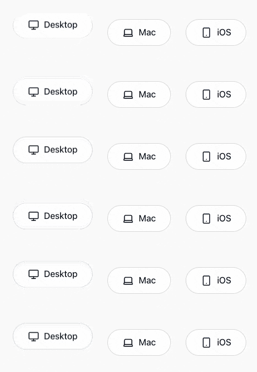
1️⃣ Hero 섹션 — Desktop 버튼 bounce
Hero 섹션에서는 전체에 복잡한 모션을 넣지 않고,
가장 중요한 CTA 버튼(Desktop) 하나만 살짝 튀게 해서
“눌러보고 싶은 느낌”을 만들어 준다.// src/components/landing/LandingHeroCtas.tsx // import { cn } from "@/lib/utils"; // import { Button } from "@/shared/button"; // import { Icon } from "@/shared/Icon"; // import Link from "next/link"; import { motion } from "framer-motion"; import { heroCtaBounceAnimate, heroCtaBounceTransition, } from "@/lib/variants/motion.landing"; export function LandingHeroCtas() { return ( <div className={ // 전체 레이아웃 관련 코드는 생략 // "mt-10 flex flex-col items-center gap-8 md:mt-20 md:flex-row md:gap-12" "" }> {/* ✅ Desktop: bounce 애니메이션 적용 */} <motion.div animate={heroCtaBounceAnimate} transition={heroCtaBounceTransition}> <Link href="/login"> <Button preset="hero" size="sm" className={cn("animate-bounce", "md:t-18-m md:px-[3rem] md:h-[5.4rem]")} <span className="inline-flex items-center gap-4"> <Icon name="monitor" className="h-6 w-6 md:h-9 md:w-9" /> <span>Desktop</span> </span> </Button> </Link> </motion.div> {/* 아래 Mac / iOS 버튼은 애니메이션 없이 동일 스타일로 렌더 */} {/* ... */} </div> ); }
✏️ 설명
CTA 버튼은 페이지 진입 시 사용자의 시선을 가장 먼저 끌어야 하는 요소이므로,
다른 컴포넌트와 달리 두 번에 나누어지는 리듬감 있는 “더블 바운스”을 적용했다.
y: [0, -10, 0, -4, 0]
→ 첫 번째로 크게 한 번 점프(-10px) 하고
다시 내려온 뒤
두 번째로 살짝 더 작은 점프(-4px) 를 한다.
마지막에 자연스럽게 원래 위치로 돌아오며 모션이 마무리된다.
duration과ease로 움직임의 속도와 곡선을 제어해
튐이 너무 급하거나 느릿하지 않도록 조정했다.
repeatDelay는 반복 사이에 텀을 주어
버튼이 계속 흔들리는 것처럼 보이지 않도록 했다.
일정 간격으로만 통통 튀기 때문에 방해되지 않고 자연스러운 리듬을 만든다.
- hover·tap 상태에서는 별도의 모션을 넣지 않았다.
CTA 버튼은 이미 시각적 강조가 되어 있기 때문에
인터랙션마다 움직임을 추가하면 오히려 산만해진다.
Hero 섹션에서는 이 버튼 하나만 가볍게 튀도록 설계해,
사용자가 “여기를 먼저 눌러보라”는 흐름을 자연스럽게 느낄 수 있도록 했다.
2️⃣ Feature1 & Feature2 — 스크롤 기반 좌우 슬라이드 + 페이드 인
Feature1과 Feature2는 동일한 구조를 사용하되,
등장 방향만 서로 반대로 설정해 스크롤 흐름에 리듬을 준다.
- Feature1: 오른쪽 → 가운데
- Feature2: 왼쪽 → 가운데
2️⃣-1️⃣ Feature1 — 오른쪽에서 왼쪽으로 fade-in
// src/components/landing/LandingFeaturesSection1.tsx
"use client";

// import { LandingFeatureGrid } from "@/components/landing/LandingFeatureGrid";
// import { cn } from "@/lib/utils";
// import { useFeaturePreviewStore } from "@/stores/featurePreviewStore";
// import type { LandingFeaturesSection1Props } from "@/types/landing";
// import Image from "next/image";
import { motion } from "framer-motion";
import {
  fadeInFromRight,
  viewportOnce30,
  sectionTransition,
} from "@/lib/variants/motion.landing";

export function LandingFeaturesSection1({ className }: LandingFeaturesSection1Props) {
  // const activeFeature = useFeaturePreviewStore((state) => state.activeFeature);

  return (
    <motion.section
      id="landing-features1"
      aria-labelledby="landing-features1-title"
      className={cn(
        "grid gap-18",
        "md:grid-cols-[minmax(0,1.1fr)_minmax(0,0.9fr)] md:items-center",
        "transition-all duration-1000 ease-out",
        className,
      )}
      variants={fadeInFromRight}
      initial="hidden"
      whileInView="visible"
      viewport={viewportOnce30}
      transition={sectionTransition}>

      {/* 텍스트 + 이미지 블록 */}
    </motion.section>
  );
}
✏️ 설명
Feature1 섹션은 “오른쪽에서 가운데로 미끄러지듯 들어오는” 모션을 사용한다.
이 모션은fadeInFromRightvariants로 정의되어 있으며 다음과 같은 구조로 동작한다.
- 초기 상태 (
hidden)
opacity: 0x: 40
→ 화면 오른쪽 바깥에서 약 40px 정도 떨어진 위치에서 투명하게 시작한다.
- 등장 상태 (
visible)
opacity: 1x: 0
→ 자연스럽게 중앙 위치로 이동하며 완전히 보이는 상태가 된다.
viewport={{ once: true, amount: 0.3 }}
- 섹션의 30% 이상이 화면에 보이는 순간 애니메이션이 발동한다.
- 한 번만 재생되고, 다시 스크롤해서 올라가도 재실행되지 않는다.
transition={sectionTransition}
- 0.7~1초 내에 부드럽게 감속하며 들어오도록 설계해
“흘러들어오는 느낌”이 강조된다.
이 패턴 덕분에 Hero에서 내려올 때
Feature1 섹션 전체가 오른쪽 → 중앙 방향으로 자연스럽게 등장하여
사용자의 시선이 콘텐츠 흐름에 맞춰 이동하게 된다.
2️⃣-2️⃣ Feature2 — 왼쪽에서 오른쪽으로 fade-in
// src/components/landing/LandingFeaturesSection2.tsx
"use client";

// import { LandingFeatureText } from "@/components/landing/LandingFeatureText";
// import { LandingLayoutPreview } from "@/components/landing/LandingLayoutPreview";
// import { cn } from "@/lib/utils";
// import type { LandingFeaturesSection2Props } from "@/types/landing";
import { motion } from "framer-motion";
import {
  fadeInFromLeft,
  viewportOnce35,
  sectionTransition,
} from "@/lib/variants/motion.landing";

export function LandingFeaturesSection2({ className }: LandingFeaturesSection2Props) {

  return (
    <motion.section
      id="landing-features2"
      aria-labelledby="landing-features2-title"
      className={cn(
        "grid gap-20",
        "md:grid-cols-[minmax(0,1.1fr)_minmax(0,0.9fr)] md:items-center md:gap-35",
        "transition-all duration-1000 ease-out",
        className,
      )}
      variants={fadeInFromLeft}
      initial="hidden"
      whileInView="visible"
      viewport={viewportOnce35}
      transition={sectionTransition}>

      {/* <LandingFeatureText className="md:order-2" /> */}
      {/* <LandingLayoutPreview className="md:order-1" /> */}
    </motion.section>
  );
}
✏️ 설명
Feature2 섹션은 Feature1과 동일한 구조를 사용하지만,
모션의 등장 방향만 반대로 설정해 스크롤 흐름에 리듬을 준다.
이 섹션은fadeInFromLeftvariants를 적용해
왼쪽에서 가운데로 미끄러지듯 진입하는 패턴을 사용한다.
- 초기 상태 (
hidden)
opacity: 0x: -40
→ 화면 왼쪽 바깥에서 약 40px 정도 떨어진 위치에서 투명하게 시작한다.
- 등장 상태 (
visible)
opacity: 1x: 0
→ 중앙 위치로 자연스럽게 이동하며 완전히 보이는 상태가 된다.
viewport={{ once: true, amount: 0.35 }}
- 섹션의 35% 정도가 화면에 들어오는 시점에 애니메이션이 시작된다.
- Feature1보다 약간 더 늦게 트리거되도록 조정해
두 섹션 사이의 간격감을 조금 더 부드럽게 맞췄다.
transition={sectionTransition}
- 동일한 전역 전환 설정을 사용해
Feature1 → Feature2로 이어지는 흐름이 한결같고 부드럽게 보이도록 했다.
이 패턴을 통해
Feature1이 오른쪽 → 중앙 방향으로 등장했다면,
Feature2는 왼쪽 → 중앙 방향으로 등장하기 때문에
스크롤하면서 좌우로 번갈아 등장하는 자연스러운 리듬이 만들어진다.
결과적으로 사용자는 기능 설명 흐름을
“오른쪽 → 왼쪽 → 오른쪽”의 패턴으로 안정적으로 따라갈 수 있다.
3️⃣ Special 섹션 — 제목 아래→위 슬라이드 + 카드 순차 등장
마지막 Special 섹션은,
제목/부제와 카드 3장이 서로 다른 방식으로 등장하도록 설계했다.
- 제목/부제(header): 아래에서 위로 슬라이드 + 페이드 인
- 카드 3장
- 아래에서 위로 슬라이드 + 페이드 인
- 왼쪽 카드부터 0ms, 200ms, 400ms 순차 delay
- hover 시 살짝 떠오르면서 shadow 강화
3️⃣-1️⃣ 제목 블록 애니메이션
// src/components/landing/LandingSpecialFeaturesSection.tsx
"use client";

// import { LandingSpecialFeatureGrid } from "@/components/landing/LandingSpecialFeatureGrid";
// import { cn } from "@/lib/utils";
// import type { LandingSpecialFeaturesSectionProps } from "@/types/landing";
  import { motion } from "framer-motion";
  import {
    fadeInUp,
    headerTransition,
    viewportOnce30,
  } from "@/lib/variants/motion.landing";

export function LandingSpecialFeaturesSection({ className }: LandingSpecialFeaturesSectionProps) {
  return (
    <section
      id="landing-special-features"
      aria-labelledby="landing-special-features-title"
      className={cn("bg-[var(--color-gray-50)] py-24 md:py-32", className)}>
      <div className="container space-y-12 md:space-y-16">
        <motion.header
          variants={fadeInUp}
          initial="hidden"
          whileInView="visible"
          viewport={viewportOnce30}
          transition={headerTransition}
          className={cn("space-y-3 text-center transition-all duration-1000 ease-out")}>
          {/* 제목 + 부제 */}
         </motion.header>

        <LandingSpecialFeatureGrid />
      </div>
    </section>
  );
}
✏️ 설명
Special 섹션의 제목·부제(header)는
섹션의 시작을 자연스럽게 알려주는 인트로 모션 역할을 한다.
이 블록에는fadeInUpvariants를 적용해
아래에서 위로 가볍게 떠오르는 형태로 등장하도록 구성했다.
- 초기 상태 (
hidden)
opacity: 0y: 24
→ 화면 아래쪽으로 24px 정도 내려간 위치에서 투명하게 시작한다.
- 등장 상태 (
visible)
opacity: 1y: 0
→ 제자리로 부드럽게 올라오며 완전히 보이는 상태가 된다.
viewport={{ once: true, amount: 0.3 }}
- 제목 영역이 화면에 약 30% 정도 보이는 순간 모션이 재생되도록 설정했다.
- 한 번만 재생되어, 페이지 스크롤을 다시 올려도 “헤더가 또 튀는” 현상이 없다.
transition={headerTransition}
- Feature 섹션보다 살짝 더 짧고 부드러운 시간 값으로 설정해
섹션의 도입부가 가볍게 시작되는 느낌을 준다.
이 모션은 Special 섹션의 첫 화면을 차분하게 열어주는 역할을 하며,
뒤이어 등장할 카드 3장의 순차 애니메이션과도 자연스럽게 이어진다.
3️⃣-2️⃣ 카드 3장 — 위로 슬라이드 + 순차 delay + hover shadow
// src/components/landing/LandingSpecialFeatureGrid.tsx
"use client";

import { SPECIAL_FEATURES } from "@/lib/constants";
import { cn } from "@/lib/utils";
import {
  specialCardVariants,
  specialGridVariants,
  viewportOnce25,
} from "@/lib/variants/motion.landing";
import { Icon } from "@/shared/Icon";
import { SpecialFeatureCard } from "@/shared/SpecialFeatureCard";
import { motion } from "framer-motion";

export function LandingSpecialFeatureGrid({ className }: { className?: string }) {
  return (
    <motion.div
      className={cn(
        "flex flex-col items-center gap-10 md:flex-row md:justify-center md:gap-8",
        className,
      )}
      variants={specialGridVariants}
      initial="hidden"
      whileInView="visible"
      viewport={viewportOnce25}>
      {SPECIAL_FEATURES.map((feature) => (
        <motion.div key={feature.title} variants={specialCardVariants}>
          <SpecialFeatureCard
            icon={<Icon name={feature.iconName} size={28} />}
            title={feature.title}
            description={feature.description}
            className="transition-all duration-300 hover:-translate-y-1 hover:shadow-[0_18px_40px_rgba(0,0,0,0.12)]"
          />
        </motion.div>
      ))}
    </motion.div>
  );
}
✏️ 설명
Special 섹션의 카드 3장은
그리드 전체 → 카드 한 장씩 두 단계로 나눠서 애니메이션을 준다.
1.motion.div그리드 래퍼에specialGridVariants를 적용해
“등장 타이밍과 순서”를 제어한다.
2. 각 카드 컨테이너(motion.div)에specialCardVariants를 적용해
“카드 하나의 움직임”을 정의한다.
이때specialGridVariants는 내부에서staggerChildren을 사용해
왼쪽 카드부터 순차적으로 등장하도록 만든다.export const specialGridVariants: Variants = { hidden: {}, visible: { transition: { staggerChildren: 0.18 }, }, };즉,
visible상태로 전환될 때
첫 번째 카드 → 두 번째 카드 → 세 번째 카드 순으로
약0.18초간격을 두고 애니메이션이 재생된다.
각 카드(specialCardVariants)는
- 초기 상태 (
hidden)
opacity: 0y: 18
→ 살짝 아래쪽에서 보이지 않는 상태로 시작한다.
- 등장 상태 (
visible)
opacity: 1y: 0
→ 위로 부드럽게 떠오르며 완전히 보이는 상태가 된다.
또한, 카드 자체에는 Tailwind로 가벼운 hover 효과를 얹어두었다.className="transition-all duration-300 hover:-translate-y-1 hover:shadow-[0_18px_40px_rgba(0,0,0,0.12)]"
- 마우스를 올리면 카드가
1px정도 위로 떠오르고- 그림자가 살짝 진해지면서 눌러보고 싶은 입체감을 만들어준다.
결과적으로, Special 섹션은
제목이 먼저 아래→위로 떠오른 뒤,
카드 3장이 왼쪽에서 오른쪽 순으로 톡톡 튀어나오는 흐름을 가지게 된다.
마지막으로 hover 시의 미세한 모션까지 더해져
“가볍지만 완성도 있는” 마무리 섹션이 된다.
🔚 전체 애니메이션 흐름 정리
Hero → Feature1 → Feature2 → Special로 내려오는 동안,
각 섹션은 서로 다른 방식으로 등장해 페이지 흐름을 자연스럽게 안내한다.
1. Hero
- 로그인 CTA만 idle 상태에서 가볍게 통통 2번 튐
- 첫 진입 시 화면의 중심 포커스 역할
- Feature1
- 오른쪽 바깥 → 제자리
- 기능 리스트 + 미리보기 영역을 하나의 단위로 보여준다.
- Feature2
- 왼쪽 바깥 → 제자리
- Feature1과 반대 방향으로 등장해 흐름에 리듬 부여
- Special
- 제목은 아래→위 슬라이드
- 카드 3장은 왼쪽부터 순차적으로 등장
- hover 시 미세한 입체감으로 강조
결과적으로,
Framer Motion 기반의 가벼운 모션 시스템을 통해
정보 전달과 시각 흐름에 최적화된 랜딩 페이지가 완성된다.
🧭 섹션 간 스크롤 전환 — Full-page Scroll 설계
랜딩 페이지에서 각 섹션(Hero → Feature1 → Feature2 → Special)이
제각각 움직이는 애니메이션뿐만 아니라
“섹션에서 섹션으로 이동하는 흐름”도 자연스러워야 한다.
기본 스크롤만 쓰면 이런 문제가 생긴다.
- 사용자마다 스크롤 속도가 달라서 섹션 모션 타이밍이 흐트러짐
- 콘텐츠 중간에서 멈추면 다음 섹션의 등장 시점이 어색함
- 애니메이션 리듬이 깨져 브랜드 스토리 흐름이 잘 전달되지 않음
그래서 이번 프로젝트는 랜딩 페이지에
한 번의 스크롤로 정확히 한 섹션씩 이동하는 Full-page Scroll 구조를 도입했다.
🎯 목표 — “한 번의 입력으로 한 섹션씩, 일정한 리듬으로”
섹션 전환 기능의 목표는 세 가지다.
1. 한 번의 휠 / 스와이프 입력 → 한 섹션 이동
사용자가 휠을 살짝만 굴려도 다음 섹션으로 정확히 이동한다.
2. 섹션 위치가 중앙에 스냅처럼 정렬
섹션에 진입하면 “정확한 위치에서” 머물러
Framer Motion 애니메이션이 자연스럽게 재생된다.
3. 전체 흐름이 부드럽고 끊기지 않음
scrollTo({ behavior: "smooth" })로 섹션 간 이동감을 매끄럽게 유지한다.
🧩 구조 설계 —
useFullPageScroll훅Tailwind의
scroll-snap만으로도 비슷한 효과를 낼 수 있지만,
섬세한 제어(마지막 섹션 정렬·모바일 대응·가속 조절)를 위해
직접 커스텀 스크롤 훅을 구현했다.
이 훅은 다음과 같은 원리로 동작한다.
동작 순서 설명 1️⃣ .scroll-section클래스를 가진 섹션들을 전부 가져온다.2️⃣ 휠이나 터치 스와이프 이벤트를 가로채서, 한 번의 입력마다 섹션 인덱스를 +1 또는 -1 이동시킨다. 3️⃣ window.scrollTo({ behavior: "smooth" })로 해당 섹션의 위치로 스크롤 이동시킨다.4️⃣ 마지막 섹션만 중앙 정렬 대신 상단에 붙인다. (푸터는 고정) // src/hooks/useFullPageScroll.ts "use client"; import { useEffect } from "react"; /** * useFullPageScroll * - Hero~Special 섹션까지 풀페이지 전환 * - 마지막 섹션은 중앙이 아닌 상단 정렬 * - 자연 스크롤은 모두 비활성화 */ export function useFullPageScroll() { useEffect(() => { const sections = document.querySelectorAll<HTMLElement>(".scroll-section"); if (!sections.length) return; let isScrolling = false; let startY = 0; const getClosestSectionIndex = () => { const scrollY = window.scrollY; let closestIndex = 0; let smallestDiff = Number.POSITIVE_INFINITY; sections.forEach((section, index) => { const diff = Math.abs(section.offsetTop - scrollY); if (diff < smallestDiff) { smallestDiff = diff; closestIndex = index; } }); return closestIndex; }; const scrollToSection = (index: number) => { const target = sections[index]; if (!target) return; const sectionTop = target.offsetTop; const sectionHeight = target.offsetHeight; const viewportHeight = window.innerHeight; const lastIndex = sections.length - 1; const isLast = index === lastIndex; // ✅ 마지막 섹션만 상단 정렬 const targetY = isLast ? sectionTop : sectionTop - (viewportHeight - sectionHeight) / 2; window.scrollTo({ top: targetY, behavior: "smooth", }); }; const moveOneSection = (direction: 1 | -1) => { if (isScrolling) return; isScrolling = true; const currentIndex = getClosestSectionIndex(); const nextIndex = Math.min( Math.max(currentIndex + direction, 0), sections.length - 1, ); scrollToSection(nextIndex); setTimeout(() => { isScrolling = false; }, 900); }; const handleWheel = (event: WheelEvent) => { event.preventDefault(); // ✅ 기본 스크롤 차단 const deltaY = event.deltaY; if (Math.abs(deltaY) < 10) return; const direction: 1 | -1 = deltaY > 0 ? 1 : -1; moveOneSection(direction); }; const handleTouchStart = (e: TouchEvent) => { startY = e.touches[0].clientY; }; const handleTouchEnd = (e: TouchEvent) => { const endY = e.changedTouches[0].clientY; const deltaY = startY - endY; if (Math.abs(deltaY) < 50) return; const direction: 1 | -1 = deltaY > 0 ? 1 : -1; moveOneSection(direction); }; window.addEventListener("wheel", handleWheel, { passive: false }); window.addEventListener("touchstart", handleTouchStart, { passive: true }); window.addEventListener("touchend", handleTouchEnd, { passive: true }); // 첫 진입 시 Hero 중앙으로 스냅 scrollToSection(0); return () => { window.removeEventListener("wheel", handleWheel); window.removeEventListener("touchstart", handleTouchStart); window.removeEventListener("touchend", handleTouchEnd); }; }, []); }✏️ 작동 방식 요약
구간 스크롤 방향 동작 Hero → Feature1 아래 Feature1로 부드럽게 전환 Feature1 → Feature2 아래 Feature2로 전환 Feature2 → Special 아래 Special 섹션으로 전환 (상단 정렬) Special → Feature2 위 Feature2로 부드럽게 복귀
- 모든 스크롤은
preventDefault()로 제어되어
브라우저 기본 스크롤이 완전히 비활성화된다.
- 섹션의 위치는
window.scrollTo({ behavior: "smooth" })로 이동.
- 마지막 섹션만 상단에 붙여 푸터 영역이 깔끔히 맞물리도록 처리했다.
⚙️ 적용 구조 —
LandingFullPageWrapper+page.tsx풀페이지 스크롤은 페이지 전체 흐름을 제어하는 역할이라
직접page.tsx에서 훅을 호출하기보다는,
레이아웃처럼 한 번 감싸는 전용 래퍼 컴포넌트를 뒀다.1)
LandingFullPageWrapper— 훅 전용 래퍼// src/components/landing/LandingFullPageWrapper.tsx "use client"; import { useFullPageScroll } from "@/hooks/useFullPageScroll"; import type { LandingFullPageWrapperProps } from "@/types/landing"; /** * LandingFullPageWrapper * - 랜딩 페이지 전체에 풀페이지 스크롤을 적용하는 래퍼 * - 내부에서 useFullPageScroll 훅을 한 번만 호출한다. */ export function LandingFullPageWrapper({ children }: LandingFullPageWrapperProps) { useFullPageScroll(); return <>{children}</>; }
// src/types/landing.ts
export interface LandingFullPageWrapperProps {
  children: React.ReactNode;
}
- 이 컴포넌트는 UI를 추가로 렌더링하지 않고,
오직useFullPageScroll()을 호출해 스크롤 로직만 주입하는 역할만 한다.- 덕분에 스크롤 로직과 실제 섹션 레이아웃 코드를 깔끔하게 분리할 수 있다.
2)
page.tsx— 섹션 조립 + 래퍼 적용// app/(marketing)/(landing)/page.tsx "use client"; import { LandingHeroSection } from "@/components/landing/LandingHeroSection"; import { LandingFeaturesSection1 } from "@/components/landing/LandingFeaturesSection1"; import { LandingFeaturesSection2 } from "@/components/landing/LandingFeaturesSection2"; import { LandingSpecialFeaturesSection } from "@/components/landing/LandingSpecialFeaturesSection"; import { LandingMainSection } from "@/components/landing/LandingMainSection"; import { LandingFullPageWrapper } from "@/components/landing/LandingFullPageWrapper"; export const revalidate = 21600; export default function Home() { return ( <LandingFullPageWrapper> <LandingHeroSection className="scroll-section" /> <LandingFeaturesSection1 className="scroll-section" /> <LandingFeaturesSection2 className="scroll-section" /> <LandingSpecialFeaturesSection className="scroll-section" /> </LandingFullPageWrapper> ); }✏️ 정리
LandingFullPageWrapper
- 스크롤 제어 전용 컴포넌트
- 내부에서
useFullPageScroll()을 한 번만 호출
LandingMainSection
- 가로 폭/좌우 패딩/섹션 간 간격만 관리하는 레이아웃 래퍼
- 각 컴포넌트 섹션에
<Landing??Section className="scroll-section">
useFullPageScroll훅이 “어디까지를 한 섹션으로 보고 이동할지”를 판단하는 기준
💡 스타일 가이드
globals.css에는 별다른 스냅 속성이 필요 없다.
휠 이벤트가 직접 스크롤을 제어하므로, 아래 정도만 있으면 충분하다.html, body { height: 100%; scroll-behavior: smooth; }
.scroll-section은 단순히 훅에서 타겟팅용으로 쓰이므로
스타일을 지정하지 않아야 레이아웃이 깨지지 않는다.
🎬 결과 — “풀페이지 전환 + 애니메이션 타이밍 완성”
최종적으로 랜딩 페이지는 이렇게 동작한다.
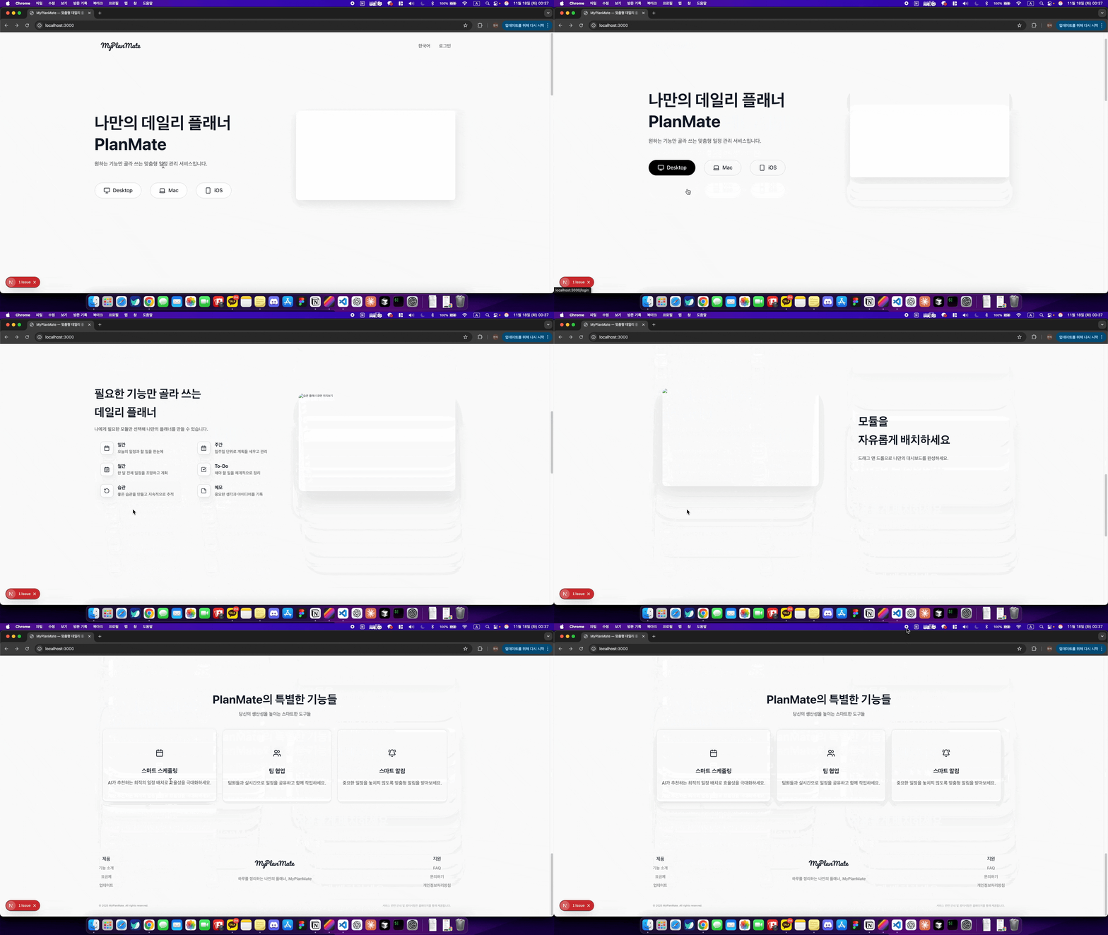
단계 이벤트 효과 ① Hero 페이지 진입 Desktop 버튼 bounce ② ↓ Hero → Feature1 화면이 부드럽게 이동 + Feature1 등장 (오른쪽→왼쪽) ③ ↓ Feature1 → Feature2 화면이 이동 + Feature2 등장 (왼쪽→오른쪽) ④ ↓ Feature2 → Special 마지막 섹션 상단 정렬 + 카드 순차 애니메이션 즉, Hero → Feature1 → Feature2 → Special로 이어지는
일관된 한 섹션 단위 스크롤 흐름이 완성된다.
사용자는 손가락 한 번의 스크롤만으로
브랜드 스토리를 끊김 없이, 부드럽게 경험하게 된다.