1. 요소(Element) 내부에 요소를 가운데 정렬
1) flex 사용
<html lang="en">
<head>
<meta charset="UTF-8">
<meta name="viewport" content="width=device-width, initial-scale=1.0">
<title>Table Row Border Example</title>
<style>
  .container{

    display : flex;
    justify-content : center;
    align-items : center;

    width : 200px;
    height : 100px;


    background-color : hotpink;

  }

  .content{

    width : 130px;
    height : 50px;

    background-color : yellow;
  }


</style>
</head>
<body>
	<div class="container">
    	<div class="content">
        </div>
    </div>

</body>
</html>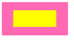
2. position 속성 사용
- 부모 요소에 position : relative,
자식 요소에 position : absolute 적용
- 자식 요소에 left : 50%, right : 50% 적용,
(부모 요소로 부터 상대적으로 x축, y축 방향 정렬)
- transform: translate(-50%, -50%); 적용
현재, 자식 요소의 왼쪽 위 모서리가 부모 요소 중앙에 위치하므로,
부모 요소 중심과, 자식 요소의 중심을 맞추기 위해서 설정한다.
<html lang="en">
<head>
<meta charset="UTF-8">
<meta name="viewport" content="width=device-width, initial-scale=1.0">
<title>Table Row Border Example</title>
<style>
  .container{

    position : relative;

    width : 200px;
    height : 100px;


    background-color : hotpink;

  }

  .content{

  	position: absolute;
	top: 50%;
	left: 50%;
	transform: translate(-50%, -50%);

    width : 130px;
    height : 50px;

    background-color : yellow;
  }


</style>
</head>
<body>
	<div class="container">
    	<div class="content">
        </div>
    </div>

</body>
</html>
2. 텍스트 중앙 정렬
1) text-align : center 설정하고, height / line-height 동일하게
가로 축 중앙 정렬 : text-align : center;
세로 축 중앙 정렬 : height : 30px; / line-height : 30px; (세트로 적용)
<html lang="en">
<head>
<meta charset="UTF-8">
<meta name="viewport" content="width=device-width, initial-scale=1.0">
<title>Table Row Border Example</title>
<style>
  .text{

    width : 200px;

    // 세로 축 중앙 정렬

    height : 100px;
    line-height : 100px;

    // 가로 축 중앙 정렬
    text-align : center;

    background-color : skyblue;

  }

</style>
</head>
<body>
	<p class="text">텍스트</p>
</body>
</html>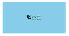
2) flex 사용
<html lang="en">
<head>
<meta charset="UTF-8">
<meta name="viewport" content="width=device-width, initial-scale=1.0">
<title>Table Row Border Example</title>
<style>
  .text{

    width : 200px;
    height : 100px;

    display: flex;
    justify-content : center;  // 가로 중앙 정렬
    align-items : center;  // 세로 중앙 정렬

    background-color : skyblue;

  }

</style>
</head>
<body>
	<p class="text">텍스트</p>
</body>
</html>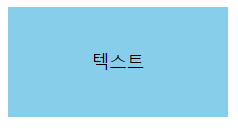
3) 부모 요소에 display : table;
자식 요소에 display : table, vertical-align : middle, text-align : center; 사용
1), 2)와는 다르게 <p> 태그 내부 정렬(텍스트 내부)이 아니라
상위에 <div>등 부모요소가 있을때 사용함, <p> 태그는 자식요소.
<html lang="en">
<head>
<meta charset="UTF-8">
<meta name="viewport" content="width=device-width, initial-scale=1.0">
<title>Table Row Border Example</title>
<style>
.container{
width : 200px;
height : 100px;
display: table;
background-color : skyblue; => 무시됨
}
.content{
width : 130px; => 무시됨
height : 50px; => 무시됨
background-color : yellow;
display : table-cell;
text-align : center;
vertical-align : middle;
}
</style>
</head>
<body>
<div class="container">
<p class="content">텍스트</p>
</div>
</body>
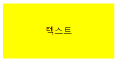
</html>결과) width, height는 부모 요소, background-color는 자식 요소 <p>의 내용이 적용되었음을 확인할 수 있습니다.
프론트엔드 개발자